Portal - Powerful Client Management Landing Page Template
Portal is a scroll-reveal landing page template built for startup founders who manage clients across too many tools. It leads with live-style metric counters, stacks brutalist proof blocks as users scroll, and drives signups with a progressive two-step form. The design uses a bold teal-and-charcoal palette that feels industrial, focused, and impossible to ignore.
by Rocket studio
Quick summary
Portal is a single-page, scroll-reveal landing page template designed for startup client portal products. It opens with a full-viewport stats dashboard, then builds its case block by block as the visitor scrolls. Every section earns trust before asking for a click. The result feels less like a marketing page and more like undeniable proof.
Who this template is for
This template is built for founders selling a client portal or client management product to small, fast-moving teams. If your buyers feel the pain of scattered tools every day, this page speaks directly to that moment.
- Two-to-fifteen-person SaaS teams juggling multiple client touchpoints
- Freelance development shops billing on retainers who need one clean view
- Agency founders who personally onboard every account and feel the late-night chaos
What problem this template solves
Most client management products are sold with generic screenshots and feature lists. That approach fails founders whose buyers already know what chaos feels like and need to see proof that it ends. This template leads with data, not declarations.
- Visitors arrive skeptical and leave seeing specific, weighted evidence
- The scattered-tools problem is named and priced before the product appears
- A two-step signup form removes friction without hiding commitment
What you get with this template
You get a fully structured, scroll-reveal landing page ready to represent your startup client portal. Every section is sequenced to move a skeptical buyer from recognition to action.
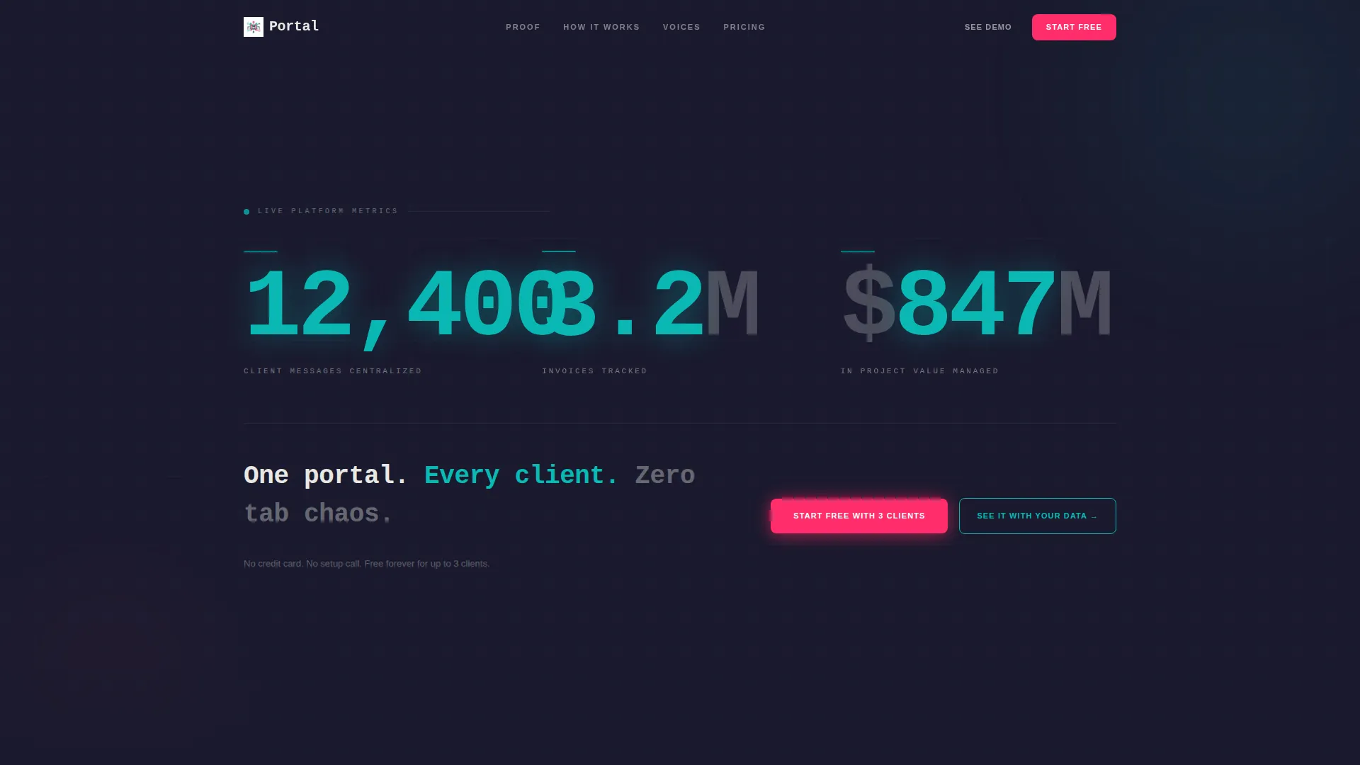
- A full-viewport header block with three animated stat counters and a primary call-to-action
- Progressive scroll reveals that each open with an anchor metric before context appears
- A sticky conversion bar, a two-step signup form, and a secondary demo path built into the layout
Feature list
This template delivers a focused set of purpose-built components. Each one serves the Stats-First Impact creative direction without adding visual noise.
Animated Metrics Header
The header fills the entire viewport with three large stat counters that animate upward on load. Numbers are set in a heavy mono typeface against the charcoal background, with teal digits ticking like a departures board. A single tagline fades in beneath: "One portal. Every client. Zero tab chaos."
Scroll-Reveal Proof Blocks
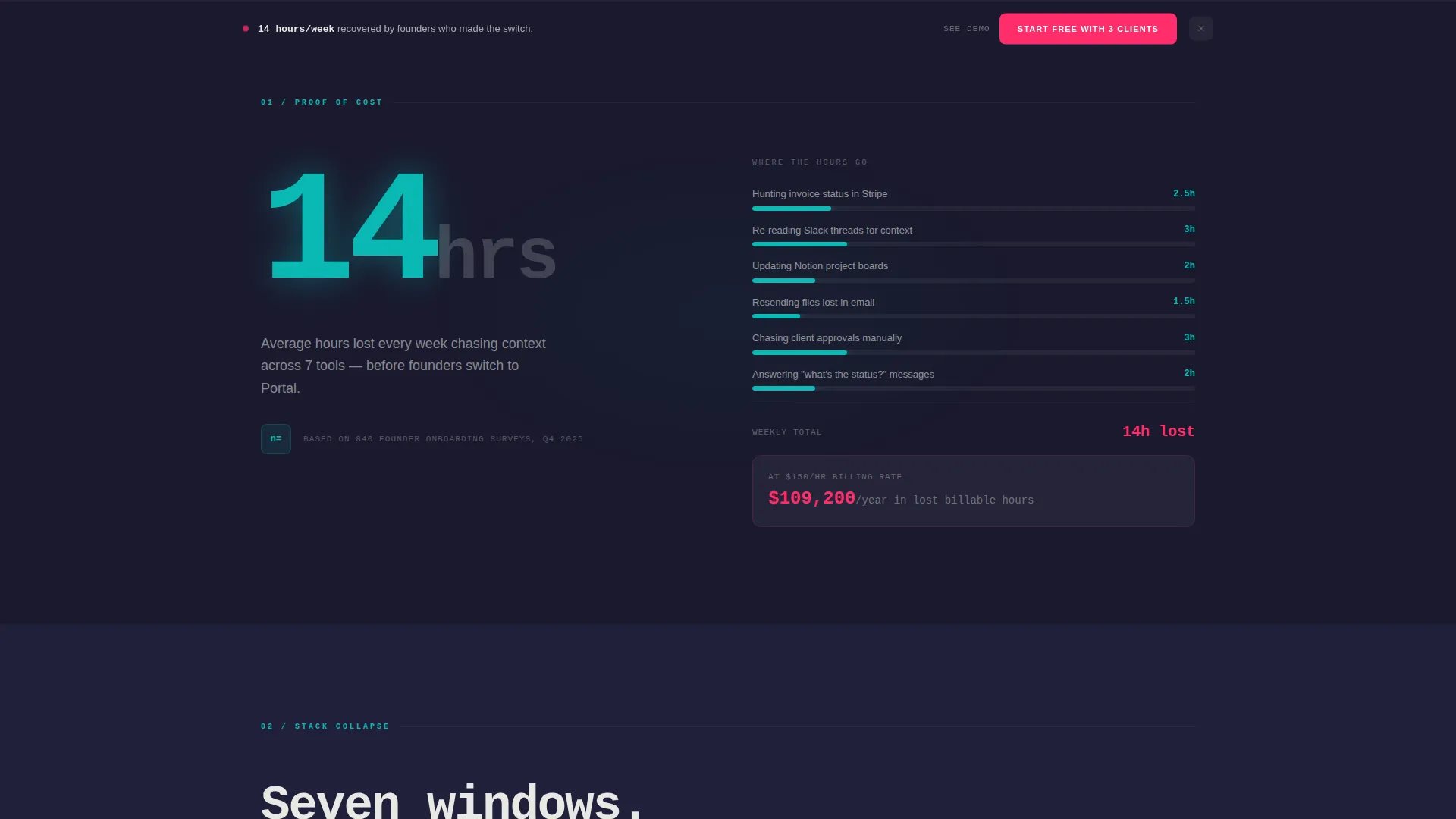
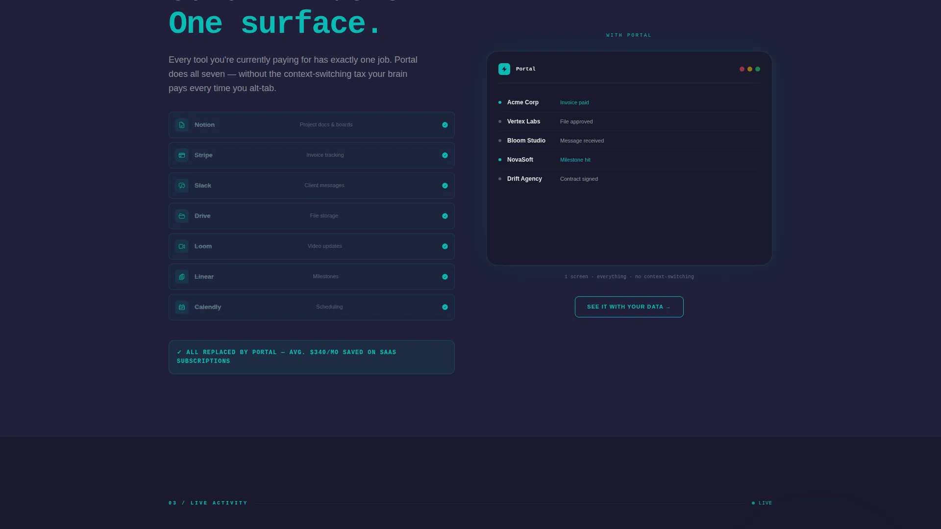
Each scroll reveal drops a new brutalist content block into view. The first block lands an hours-saved number before any explanation appears. The second shows a before-and-after panel of seven app icons collapsing into one. This sequencing teaches by proving, not by claiming.
Live-Style Activity Feed
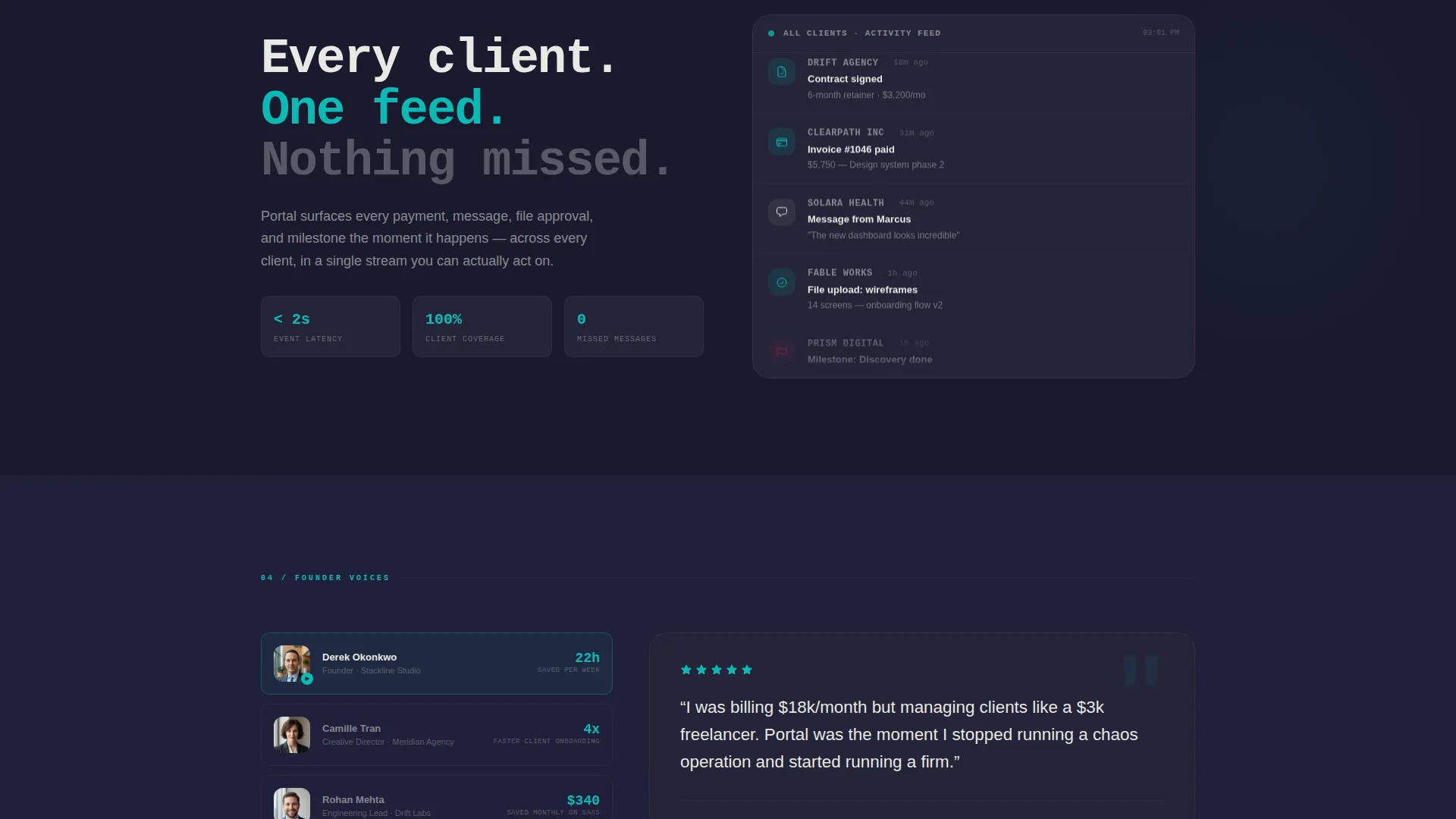
The third proof block displays a real-time-styled feed of client activity, including messages, payments, and approvals, scrolling autonomously. It gives visitors a concrete feel for what the portal looks like in motion without requiring a full demo.
Progressive Two-Step Signup Form
The primary call-to-action collects only an email address on first click. The second step asks for team size and current tool stack. This keeps early friction low while gathering the context needed for a meaningful onboarding experience.
Sticky Conversion Bar
After the second scroll reveal, a sticky bar anchors the primary call-to-action to the bottom of the viewport. Visitors never have to scroll back up to act. The bar uses the warning-flare magenta to stay visually distinct from the rest of the layout.
Secondary Demo Path
A secondary call-to-action, labeled "See It With Your Data," offers access to a pre-loaded demo environment. This gives hesitant visitors a lower-commitment way to experience the product before signing up.
Page sections overview
| Section | Purpose |
|---|---|
| Viewport Metrics Header | Opens with animated stat counters and primary call-to-action |
| Hours Saved Block | First scroll reveal anchored by a weekly time-saved figure |
| App Collapse Panel | Before-and-after showing seven tools replaced by one |
| Live Activity Feed | Autonomous-scrolling feed of client messages and payments |
| Sticky Conversion Bar | Persistent signup prompt appearing after second scroll reveal |
| Progressive Signup Form | Two-step email-first form capturing team context |
| Demo Entry Path | Secondary route into a pre-loaded product demo |
Design & branding system
The visual identity follows a Bold Brutalist theme built around the Teal Catalyst color system. The palette feels like a warehouse office with polished concrete floors and a single neon sign overhead.
- Reactor-core teal (#0ABAB5) drives primary actions and live data elements; poured-slab charcoal (#1A1A2E) covers section backgrounds
- Exposed-concrete off-white (#E8E8E4) surfaces card backgrounds and body text for legibility against dark slabs
- Warning-flare magenta (#FF2D6B) appears exclusively on conversion moments, keeping it visually urgent without overuse
Mobile & speed optimization
The layout is structured for clean rendering across screen sizes. Scroll-reveal sequencing and heavy mono display type are handled with readability in mind at every breakpoint.
- Brutalist block layouts stack naturally on narrow viewports without losing hierarchy
- The sticky conversion bar remains accessible regardless of scroll position on mobile screens
- Display-scale type is sized to remain legible and impactful on smaller devices
How this template helps you convert
This template is engineered around one idea: earn the click before asking for it. Every layout decision serves that goal.
- The page front-loads proof that the problem is expensive, so the free tier feels like found money rather than a risk
- The progressive form reduces abandonment by asking only for an email address on the first interaction
- The secondary demo path catches visitors who want to see before they commit, keeping them inside the conversion funnel
Other information about this template
Portal is a category-specific template built for the startup client portal niche. It is not a general-purpose SaaS template and should not be treated as one.
- The template style is Scroll Reveal (Progressive), meaning sections animate into view as the user scrolls rather than loading all at once
- The landing page direction is Freemium/Trial, meaning the layout is calibrated for low-barrier signups and a free-tier entry point
- The header concept is Stats/Metrics, a deliberate choice that replaces hero imagery with data as the primary visual statement
- This template works well for founders building or launching a startup client portal who want a page that proves value before it asks for anything
Theme
Bold Brutalist
Creative direction
Stats-First Impact
Color system
Teal Catalyst
Style
Scroll Reveal (Progressive)
Direction
Freemium/Trial
Page Sections
Animated Metrics Header
Scroll-reveal Proof Blocks
Live-style Activity Feed
Progressive Two-step Signup Form
Sticky Conversion Bar
Secondary Demo Entry Path
Related questions
Who is this landing page template designed for?
Can I customize the stat counter numbers in the header?
What is the difference between the two calls-to-action on this page?
Does the sticky conversion bar appear immediately on load?
Is this template suitable for a product that is not yet launched?



