Coaching Digital Presence Specialist Professional Website Template
Portal is a single-page coaching client landing page template built on a dark Tech Glass visual system. It combines a dashboard-style header, an industry-report scroll flow, and a head-to-head comparison table to help coaches present their platform with clarity and authority. The layout is designed to guide high-value coaching clients from first scroll to a confident sign-up decision.
by Rocket studio
Quick summary
Portal is a coaching client landing page template styled as a dark glass dashboard. It opens with four floating live-data panel cards, flows through a research-style industry report narrative, and closes on a detailed feature comparison table. The entire page is built for one purpose: making the decision to switch feel obvious before the visitor reaches the call to action.
Who this template is for
This template is built for coaching professionals who manage high-value client relationships and need a page that communicates capability at a glance. If your current stack feels scattered, Portal gives your offer a sharp, unified face.
- Solo performance coaches billing premium hourly rates who want a client-facing presence that matches their positioning
- Executive coaching firms that onboard senior corporate leaders and need a polished, data-forward first impression
- Wellness practitioners who track progress across multiple clients and want one system to replace their spreadsheet workflow
What problem this template solves
Most coaching professionals use four or more disconnected tools to manage client sessions, notes, and progress metrics. That fragmentation undermines the professional image that premium clients expect. Portal addresses this directly by presenting a unified, dashboard-first visual experience that makes complexity disappear.
- Coaches lose credibility when their client-facing setup looks patched together from free tools
- High-ticket buyers need immediate visual proof that the system they are joining is professional and purposeful
- Comparison-stage visitors leave without converting because no single page shows them why to switch
What you get with this template
Portal delivers a complete single-page layout that functions as both a product showcase and a conversion engine. Every section is structured to move the reader from skepticism to decision through data, design, and direct comparison.
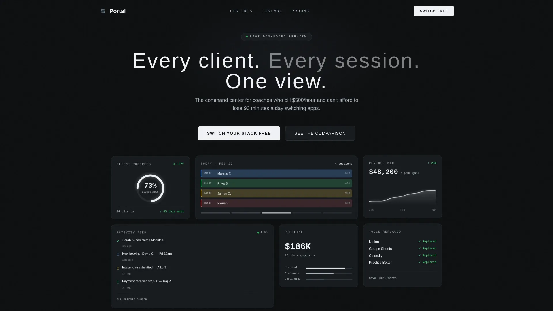
- A four-panel dark glass header with a client progress ring, session calendar, revenue sparkline, and notification feed card
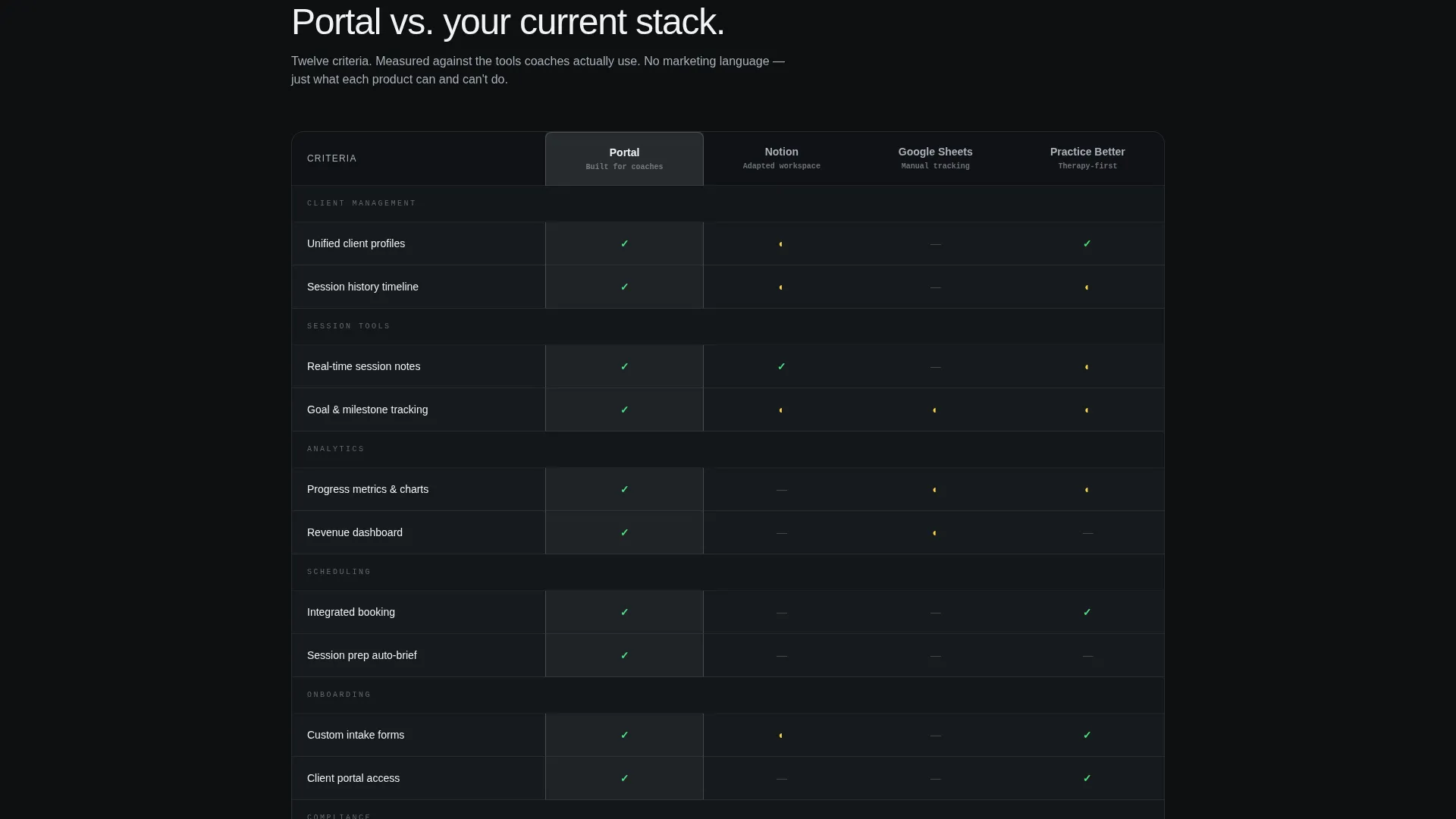
- A full-width sticky navigation bar anchored to a twelve-criteria comparison table positioned against competing tools
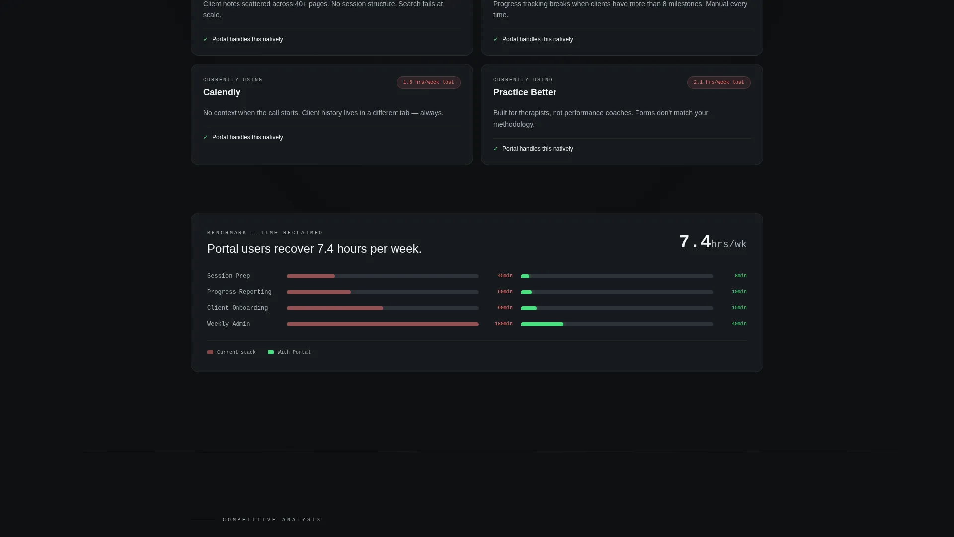
- A layered industry-report scroll flow with data callout sections, benchmark visuals, and annotated product proof panels
Feature list
This section covers the core built-in components that define the Portal template and make it ready to use from the first edit.
Four-Panel Glass Dashboard Header
The header displays four translucent rectangular card panels on a pure black field. Each panel carries a distinct live-data view: a client progress ring, a color-coded weekly session calendar, a revenue tracker with a climbing sparkline, and a notification feed. The frosted-glass blur effect and faint steel borders give the header real visual weight without relying on any photography.
Industry Report Scroll Narrative
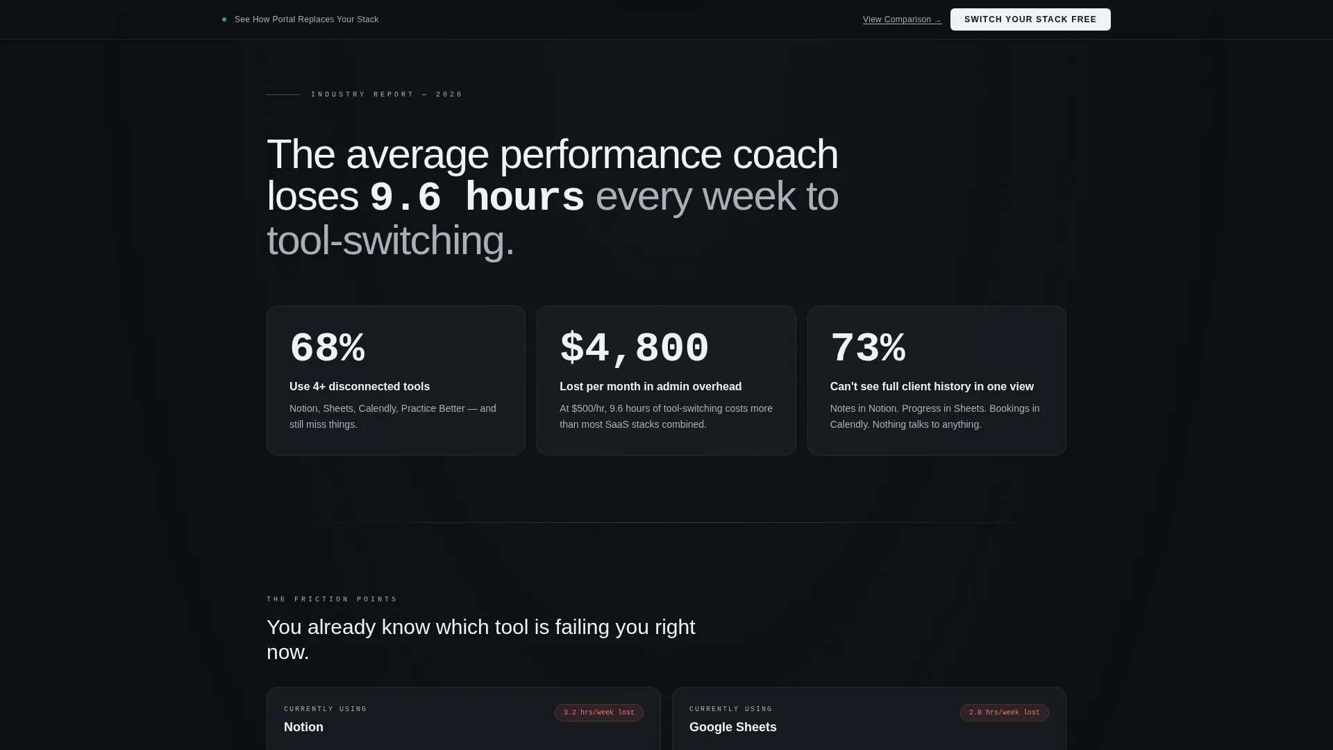
The page body follows a repeating rhythm of problem stat, industry context, and product proof. Each cycle opens with a hard data callout, builds context around a friction point that coaches recognize, and then resolves the tension with a glass-panel module showing Portal's answer. The structure makes the visitor feel like they are reading research rather than a sales pitch.
Twelve-Criteria Comparison Table
A detailed feature comparison table measures Portal column-by-column across twelve criteria against three competing tool categories. The table is the page's conversion anchor. A persistent sticky bar at the top of the viewport reads "See How Portal Replaces Your Stack" and links directly to this section, keeping the comparison always one click away.
Dual Conversion Path Layout
The primary call to action, "Switch Your Stack Free," appears at the conclusion of the comparison table and again in a floating bottom bar. A secondary path offers a downloadable comparison document behind a lightweight email gate that asks only for first name and coaching specialty. Both paths are built into the template layout and require no additional configuration.
Monochrome Steel Color System
The entire color palette runs on four values: deep gunmetal for primary backgrounds, brushed chromium for secondary surfaces and data labels, polished obsidian for card panels, and electric white for active-state text and highlighted metrics. Depth comes from opacity layering rather than color shifts, keeping the visual system disciplined and fast to scan.
Sticky Navigation Bar
A persistent sticky bar sits at the top of the scroll experience and carries the primary comparison anchor link. It stays visible throughout the entire page journey, so visitors always have a direct path to the comparison table and the primary call to action without scrolling back to the top.
Page sections overview
| Section | Purpose |
|---|---|
| Glass Panel Header | Showcases four live-data dashboard cards above the headline |
| Data Callout Block | Opens the report narrative with a coaching-industry statistic |
| Friction Point One | Introduces the first tool-fragmentation problem with industry context |
| Product Proof One | Resolves friction point one with a glass-panel Portal module |
| Friction Point Two | Presents the second pain point around client visibility gaps |
| Product Proof Two | Resolves friction point two with an annotated product screenshot panel |
| Friction Point Three | Covers the third operational friction area with benchmark data |
| Product Proof Three | Delivers the final product proof before the comparison section |
| Comparison Table | Twelve-criteria head-to-head table with sticky anchor bar |
| Primary call to action Block | "Switch Your Stack Free" placed at the table conclusion |
| Email Gate Section | Secondary path with first name and coaching specialty fields |
| Floating Bottom Bar | Persistent call to action bar visible throughout the full scroll |
Design & branding system
The Portal template uses a Tech Glass visual identity built entirely on the Monochrome Steel color system. The design philosophy treats the interface as the product. Every color decision serves clarity over decoration.
- Background layers stack in near-black tones using opacity shifts: deep gunmetal (#1B1F23) as the primary field, polished obsidian (#0D0F11) for card panel insets, and brushed chromium (#A8B0B8) for secondary labels and divider lines
- Electric white (#F0F2F5) is reserved for active-state text and highlighted metric values, giving key numbers immediate visual priority
- Typography uses thin, wide-tracked letterforms for headlines to complement the glass panel aesthetic, with no hero photography anywhere in the layout
Mobile & speed optimization
The template is structured to perform cleanly on smaller screens without sacrificing the dashboard aesthetic that defines the Portal identity. The layout adapts the four-panel header to a stacked single-column arrangement on mobile viewports.
- Card panels reflow to a vertical stack on mobile, keeping data labels and progress indicators readable at smaller sizes
- The sticky comparison bar and floating bottom call to action bar remain fixed and accessible throughout the mobile scroll
- Section spacing and type sizing are tuned to feel intentional on touch screens, not simply scaled down from desktop
How this template helps you convert
Portal is built around a specific conversion logic: let the data argue, then offer the decision. Every layout choice supports this sequence.
- The industry-report scroll structure primes visitors with credible friction-point data before showing any product claim, so by the time they reach the comparison table, they already feel the problem Portal solves.
- The twelve-criteria comparison table and persistent sticky bar work together to keep the comparison visible and the primary call to action within one tap at every point in the scroll, reducing the effort required to act.
Other information about this template
Portal is categorized under Technology and Coaching Digital Presence, making it a strong fit for coaches who want their landing page to feel like a product rather than a brochure. The template style is Dashboard and Data Grid, which is a relatively rare combination in the coaching category.
- The creative direction follows an Industry Report format, which positions the page author as a credible authority before asking for any commitment
- The header concept, Dark Glass Panels, is designed to function as the product demo itself, removing the need for separate screenshot galleries or explainer videos
- The Comparison and Versus landing-page direction is built into the template structure, so the comparison table is not an add-on but a core layout element
- This template can support coaching niches beyond the three primary audiences described, including group program facilitators, leadership development consultants, and career transition coaches who manage structured client journeys
Theme
Tech Glass
Creative direction
Industry Report
Color system
Monochrome Steel
Style
Dashboard/Data Grid
Direction
Comparison/Versus
Page Sections
Four-panel Glass Dashboard Header
Industry Report Scroll Structure
Twelve-criteria Comparison Table
Dual Conversion Path Design
Monochrome Steel Color System
Persistent Sticky Navigation Bar
Related questions
Do I need coding skills to edit the Portal template?
Can I use this template if I only work with one type of coaching client?
Is the twelve-criteria comparison table fixed, or can I customize it?
What kind of coach is this template best suited for?
Why does the template use an industry-report layout instead of a standard hero section?



