Construction Digital Presence Professional Website Template
Portal is a split-screen construction client portal landing page built for general contractors and project managers who need one screen to run multiple active jobs. The Dashboard Pro theme pairs electric indigo accents with deep void black for a cockpit-at-night aesthetic. Real interface data, micro-animations, and a clear app download call to action drive visitors toward signing up.
by Rocket studio
Quick summary
Portal is a single-page construction client portal template built on a 50/50 split-screen layout. It targets mid-size general contractors, owner's representatives, and subcontractors who manage three to eight concurrent projects. The Dashboard Pro visual theme uses electric indigo and void black to create a high-focus, data-forward experience that feels like live software from the first scroll.
Who this template is for
This template is purpose-built for construction professionals who live and die by real-time project data. It speaks directly to the people running jobs from a phone at dawn, not a desktop at noon.
- Mid-size general contractors managing three to eight simultaneous projects
- Owner's representatives who need cost-to-complete visibility without chasing emails
- Subcontractors and site supervisors tired of tracking change orders through scattered text threads
What problem this template solves
Construction teams lose time when project information lives across dozens of text threads, email chains, and disconnected spreadsheets. A single source of truth for schedules, budgets, and documentation removes that friction fast.
- No single screen exists to show Gantt timelines, budget burn-down, open requests for information (RFIs), and weather approvals together
- Change order approvals and daily log updates get buried in email, slowing field decisions
- Prospects evaluating a portal product need to feel the interface before committing to a download
What you get with this template
You get a complete, production-ready landing page that sells a construction client portal app with confidence and clarity. Every section is designed to move a skeptical site supervisor from "what is this?" to "I need this on my phone."
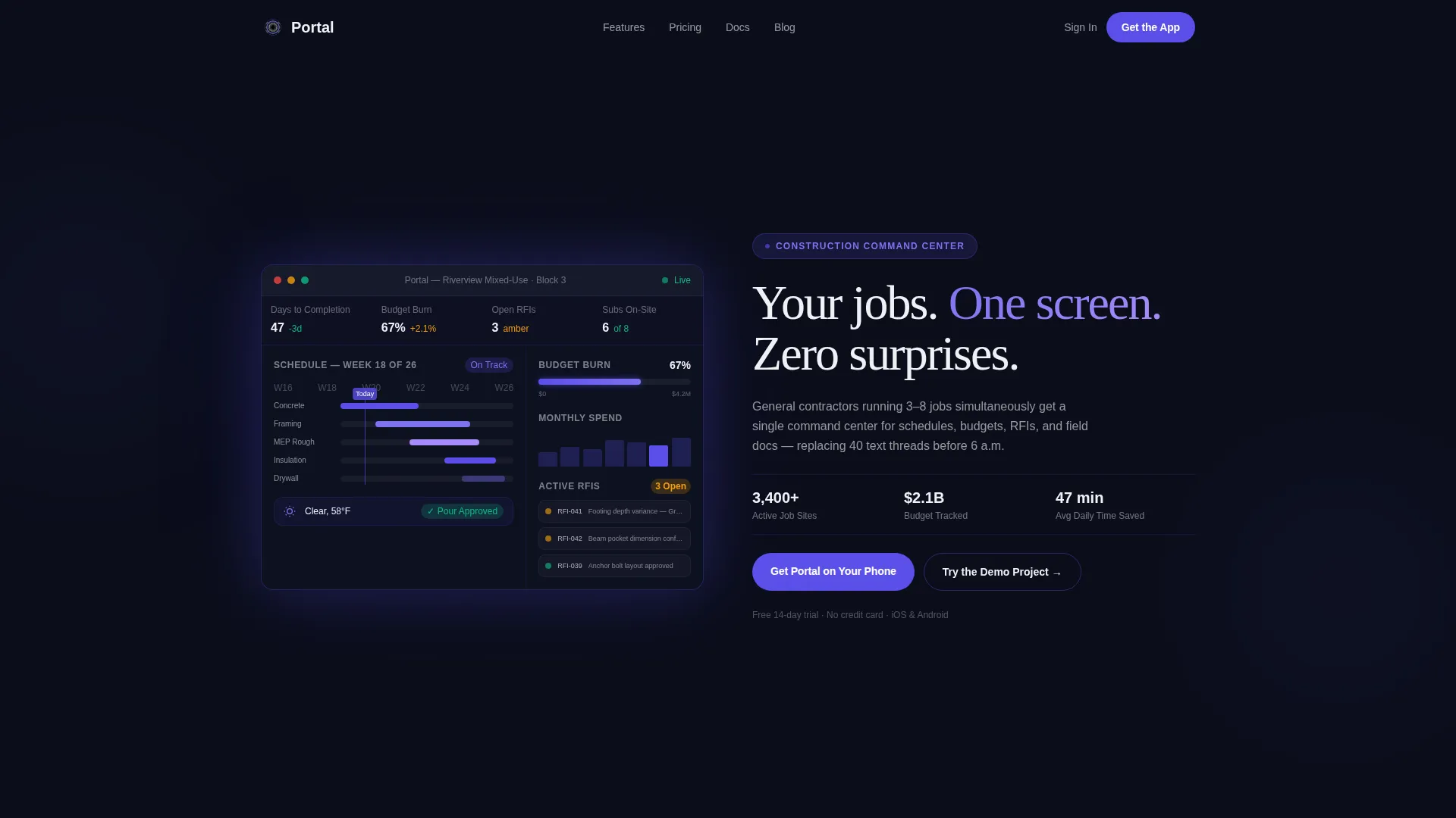
- A full-bleed dark header showcasing a live-feeling dashboard with a Gantt timeline, budget burn-down at 67%, three amber-flagged RFIs, and a weather widget
- A scrolling split-screen layout where a locked device mockup anchors the left panel while feature reveals cycle on the right at increasing tempo
- Dual call-to-action blocks including an app download section with paired store badges and a demo sandbox entry point requiring only an email address
Feature list
This template ships with a focused set of layout and interaction components drawn directly from the Portal brief.
Split-Screen Scroll Layout
The 50/50 layout locks a persistent device mockup on the left while the right panel cycles through three feature revelation sections. Scroll tempo increases deliberately, building momentum from a slow schedule sync view to rapid-fire documentation captures.
Animated Dashboard Hero Header
The full-bleed dark header displays a glowing dashboard interface at center frame. It shows a Gantt timeline, a budget burn-down chart at 67%, three active RFIs flagged amber, and a weather widget reading "Clear, 58°F, pour approved." An indigo ambient glow bleeds from behind the device frame.
Micro-Animation Interaction Layer
Progress bars fill on scroll, notification dots appear in sequence, and indigo pulses on hover states. These micro-animations make the static page feel like running software rather than a brochure screenshot.
Three-Phase Feature Reveal Sequence
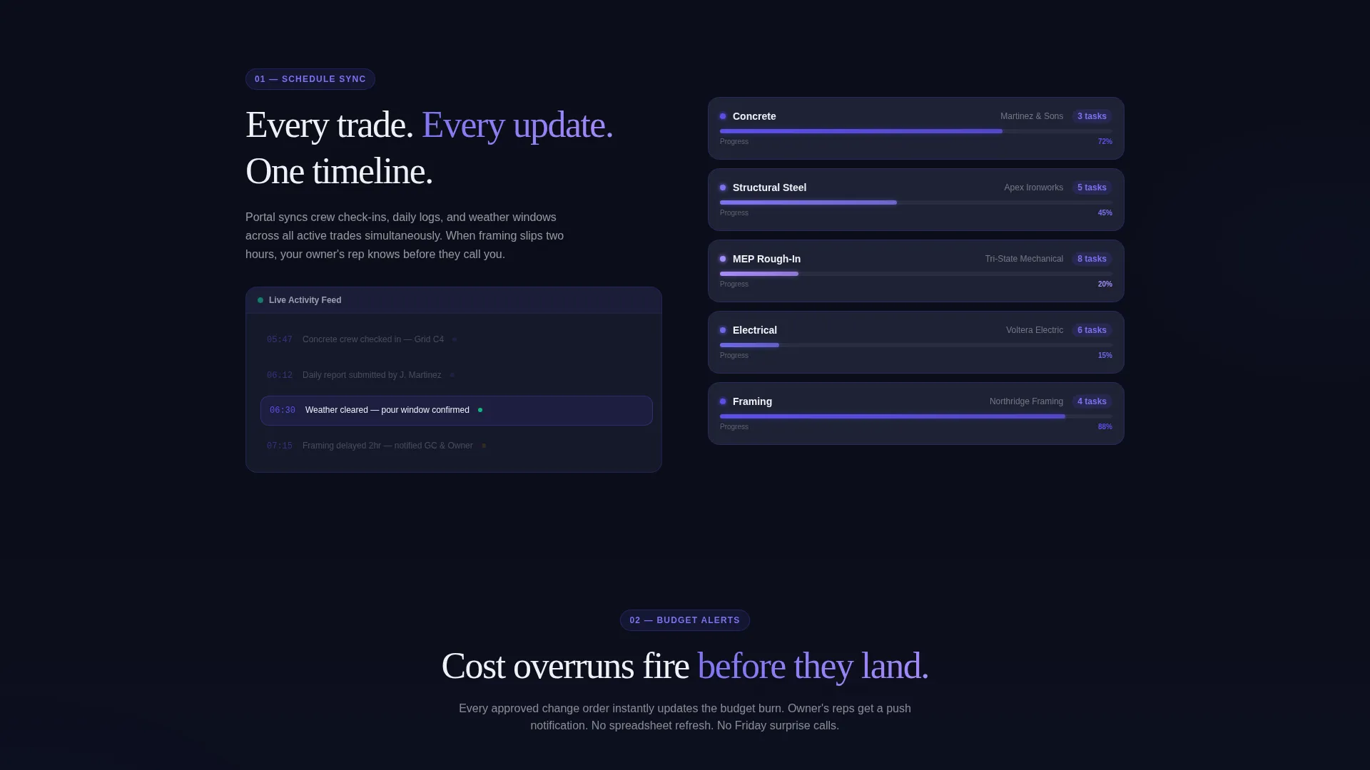
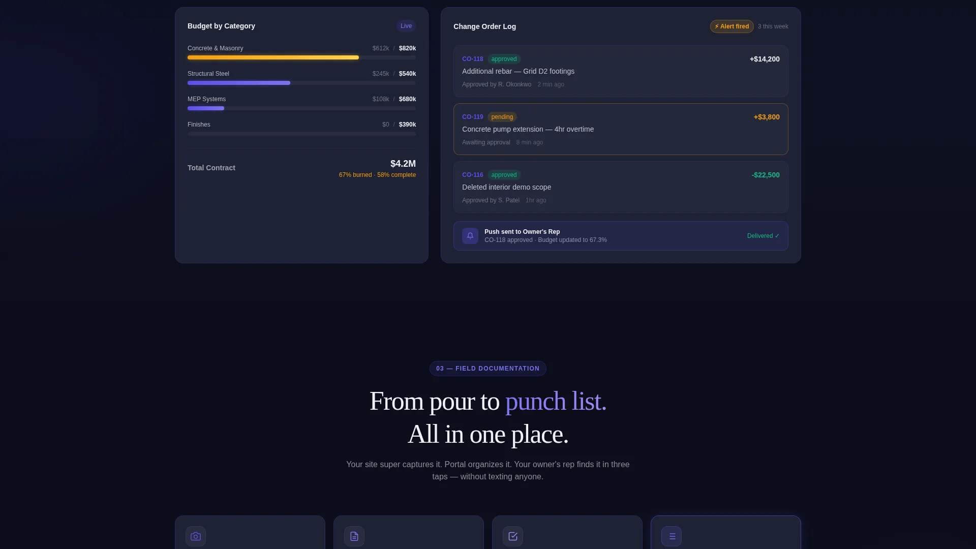
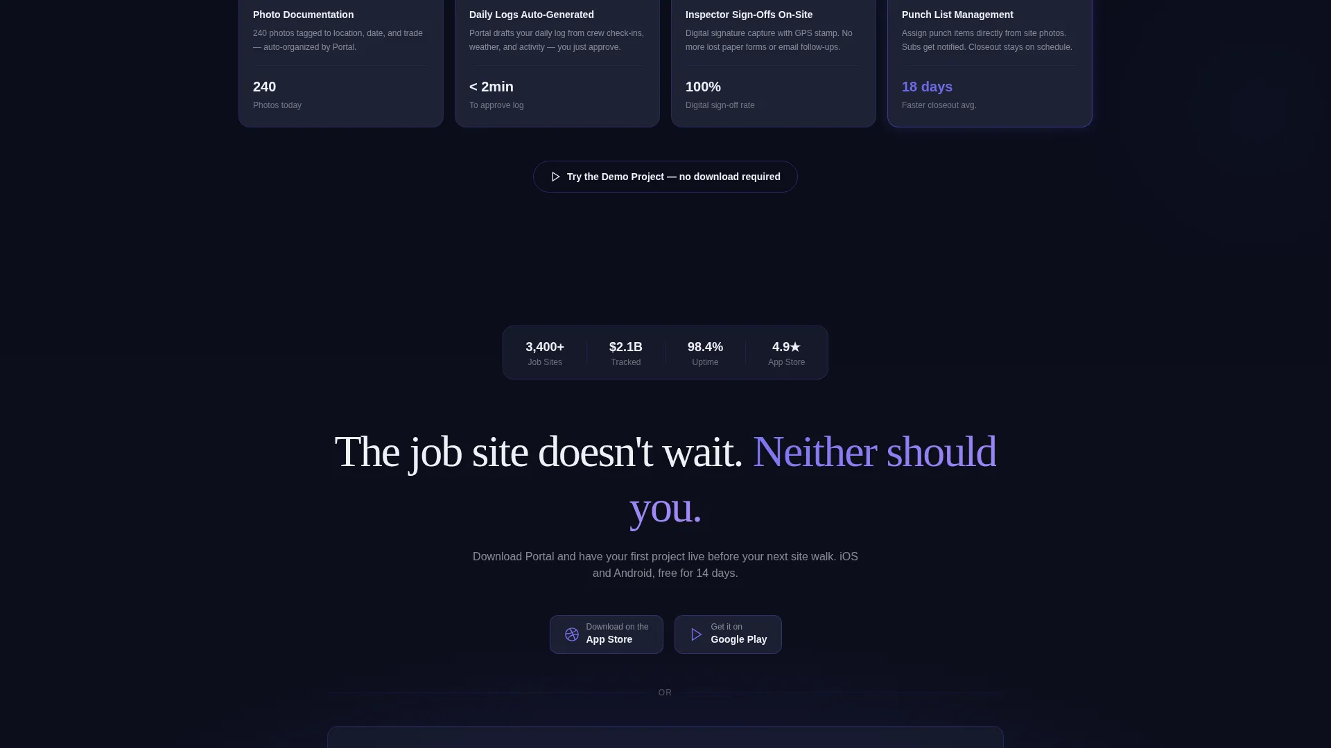
Section one introduces schedule syncing across trades at a slow, deliberate pace. Section two accelerates with real-time budget alerts firing as a change order is approved. Section three rapid-fires through photo documentation, auto-generating daily logs, and on-site inspector sign-offs.
App Download Call-to-Action Block
The primary call to action reads "Get Portal on Your Phone" with paired App Store and Google Play badges rendered in indigo against the dark background. A secondary call to action, "Try the Demo Project," opens an interactive sandbox gated by email entry.
Electric Indigo Design System
Indigo (#5B4FE9) activates on every interactive element: hover states, progress bars, notification badges, and the 1px card borders that lift slate panels above the void black background. The palette is purposeful and cockpit-coded.
Page sections overview
| Section | Purpose |
|---|---|
| Full-Bleed Header | Introduces the portal with a glowing live-data dashboard hero |
| Headline Fade-In | Delivers the core value statement above the dashboard user interface |
| Schedule Sync Reveal | Shows trade schedule syncing in the first slow feature panel |
| Budget Alert Reveal | Demonstrates real-time budget and change order alerts |
| Documentation Rapid-Fire | Highlights photo logs, daily reports, and sign-off capture |
| App Download Block | Drives app installs with store badges and a demo sandbox entry |
Design & branding system
The design language is built around a single idea: a cockpit at night, where every light is purposeful and nothing is decorative. The Electric Indigo color system creates high contrast between data and background.
- Core palette includes void black (#0B0E1A) for backgrounds, electric indigo (#5B4FE9) for interactive elements, cool slate (#1E2235) for card surfaces, and sharp white (#F0F1F6) for typography and key metrics
- Slate cards float above the dark background using subtle 1px indigo borders, giving each data module a sense of depth and separation
- Indigo pulses on hover states, progress indicators, and notification badges to reinforce the sense that the interface is live and responsive
Mobile & speed optimization
The split-screen layout is engineered to communicate the portal's mobile-first value clearly, since the product itself is a phone app. The visual hierarchy ensures key data reads instantly at any viewport size.
- The persistent device mockup on the left panel keeps the app context anchored as the right panel scrolls through feature reveals
- Call-to-action badges for the App Store and Google Play are designed as primary visual targets, sized and spaced for easy tap interaction on mobile screens
- Micro-animations are scoped to scroll-triggered events, keeping the page feeling responsive without overwhelming the viewer with competing motion
How this template helps you convert
Every design and copy decision in this template is aimed at reducing the distance between a first impression and a committed app download.
- The hero header shows real project data instead of stock photography, so visitors immediately recognize their own workflow inside the product.
- The three-phase feature reveal builds urgency with increasing scroll tempo, so by the time the visitor reaches the call-to-action block they feel familiar with the product.
- The "Try the Demo Project" sandbox lowers the commitment barrier by letting prospects interact with the dashboard before downloading the app.
Other information about this template
This template sits within the Technology category and the Construction Digital Presence subcategory, making it a strong fit for teams building a digital construction client portal product. It is designed as a single landing page, not a multi-page site.
- Template style is Split Screen (50/50), built under the Dashboard Pro theme with the Launch Energy creative direction
- The header concept is Dark Full-Bleed with Glow, meaning no stock photography is used anywhere on the page; real interface data is the visual hero
- The landing page direction is App Download, so both the layout structure and copy hierarchy are optimized toward driving installs and demo signups
- This template works well for SaaS founders, product studios, and construction technology companies launching a portal product to field teams
Theme
Dashboard Pro
Creative direction
Launch Energy
Color system
Electric Indigo
Style
Split Screen (50/50)
Direction
App Download
Page Sections
Split-screen Scroll Layout
Animated Dashboard Hero Header
Three-phase Feature Reveal Sequence
Micro-animation Interaction Layer
App Download Call-to-action Block
Related questions
Who is this landing page template designed for?
Does this template include real working app store links?
Can I customize the dashboard data shown in the hero header?
Is this a single page or a multi-page website?
What makes the demo sandbox call to action different from the main download button?



