Dental Customer Portal Landing Page Template
Portal is a split-screen dental landing page template built for practices ready to replace paper-based intake and manual insurance verification with a modern digital workflow. It uses a bold Void and Violet color system, a Feature Tab Switcher header, and an Industry Report narrative structure to show prospective buyers exactly where their current software falls short, and what a smarter patient portal looks like.
by Rocket studio
Quick summary
Portal is a single-page dental customer portal landing page template with a 50/50 split-screen layout. It targets dental service organizations (DSOs), solo practitioners, and office managers. The page uses hard data, side-by-side comparisons, and a three-tab interactive header to turn scroll behavior into conviction, moving visitors toward a diagnostic call to action before they reach the bottom.
Who this template is for
This template is designed for dental businesses that need to communicate a real operational upgrade to a skeptical, time-pressed audience. The layout speaks directly to people who already feel the pain of fragmented software stacks.
- Multi-location DSOs managing several offices on different practice management systems
- Solo practitioners still relying on paper charts and manual phone-based intake
- Office managers who lose productive morning hours on hold with insurance carriers
What problem this template solves
Many dental software landing pages look generic. They list features without context and ask visitors to trust claims they cannot verify. Portal solves this by making the comparison undeniable from the first scroll.
- Visitors arrive skeptical about switching software; the page earns trust with sourced data points before asking for anything
- Prospective buyers cannot see where their current workflow fails; the split-screen versus format makes the gap visible instantly
- Generic calls to action feel like pressure; the diagnostic-style call to action feels like a logical next step the visitor chooses themselves
What you get with this template
Portal delivers a fully structured landing page layout built around a single conversion goal. Every section, color choice, and interaction pattern serves that goal without unnecessary decoration.
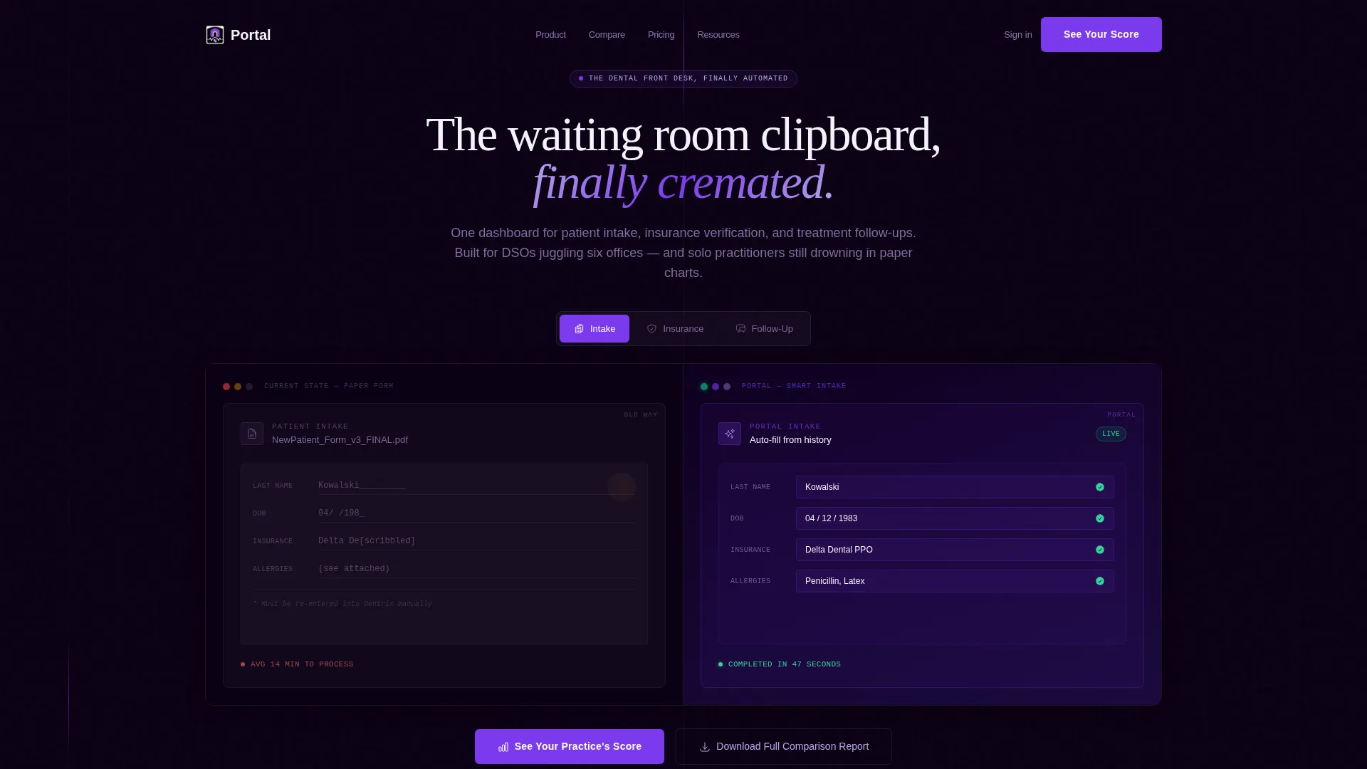
- A Feature Tab Switcher header with three tabs: Intake, Insurance, and Follow-Up, each splitting the viewport to show the old way versus the portal approach
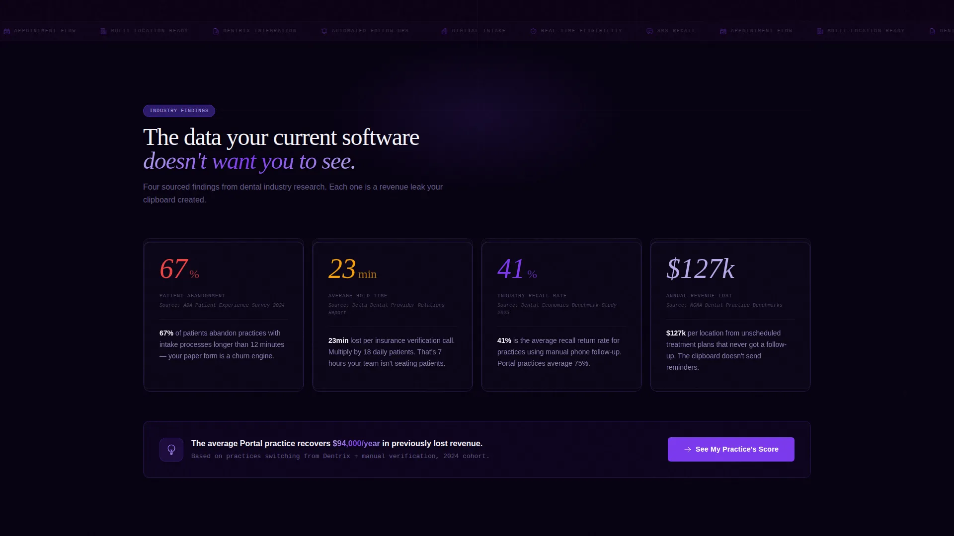
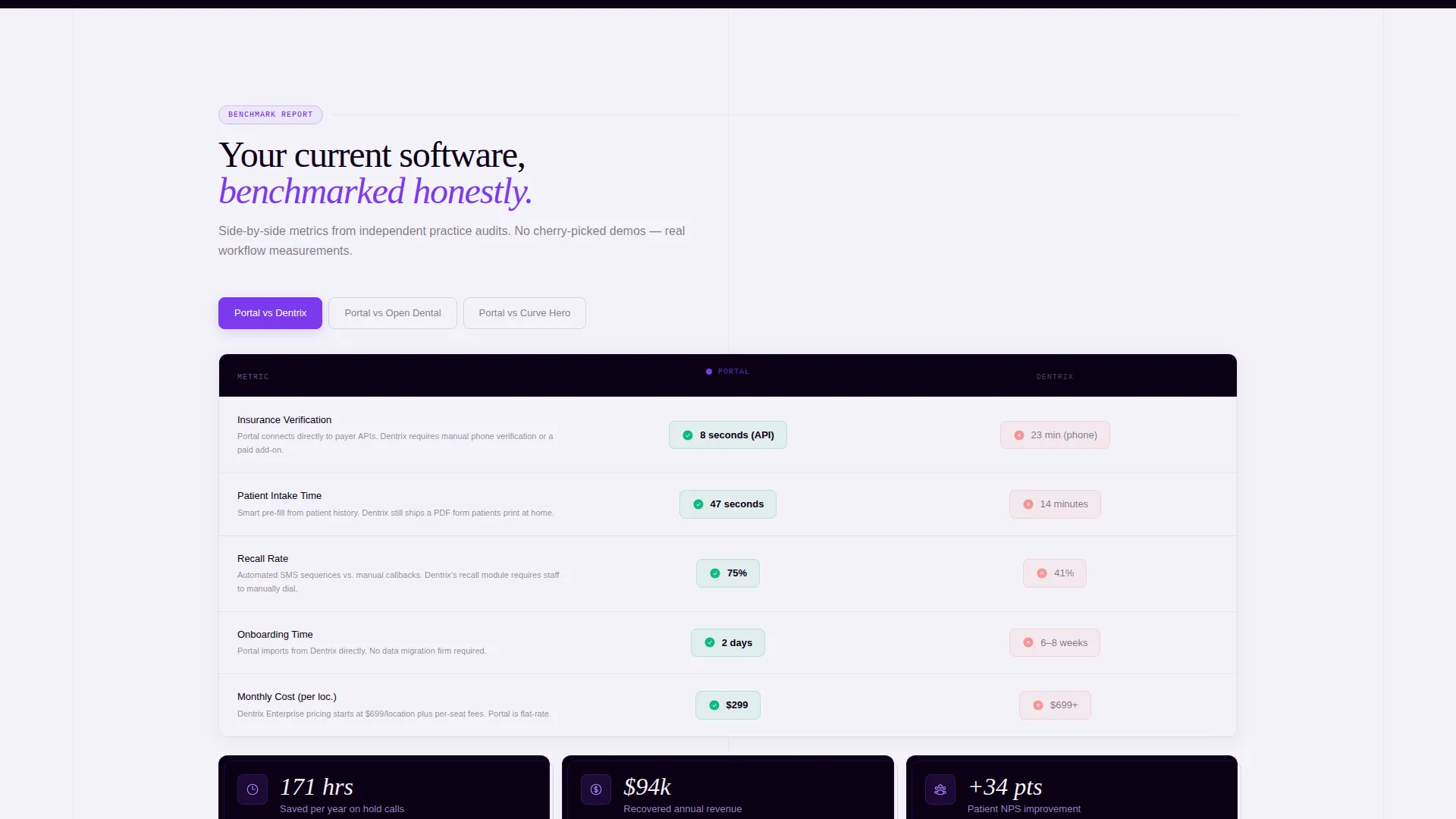
- An Industry Report scroll narrative with sourced statistics, benchmarked comparisons, and escalating urgency built into the section order
- A Comparison/Versus conversion path anchored by a three-field diagnostic call to action and a secondary gated report download
Feature list
This section covers the core structural and design capabilities built into the Portal template.
Split-Screen 50/50 Layout
The entire page is built on a 50/50 split-screen format. Left panels show outdated or competitor workflows; right panels show the portal's modern equivalent. The visual tension is immediate and meaningful on every scroll.
Feature Tab Switcher Header
Three clickable tabs labeled Intake, Insurance, and Follow-Up sit center-screen and control the split-screen viewport. The active tab pulses in electric violet. Each tab reveals a side-by-side contrast without a traditional hero image, the product demonstration begins in the first three seconds.
Industry Report Scroll Narrative
The page is structured like a research brief. Each section introduces a data point or benchmark finding, then shows the portal's answer beside a named competing approach. Urgency builds naturally as the visitor scrolls, making the switch feel rational rather than sold.
Diagnostic call to action Block
The primary call to action is a three-field diagnostic form asking for the visitor's current practice management software, number of locations, and monthly patient volume. This format feels like a useful tool rather than a standard lead form, reducing friction at the conversion moment.
Gated Secondary Download Path
A secondary conversion path offers a downloadable comparison report gated behind an email address and role title. This gives visitors who are not yet ready to commit a lower-stakes reason to engage while still entering the funnel.
Void and Violet Visual System
The color system uses abyssal black (#0B0014), deep ultraviolet (#2D1B69), clinical lilac (#B8A9E8), and sterile white (#F4F2F9). Electric violet (#7C3AED) is reserved for interactive elements and active states. Backgrounds alternate between void black and sterile white to reinforce the split-screen tension throughout.
Page sections overview
| Section | Purpose |
|---|---|
| Tab Switcher Header | Demonstrates Intake, Insurance, and Follow-Up contrasts side by side |
| Stat Drop Block | Opens with a sourced abandonment statistic to anchor urgency |
| Versus Comparison One | Benchmarks verification speed against a competitor workflow |
| Versus Comparison Two | Compares patient satisfaction scores to an alternative system |
| Versus Comparison Three | Measures onboarding time against another practice management approach |
| Diagnostic call to action Block | Collects practice details through a three-field self-assessment form |
| Gated Report Download | Offers the full comparison report behind email and role title |
Design & branding system
The Void and Violet palette gives Portal a distinctive look that stands apart from typical healthcare software pages. The design language feels clinical but modern, like a dental office after hours, with violet-lit monitors in a dark reception area.
- Colors: abyssal black (#0B0014), deep ultraviolet (#2D1B69), clinical lilac (#B8A9E8), sterile white (#F4F2F9), and electric violet (#7C3AED) for interactive hits
- Backgrounds alternate between void black and sterile white sections to sustain split-screen visual tension as the visitor scrolls
- Violet gradients mark section transitions and discovery moments, guiding the eye through the Industry Report narrative
Mobile & speed optimization
The split-screen format is built to restack gracefully on smaller viewports. The tab switcher and comparison panels are designed to remain usable on mobile screen widths without losing the before/after contrast that drives the page's core message.
- The 50/50 columns collapse to a single stacked column on mobile, preserving the left/right comparison as a top/bottom sequence
- The Feature Tab Switcher remains interactive on touch devices, with the active tab highlighted in electric violet for clear visual feedback
- Lightweight visual elements keep the page structure clean, relying on color contrast and layout rather than heavy image assets
How this template helps you convert
Portal is built around a Comparison/Versus conversion strategy. Every design and copy decision serves the goal of moving a skeptical dental professional from doubt to action.
- The Feature Tab Switcher puts a live product demonstration in the first viewport, so visitors understand the value before reading a single line of body copy
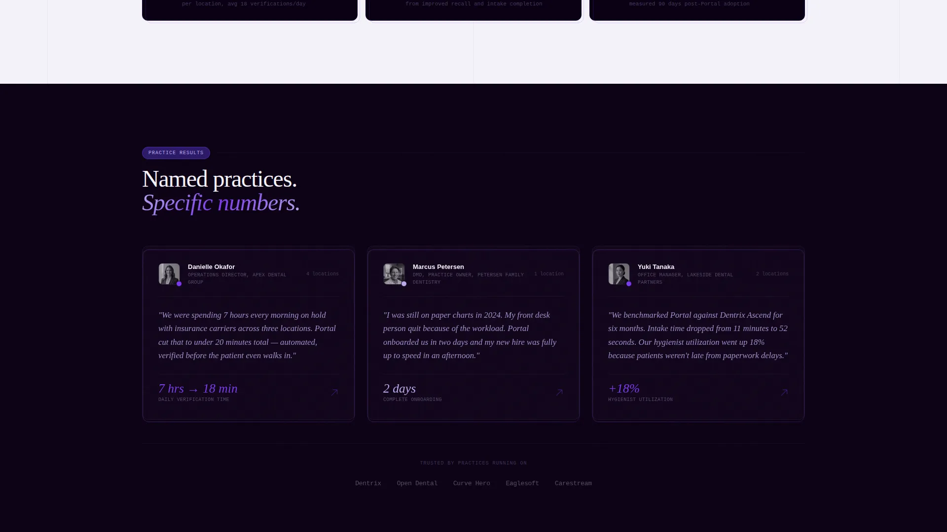
- The Industry Report structure uses sourced data and benchmarked comparisons to build conviction section by section, so the diagnostic call to action feels earned rather than rushed
- The dual call to action path captures both ready buyers through the diagnostic form and research-stage visitors through the gated report download, broadening the conversion funnel without diluting the primary goal
Other information about this template
Portal fits naturally into a dental software category where buyers are already comparing options before they arrive on your page. The template's Directory and Discovery theme supports that research mindset by organizing information the way a buyer thinks rather than the way a vendor wants to pitch.
- The template suits dental software products that compete on workflow efficiency, such as patient intake tools, insurance eligibility platforms, or treatment follow-up automation
- The Industry Report creative direction pairs well with positioning against established practice management systems, including products like Dentrix, Open Dental, and Curve Dental, where benchmark comparisons carry weight
- The Comparison/Versus landing page direction is a proven format in the dental software and SaaS category, where switching costs are high and buyers need clear, documented justification before acting
Theme
Directory & Discovery
Creative direction
Industry Report
Color system
Void & Violet
Style
Split Screen (50/50)
Direction
Comparison/Versus
Page Sections
Split-screen 50/50 Layout
Feature Tab Switcher Header
Industry Report Scroll Narrative
Three-field Diagnostic Call to Action
Gated Comparison Report Download
Void and Violet Color System
Related questions
Who is the Portal template designed for?
Do I need design experience to customize this template?
What makes the call to action approach different from a standard contact form?
How does the split-screen layout work on mobile devices?
Can this template support a single-location dental practice?



