Complete Dental Digital Presence Professional Website Template
Portal is a bento grid landing page template built for dental practices that need a serious digital front door. It showcases a centralized client portal with a bold brutalist design, teal-on-black visual identity, and a freemium trial conversion flow. The layout puts every core capability on screen at once, so practice managers and front-desk teams can see the value before signing up.
by Rocket studio
Quick summary
Portal is a single-page bento grid landing page template designed for dental client portal software. It leads with a dark full-bleed header, moves into a feature matrix grid, and closes with a low-friction free trial form. The visual identity is bold brutalist: operating-room black, surgical teal, and reactive white. Every section earns attention by solving a specific operational problem.
Who this template is for
This template is built for dental software teams and practice operators who need to present a powerful portal product with clarity and confidence. It speaks directly to the people running the daily chaos behind the chair.
- Multi-location practice managers juggling hygienist schedules across several offices
- Solo dentists replacing paper intake forms with a structured digital workflow
- Front-desk coordinators who currently switch between multiple tabs to complete a single task
What problem this template solves
Dental practices lose time and revenue when their tools are scattered. Staff toggle between disconnected systems for scheduling, intake, insurance, and messaging. This template gives portal software a landing page that names those pain points directly and shows a clear way out.
- No clear visual proof that the portal handles every workflow in one place
- Visitors leave without understanding the feature set because it is buried behind a sales call
- Generic healthcare landing pages fail to communicate the operational depth that practice managers need to see
What you get with this template
You get a fully structured bento grid landing page that puts the entire feature matrix in front of the visitor before asking for anything. The layout is built for trust, speed of comprehension, and a frictionless path to a free trial.
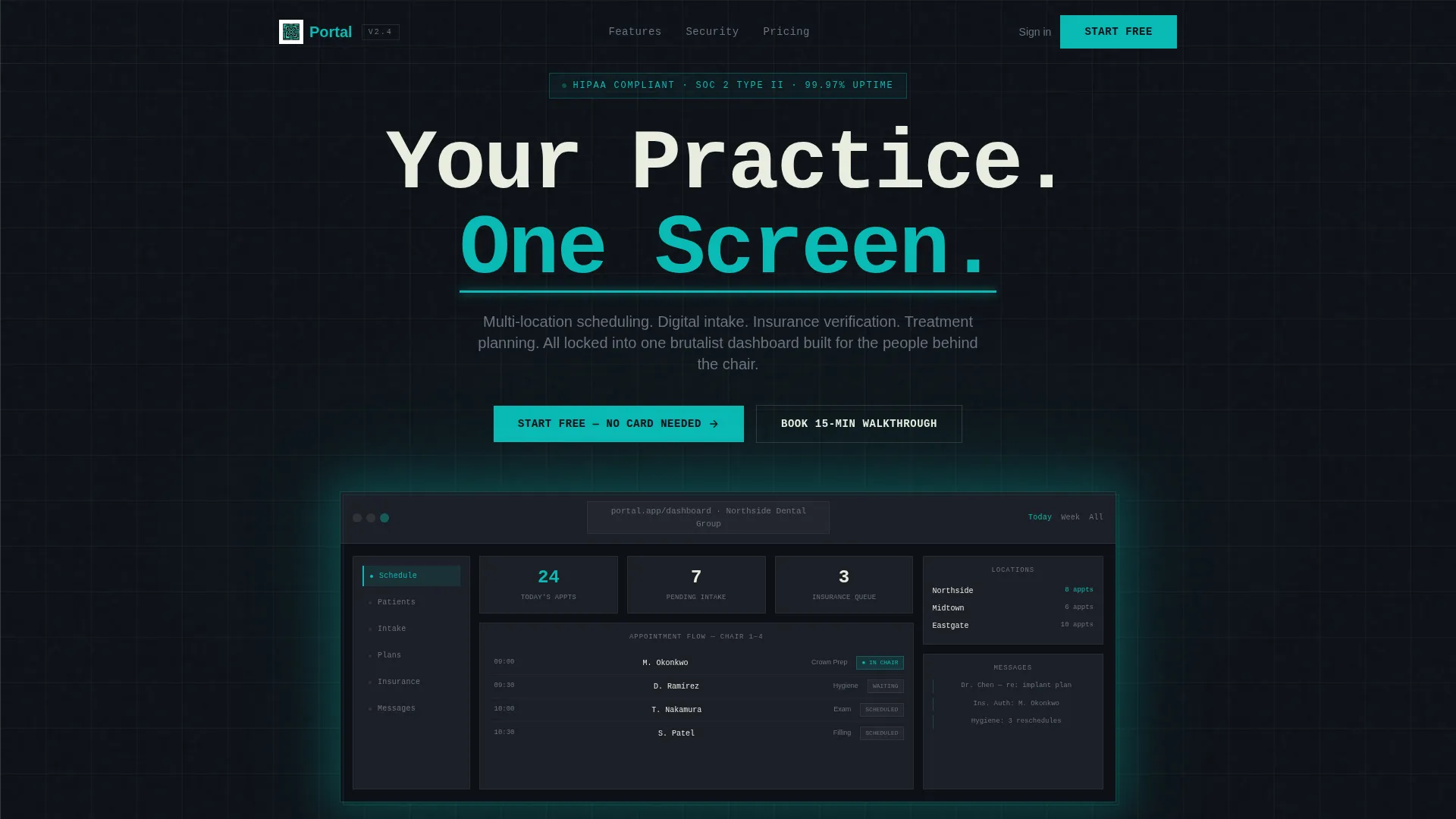
- A dark full-bleed header with a floating isometric dashboard screenshot and a pulsing teal glow effect
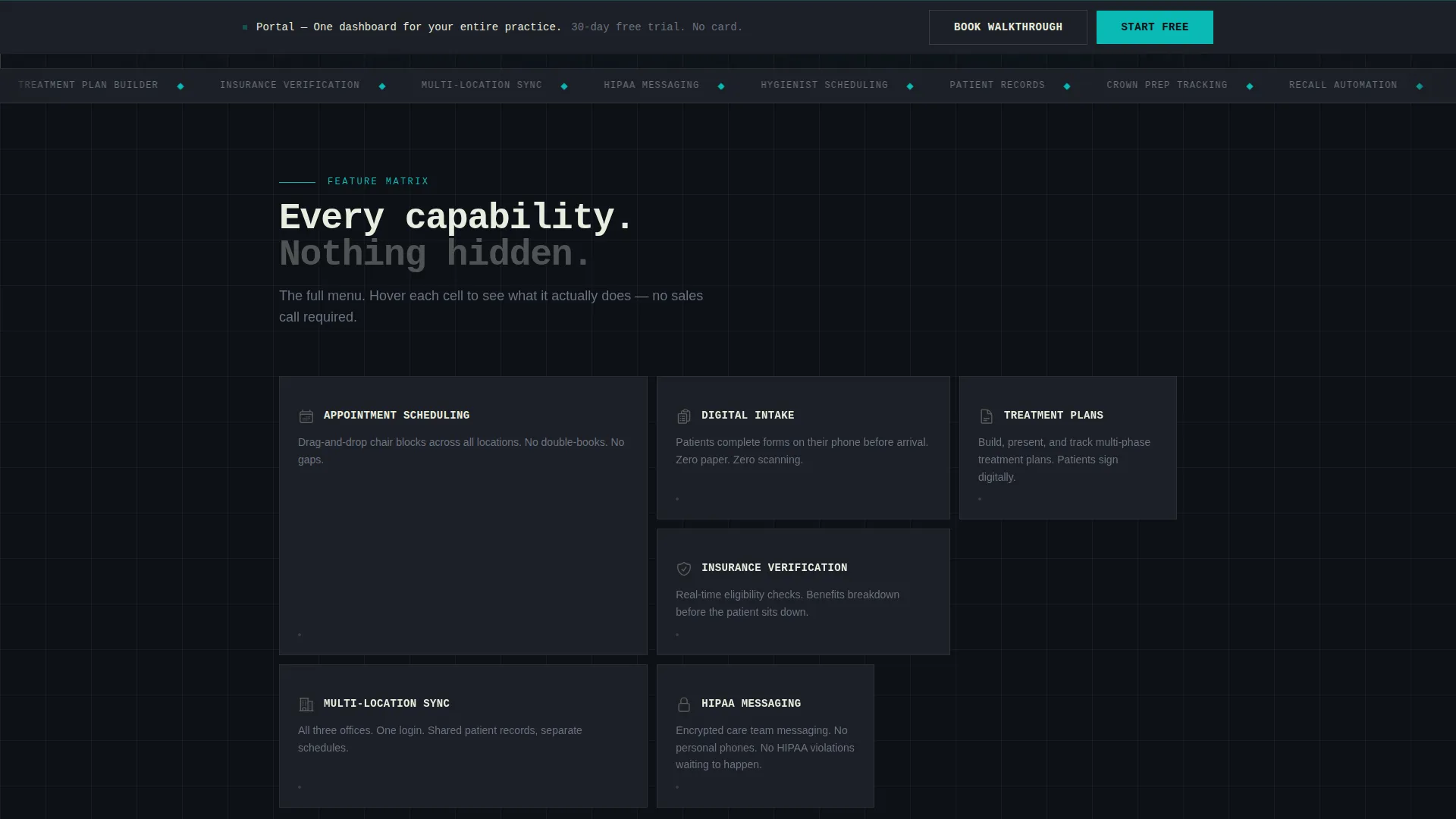
- A scrolling bento grid of capability cards covering appointment scheduling, patient intake, treatment planning, insurance verification, multi-location sync, and compliant messaging
- A sticky bottom bar call to action and a secondary "Book a 15-Min Walkthrough" path for high-consideration buyers
Feature list
This template is built around one principle: show the full capability set before asking for commitment. Every component below serves that goal.
Dark Full-Bleed Header with Glow Effect
The header opens on pure operating-room black with a single isometric screenshot of the portal dashboard floating center-frame. Teal light bleeds from the screen edges at reduced opacity, creating a subtle pulse effect that signals activity without distracting from the headline.
Bento Grid Feature Matrix
Each grid cell is a thick-bordered brutalist card containing a teal icon, a two-word label, and one sentence describing the capability. On hover, the card expands to reveal a micro-screenshot. The grid is a scannable menu of operational capabilities, not decoration.
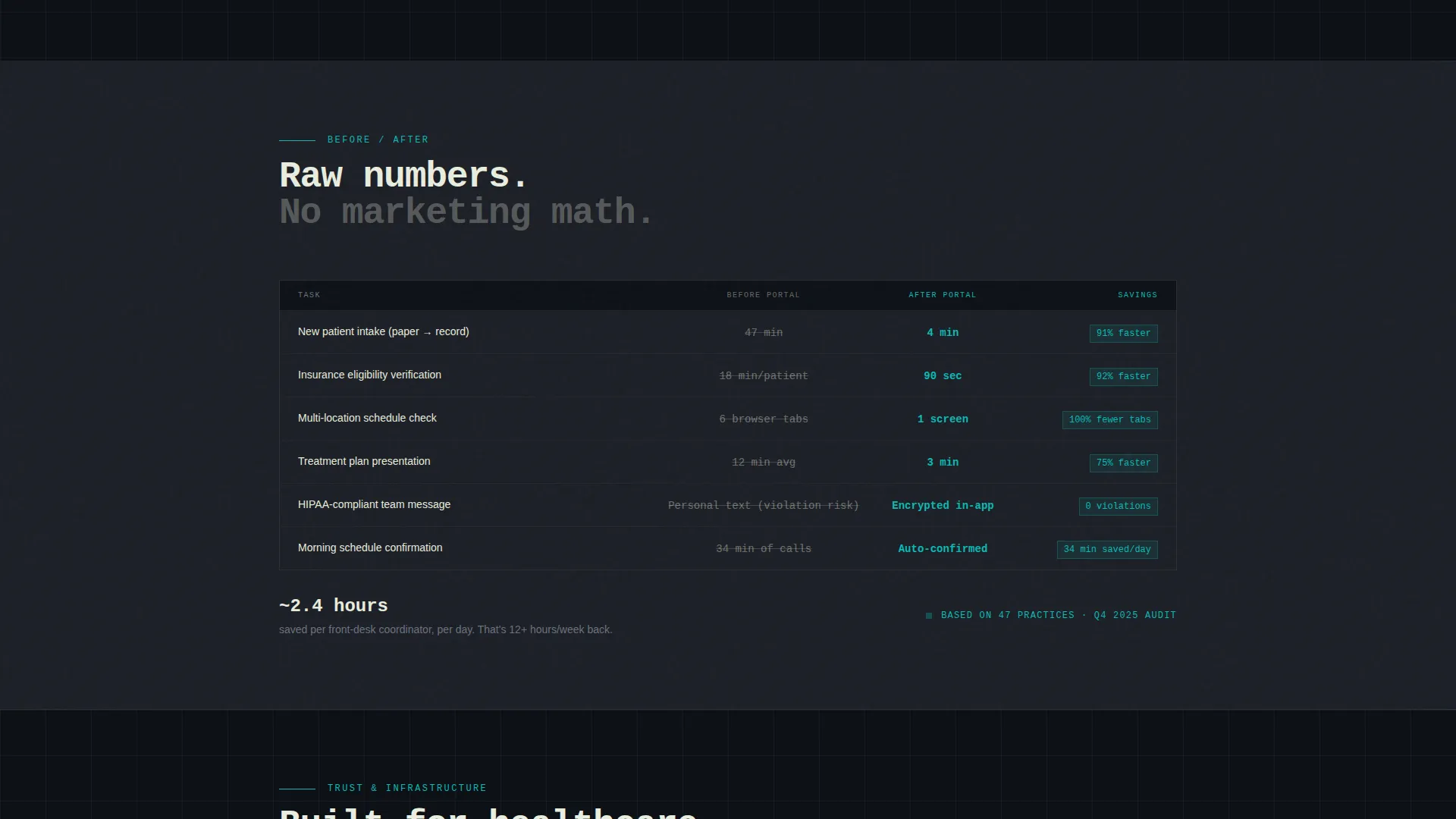
Before and After Comparison Row
As visitors scroll deeper, the grid transitions into proof. A comparison row shows "Before Portal / After Portal" time savings in raw numbers, giving practice managers concrete evidence of operational impact.
Three-Field Free Trial Form
The conversion form asks only for practice name, number of locations, and work email. Nothing else. The minimal field count removes friction and matches the freemium trial model the template is built around.
Sticky Bottom Bar call to action
After the visitor scrolls past the second grid row, a sticky bottom bar activates with the primary call to action. The bar stays present through the rest of the page, keeping the conversion path visible at all times.
Secondary Walkthrough Booking Path
Below the main grid, a secondary call to action invites practice managers to book a fifteen-minute walkthrough. This path serves high-consideration buyers who need to see multi-location sync in action before committing to a free trial.
Page sections overview
| Section | Purpose |
|---|---|
| Full-Bleed Header | Establish product identity with dashboard visual and headline |
| Hero call to action Block | Deliver primary free trial prompt above the fold |
| Bento Feature Grid | Display all core capabilities as scannable brutalist cards |
| Card Hover Reveals | Show micro-screenshots on hover to validate each feature claim |
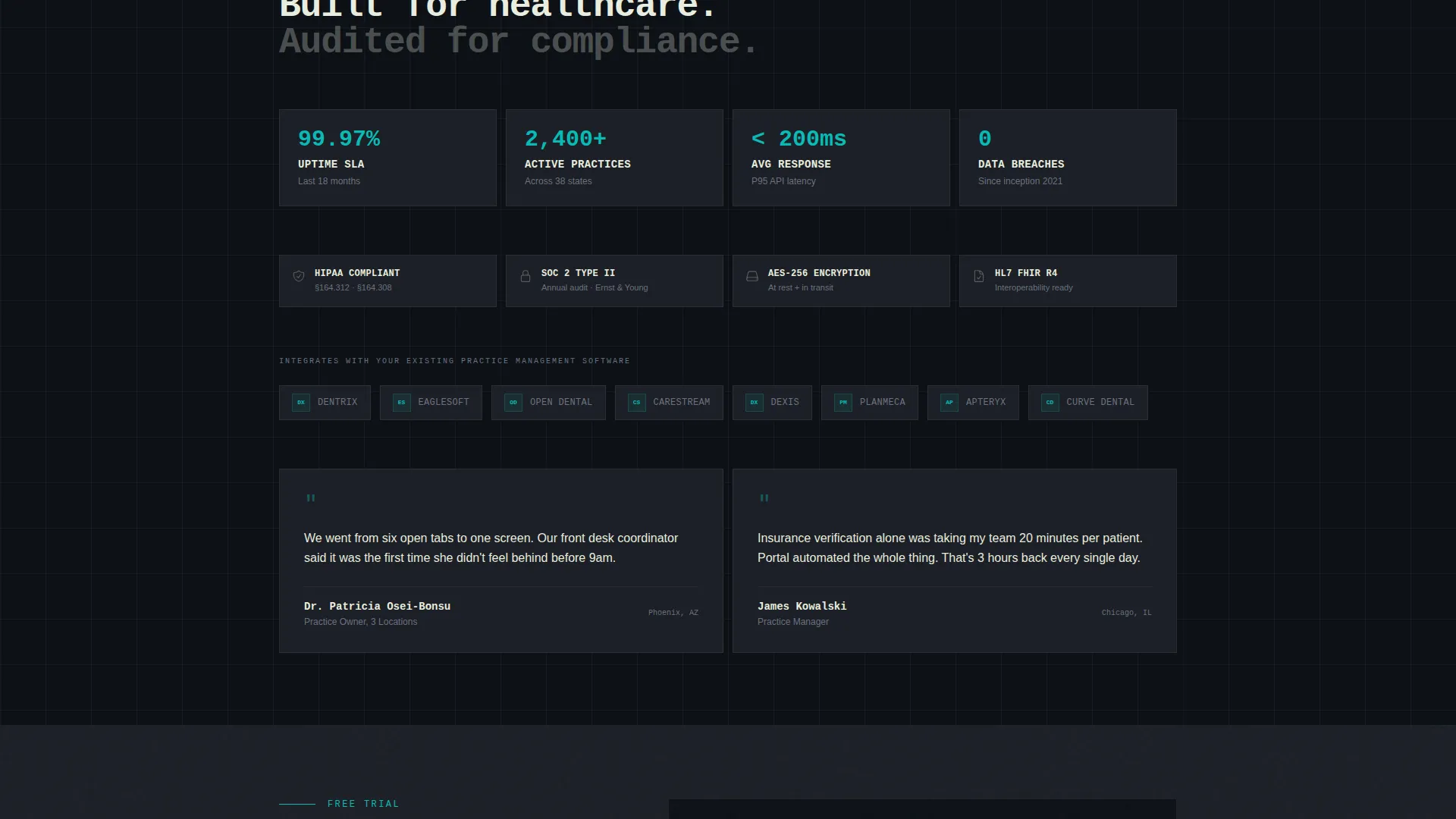
| Proof and Stats Row | Present integration logos, uptime figures, and comparison data |
| Before and After Row | Show time savings in raw numbers for immediate credibility |
| Free Trial Form | Capture practice name, location count, and work email |
| Walkthrough Booking | Offer a secondary path for practice managers needing a demo |
| Sticky Bottom Bar | Keep the primary call to action visible after second grid row scroll |
Design & branding system
The visual identity is Bold Brutalist, built on a Teal Catalyst color system. Every color choice is functional. Teal appears only where action is required, not as decoration.
- Color palette: deep operating-room black (#0D1117) for backgrounds, surgical teal (#0ABAB5) for hover states and active elements, concrete slab gray (#1C1F26) for card surfaces, and reactive white (#E8EDDF) for body typography
- Typography uses oversized mono weight for headlines, giving the page an industrial precision that matches the portal's operational focus
- No curves, no gradients, and no softness in the layout; borders are thick, grid lines are hard, and every element locks into its position with zero decorative slack
Mobile & speed optimization
The bento grid layout is structured to translate cleanly across screen sizes. The brutalist design system, with its hard grid and minimal decoration, naturally supports compact mobile rendering without visual degradation.
- Card-based grid structure reflows from multi-column desktop layout to single-column stacked view on smaller screens
- The sticky bottom bar is designed to remain functional on mobile, keeping the free trial call to action accessible throughout the scroll
- Minimal use of gradients and heavy imagery outside the hero screenshot keeps the visual load practical across devices
How this template helps you convert
Every structural decision in this template is aimed at reducing hesitation and building confidence before the form appears.
- The feature matrix is fully visible before any sign-up prompt, so visitors mentally evaluate the product on their own terms. By the time they reach the form, the decision is already made.
- The three-field form and "no card needed" framing remove the two most common objections to starting a free trial: time investment and financial risk.
- The secondary walkthrough booking path captures practice managers who need one more layer of proof, ensuring the page converts high-consideration buyers instead of losing them.
Other information about this template
This template is categorized under the Technology sector with a focus on dental digital presence. It is purpose-built for the dental client portal niche, where operational clarity and professional credibility are the two most important conversion signals.
- The template style is Bento Grid, a layout format that presents discrete capabilities side by side without requiring the visitor to scroll through narrative copy to understand the product
- The landing page direction follows a Freemium and Trial model, making it well-suited for dental software products that offer a no-cost entry point
- The header concept is Dark Full-Bleed with Glow, a choice that positions the product as modern clinical software rather than a generic healthcare website
- The creative direction is Feature Matrix, which prioritizes showing the full capability set visually before any conversion ask
Theme
Bold Brutalist
Creative direction
Feature Matrix
Color system
Teal Catalyst
Style
Bento Grid
Direction
Freemium/Trial
Page Sections
Dark Full-bleed Header with Glow
Bento Grid Feature Matrix
Before and After Comparison Row
Three-field Free Trial Form
Sticky Bottom Bar Call to Action
Secondary Walkthrough Booking Path
Related questions
Who is this landing page template designed for?
Can I customize the bento grid cards for different features?
What does the free trial form collect?
Does this template support a demo booking flow alongside the free trial?
Is this template suitable for a single dental office or only multi-location practices?



