Complete E-Commerce Digital Presence Professional Website Template
Portal is a scroll-reveal e-commerce client portal landing page built for merchants who need one screen to manage orders, returns, disputes, and customer conversations. The template features a tab-switching header, progressive feature matrix, and a conversion-green app download call to action, all wrapped in a sharp Electric Indigo visual system.
by Rocket studio
Quick summary
Portal is a single-page, scroll-reveal landing page template designed for e-commerce operators who want one unified dashboard view. It presents order management, returns, chargebacks, and customer conversations through an animated feature matrix and a tab-switching device mockup. The Electric Indigo color system gives it a digital-native, high-contrast visual identity that feels built for serious operators.
Who this template is for
This template is built for e-commerce merchants and agency teams who currently manage store operations across too many tabs and tools. It speaks directly to operators who want a cleaner, faster way to present their client portal product to potential users.
- Shopify store owners managing fulfillment at volume, typically between $30,000 and $500,000 per month
- Direct-to-consumer brand operators juggling multiple third-party logistics providers and warehouse workflows
- Agency account managers who need a single login to monitor several client stores before daily standups
What problem this template solves
Managing an e-commerce operation today usually means switching between separate tools for orders, returns, disputes, and customer messages. That fragmented experience slows response times and increases the chance of things falling through the cracks. This template gives portal products a compelling visual argument for consolidation.
- Merchants lose time alt-tabbing between order, return, and customer tabs across disconnected platforms
- No single view exists today that shows the full picture of store health at a glance
- Portal products often fail to communicate their value clearly, so potential users hesitate to sign up
What you get with this template
You get a fully structured, scroll-reveal landing page that demonstrates your client portal product with confidence. Every section is purpose-built to move a skeptical operator from curiosity to action, without requiring a signup just to see what the product does.
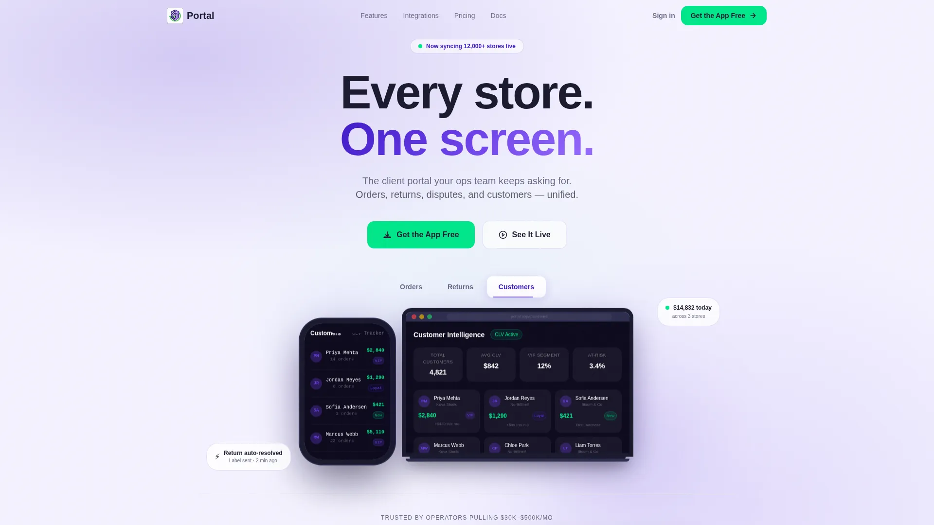
- A Feature Tab Switcher header with auto-cycling device mockups showing Orders, Returns, and Customers states
- A progressive Feature Matrix with before-and-after comparison columns that animate in as the visitor scrolls
- A floating app download call-to-action bar and an interactive demo modal requiring no signup
Feature list
This template is built around a specific set of components described below. Each one contributes directly to the landing page's ability to communicate value and drive app downloads.
Feature Tab Switcher Header
Three clickable tabs labeled "Orders," "Returns," and "Customers" sit centered above a phone and laptop device mockup. Clicking any tab swaps the screen content inside both frames simultaneously. When left idle, the tabs auto-cycle every four seconds with a thin indigo progress bar beneath each label.
Scroll-Reveal Feature Matrix
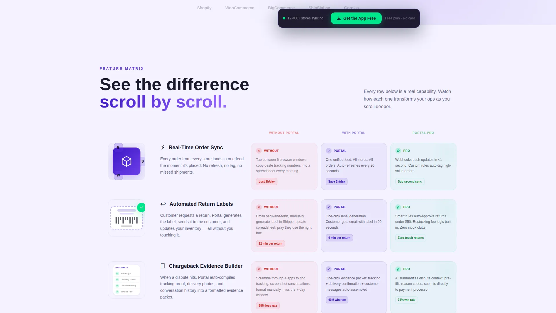
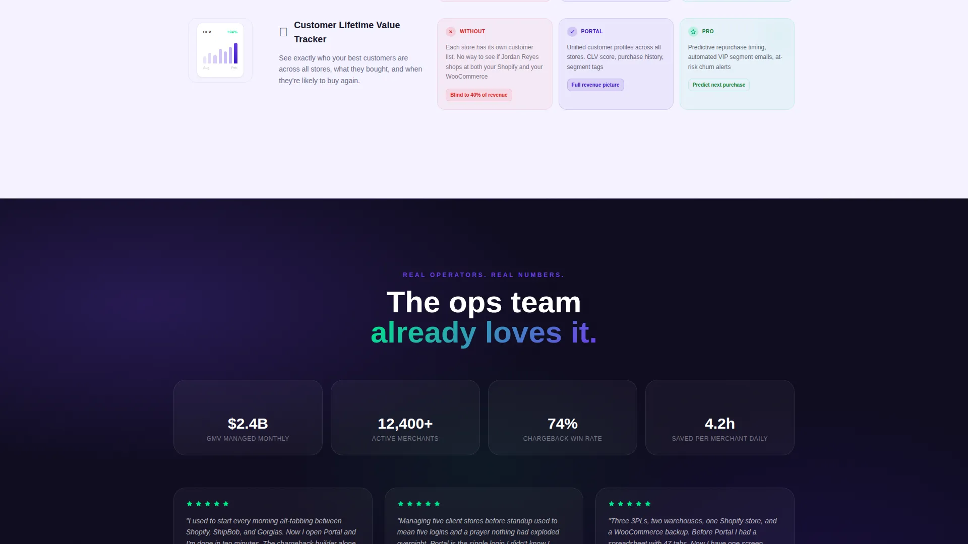
Each scroll checkpoint reveals a new capability row that slides in from the right. Rows cover real-time order sync, automated return labels, chargeback evidence building, and a customer lifetime value tracker. The rhythm accelerates as the visitor scrolls deeper, creating a sense of mounting product capability.
Before-and-After Comparison Columns
Every feature row contains three progressive columns: Without Portal, With Portal, and With Portal Pro. The columns fill in as the row enters the viewport, turning abstract feature names into visible, side-by-side contrasts. This format is especially effective for operators who are skeptical of feature claims.
Floating App Download Bar
After the second scroll checkpoint, a sticky bottom bar appears with the primary "Get the App Free" call to action rendered in conversion-green. Tapping it opens a two-field form asking for store platform and email address. The form then triggers a smart download link for iOS or Android.
Interactive Demo Modal
A secondary call to action labeled "See It Live" opens a clickable demo modal with no signup required. Skeptical visitors can explore the real interface before committing. This removes friction for merchants who have been disappointed by tools that look nothing like their screenshots.
Mini-Illustration Feature Rows
Each row in the feature matrix includes a mini-illustration alongside its comparison columns. The illustrations reinforce the message visually without requiring dense copy. They give each feature a distinct, scannable identity as the visitor scrolls through the page.
Page sections overview
| Section | Purpose |
|---|---|
| Tab Switcher Header | Introduce the portal with auto-cycling device mockups |
| Primary call to action Block | Drive immediate app downloads below the header tabs |
| Feature Matrix | Reveal capabilities row by row as the visitor scrolls |
| Comparison Columns | Show before-and-after value contrast for each feature |
| Floating Download Bar | Persist the primary call to action after the second scroll checkpoint |
| Demo Modal Trigger | Offer a no-signup interactive preview of the real interface |
Design & branding system
The visual identity follows a Directory and Discovery theme built on the Electric Indigo color system. The palette reads like a neon sign reflected off a rain-wet screen at midnight: digital-native, high-signal, and focused entirely on clarity and action.
- Core colors include deep app-shell indigo (#3D17C6), active-state violet (#6C3FE8), a blue-undertone surface white (#F4F2FF), and conversion-green (#00E68A) reserved for calls to action and success states
- Backgrounds alternate between the near-white surface and deep indigo to create strong section contrast, with charcoal text (#1A1A2E) on light sections and pure white on dark sections
- Violet is used specifically for navigation states, toggle selections, and hover rings, keeping interactive elements visually distinct at a glance
Mobile & speed optimization
The template is designed around a mobile-first experience, which makes sense given that its primary audience manages store operations from their phones between supplier calls. The scroll-reveal animations and floating bar are structured to work cleanly on small screens.
- The Feature Tab Switcher displays a phone mockup alongside a laptop frame, keeping the mobile use case front and center throughout the header
- The floating bottom bar with the "Get the App Free" call to action is positioned for easy thumb access on mobile screens
- The two-field app download form (store platform dropdown and email address) is kept deliberately short to reduce friction on any device size
How this template helps you convert
This template is built around a deliberate conversion path. Every design decision, from the auto-cycling header to the floating download bar, is aimed at reducing hesitation and moving the visitor toward a single action: downloading the app.
- The auto-cycling tab demo and side-by-side comparison columns build trust progressively, so the visitor arrives at the call to action already convinced rather than curious
- The no-signup demo modal removes the single biggest objection for operators who have been burned before, letting them interact with the real interface before entering their email
- The floating download bar with conversion-green styling keeps the primary action visible and accessible throughout the entire scroll journey without interrupting the reading experience
Other information about this template
This template is part of a broader set of scroll-reveal landing page templates built for technology and e-commerce digital presence use cases. It is designed to be edited and launched quickly, with a structure that mirrors how modern app marketing pages communicate value.
- The template style is Scroll Reveal (Progressive), meaning each section enters the viewport with a directional slide animation rather than loading all at once
- The header concept is a Feature Tab Switcher, a pattern commonly used by developer tools, productivity apps, and client portal products to show multiple product states without requiring separate pages
- The landing page direction is App Download, making it well-suited for any e-commerce portal product that delivers its core value through a native mobile or cross-platform application
- The creative direction is a Feature Matrix, which works especially well when the product has multiple distinct capabilities that benefit from side-by-side before-and-after framing
Theme
Directory & Discovery
Creative direction
Feature Matrix
Color system
Electric Indigo
Style
Scroll Reveal (Progressive)
Direction
App Download
Page Sections
Feature Tab Switcher with Auto-cycling Device Mockups
Scroll-reveal Progressive Feature Matrix
Before-and-after Comparison Columns
Floating App Download Call-to-action Bar
No-signup Interactive Demo Modal
Mini-illustration Feature Rows
Related questions
Who is this landing page template designed for?
Can I edit the tab labels and device mockup content?
Does the demo modal require a backend or third-party service?
What platforms does the app download form support by default?
Is this template suitable for a SaaS product outside of e-commerce?



