Portal - Powerful Energy Management Landing Page Template
Portal is a bold brutalist landing page template built for energy customer portals. It uses a Problem→Solution Arc with comparison tables, a persistent demo call to action, and a product screenshot header to convert facilities managers, procurement officers, and property management firms who need one place to track consumption, dispute bills, and manage multiple utility accounts.
by Rocket studio
Quick summary
Portal is a single-page, lead-generation landing page template for energy management software. It opens with a raw product screenshot, walks visitors through a blunt problem inventory, then breaks into comparison tables that make the old workflow look exhausting. Every design choice, from the gunmetal palette to the locked yellow call to action bar, is built to move serious buyers toward booking a demo.
Who this template is for
This template is built for energy software companies and SaaS platforms that sell to high-volume, multi-site energy buyers. If your product helps organizations tame complex utility portfolios, this page speaks their language immediately.
- Facilities managers overseeing utility accounts across hospital networks or large campuses
- Procurement officers at manufacturing plants who reconcile six-figure monthly energy bills
- Property management firms that currently log into multiple supplier portals to get basic data
What problem this template solves
Energy portal buyers are skeptical. They have seen clunky dashboards, bloated onboarding decks, and vendor promises that do not survive contact with a real utility bill. This template skips the warm-up and gets straight to the comparison.
- Scattered logins across multiple supplier portals waste time and create errors
- Unverified bills and missing consumption data make cost control nearly impossible
- No single view of multi-site usage means reporting stays manual and slow
What you get with this template
You get a structured, single-page layout that follows a clear Problem→Solution Arc from the first scroll to the final call to action. The template is purpose-built for lead generation and comparison-driven selling.
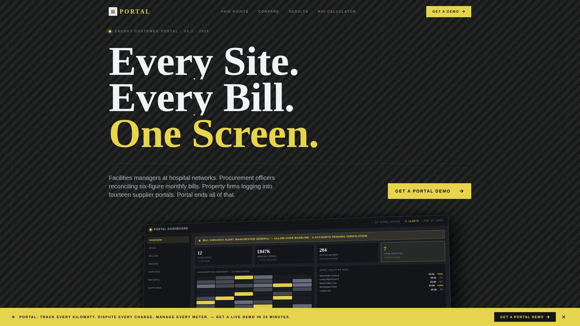
- A full-width product screenshot header showing a real multi-site energy dashboard on an isometric tilt
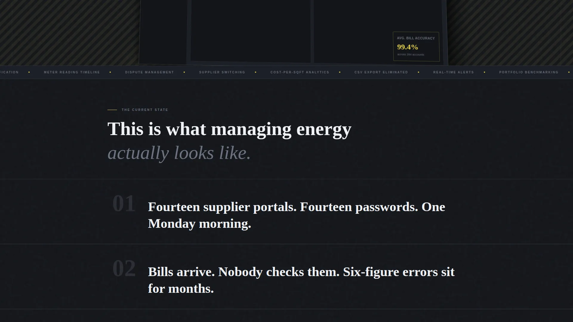
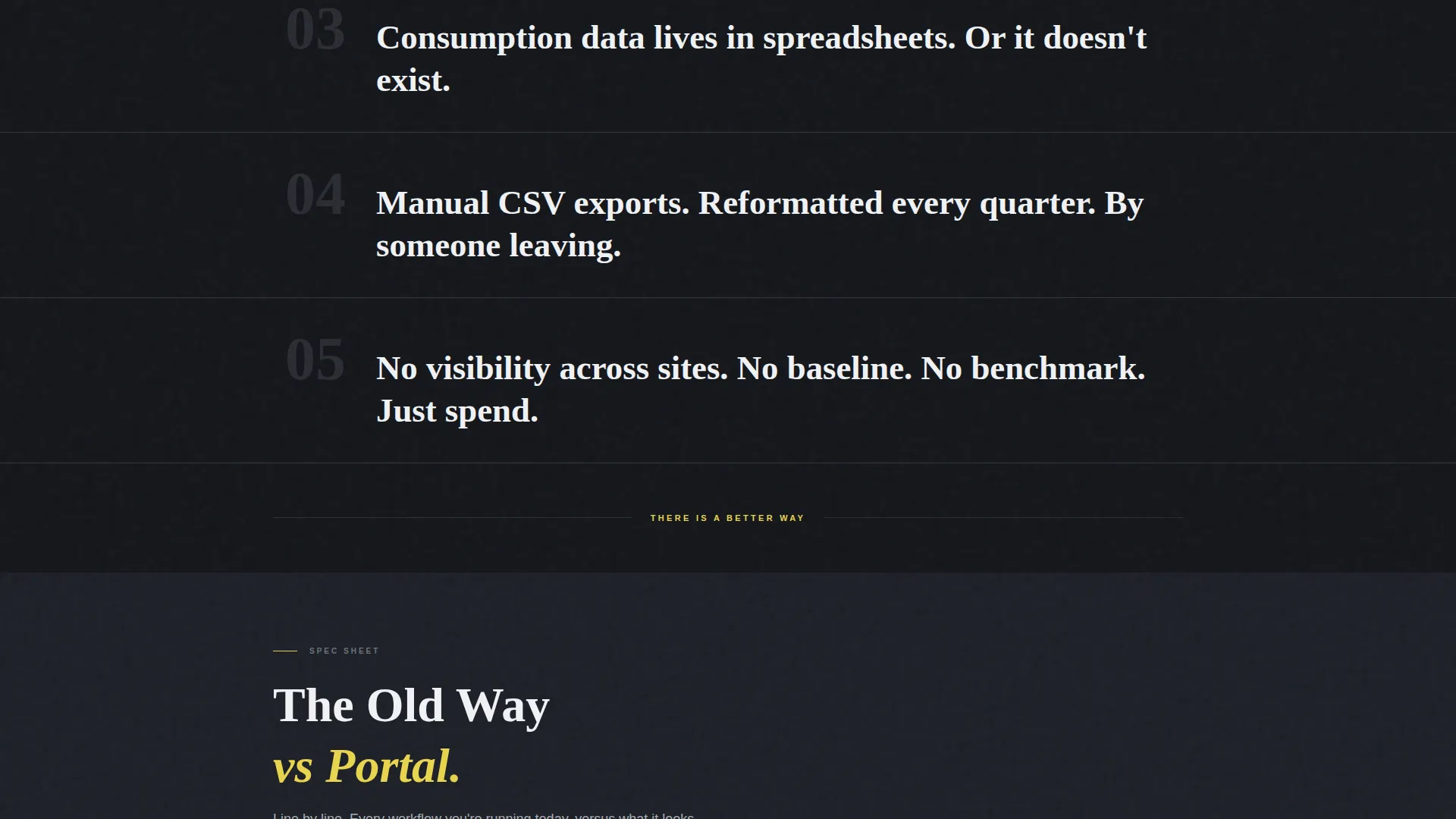
- Full-width problem statement bands that stack like concrete slabs before breaking into comparison tables
- A persistent sticky call to action bar locked to the bottom of the viewport after the first scroll, plus a secondary gated PDF download path
Feature list
This template is built around a tight set of purposeful components. Each one earns its place on the page.
Isometric Product Screenshot Header
The header drops a pixel-sharp dashboard screenshot directly into the viewport. It shows a consumption heatmap across twelve buildings, a bill variance alert flagged in yellow, a meter reading timeline, and a cost-per-square-foot comparison column. The screenshot sits on a slight isometric tilt against the gunmetal background with a hard drop shadow.
Problem Inventory Band Layout
Before the comparison tables appear, the page opens with a blunt inventory of pain points. Each problem occupies its own full-width band as a single heavy-set line of text. The bands stack visually like concrete slabs, creating immediate recognition for facilities managers and procurement teams.
Old-Way versus Portal Comparison Tables
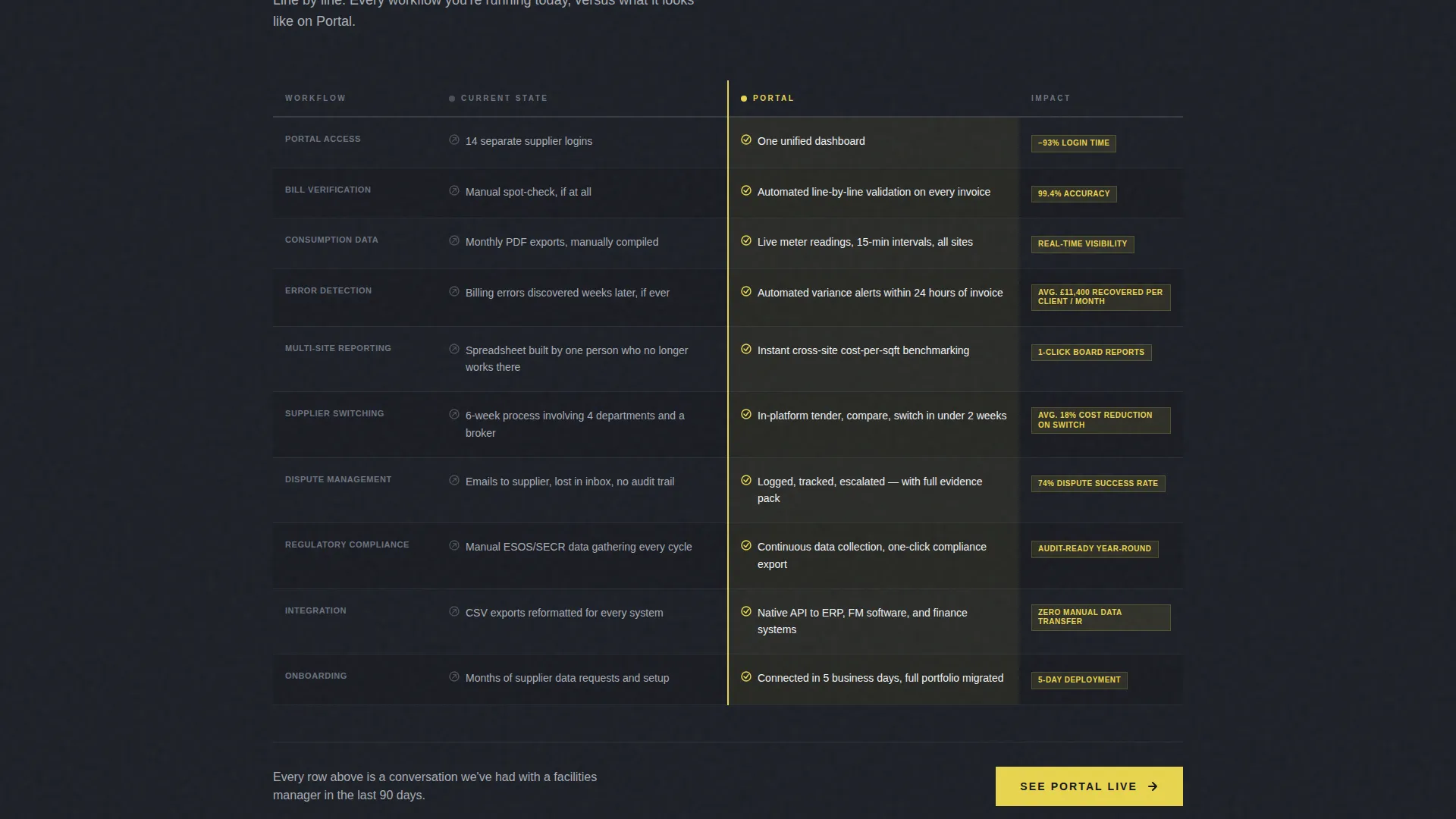
The core of the page is a set of spec-sheet-style comparison tables. Each row contrasts the legacy workflow against the portal workflow, line by line. Cell backgrounds shift from plate steel gray to accent yellow as the eye moves from the problem column to the solution column.
Persistent Sticky Demo call to action Bar
After the first scroll, a yellow call to action bar locks to the bottom of the viewport and stays visible throughout the entire page. The primary call to action reads "Get a Portal Demo" and opens a lead capture form collecting company name, number of utility accounts managed, biggest pain point via dropdown, and work email.
Gated ROI Calculator Download
A secondary conversion path offers a downloadable return-on-investment calculator as a gated PDF. This captures visitors who are not yet ready to speak with sales. The gate asks only for email address and portfolio size, keeping friction low.
High-Voltage Accent call to action System
Accent yellow (#E8D44D) is used exclusively for calls to action and active-state indicators throughout the page. It never appears as decoration. This strict color discipline means every yellow element on the page signals an action, creating a reliable visual language for high-stakes buyers.
Page sections overview
| Section | Purpose |
|---|---|
| Header screenshot zone | Anchors the product with a real multi-site dashboard view |
| Problem statement bands | Stacks pain points as full-width, heavy-set single lines |
| Old-way column | Shows legacy workflow row by row in plate steel gray |
| Portal solution column | Resolves each row with yellow-highlighted portal features |
| Demo request form | Captures company name, account count, pain point, and email |
| ROI calculator gate | Offers a secondary PDF download for early-stage visitors |
| Persistent call to action bar | Keeps "Get a Portal Demo" visible after the first scroll |
Design & branding system
The visual identity follows a Bold Brutalist theme built on a Monochrome Steel color system. The palette is drawn from industrial reference points: electrical substations, stamped metal panels, exposed fasteners, and stenciled warnings.
- Core colors are deep gunmetal (#1C1F26), brushed aluminum (#A8ADB5), raw plate steel (#4A4E57), and high-voltage accent yellow (#E8D44D)
- Backgrounds alternate between gunmetal and near-black; body text uses aluminum-white for strong contrast
- Accent yellow is reserved strictly for calls to action and active-state indicators, functioning like a hazard stripe rather than a decorative element
Mobile & speed optimization
The layout is structured so its heaviest visual element, the isometric product screenshot, is composited cleanly against a flat background color rather than relying on complex layering. This keeps the page structurally lean on smaller screens.
- Full-width problem bands and comparison tables reflow naturally for narrow viewports
- The sticky call to action bar is designed to remain usable on mobile without blocking content
- The gated PDF form is minimal by design, asking for two fields only on the secondary path
How this template helps you convert
The entire page is engineered around one goal: turning a skeptical energy buyer into a qualified demo request or a gated download lead.
- The Problem→Solution Arc mirrors how facilities managers and procurement officers actually think, moving them from recognition to resolution before the first call to action appears.
- The comparison tables do the persuasion work by making the legacy workflow look heavier with every row, so the call to action at the bottom feels like the obvious next step rather than a sales push.
- The dual conversion path, demo request for hot leads and ROI calculator download for early-stage visitors, means the page captures intent at two different readiness levels simultaneously.
Other information about this template
Portal is categorized under Technology, specifically the Energy Software and Software-as-a-Service subcategory, with a niche focus on energy customer portal products. It carries an intersection match score of 13, indicating strong alignment between the template style, creative direction, and the target buyer context.
- Template style is Comparison Table, making it well suited for competitive positioning and feature-by-feature selling
- Creative direction follows a strict Problem→Solution Arc, a proven structure for selling operational software to skeptical B2B buyers
- The header concept is Product Screenshot, with no lifestyle imagery or stock photography used anywhere on the page
- The lead-generation direction means every section flows toward the demo form or the gated download, not toward brand storytelling
- The Bold Brutalist theme is intentional and audience-matched: industrial buyers often distrust polished marketing, and the raw aesthetic signals that this product is built for real operational use
Theme
Bold Brutalist
Creative direction
Problem→Solution Arc
Color system
Monochrome Steel
Style
Comparison Table
Direction
Lead Generation
Page Sections
Isometric Product Screenshot Header
Problem Inventory Band Layout
Old-way Versus. Portal Comparison Tables
Persistent Sticky Demo Call to Action Bar
Gated ROI Calculator Download
High-voltage Accent Call to Action System
Related questions
Who is this landing page template designed for?
Can I adapt the comparison tables for my own feature set?
What lead capture fields does the demo form include?
Does the template use stock photography?
What makes the sticky call to action bar different from a standard button?



