Portal - Powerful Government Landing Page Template
Portal is a government customer portal landing page template built around a three-tier comparison table. It helps municipalities show residents and city staff exactly what each service tier includes, from online bill pay to permit routing. The dark full-bleed header, animated feature rows, and a freemium call to action make it easy for cities to launch a digital front door fast.
by Rocket studio
Quick summary
Portal is a single-page comparison table landing page designed for government customer portals. It presents Free, Pro, and Enterprise service tiers side by side, covering real municipal workflows. The design feels authoritative yet approachable, and the freemium conversion flow lets any city launch a self-service portal without procurement delays.
Who this template is for
This template speaks directly to the people who carry the daily weight of city service delivery. It was built with their specific pain points in mind, not generic software marketing.
- Municipal clerks who answer the same service questions repeatedly and need residents to self-serve online
- IT directors managing aging legacy systems who need a clean front end to present modern services
- City managers who must improve constituent satisfaction scores before the next council meeting
What problem this template solves
City halls often have no single, clear place where residents can find services, pay bills, or track requests. Staff time drains away answering calls that a well-designed portal page would eliminate.
- Residents struggle to find the right service channel, leading to repeated phone calls and front-desk visits
- City staff cannot clearly communicate what the portal offers at each tier, slowing adoption
- Decision-makers lack a compelling, structured page to justify portal investment to elected officials
What you get with this template
You get a fully structured, single-page comparison table landing page ready to present a government customer portal to residents, staff, and city leadership alike.
- A dark full-bleed hero header with animated portal dashboard tiles that boot up one by one on load
- A three-column comparison table covering real municipal workflows, with viewport-triggered row animations
- A live service-request counter, a testimonial carousel with population badges, and a two-step freemium sign-up form
Feature list
This template packages every section a government portal landing page needs to inform, build trust, and earn the click.
Animated Hero Header
The header fills the full viewport in deep government slate with a radial sky-blue glow at center. A dashboard preview fades in tile by tile, utility bills, permit applications, inspection calendars, giving visitors the feel of a system powering on live.
Three-Tier Comparison Table
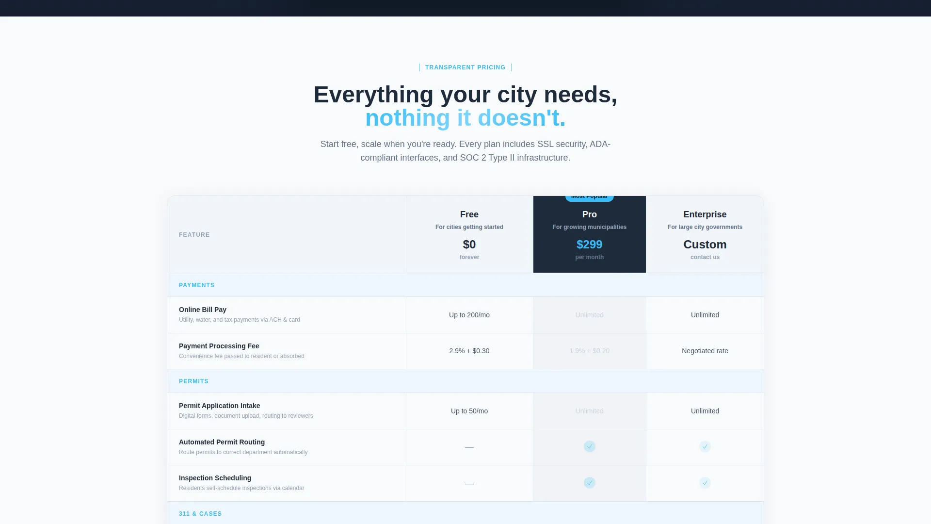
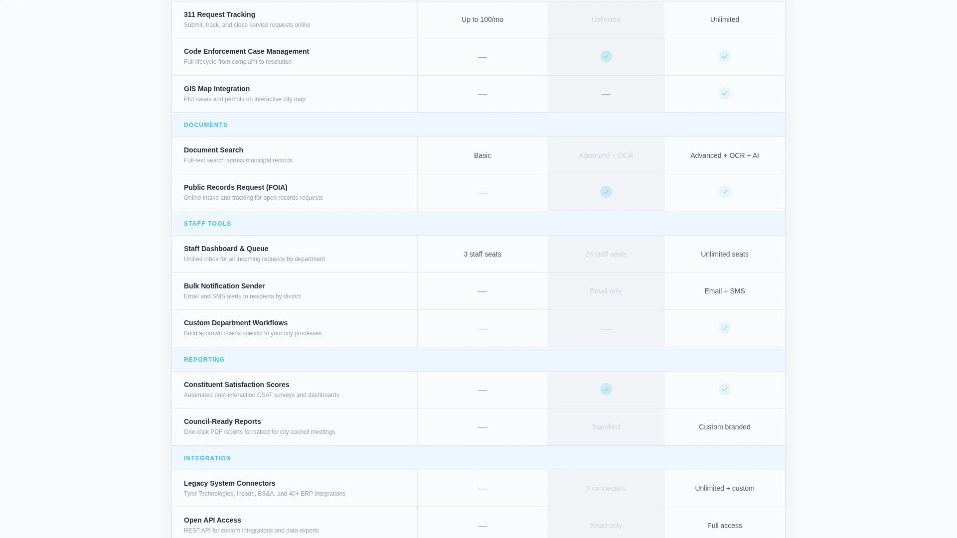
The core of the page is a Free, Pro, and Enterprise column table. Each row names a real municipal workflow: online bill pay, permit routing, 311 request tracking (a standard non-emergency public service channel), inspection scheduling, and document search. Checkmarks and feature counts fill each cell cleanly.
Viewport-Triggered Row Animations
As each table row scrolls into view, a micro-animation fires. Features appear to activate rather than simply load. This gives the page a sense of momentum and keeps visitors engaged through the full comparison.
Live Service-Request Counter
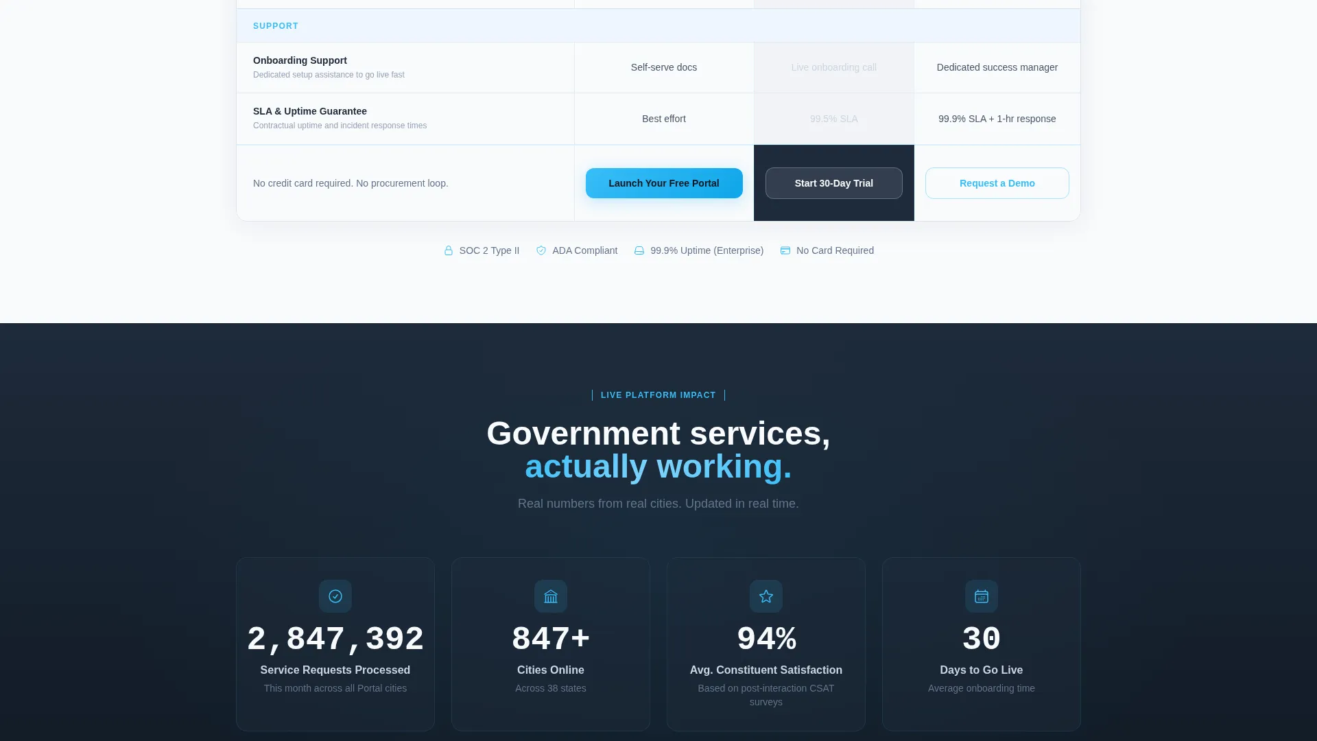
Below the comparison table, a live-style ticker shows how many service requests have been processed across Portal cities that month. This social-proof element reinforces scale and platform trust without requiring visitors to take anything on faith.
Testimonial Carousel with Population Badges
A dark-on-dark testimonial section presents quotes from city managers and IT directors. Each quote carries a population badge so prospects can quickly find a reference city that matches their own size.
Two-Step Freemium Sign-Up Form
The primary call to action opens a two-step form. Step one collects city name, state, and estimated population. Step two asks for the admin's work email and role title. No credit card is required, and the free tier is presented as live within minutes.
Page sections overview
| Section | Purpose |
|---|---|
| Hero Header | Introduce the portal with a full-bleed dark header and animated dashboard preview |
| Comparison Table | Display Free, Pro, and Enterprise tiers with real municipal workflow rows |
| Live Request Counter | Reinforce platform scale with a social-proof service-request ticker |
| Testimonial Carousel | Build trust with city manager and IT director quotes paired with population badges |
| Sticky call to action Bar | Keep the "Launch Your Free Portal" button visible after the first scroll |
| Sign-Up Form | Capture city details and admin contact through a two-step freemium flow |
Design & branding system
The visual identity follows a Directory and Discovery theme built on the Slate and Sky color system. Every color choice serves a functional purpose, keeping the page authoritative without feeling cold.
- Deep government slate (#1E2A3A) anchors headers and navigation; civic white (#F8FAFC) keeps table rows open and readable
- Open-sky blue (#38BDF8) marks every interactive element, active state, and call-to-action button
- Fog gray (#CBD5E1) separates comparison rows and provides visual breathing room between data cells
Mobile & speed optimization
The comparison table layout is designed to remain clear and functional at smaller screen sizes. Residents and staff check city services on mobile just as often as on desktop.
- Column layout adapts so the three-tier table stays readable without horizontal overflow on phone screens
- Micro-animations are scoped to viewport entry, so they fire only when content is visible rather than on initial page load
- The sticky call-to-action bar and two-step form are sized for touch interaction on mobile devices
How this template helps you convert
The page is structured so visitors understand the full offer before they ever see the button. That sequence is intentional and directly tied to conversion.
- The comparison table appears before any call to action, so visitors already know what the free tier includes by the time they reach the "Launch Your Free Portal" button
- The sticky header bar keeps the primary call to action visible throughout the scroll, removing friction for visitors who decide early
Other information about this template
This template is well suited for government software and SaaS teams presenting a citizen self-service portal to municipal buyers. It fits the broader context of local government digital transformation, where city halls are under pressure to move routine services online and reduce in-person demand.
- The template style is a comparison table landing page, making it a practical choice for any government portal platform with tiered pricing or tiered feature access
- The freemium and trial conversion model shown here is common in government SaaS, where low-barrier entry helps IT directors get internal approval without a full procurement cycle
- Population badges in the testimonial section help prospects self-segment by city size, a detail especially useful when selling to both small towns and mid-size cities
- The "Your City, Online in 30 Days" headline directly addresses the timeline concern that comes up most often in municipal software evaluations

Theme
Directory & Discovery
Creative direction
Launch Energy
Color system
Slate & Sky
Style
Comparison Table
Direction
Freemium/Trial
Page Sections
Animated Boot-up Hero Header
Three-tier Comparison Table
Viewport-triggered Row Animations
Live Service-request Counter
Testimonial Carousel with Population Badges
Two-step Freemium Sign-up Form
Related questions
Who is this landing page template built for?
What municipal workflows does the comparison table include?
Is a credit card required to use the freemium sign-up form?
Does the template work for smaller cities, not just large ones?
How does the sticky call-to-action bar function?



