Healthcare Digital Presence Reviews Website Template
Portal is a bento grid healthcare landing page template built for mid-size health systems and multi-specialty practices. It showcases a patient portal with self-scheduling, secure messaging, and lab result delivery. The design uses a deep navy and electric indigo palette, a dashboard preview header, and a side-by-side comparison strip to help buyers make a confident decision fast.
by Rocket studio
Quick summary
Portal is a single-page healthcare landing page template built around a bento grid layout. It is designed to help health systems and multi-specialty practices present their patient portal to prospective buyers and decision-makers. The template leads with a dashboard preview header, moves through feature tiles backed by hard numbers, and closes with a comparison table that makes the case before asking for any contact information.
Who this template is for
This template is built for teams who need to sell a digital patient portal to serious buyers inside healthcare organizations. It speaks directly to the people who own the decision and the pain.
- Health system marketing and product teams launching or promoting a patient portal
- Multi-specialty practices looking to reduce front desk call volume with a self-service digital tool
- Healthcare technology vendors pitching portal solutions to IT directors, CTOs, and practice administrators
What problem this template solves
Front desk staff are overwhelmed by inbound calls for scheduling, refills, and lab results. Patients compare their experience against consumer apps and leave for competitors with smoother digital access. Meanwhile, IT directors need documented proof of compliance and integration before approving any new platform.
- Patients cannot access records, messages, or appointments outside of office hours
- Practice staff spend hours each day handling requests that a portal could automate
- Procurement teams need side-by-side comparisons and spec data before approving a vendor
What you get with this template
You get a complete, ready-to-customize single-page layout that builds a procurement-ready case for a healthcare patient portal. Every section serves a specific job, from first impression to final call to action.
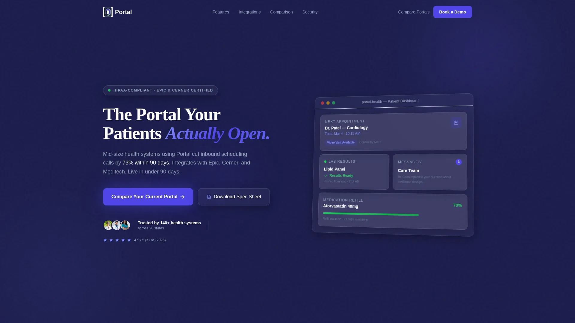
- A pixel-perfect dashboard preview header showing real portal interface components at an isometric angle
- A full bento grid of feature tiles, each pinned to a specific capability and a hard performance number
- A sticky horizontal comparison table, a diagnostic intake form, and a secondary PDF spec sheet download path
Feature list
This template is built around six core layout and content capabilities, each grounded directly in the source brief.
Isometric Dashboard Header
The header renders a realistic patient portal interface floating at a slight isometric angle against the deep navy background. Visible elements include an upcoming appointment card, a lab result tile with a status indicator, an unread message badge, and a medication refill tracker. This gives visitors an immediate, honest preview of the product experience.
Bento Grid Feature Tiles
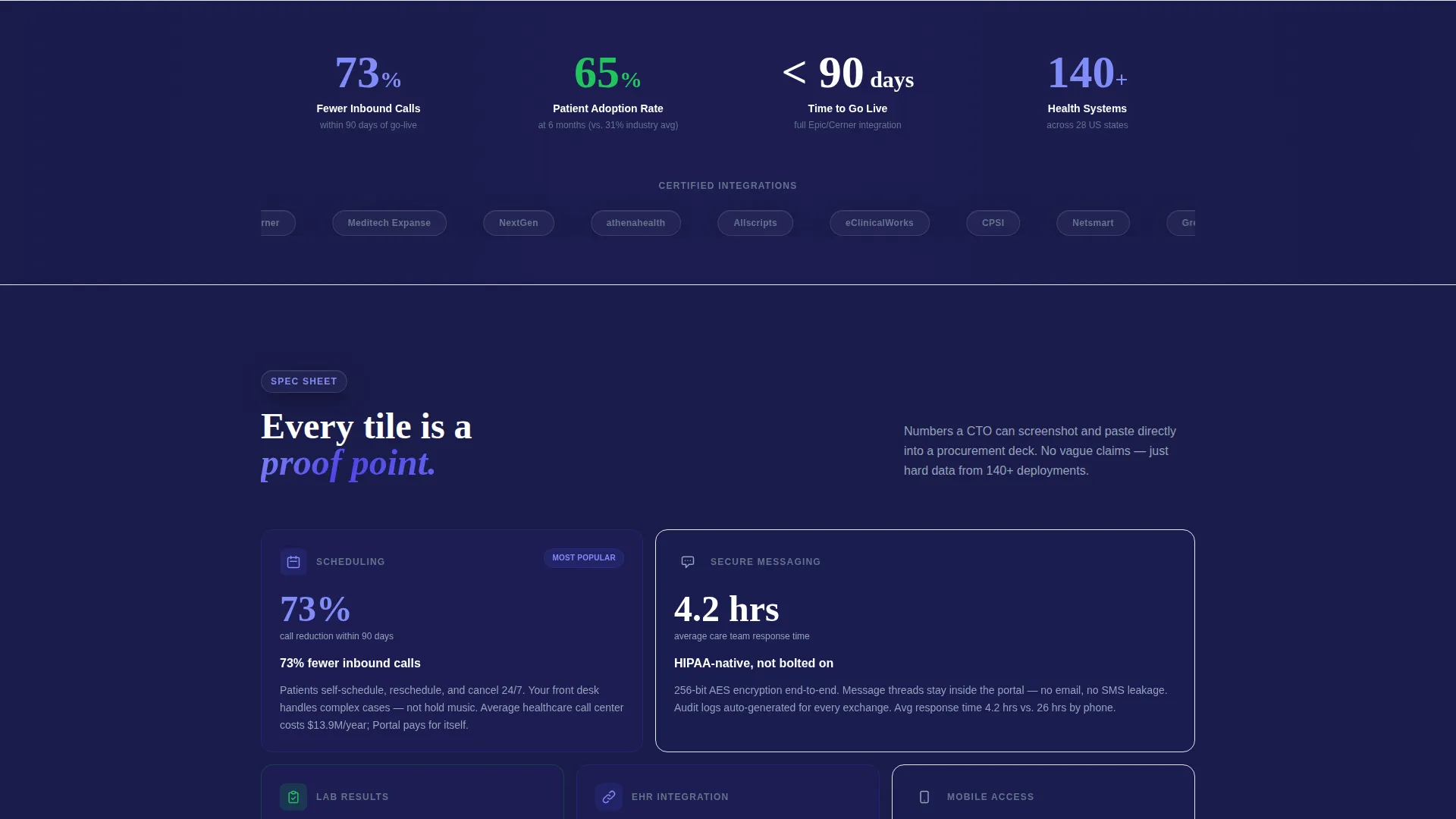
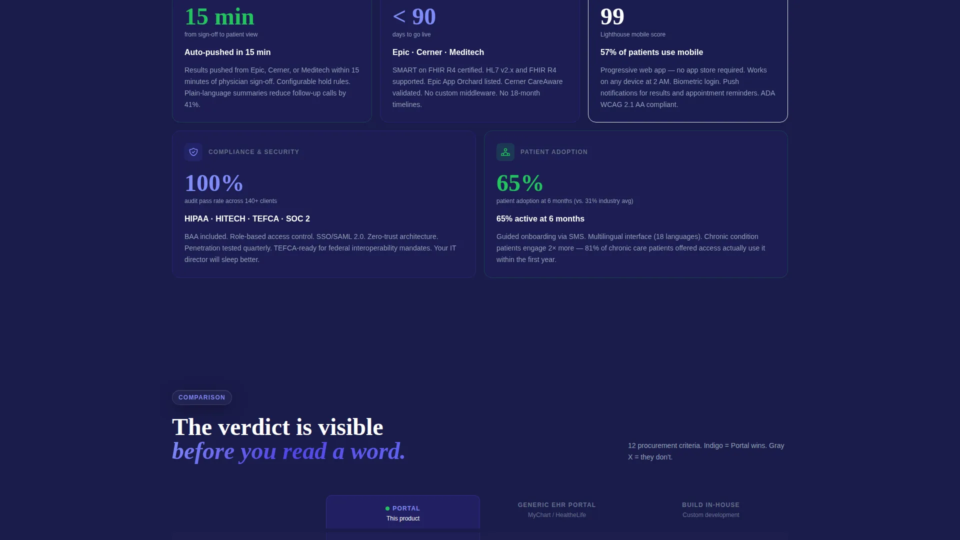
Below the header, a structured bento grid presents individual portal capabilities as self-contained proof tiles. Each tile isolates one feature and anchors it to a hard number, such as scheduling reducing inbound calls by 73 percent within 90 days. The format is designed so a CTO can screenshot any tile and drop it into a procurement deck.
Spec Sheet Creative Direction
Every tile follows a Spec Sheet format: a short capability label followed by a precise, verifiable claim. Secure messaging tile calls out 256-bit encryption and a 4.2-hour average response time. Lab result tile specifies auto-push from connected health record systems within 15 minutes of sign-off. This approach builds a factual case rather than relying on emotional appeal.
Sticky Comparison Table
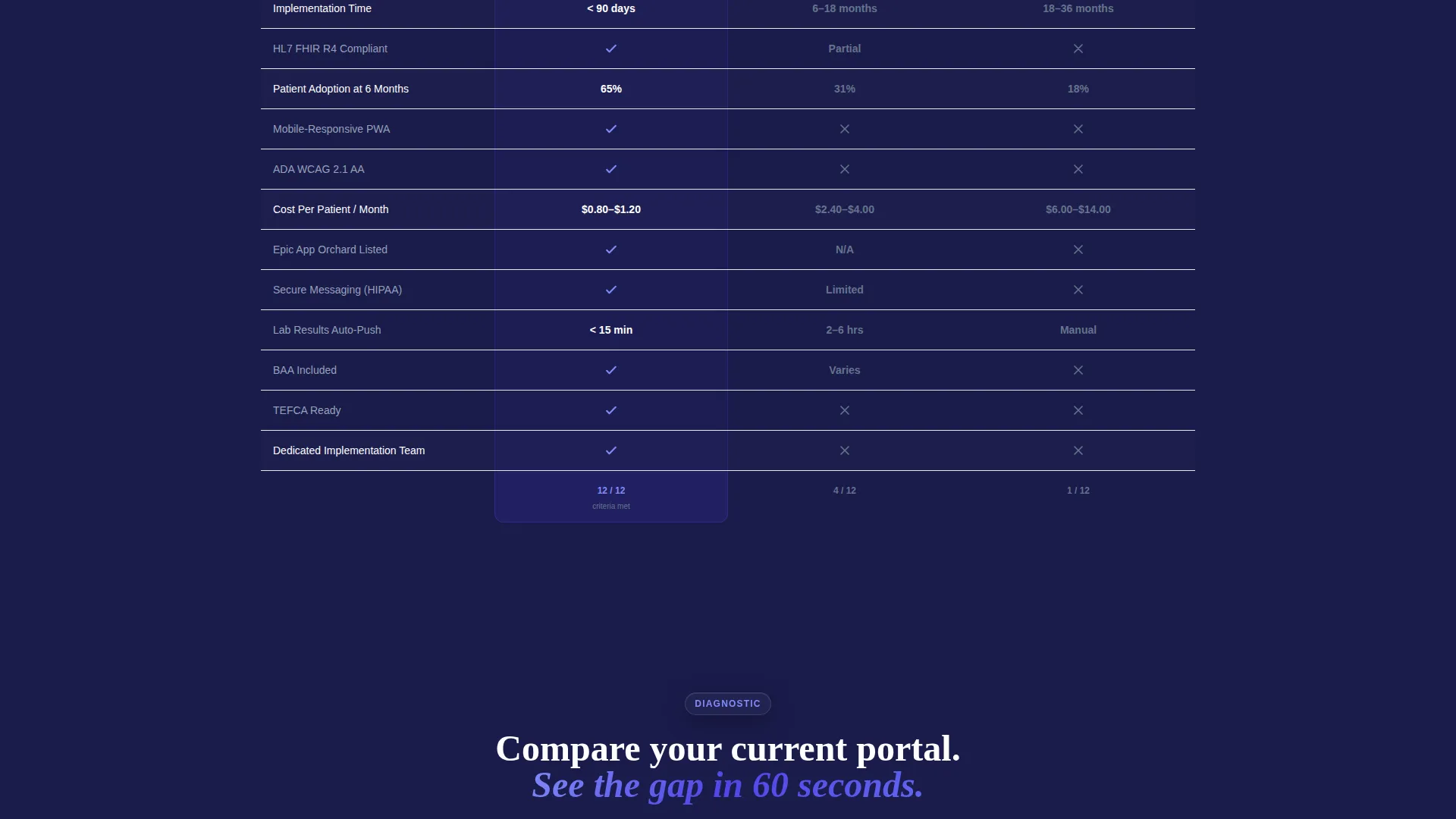
After the feature grid, a full-width sticky horizontal table compares the portal against a generic electronic health record patient portal and an in-house build option. Twelve comparison rows cover implementation time, patient adoption rate at six months, mobile responsiveness, cost per patient per month, and more. Indigo checkmarks and red-gray X marks make the verdict readable at a glance before a word is read.
Dual Conversion Paths
The primary call to action, "Compare Your Current Portal," opens a short diagnostic form. Fields include a current health record system dropdown, an active patient range slider, and a multi-select pain point picker covering scheduling, messaging, billing, lab delivery, and mobile access. A secondary path, "Download the Full Spec Sheet (PDF)," captures email only and serves prospects still in research mode.
Typographic Headline Treatment
The hero headline, "The Portal Your Patients Actually Open," is set in a clean geometric sans-serif at 56 pixels in white. The phrase "Actually Open" is highlighted in vivid indigo (#4F46E5) to draw the eye and reinforce the template's confident positioning.
Page sections overview
| Section | Purpose |
|---|---|
| Dashboard Preview Header | Opens with an isometric portal user interface rendering alongside the hero headline to anchor the product experience immediately |
| Bento Feature Grid | Presents individual portal capabilities as isolated spec tiles, each paired with a hard performance number |
| Full-Width Comparison Strip | Pits the portal against two alternatives across twelve rows using visual checkmark and X-mark verdicts |
| Diagnostic Intake Form | Qualifies leads through a short form triggered by the primary call to action beneath the comparison table |
| PDF Spec Sheet Capture | Collects email only for prospects in research mode via the secondary download call to action |
Design & branding system
The visual identity follows a Directory and Discovery theme built on an Electric Indigo color system. The palette is clinical and precise, with each color assigned a specific role so the page stays organized and readable under any context.
- Deep clinical navy (#1A1B4B) anchors the page background, grounding every element against a dark, focused surface
- Vivid indigo (#4F46E5) activates on interactive tiles and clickable elements, drawing the eye to every action point
- Cool antiseptic white (#F8F9FC) surfaces the bento cards above the dark background like floating interface panels
- Pulse green (#22C55E) appears exclusively on status indicators and success confirmations, never used decoratively
Mobile & speed optimization
The bento grid layout is structured to reflow naturally across screen sizes without losing its tile-based hierarchy. Compact tile sizes and clearly bounded card surfaces keep content readable on smaller displays.
- Each bento tile is self-contained, making it easy to stack vertically on mobile without breaking the spec sheet format
- The comparison table is designed as a horizontal scroll component on narrow screens so all twelve rows remain accessible
How this template helps you convert
This template is built to earn the click before asking for it. The page sequences proof before contact, which reduces friction for high-intent buyers inside healthcare organizations.
- The isometric dashboard header creates an immediate product impression, so visitors understand exactly what the portal looks like and does within the first few seconds of landing on the page.
- The bento feature tiles and comparison table build a layered, data-backed case across the full scroll, giving procurement-minded buyers the documentation they need to justify a decision internally.
- Two distinct conversion paths serve different buyer stages: the diagnostic form captures ready buyers, while the PDF download path retains research-phase prospects for later follow-up.
Other information about this template
This template is built specifically for the healthcare digital presence category, with niche intent aligned to healthcare client portal use cases. It is well-suited for teams evaluating or replacing legacy portal solutions.
- The template style is a bento grid single-page layout with a Spec Sheet creative direction and a Comparison/Versus landing-page flow
- The header concept is a Dashboard Preview, a specific visual format that shows a working product interface rather than abstract imagery
- The color system is Electric Indigo, chosen to evoke a calm, clinical digital environment appropriate for healthcare software marketing
- The template is compatible with positioning against common electronic health record patient portal alternatives, including legacy platforms and custom in-house builds
- The intersection match score for this template across category, subcategory, and niche is 13, indicating a strong alignment between the design system and the target use case
Theme
Directory & Discovery
Creative direction
Spec Sheet
Color system
Electric Indigo
Style
Bento Grid
Direction
Comparison/Versus
Page Sections
Isometric Dashboard Preview Header
Bento Grid Spec Tiles
Sticky Comparison Table
Dual Conversion Path Layout
Typographic Headline Treatment
Electric Indigo Color System
Related questions
Who is this template designed for?
What sections are included in this landing page template?
Can I customize the comparison table rows?
What does the diagnostic form collect?
Is this template suitable for a single-page layout only?



