Higher Education Digital Presence Cost Calculator Website Template
Portal is a bento grid landing page template built for higher education client portals. It combines a Feature Tab Switcher hero, an embedded ROI calculator, and a Comparison/Versus scroll flow to show university administrators exactly what they gain. The Dashboard Pro visual theme uses Electric Indigo against deep console black for a focused, data-forward presentation.
by Rocket studio
Quick summary
Portal is a single-page bento grid landing page template designed for higher education client portals. It opens with a three-tab dashboard hero, moves into an interactive ROI calculator, and builds a quantified case through side-by-side comparisons. The Electric Indigo color system gives every section the visual weight of a real command center.
Who this template is for
This template is built for teams that need to demonstrate the value of a unified university portal to decision-makers who are skeptical of yet another software pitch.
- Registrars managing enrollment data across multiple disconnected systems
- Financial aid directors tracking federal disbursement deadlines and compliance status
- Provosts and institutional leaders who need retention dashboards ready for board meetings
What problem this template solves
University administrators typically juggle six or more legacy systems to get a complete picture of enrollment, aid, and student success. That fragmentation costs hours every week and increases the risk of reporting errors. This template addresses that pain directly and visually.
- Manual spreadsheet exports and after-hours reconciliation cycles feel invisible to decision-makers
- Legacy workflow inefficiencies are hard to quantify without a tool that does the math for visitors
- Standard marketing pages fail to earn trust from data-literate administrators who need proof, not adjectives
What you get with this template
You get a fully structured bento grid landing page that leads with an interactive experience rather than promotional copy. Every section is designed to advance a skeptical administrator from awareness to a completed lead form.
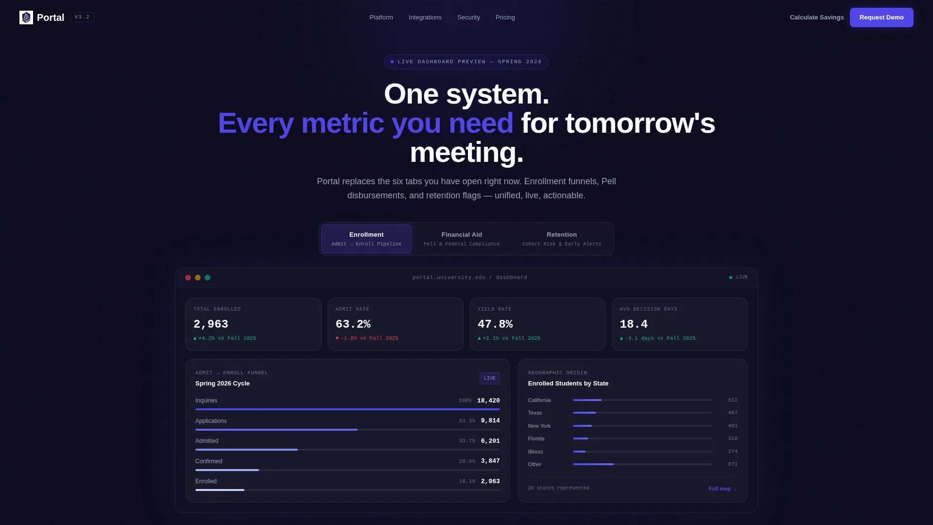
- A Feature Tab Switcher hero with three tabs: Enrollment, Financial Aid, and Retention, each rendering a distinct dashboard mockup
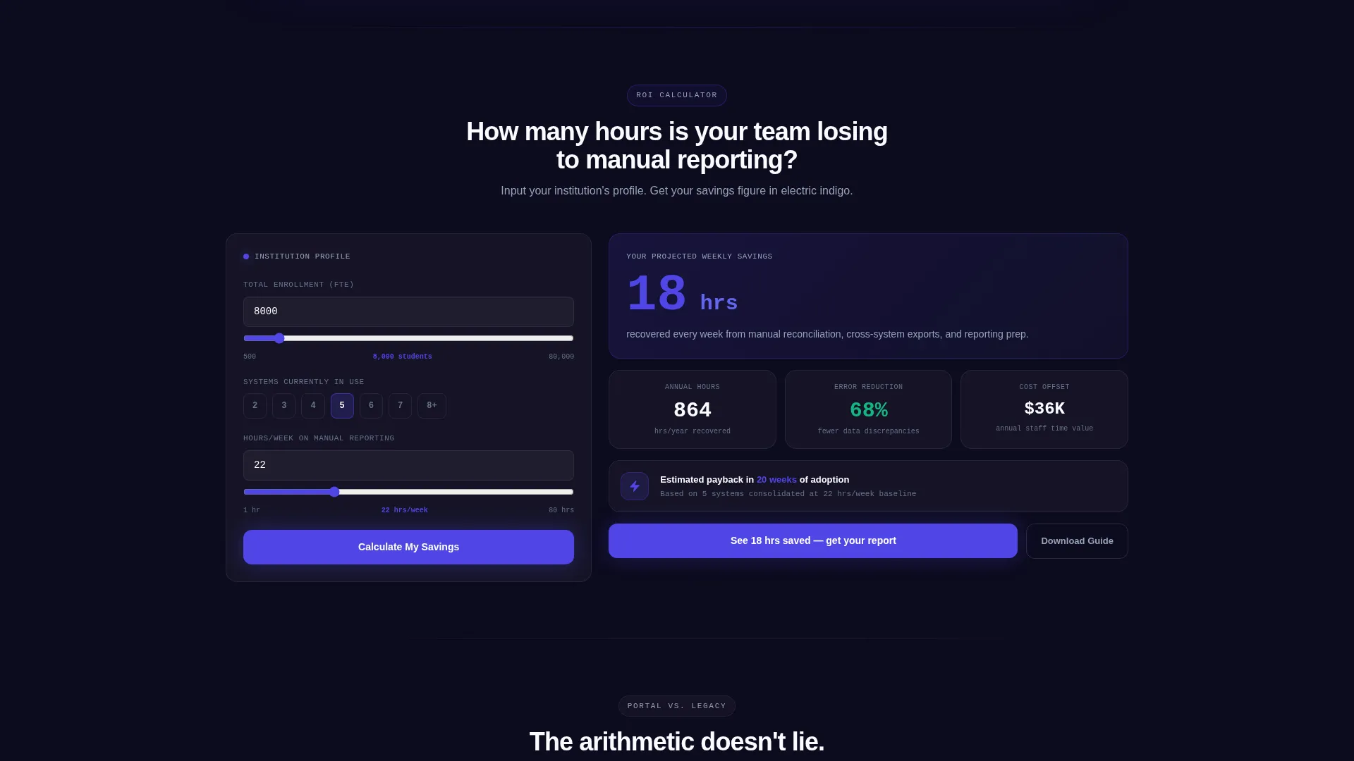
- An embedded ROI calculator that outputs projected time savings, error reduction percentages, and estimated cost offsets based on visitor inputs
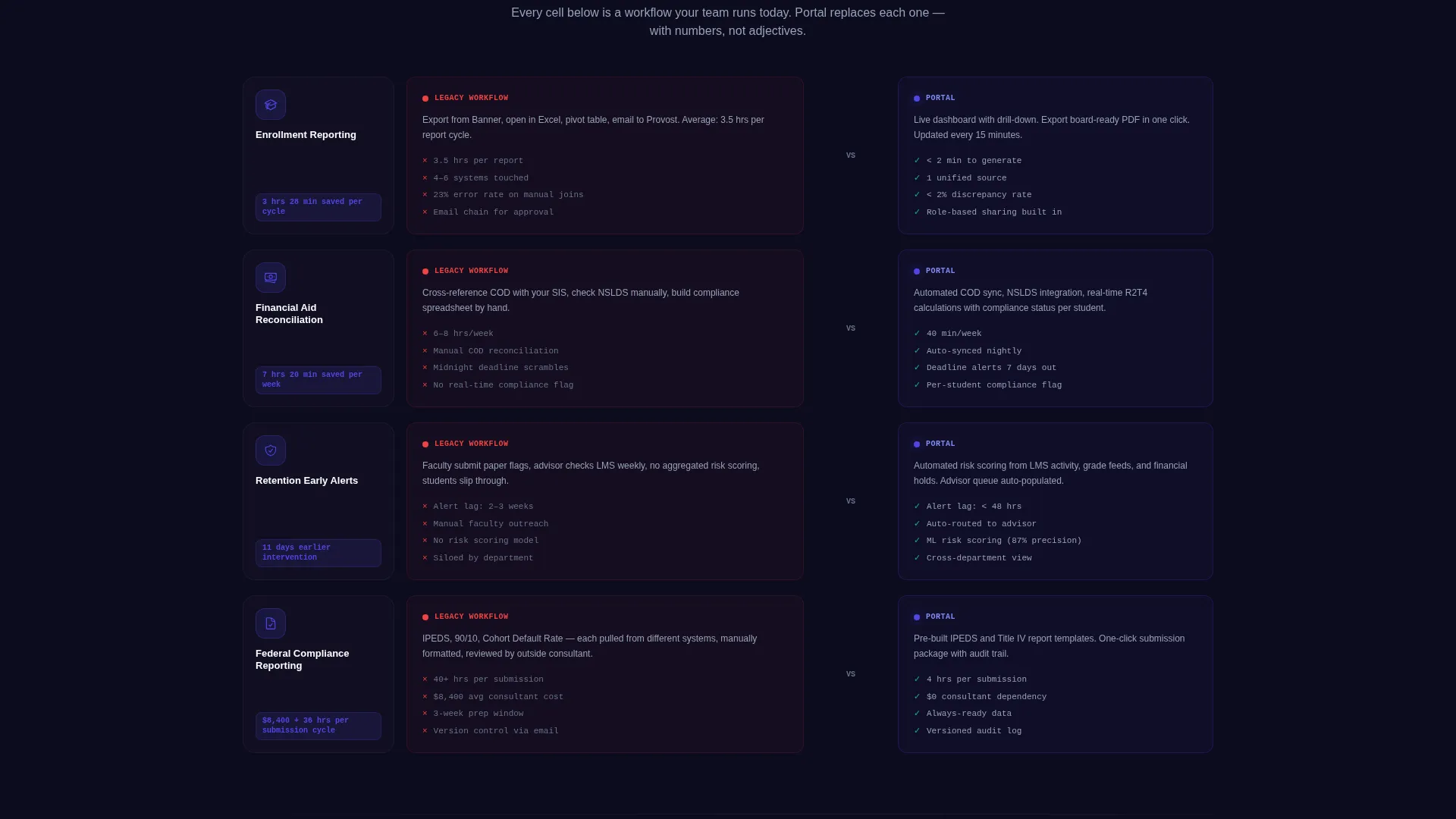
- A Comparison/Versus scroll section where each bento cell pairs a portal capability against the legacy workflow it replaces, using quantified differences
Feature list
This section describes the core built-in components that make Portal a functional, persuasive landing page for higher education client portals.
Feature Tab Switcher Hero
Three clickable tabs labeled Enrollment, Financial Aid, and Retention sit above a live-rendered dashboard mockup. Each tab instantly swaps the bento grid below it. The Enrollment tab shows a funnel visualization with admit-to-enroll conversion rates and a geographic heat map. Financial Aid displays a Pell disbursement tracker with compliance status indicators. Retention surfaces a cohort waterfall chart with early-alert flags.
Embedded ROI Calculator
Visitors input their institution size, number of systems currently in use, and average hours spent on manual reporting. The calculator instantly outputs projected time savings, an error reduction percentage, and an estimated cost offset. This interactive tool earns attention before any marketing copy appears.
Comparison/Versus Bento Grid
Below the calculator, the bento grid enters comparison mode. Each cell pairs a portal capability against the legacy workflow it replaces, using side-by-side layout and quantified differences. The scroll moves from institutional overview down to individual workflow automation, becoming more granular with each section.
Dual Conversion Path Forms
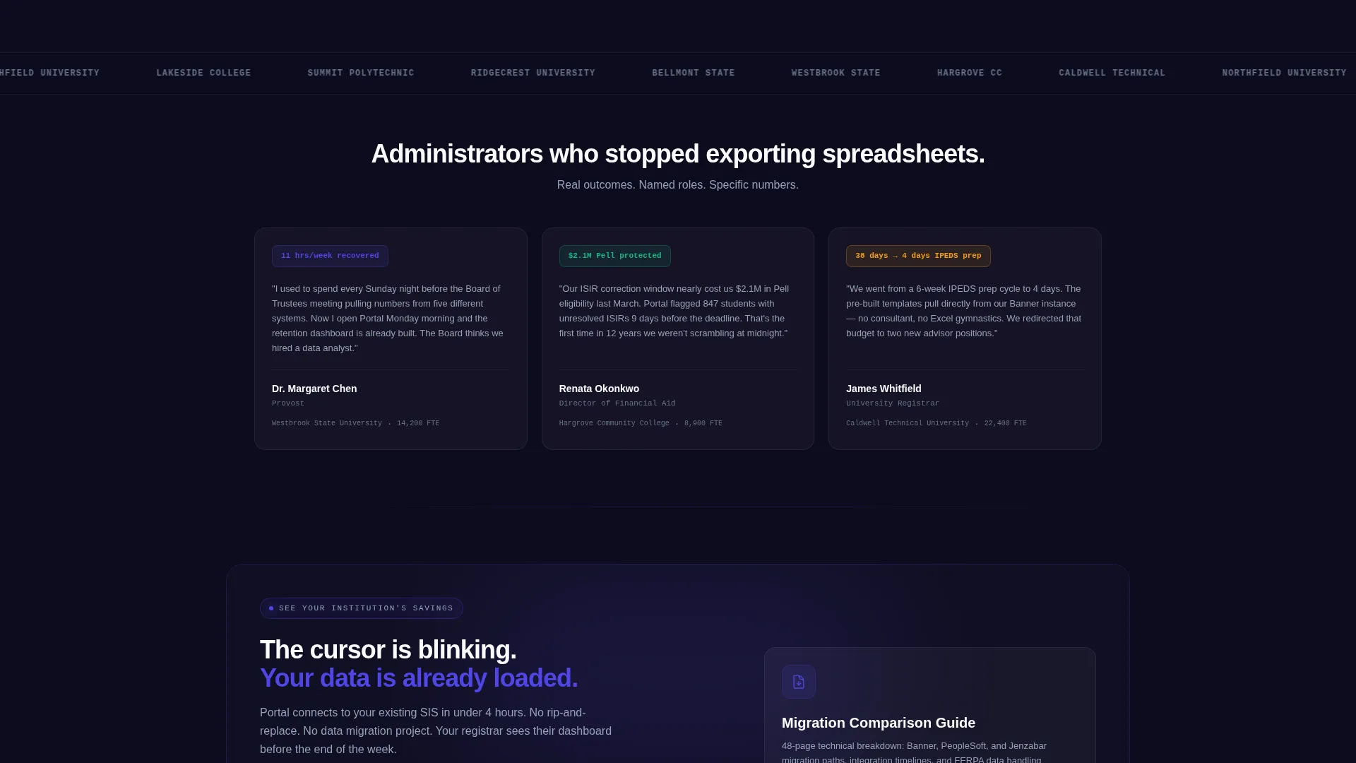
The primary call to action, "See Your Institution's Savings," anchors to the ROI calculator output. It captures institution name, role title, current student information system provider from a dropdown, and work email. A secondary path offers a Migration Comparison Guide gated behind email only, serving visitors who are still evaluating.
Dashboard-First Visual Design
No stock photography appears anywhere on the page. The dashboard mockup is the hero. Specific numbers, named semesters, and percentage changes with directional arrows make the data look real and immediately credible to data-literate administrators.
Page sections overview
| Section | Purpose |
|---|---|
| Tab Switcher Hero | Showcase Enrollment, Financial Aid, Retention dashboards |
| ROI Calculator Viewport | Let visitors quantify personal time and cost savings |
| Comparison Bento Grid | Pair portal capabilities against legacy workflows |
| Primary call to action Form | Capture high-intent leads via savings-anchored form |
| Secondary Download Gate | Collect emails from visitors still in evaluation mode |
Design & branding system
The template uses a Dashboard Pro theme built around an Electric Indigo color system. The palette is deliberately minimal, drawing visual hierarchy from contrast rather than decoration.
- Deep console black (#0D0B1E) as the page background, cool slate (#94A3B8) for secondary text and grid dividers, and crisp white (#FAFBFF) for card surfaces and input fields
- Electric indigo (#4F46E5) carries every interactive element including toggle switches, progress bars, and selected tabs, so the user's eye always knows where to act
- Bento cell borders and background contrast create depth between modules, making each data panel feel like a discrete instrument in a larger control interface
Mobile & speed optimization
The bento grid layout is structured to reflow cleanly across screen sizes, keeping each module readable without horizontal scrolling. The interactive components are designed for clarity at smaller viewports.
- Tab switching and calculator inputs remain accessible and usable on touch screens
- Bento cells stack vertically on smaller screens so comparison content stays legible without shrinking
How this template helps you convert
The page is engineered around a Calculator/Tool First creative direction, meaning visitors earn insight before they are asked for anything. That sequence builds trust and reduces form abandonment.
- The ROI calculator outputs a personalized savings figure in electric indigo, making the value concrete and emotionally resonant before a form appears
- The Comparison/Versus scroll structure gives administrators the specific, quantified evidence they need to justify a decision internally, reducing sales cycle friction
Other information about this template
Portal fits naturally into a broader higher education digital presence strategy. It is designed as a focused single-page experience rather than a multi-page site, which keeps the conversion path tight and measurable.
- The template style is Bento Grid, a layout approach well suited to data-rich interfaces where multiple metrics need to coexist without visual clutter
- The landing page direction is Comparison/Versus, meaning the scroll is built to persuade through arithmetic and specificity rather than through aspirational language
- The theme is Dashboard Pro, which aligns with the expectations of technical and administrative buyers who work in data-heavy environments every day
Theme
Dashboard Pro
Creative direction
Calculator/Tool First
Color system
Electric Indigo
Style
Bento Grid
Direction
Comparison/Versus
Page Sections
Feature Tab Switcher Hero
Embedded ROI Calculator
Comparison Bento Grid Layout
Dual Conversion Path Forms
Dashboard-first Visual Presentation
Related questions
Who is the primary audience for this landing page template?
Can I customize the ROI calculator inputs and outputs?
Does the template use real data or placeholder content in the dashboard mockups?
What are the two conversion paths built into this template?
Is this template suited for a single-page experience or a multi-page site?



