Nonprofit Digital Presence Reviews Website Template
Portal is a Bold Brutalist nonprofit client portal landing page built on a modular card grid layout. It gives executive directors, program managers, and development officers one screen to track grant milestones, review deliverables, and pull impact reports. The dark full-bleed header and interactive card explorer guide visitors into a live demo before they speak to anyone.
by Rocket studio
Quick summary
Portal is a single-page, click-through landing page designed for nonprofit teams who need a secure digital command center. The Bold Brutalist design, Teal Catalyst color system, and modular card grid work together to show visitors exactly what the portal does before they ever fill out a form.
Who this template is for
This template is built for nonprofits that manage complex grant portfolios and need a polished way to introduce their internal portal to new stakeholders. It speaks directly to the people who live inside grant cycles every day.
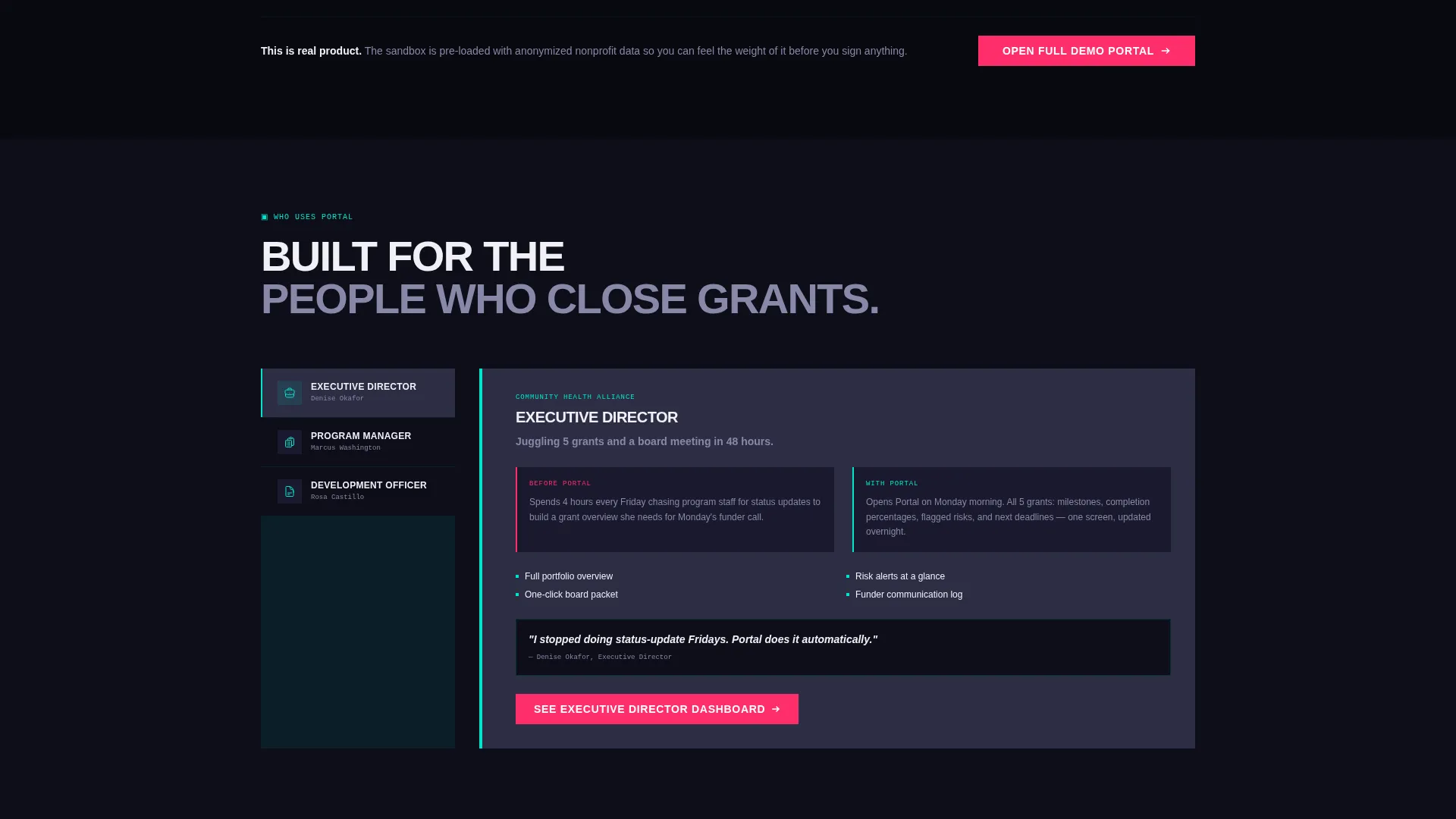
- Executive directors managing multiple active grants at once
- Program managers documenting outcomes for funders and preparing deliverables
- Development officers building board packets under tight quarterly deadlines
What problem this template solves
Nonprofit teams waste hours chasing status updates across email chains, spreadsheets, and scattered documents. This landing page solves the challenge of communicating what a portal actually does before anyone commits to a demo call.
- Visitors cannot evaluate a portal they cannot see, so the template lets the product speak for itself
- Teams often struggle to show funders and board members that mission data is organized and accessible
- Without an interactive preview, prospects bounce before they understand the platform's value
What you get with this template
You get a fully structured, single-page landing page built around a modular card grid. Every section is designed to move a visitor from awareness to action without a form standing in the way.
- A dark full-bleed header with a pulsing teal radar grid and boldly typed headline
- An interactive card explorer where each module can be hovered, flipped, or expanded to preview features
- A click-through call to action flow that routes visitors directly into a sandbox demo environment
Feature list
This template delivers a focused set of components drawn directly from the source brief. Each one serves the nonprofit portal use case with intention.
Interactive Card Grid Explorer
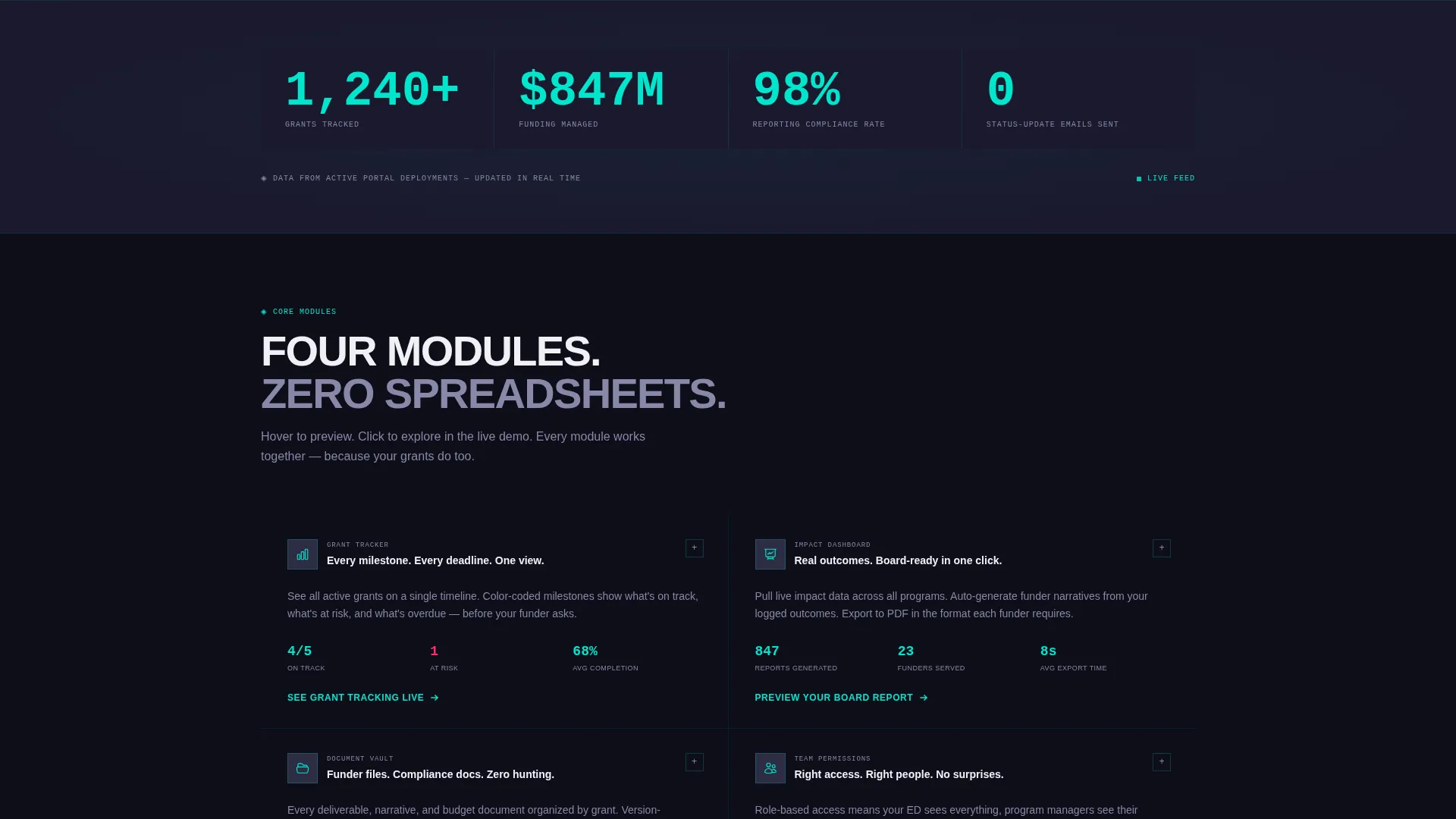
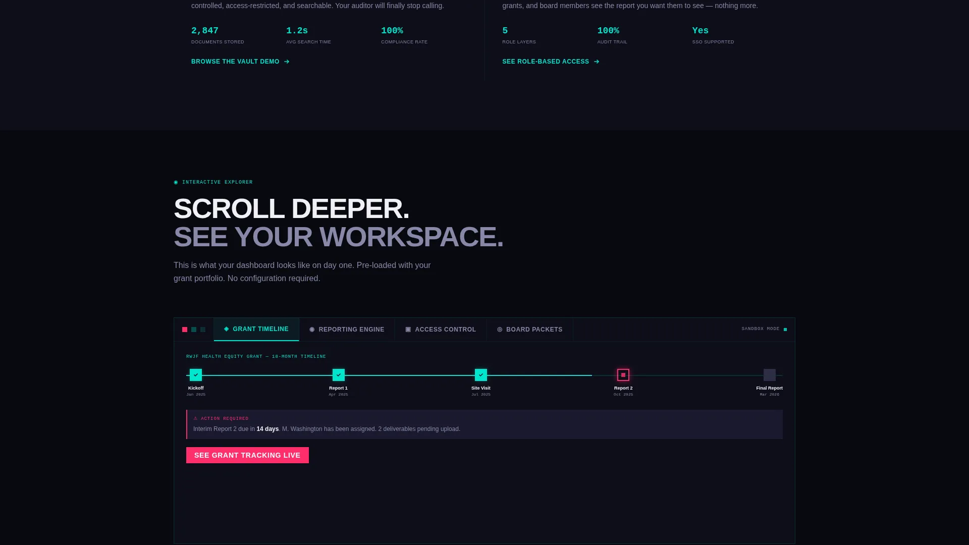
Each card in the grid is a live preview module. Visitors can hover, flip, or expand cards to see grant timelines populating, report snapshots fanning open, and role-based permission layers revealing themselves. Scrolling feels like onboarding into the product itself.
Dark Full-Bleed Header with Radar Animation
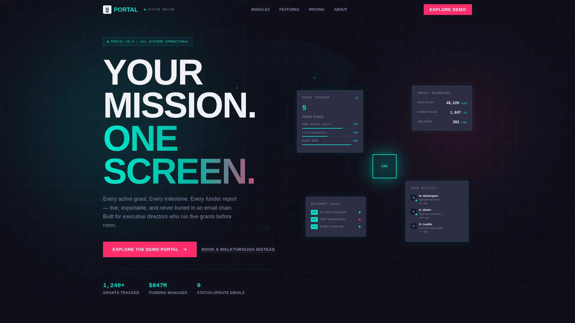
The header uses a deep black field where faint teal grid lines pulse outward from center like a radar sweep. Modular card shapes float forward out of the darkness, giving the impression the portal is assembling in real time. The headline is set in oversized brutalist slab type.
Contextual In-Card calls to action
The primary call to action appears below the header as a glowing teal button labeled "Explore the Demo Portal." It resurfaces inside individual cards as prompts like "See Grant Tracking Live" and "Preview Your Board Report," keeping the demo path always one click away.
Role-Based Access Preview Card
One dedicated card reveals layered team permissions. Visitors can see how executive directors, program managers, and development officers each get a different view of the same data. This addresses a common procurement question without requiring a sales conversation.
Exportable Report Snapshot Card
A reporting card fans open to display exportable document snapshots. This directly addresses the board-packet use case by showing development officers exactly what a deliverable looks like before they commit to the platform.
Secondary Booking Pathway
A text link below the primary call to action reads "Book a Walkthrough Instead" and routes to a calendar. This gives executive directors who prefer a guided tour a clear path without cluttering the main click-through flow.
Page sections overview
| Section | Purpose |
|---|---|
| Dark Full-Bleed Header | Establishes atmosphere and surfaces the headline with a pulsing teal radar animation |
| Primary call to action Block | Anchors the demo entry point directly below the header with a glowing teal button |
| Grant Tracker Card | Shows milestone timelines populating interactively on hover or flip |
| Impact Dashboard Card | Previews real-time data visualization in a glowing card module |
| Document Vault Card | Demonstrates organized deliverable storage with an expandable card interaction |
| Reporting Card | Fans open to reveal exportable document snapshots for funder and board use |
| Team Permissions Card | Reveals role-based access layers for different staff and director roles |
| Team Activity Feed Card | Shows a live-style activity log to communicate organizational transparency |
| Secondary call to action Block | Places contextual demo prompts inside individual cards across the grid |
| Walkthrough Link | Offers a calendar booking path beneath the primary call to action for guided-tour seekers |
Design & branding system
The visual identity is rooted in a Bold Brutalist aesthetic. The Teal Catalyst color system treats every surface as a structural decision, not a decorative one.
- Deep slab charcoal (#1A1A2E) forms the page foundation; muted graphite (#2D2D44) builds card surfaces with no rounded corners, no drop shadows, and no softening
- Electric teal (#00E5CC) pulses across hover states, progress bars, and the radar header animation to signal system activity
- Hot catalyst magenta (#FF2E6C) is reserved exclusively for call to action buttons and alert states, ensuring every actionable click registers as a visual detonation
Mobile & speed optimization
The card grid layout is structured for clean stacking and clear readability across screen sizes. The brutalist design philosophy naturally avoids heavy decorative assets that slow load times.
- Cards reflow into a single-column stack on smaller screens, preserving the interactive hover and expand behavior
- No stock photography or illustration assets are used anywhere in the template, keeping the visual weight on the user interface itself
- Typography scales from oversized desktop slab to a readable mobile weight without losing the brutalist character
How this template helps you convert
This landing page is engineered as a click-through page with one conversion goal: get the visitor into the live demo environment before they leave.
- The interactive card explorer lets visitors mentally configure their own dashboard without speaking to anyone, lowering the friction between curiosity and commitment
- Contextual in-card calls to action resurface the demo path at every scroll depth, so visitors who skip the header call to action encounter another prompt inside the content they are already exploring
- The secondary booking link captures directors who need a human touchpoint, ensuring the page converts both self-serve explorers and high-intent decision-makers
Other information about this template
This template is built as a single landing page with a card grid structure. It is part of a Bold Brutalist design family using the Teal Catalyst color system. Below are a few additional details worth knowing before you build.
- The template style is Card Grid (Modular), meaning individual card components can be reordered, duplicated, or removed to match your portal's actual feature set
- The creative direction is Interactive Explorer, so the scroll experience is designed to feel like product onboarding rather than passive reading
- No form appears anywhere on this page by design; the conversion path leads directly to a pre-loaded sandbox portal with sample nonprofit data
- The lp direction is Click-Through, meaning every design and copy decision serves the single goal of earning a demo click
- The header concept is Dark Full-Bleed with Glow, a combination that works especially well for technology-category pages where the product user interface is the hero
Theme
Bold Brutalist
Creative direction
Interactive Explorer
Color system
Teal Catalyst
Style
Card Grid (Modular)
Direction
Click-Through
Page Sections
Interactive Card Grid Explorer
Dark Full-bleed Radar Header
Contextual In-card Call to Action System
Role-based Access Preview
Exportable Report Snapshot Card
Secondary Walkthrough Booking Link
Related questions
Is this template suitable for showing to grant funders or board members?
Does this landing page include a contact form?
Can the card grid modules be customized for different portal features?
Who is the primary audience this landing page is built for?
What makes the visual style appropriate for a nonprofit portal product?



