Pet Care Digital Presence Comparison Website Template
Portal is a single-page landing page template built for pet care businesses ready to replace phone-tag chaos with a sleek client dashboard experience. It leads with a live-style metrics header, a side-by-side comparison table, and a kinetic feature carousel. The Tech Glass visual design and teal-on-graphite palette make every data point feel urgent, clear, and effortless to act on.
by Rocket studio
Quick summary
Portal is a comparison table landing page template designed for pet care client portals. It opens with a Stats/Metrics header showing vaccination rates, upcoming appointments, and boarding status. A scrolling comparison table, feature carousel, and testimonial cards build confidence fast. Three strategically placed "See It Live" calls to action drive visitors toward a pre-loaded demo, no form required.
Who this template is for
This template is built for pet care businesses that need to communicate the value of a modern client portal quickly and convincingly. It speaks directly to decision-makers who are tired of managing pet health schedules through phone calls and paper reminders.
- Veterinary clinics overwhelmed by callback queues and manual appointment reminders
- Dog daycare franchises currently managing bookings through group texts or spreadsheets
- Pet care software teams pitching their portal product to busy, dual-income pet-owning households
What problem this template solves
Most pet care businesses still rely on phone calls, sticky notes, and fragmented systems to keep clients informed. That friction costs time on both sides and leads to missed appointments and lost trust. This template positions a client portal as the clear, modern solution.
- Pet owners have no single place to check vaccination records, boarding confirmations, and upcoming visits at once
- Clinics spend significant staff time fielding calls that a self-serve portal could eliminate
- Businesses promoting a portal product struggle to communicate its value without showing it in action
What you get with this template
Portal delivers a full single-page layout built around momentum and visual clarity. Every section is sequenced to move visitors from problem recognition to confident action without unnecessary detours.
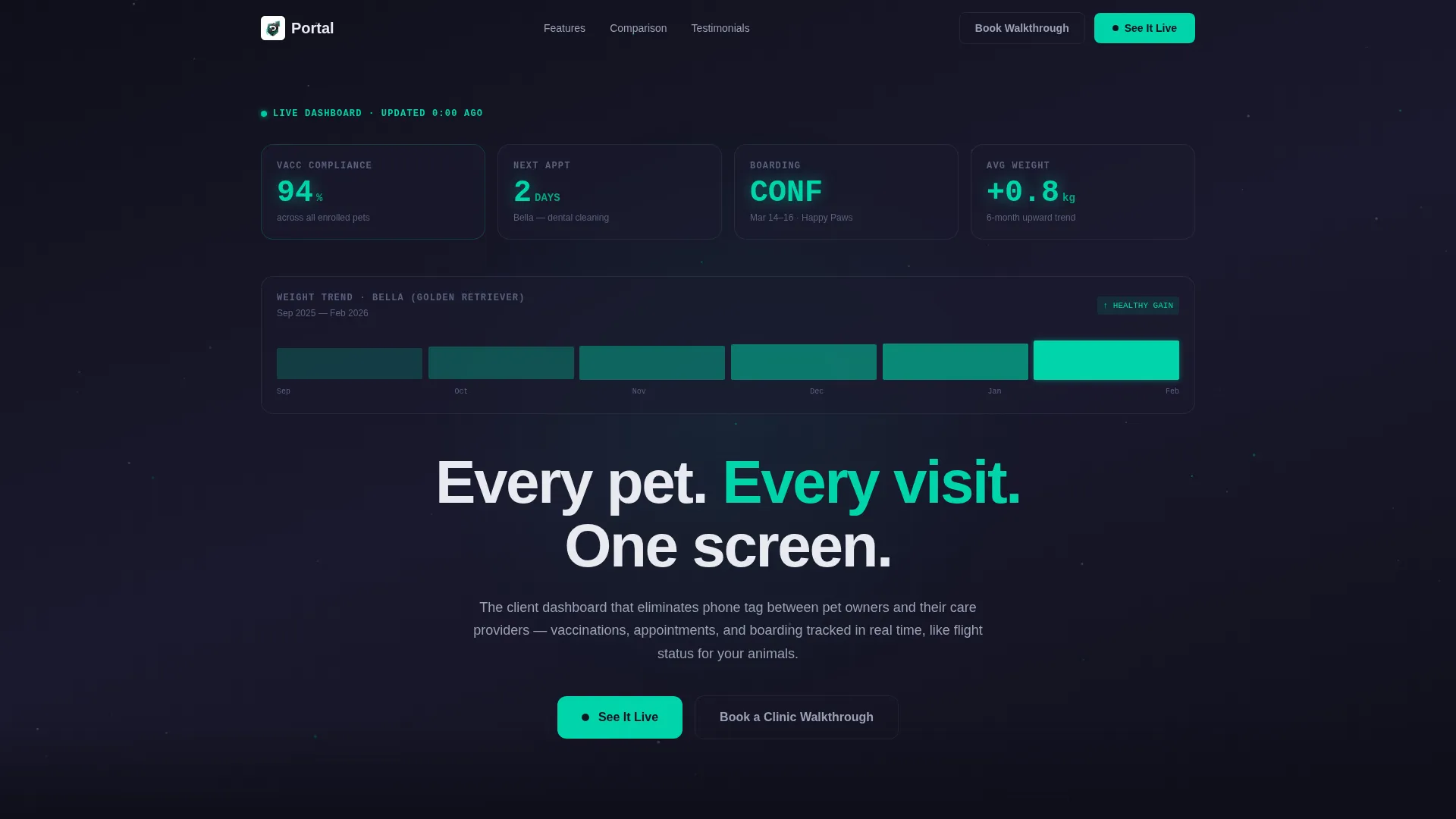
- A live-style Stats/Metrics header displaying vaccination compliance, next appointment countdown, boarding status, and a six-month weight trend chart
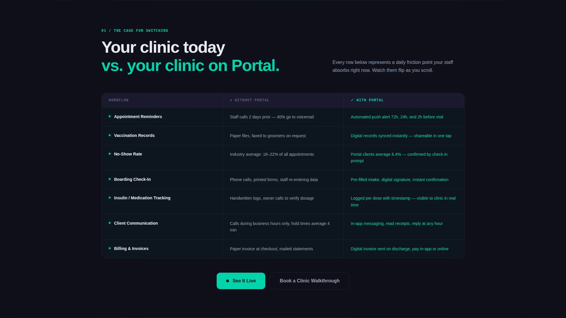
- A structured comparison table contrasting old clinic workflows against the portal experience, with viewport-triggered teal row highlights
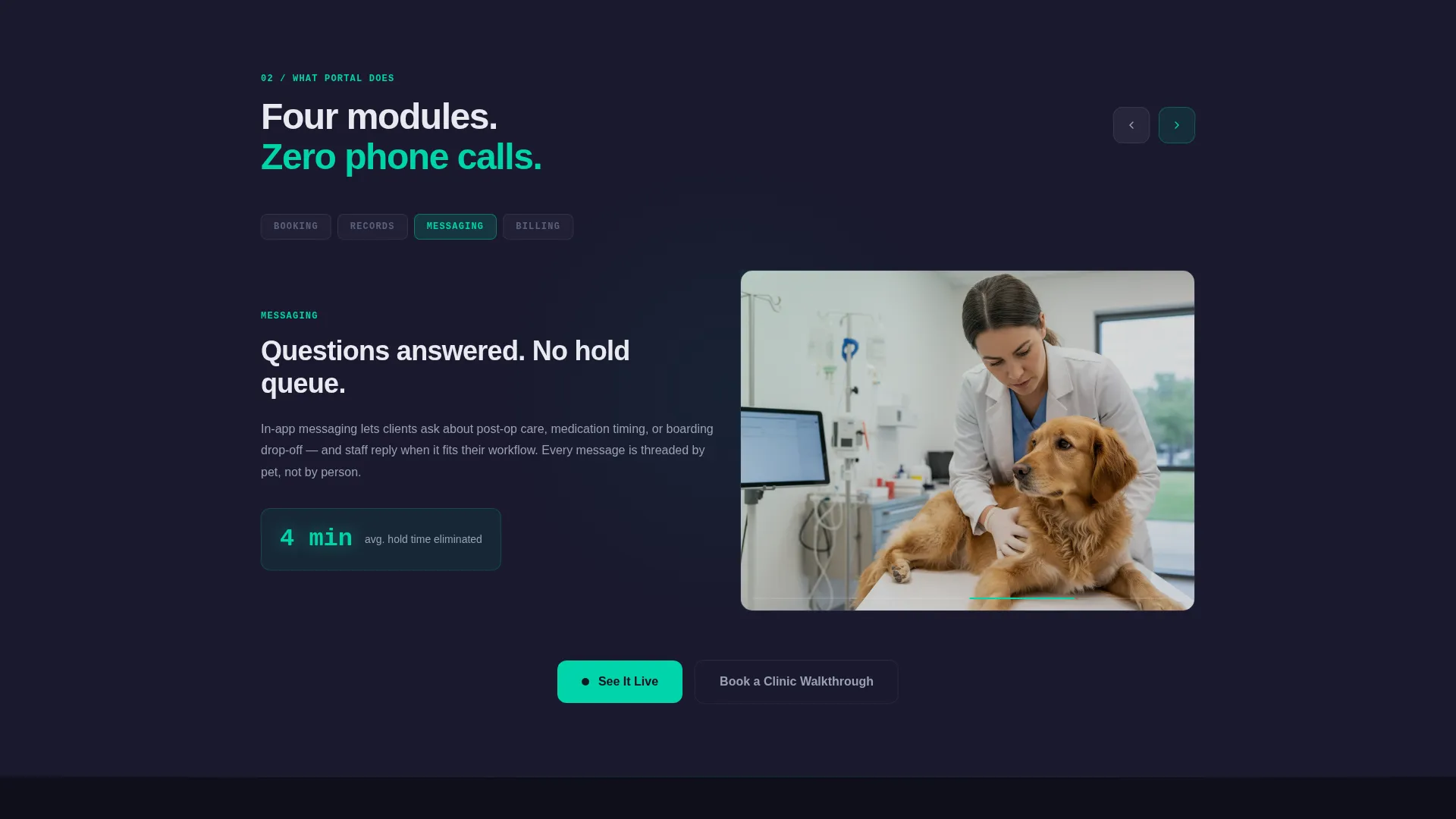
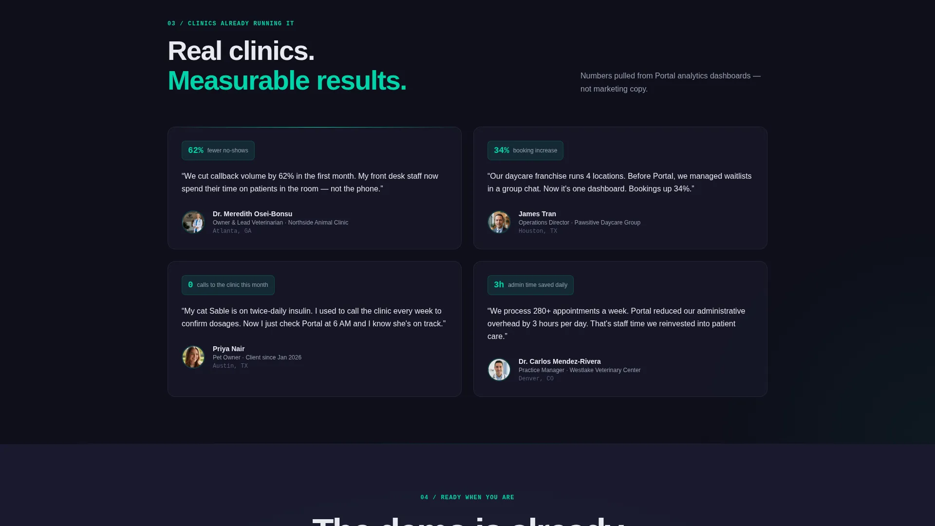
- A kinetic feature carousel covering booking, records, messaging, and billing, plus sliding testimonial cards with measurable clinic results
Feature list
This template includes several design-driven components that work together to build buyer confidence and guide visitors toward the demo.
Live Stats/Metrics Header
The header presents a dashboard frozen mid-pulse, showing key pet health metrics in large monospace type on a deep graphite background. Teal-on-graphite numbers and a subtle particle animation create a sense of live data without overwhelming the viewer.
Viewport-Triggered Comparison Table
The comparison table is the page's first content section. Each row highlights in electric teal as it enters the viewport, making the contrast between old workflows and the portal solution feel immediate and kinetic.
Kinetic Feature Carousel
A swipe-style carousel cycles through the portal's core capabilities: booking, records, messaging, and billing. Transitions are designed to feel like swiping through app screens, reinforcing the product's mobile-native identity.
Testimonial Cards with Results
Sliding testimonial cards display clinic names alongside measurable outcomes, such as a 62% reduction in no-shows. This grounds the template's energy in real-world credibility rather than abstract promises.
Three-Point Call-to-Action System
The primary call to action, "See It Live," appears after the comparison table, after the feature carousel, and as a fixed bottom bar on mobile. A secondary path, "Book a Clinic Walkthrough," sits beneath each primary button for decision-makers who prefer a guided conversation.
Page sections overview
| Section | Purpose |
|---|---|
| Stats/Metrics Header | Opens with live-style pet health dashboard data and headline |
| Comparison Table | Contrasts old clinic workflow with the portal side by side |
| Feature Carousel | Cycles through booking, records, messaging, and billing |
| Testimonial Cards | Slides in clinic results and social proof with measurable data |
| Primary call to action Block | Drives clicks to pre-loaded demo after comparison table |
| Secondary call to action Block | Drives clicks to demo after feature carousel |
| Fixed Mobile Bar | Keeps "See It Live" persistent on mobile during scroll |
| Walkthrough call to action | Offers a secondary human-conversation path for decision-makers |
Design & branding system
Portal uses a Tech Glass theme built on a Carbon Fiber color system. The palette feels tactile and engineered, like a matte-black device with a glowing notification on the lock screen. Every color choice reinforces urgency without creating visual anxiety.
- Core palette: deep graphite (#1A1A2E) for backgrounds, woven carbon black (#0F0F1A) for section depth, frosted glass overlay white (#E8EAF0) for readable contrast, and electric teal (#00D4AA) for active states and data highlights
- Typography uses a monospace font in the header to evoke a mission-control readout, keeping numbers large, sharp, and instantly scannable
- A subtle particle animation drifts behind the metrics header, adding motion without distraction
Mobile & speed optimization
The template is structured with mobile behavior built into its conversion logic, not added as an afterthought. The fixed bottom bar ensures the primary call to action is always one tap away on smaller screens.
- The fixed mobile call to action bar keeps "See It Live" visible throughout the entire scroll without interrupting the reading flow
- Section transitions and carousel animations are designed to feel like native app interactions, matching the expectations of mobile-first pet-owning audiences
- Layout sections are tight and sequenced for fast vertical scanning, reducing friction for users checking the page quickly before their day begins
How this template helps you convert
Portal is built around a click-through structure where every section earns the next click by showing the product working rather than describing it in abstract terms.
- The comparison table creates an immediate before-and-after contrast, making the value of switching obvious within the first scroll
- The feature carousel and testimonial cards layer in product proof and social credibility, so visitors arrive at the call to action already convinced
- The three-point call to action system, including the fixed mobile bar, ensures no motivated visitor reaches the end of the page without a clear, frictionless next step
Other information about this template
Portal is categorized under Technology with a subcategory focus on Pet Care Digital Presence. It is purpose-built for the Pet Care Client Portal niche, targeting the specific intersection of tech-forward design and veterinary or pet daycare business needs.
- The template style is a Comparison Table landing page, making it well-suited for product launch pages, feature announcement pages, or competitive positioning campaigns
- Creative direction follows a Launch Energy principle: each section is designed to feel faster and more confident than the previous one, building forward momentum through the page
- The header concept is Stats/Metrics, which positions the template as a data-forward product showcase rather than a traditional marketing layout
- The landing page direction is Click-Through, routing all primary actions to a pre-loaded interactive demo environment with no form barrier
Theme
Tech Glass
Creative direction
Launch Energy
Color system
Carbon Fiber
Style
Comparison Table
Direction
Click-Through
Page Sections
Live Stats/metrics Dashboard Header
Viewport-triggered Comparison Table
Kinetic Feature Carousel
Sliding Testimonial Cards
Three-point Call to Action Architecture
Related questions
Who is the primary audience for this template?
Do visitors need to fill out a form to reach the demo?
Can a single veterinary practice use this template?
What makes the design feel different from a standard landing page?
How many times does the call to action appear on the page?



