Specialist Printing Digital Presence Cost Estimator Website Template
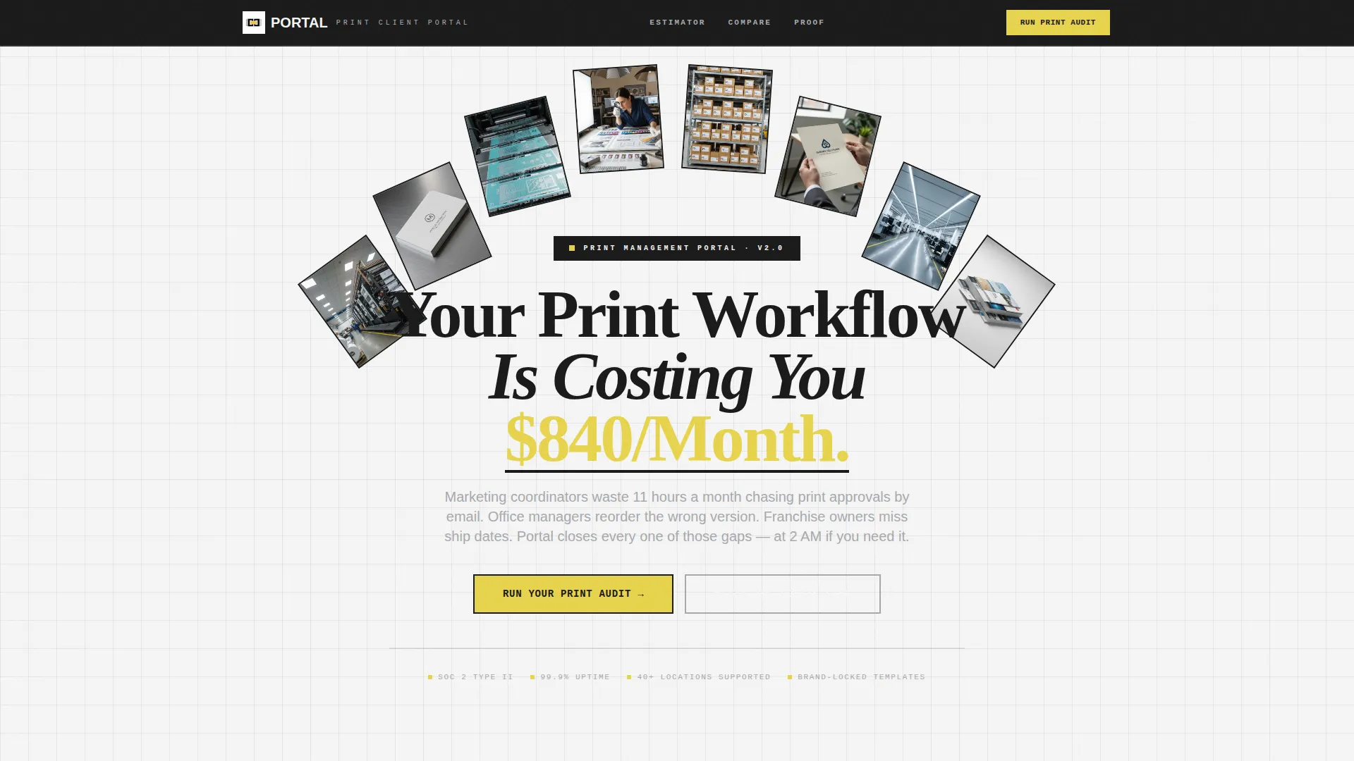
Portal is a bold brutalist landing page template built for printing client portals. It uses an interactive comparison table, a brutalist cost estimator, and a pinned call-to-action to show print buyers exactly how much time and money manual ordering wastes. The design is raw, industrial, and built to convert marketing coordinators, office managers, and franchise operators.
by Rocket studio
Quick summary
Portal is a single-page comparison landing page template for printing client portals. It opens with a brutalist cost estimator, walks visitors through a live interactive comparison table, and closes with a pinned "Run Your Print Audit" call-to-action. The design uses a Monochrome Steel palette and Bold Brutalist typography to make the case fast and hard.
Who this template is for
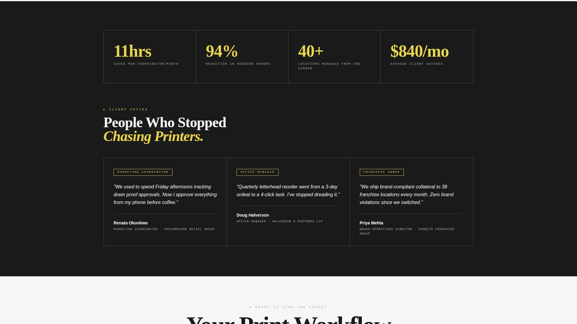
This template is built for print service providers who want to replace phone calls and email chains with a self-service portal. It speaks directly to the people managing print orders at scale, and it earns their trust by reflecting exactly how their day feels.
- Marketing coordinators juggling multiple vendor logins and recurring collateral requests
- Office managers who reorder the same letterhead every quarter and need a faster path
- Franchise operators who need brand-compliant collateral delivered across many locations on a tight deadline
What problem this template solves
Print buyers waste real hours on back-and-forth approvals, manual reorders, and proof corrections sent over email. This template makes that pain visible. It uses a side-by-side comparison structure to show the cost of the old workflow before asking for any commitment.
- No clear way for buyers to self-serve artwork uploads or proof approvals outside business hours
- Reorder errors caused by outdated files and lack of template-locked controls
- No single overview of print spend, locations, or order status without a phone call
What you get with this template
You get a fully structured, single-page landing page designed around one conversion goal: getting print buyers to request a portal audit or watch a live demo. Every section is purposeful and nothing is decorative for its own sake.
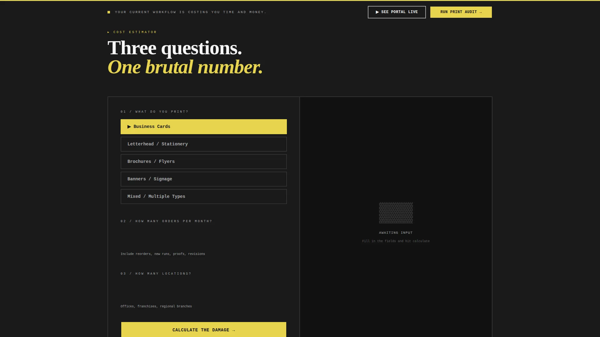
- A brutalist cost estimator in the header that takes three inputs and outputs a comparison of manual versus automated print workflows
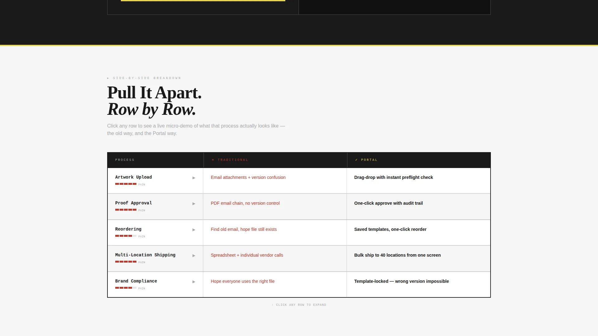
- An interactive comparison table where each row expands on hover to show a micro-demo of the portal feature being compared
- A pinned "Run Your Print Audit" call-to-action rail at the bottom of the table, always visible once the visitor starts scrolling
Feature list
This template is built around a small number of high-impact components. Each one does a specific job in the conversion flow.
Brutalist Cost Estimator Header
The header section opens with an exposed-input estimator styled in monospaced type. Visitors enter what they print, how often, and how many locations. The tool returns a side-by-side output comparing hours lost to email approvals against portal automation, and reorder errors against template-locked accuracy.
Interactive Comparison Table
The core of the page is a comparison table that visitors can explore row by row. Each row expands on hover to reveal a micro-demo of the portal feature in context. The contrast between traditional ordering and portal ordering does the persuading without additional copy.
Pinned Audit Call-to-Action Rail
Once scrolling begins, a bottom rail stays fixed in view. It carries the primary call-to-action: "Run Your Print Audit." This rail does not disappear, ensuring the conversion path is always one click away regardless of where the visitor is on the page.
Three-Field Audit Form
Clicking the primary call-to-action opens a focused form with three fields: company name, estimated monthly print spend, and number of locations. The form is short by design, removing friction at the moment of highest intent.
Brutalist Modal Video Walkthrough
A secondary call-to-action, "See the Portal Live," triggers an embedded walkthrough video inside a brutalist-styled modal. Visitors who need more proof before committing get a contained, distraction-free demo experience without leaving the page.
Signal Yellow Interactive States
Signal yellow is reserved exclusively for interactive elements and call-to-action states. Buttons, hover triggers, and clickable rows fire in yellow only when a cursor is active. This keeps the palette disciplined and makes every interactive moment unmistakable.
Page sections overview
| Section | Purpose |
|---|---|
| Estimator Header | Opens with a three-input cost comparison tool |
| Comparison Table | Side-by-side portal versus manual workflow rows |
| Row Micro-Demos | Expands each row on hover with a feature preview |
| Pinned call to action Rail | Keeps the audit call-to-action fixed during scroll |
| Audit Request Form | Collects company name, print spend, and locations |
| Demo Modal | Hosts the embedded portal walkthrough video |
Design & branding system
The visual identity follows a Bold Brutalist theme with a Monochrome Steel color system. The palette is tight, purposeful, and built to feel like a freshly machined press room under warehouse lighting.
- Four-color system: slab black (#1A1A1A) for headers and borders, rolled aluminum (#A8A9AD) for body text and dividers, press-bed white (#F5F5F5) for cell breathing room, and signal yellow (#E8D44D) reserved for interactive and call-to-action states only
- Monospaced typography in the estimator, zero border-radius on all input fields and containers, and every element snapped to a visible grid
- Raw concrete gray framing in the estimator section with hard black borders throughout, giving the layout an industrial and unapologetic character
Mobile & speed optimization
The layout is grid-snapped and built around structured components that translate clearly to narrower viewports. The brutalist design system, with its hard edges and high-contrast palette, supports legibility at any screen size.
- Fixed-grid structure and zero border-radius components adapt predictably across screen widths without decorative elements breaking the layout
- The pinned call-to-action rail and short audit form keep the conversion path accessible on mobile without requiring scroll-back
How this template helps you convert
This template is designed around a single principle: show the visitor how expensive their current workflow is before asking them to do anything. The conversion sequence is intentional and escalating.
- The cost estimator in the header immediately quantifies the pain of manual print ordering in the visitor's own numbers, making the problem feel personal and measurable before any claim is made.
- The interactive comparison table escalates friction row by row, letting visitors pull the old workflow apart and feel the contrast against portal-based ordering without reading a wall of copy.
- The pinned audit call-to-action and the secondary demo modal give visitors two clear exit ramps at peak intent, one for buyers ready to act and one for buyers who need one more proof point.
Other information about this template
Portal is categorized under the Technology vertical with a Printing Digital Presence subcategory and a Printing Client Portal niche focus. It is built as a Comparison Table template style using the Interactive Explorer creative direction and a Comparison/Versus landing page structure. The intersection match score for this template is 13, reflecting a tightly aligned combination of niche, theme, and conversion direction.
- Template style: Comparison Table with Interactive Explorer creative direction
- Landing page direction: Comparison/Versus with a Calculator/Estimator header concept
- Theme: Bold Brutalist with a Monochrome Steel color system
- Niche alignment: Printing Client Portal within the Printing Digital Presence subcategory
Theme
Bold Brutalist
Creative direction
Interactive Explorer
Color system
Monochrome Steel
Style
Comparison Table
Direction
Comparison/Versus
Page Sections
Brutalist Cost Estimator Header
Interactive Comparison Table
Pinned Audit Call to Action Rail
Three-field Audit Request Form
Brutalist Modal Video Demo
Signal Yellow Interaction System
Related questions
Who is the Portal template designed for?
What is the primary call-to-action on this landing page?
How does the interactive comparison table work?
Can visitors watch a demo without filling out a form?
What does the cost estimator in the header actually ask?



