Specialist Beauty & Salon Digital Presence Appointment Booking Website Template
Portal is a bold brutalist salon landing page template built around a live calculator header and a transparent feature comparison table. It targets solo estheticians, mid-size salon owners, and spa managers who need to replace messy manual booking systems. The layout drives freemium sign-ups with raw arithmetic, stark visual design, and a friction-free three-field signup form.
by Rocket studio
Quick summary
Portal is a single-page brutalist landing page template for a beauty and salon client portal. It opens with a working cost-and-savings calculator, then flows into a hard-edged feature comparison table across three service tiers. The design is stark, the copy is data-first, and every layout decision pushes visitors toward a free sign-up with no credit card required.
Who this template is for
This template is built for salon and spa businesses that are done patching together disconnected tools. It speaks directly to operators who lose real time and real revenue every week because their current setup is not built for the way they actually work.
- Solo estheticians renting chairs in shared studio spaces who need a lightweight but complete booking system
- Mid-size salon owners managing six or more stylists and struggling to keep schedules synchronized
- Spa managers who spend hours each evening reconciling walk-in records against appointment books
What problem this template solves
Running a salon on paper appointment books, sticky notes, and multiple apps that never sync is an invisible drain on time and revenue. This template gives that pain a visible price tag, right at the top of the page, before a visitor reads a single feature bullet.
- No-show appointments go unrecovered because there is no automated confirmation or reminder flow in place
- Booking histories, client photo notes, and payment records live in separate places, creating friction at every visit
- Salon owners have no single screen to view all stylist schedules, walk-ins, and pending payments together
What you get with this template
You get a fully structured, single-page brutalist landing page layout with every section designed around freemium conversion. The template includes clearly defined content zones, a visual identity system, and interactive input components ready to be wired up.
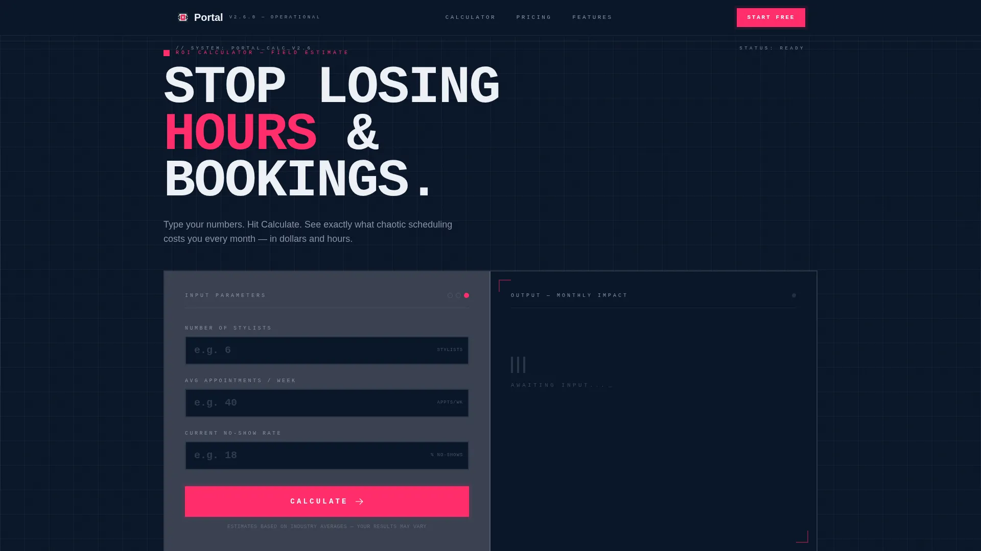
- A brutalist calculator block at the top that outputs personalized savings estimates in oversized pink type
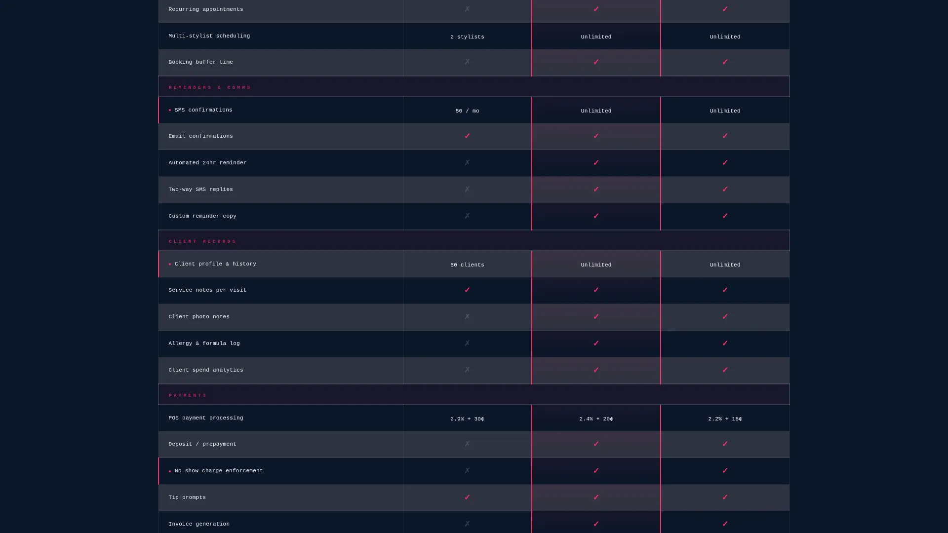
- A thick-bordered three-tier comparison table with binary feature indicators and hard numeric limits per tier
- Two distinct conversion paths: a three-field free sign-up form and an inline Pro trial expansion form
Feature list
This template covers six purpose-built components that work together across the page.
Brutalist Calculator Header
The page opens with a concrete-gray input block. Visitors enter their number of stylists, average appointments per week, and current no-show rate. One button press outputs hours saved per month, revenue recovered from no-shows, and cost per stylist per day in enormous hot pink type against the midnight background. The math does the selling before any feature is listed.
Three-Tier Comparison Table
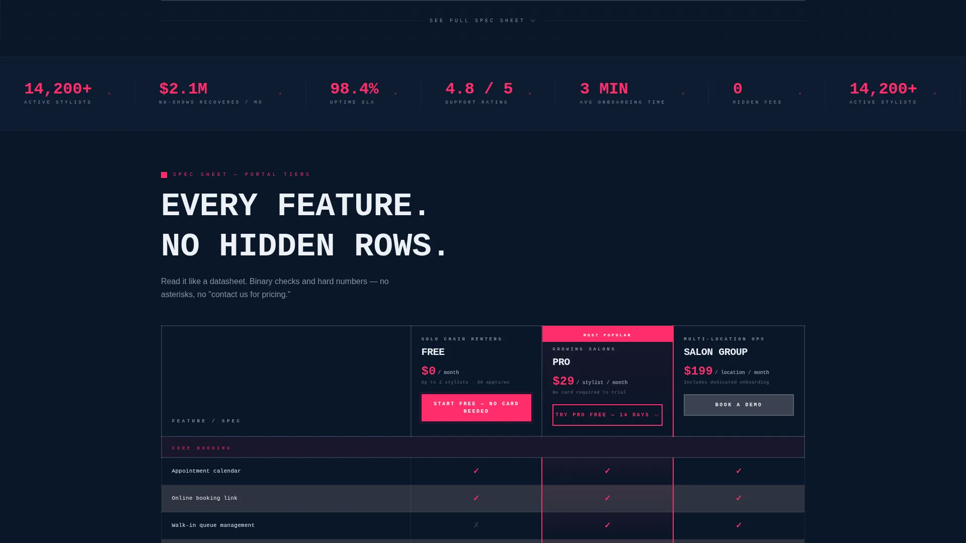
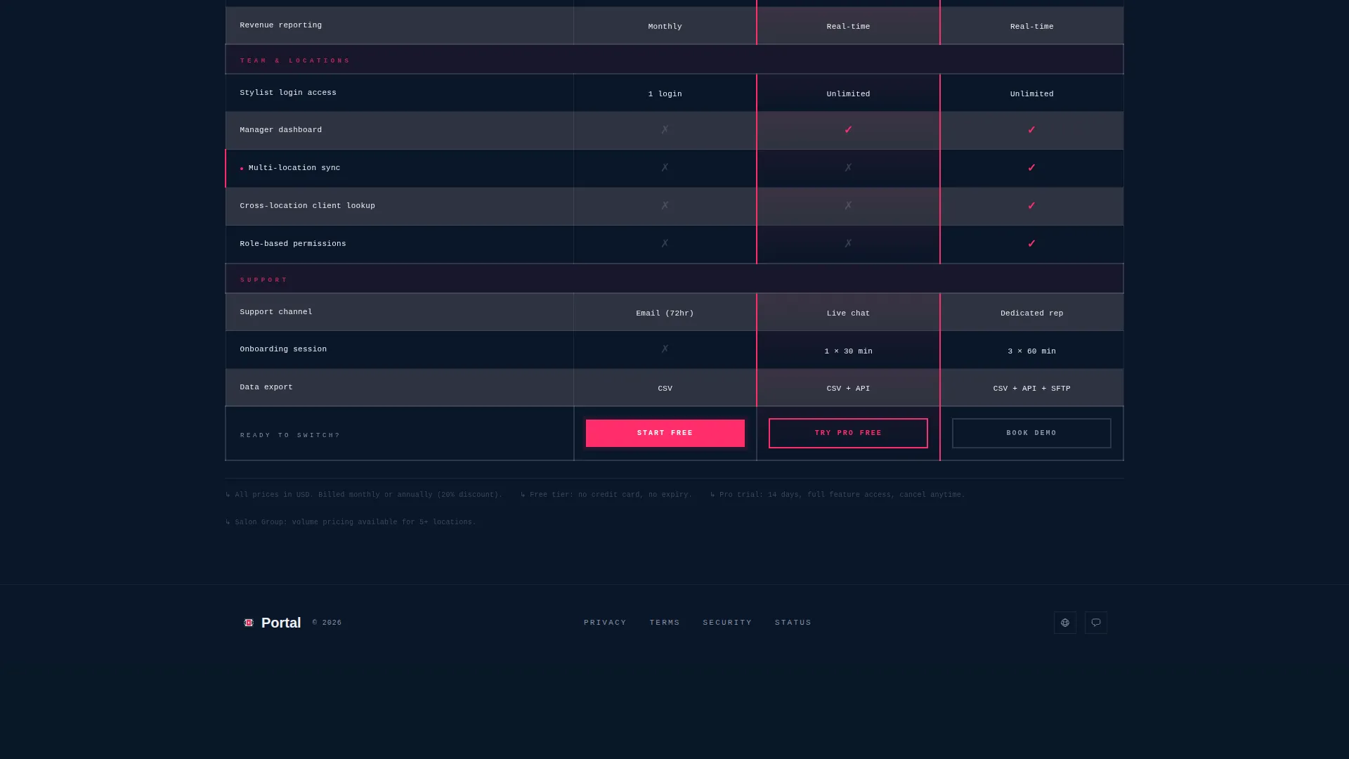
Below the calculator, the page becomes a structured product data sheet. Free, Pro, and Salon Group tiers are laid out in thick-bordered columns with feature rows reading like technical specifications. Cells contain binary check marks and hard numbers, not marketing language. Row alternation between the two background tones keeps the eye tracking cleanly down the page.
Dual Conversion Path Design
The primary call to action, "Start Free, No Card Needed," appears at the top of the calculator output and is pinned to the free-tier column footer. A secondary path sits at the Pro column header: "Try Pro Free for 14 Days," which expands inline to collect phone number and booking volume range for trial pre-configuration.
Low-Friction Signup Form
The free-tier signup form asks for exactly three fields: salon name, email address, and number of chairs. Nothing else. The form is designed to minimize drop-off at the moment of decision and get the visitor into the product as fast as possible.
Bold Brutalist Visual System
Typography is oversized and monospaced where possible, slammed flush-left against raw layout edges. There is no stock photography and no decorative imagery. Every visual element earns its place by serving a functional or conversion purpose within the layout.
Active Row and call to action Highlights
Hot pink is reserved exclusively for calls to action, toggle states, and active table row highlights. This strict color discipline means the visitor's eye is always pulled to the next action, whether that is reading a calculator result or clicking a sign-up button.
Page sections overview
| Section | Purpose |
|---|---|
| Calculator Input Block | Lets visitors enter their salon data and receive a personalized savings output |
| Calculator Results Display | Shows hours saved, revenue recovered, and daily cost per stylist in large pink type |
| Comparison Table Header | Introduces the three tiers with column labels and primary calls to action |
| Feature Specification Rows | Lists every feature as a technical spec with binary indicators and numeric limits |
| Free Tier call to action Footer | Pins the no-card-needed sign-up button to the bottom of the free column |
| Pro Trial Inline Expansion | Collects phone and booking volume to pre-configure a 14-day Pro trial |
Design & branding system
The visual identity is anchored in a Midnight Blue color palette with a single high-contrast accent. Every color choice is deliberate and load-bearing within the layout.
- Background uses abyssal navy (#0A1628), card surfaces and table rows use brushed gunmetal (#3A4150), and body text uses clinical white (#EDF0F5)
- Hot pink (#FF2D6B) appears only on calls to action, toggle states, and active row highlights, keeping the accent from losing its visual weight
- Typography is oversized and monospaced where possible, with all text set flush-left against hard layout edges and no decorative flourishes
Mobile & speed optimization
The template layout is built to stay readable and functional on smaller screens. The brutalist grid structure translates cleanly to narrower viewports without losing hierarchy.
- The comparison table is structured for horizontal scroll or column-collapse on mobile so no tier data is hidden
- The calculator input block and output display are sized for tap interaction, with the chunky button and large output type remaining legible at any viewport width
- No stock images or decorative photography are included, keeping the page visually lean and fast to render
How this template helps you convert
The conversion strategy is built into the page architecture, not added as an afterthought. Each section moves the visitor one step closer to signing up.
- The calculator personalizes the value proposition immediately. Visitors see their own numbers before they read a single feature row, which makes the free tier feel like an obvious, risk-free first step.
- The comparison table removes purchase hesitation by being fully transparent. Hard numbers and binary indicators leave no room for ambiguity, so visitors who reach the Pro column already understand exactly what they are getting.
- The dual sign-up path captures two intent levels in one page. Low-intent visitors take the three-field free path; high-intent visitors self-select into the inline Pro trial expansion without leaving the page.
Other information about this template
This template fits cleanly into a technology-category product page for a beauty and salon client portal. A few additional details are worth noting for builders evaluating it.
- The template style is a comparison table layout, which makes it well-suited for any SaaS or subscription product with tiered pricing
- The header concept is a calculator or estimator block, a format that works especially well for service businesses where time and cost savings are the primary purchase motivation
- The creative direction follows a spec sheet approach, meaning all content is written to inform rather than persuade with emotion
- The freemium or trial conversion direction means the page is optimized for volume sign-ups at the free tier, not for direct high-ticket closes
- This template is available on the same platform where Bold Brutalist design system templates and salon booking software landing page templates are catalogued
Theme
Bold Brutalist
Creative direction
Spec Sheet
Color system
Midnight Blue
Style
Comparison Table
Direction
Freemium/Trial
Page Sections
Brutalist Calculator Header Block
Three-tier Comparison Table
Dual Conversion Path Layout
Low-friction Three-field Form
Midnight Blue Visual Identity System
Active State and Call to Action Color Discipline
Related questions
Can I customize the calculator fields for my specific salon setup?
Does the comparison table support more than three tiers?
Is the inline Pro trial form separate from the main signup form?
Do I need design experience to use this template?
Who is this landing page template best suited for?



