Travel Client Portal Landing Page Template
Portal is a bold brutalist split-screen landing page template built for boutique travel agencies, destination management companies, and luxury concierge firms. It presents a client-facing portal concept with a Problem→Solution visual arc, a sky-blue and concrete-charcoal color system, a freemium trial conversion flow, and a three-field signup form, no credit card required.
by Rocket studio
Quick summary
Portal is a single-page, split-screen landing page template designed for travel client portal businesses. It uses a bold brutalist aesthetic, a Slate and Sky color system, and a Problem→Solution visual arc to guide visitors from pain to conversion. The primary call to action drives freemium trial signups with a minimal three-field form and a secondary live demo path.
Who this template is for
This template is built for travel professionals who manage complex, multi-trip client workflows and need a landing page that speaks directly to their audience's frustrations.
- Independent travel advisors managing twenty to fifty active trips simultaneously
- Destination management companies coordinating ground logistics across multiple time zones
- Luxury concierge firms whose clients expect real-time visibility without phone calls
What problem this template solves
Travel professionals lose client trust when trip details are buried in forwarded emails, scattered PDFs, and version-conflicted spreadsheets. This template gives you a landing page that names that pain clearly and presents your portal as the only logical solution.
- Cluttered inboxes and WhatsApp threads replace professional client communication
- Multi-leg itineraries break down when confirmations arrive from different sources
- Clients escalate complaints when they cannot find basic booking information on their own
What you get with this template
You get a complete, ready-to-customize single-page layout that walks visitors through an escalating problem arc and delivers them to a conversion form. Every section is structured and purposeful.
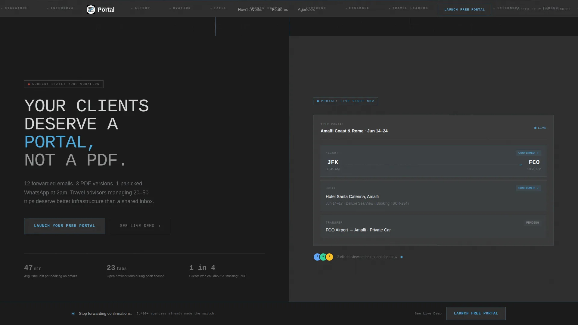
- A 50/50 split-screen layout pairing raw problem visuals on the left with clean portal user interface on the right
- A persistent bottom conversion bar that appears after the third scroll section
- A secondary demo path linking skeptical visitors to a pre-populated sample itinerary
Feature list
This template combines architectural visual design with a deliberate conversion strategy. Every feature below comes directly from the template brief.
Split-Screen Problem and Solution Layout
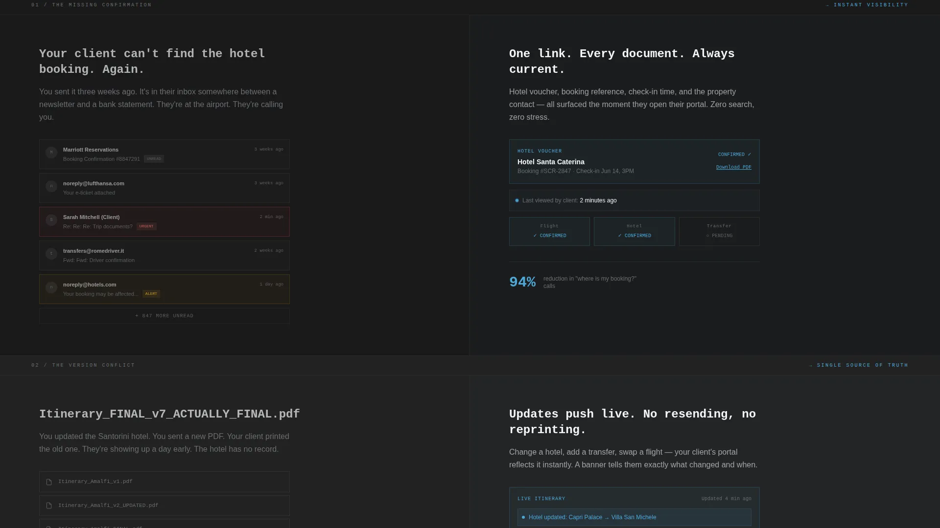
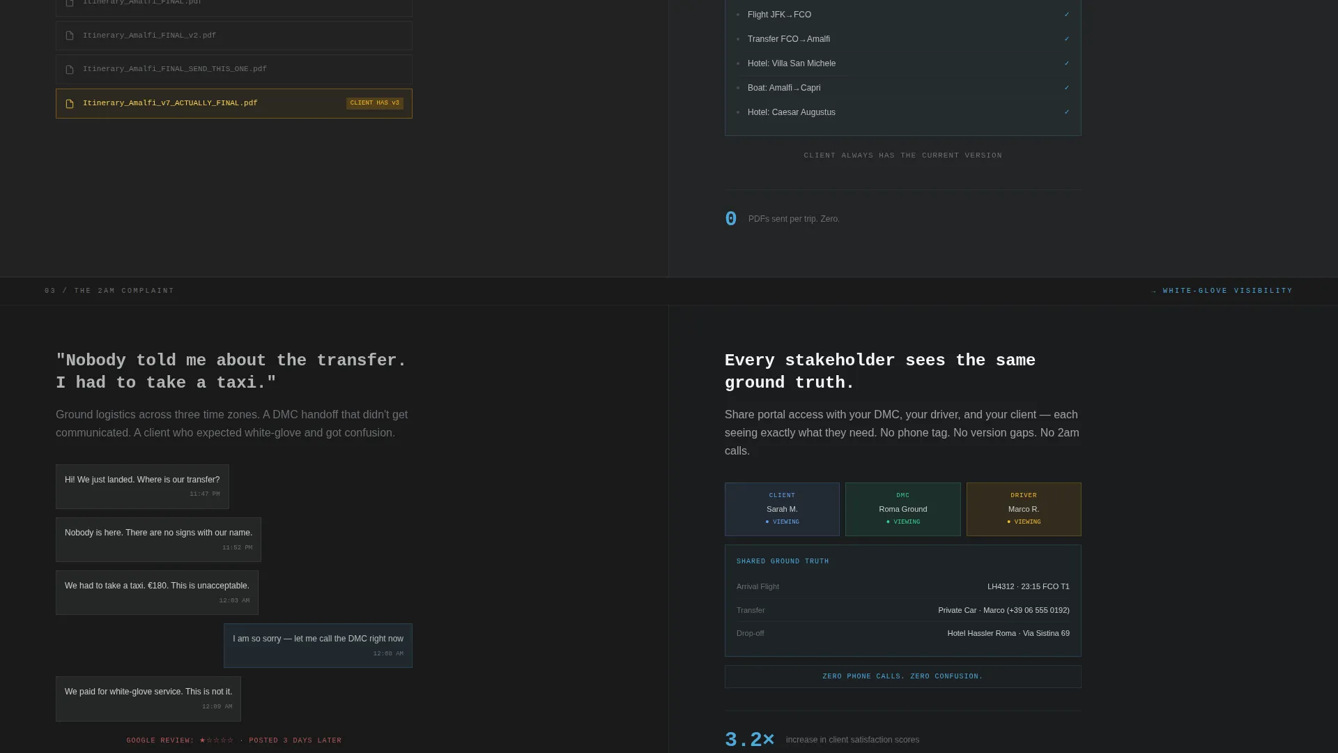
Each scroll section divides the screen equally. The left side displays an honest, confrontational representation of the problem. The right side reveals the portal equivalent with sky-blue accents. The contrast does the persuasion work without a single word of hype.
Escalating Visual Arc
The page is structured so stakes rise with every section. It moves from a single missing confirmation, to a multi-leg itinerary disaster, to a full client complaint. As problems escalate, the brutalist typography lightens and the sky-blue becomes more dominant, making the solution feel urgent.
Three-Field Freemium Conversion Form
The primary form collects business name, email address, and number of active trips via a slider from one to one hundred or more. No credit card, no phone number. The low friction matches the freemium positioning and removes every excuse to leave without signing up.
Persistent Bottom Conversion Bar
After the visitor passes the third scroll section, a fixed bottom bar displays the primary call to action. This keeps the offer visible without interrupting the arc. It reinforces the message at the exact moment the accumulated pain is heaviest.
Live Demo Secondary Path
Below the primary form, a secondary link reads "See a Live Demo Portal" and connects to a pre-populated sample itinerary. This path lets skeptical visitors experience the product before committing, reducing drop-off from buyers who need proof before trust.
Logo Bar Header
The header opens with a horizontal scroll of travel-tech and agency logos rendered in monochrome concrete gray against a full-width charcoal slab. No photography, no illustration. The logo bar establishes category credibility before a single line of body copy appears.
Page sections overview
| Section | Purpose |
|---|---|
| Logo Bar Header | Establishes travel-tech credibility with monochrome partner logos |
| Brutalist Hero Headline | Anchors the core message with oversized mono-spaced type |
| Primary call to action Block | Delivers the first "Launch Your Free Portal" call to action |
| Split Section One | Shows a cluttered inbox versus a clean portal confirmation view |
| Split Section Two | Contrasts a version-conflicted itinerary with organized multi-leg display |
| Split Section Three | Escalates to a client complaint scenario resolved by portal visibility |
| Signup Form | Captures business name, email, and active trip count with no card required |
| Live Demo Link | Offers a secondary path to a pre-populated sample itinerary |
| Persistent Bottom Bar | Keeps the primary call to action visible after the third scroll section |
Design & branding system
The visual identity follows a Bold Brutalist theme. Every design decision references architectural weight, raw material, and a single dramatic source of light.
- Color palette: poured-concrete charcoal (#2D2D2D) for backgrounds, exposed-aggregate gray (#6B6E73) for supporting text, open-sky blue (#4DA8DA) reserved exclusively for interactive elements and live-state indicators, and cirrus white (#F4F6F8) for content surfaces
- Typography: oversized mono-spaced type for headlines, grid-locked composition, and deliberately heavy spacing that references a brutalist concrete terminal
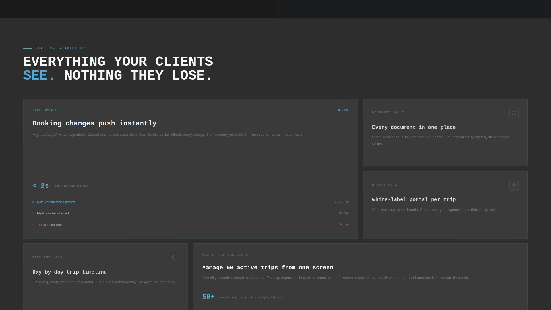
- As the visitor scrolls deeper, typography weight softens and sky-blue coverage increases, so the page literally brightens as the problems resolve
Mobile & speed optimization
The template is built with a layout system that translates naturally to smaller screens without losing the visual impact of the split-screen structure.
- The 50/50 split sections stack vertically on mobile so problem and solution remain legible in sequence
- The persistent bottom conversion bar remains accessible on touch devices throughout the scroll
- Mono-spaced headline type scales responsively to preserve the architectural weight at every viewport size
How this template helps you convert
The conversion strategy is baked into the structure of the page itself. Visitors are not asked to trust a claim, they are walked through their own pain until the offer feels inevitable.
- The escalating Problem→Solution arc builds accumulated emotional weight across three scroll sections, so the call to action arrives when visitor motivation is at its peak.
- The three-field form with no credit card requirement removes the most common objections at the moment of decision, and the live demo link catches visitors who need one more proof point before committing.
Other information about this template
This template is part of the Technology category under the Travel Digital Presence subcategory, specifically targeting the travel client portal niche. It is designed as a single landing page, not a multi-page site.
- The template style is Split Screen (50/50), a layout choice that enforces visual contrast between problem and solution without requiring custom illustration
- The creative direction is a Problem→Solution Arc, making it suitable for any SaaS or portal product that needs to demonstrate workflow improvement to a professional audience
- The Freemium/Trial landing page direction means the form and copy are calibrated for low-commitment first steps, not direct purchase
- The Bold Brutalist theme and Slate and Sky color system are distinct enough to stand out in a travel-tech marketplace where soft gradients and stock photography dominate
Theme
Bold Brutalist
Creative direction
Problem→Solution Arc
Color system
Slate & Sky
Style
Split Screen (50/50)
Direction
Freemium/Trial
Page Sections
Split-screen Problem and Solution Layout
Escalating Problem Arc
Three-field Freemium Signup Form
Persistent Bottom Conversion Bar
Live Demo Secondary Path
Logo Bar Header
Related questions
Can I customize the color palette in this template?
Does this template work for travel businesses outside the boutique or luxury segment?
What does the three-field signup form collect?
Is the live demo link pre-connected or do I set it up myself?
How many call-to-action placements does this template include?



