Sign & Banner Digital Presence Complete Professional Website Template
Portal is a single-page, hub-and-spoke landing page template built for sign shop client portals. It uses a Data Command visual theme with an Acid Digital color system to present real-time order tracking, proof approval, and install scheduling in one focused screen. The page flows toward an app download call to action, turning first-time visitors into confident app users.
by Rocket studio
Quick summary
Portal is a hub-and-spoke landing page template designed for sign shop client portals. It showcases real-time order tracking, proof approval, and install scheduling through an immersive Data Command visual theme. Anchor navigation locks to the left rail, guiding visitors through six capability sections before landing on a clear app download call to action.
Who this template is for
This template is built for sign shops that want to show clients exactly what their portal can do before the app is even downloaded. It speaks directly to the coordinators and managers who live or die by deadline visibility.
- Franchise marketing coordinators managing signage rollouts across dozens of locations
- Event producers running tight banner timelines who cannot afford proof errors
- Property managers cycling seasonal graphics across multiple storefronts
What problem this template solves
Sign shop clients make "where's my order?" calls because they have no visibility. This template replaces that anxiety with a landing page that demonstrates real-time status at a glance, building trust before a single login.
- Clients have no way to track proof approval, production progress, or install crew status without calling
- Franchise and multi-location buyers need a portal that can scale, and they need to see that proof upfront
- Decision-makers on desktop hesitate to tap app store badges, so the page offers a direct "Text Me the Link" path
What you get with this template
You get a fully structured, single-page landing page built around six anchor-navigated sections. Every section is a two-column breakdown pairing an annotated screenshot with capability details.
- A sticky anchor navigation rail with six spokes: Order Tracking, Proof Approval, Reorder, Multi-Location, Invoicing, and Install Scheduling
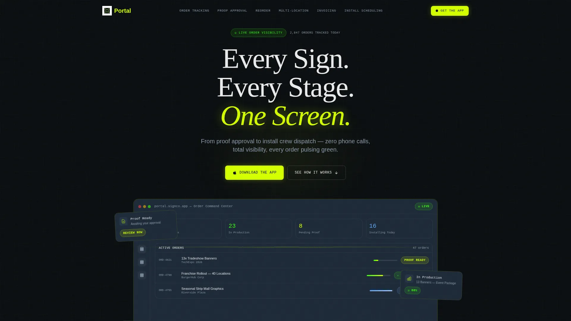
- A header section with a hero product screenshot showing three active orders at different stages, plus a headline that fades in on load
- A dual-path call-to-action block with App Store and Google Play badges alongside a phone number input field labeled "Text Me the Link"
Feature list
This template delivers six purpose-built sections and a set of visual and interactive design choices grounded in the Data Command theme.
Sticky Anchor Navigation Rail
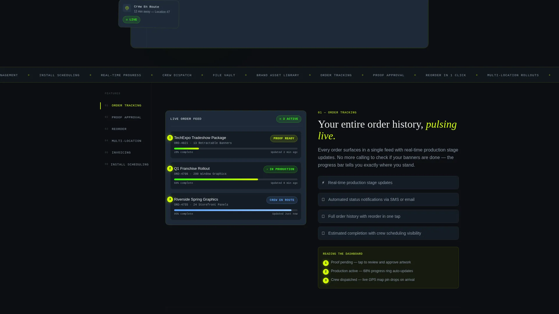
Six spoke labels lock to the left rail on scroll. Clicking any label smooth-scrolls the visitor to the matching capability section, keeping orientation clear on a long single-page layout.
Animated Product Screenshot Header
The header drops visitors into a pixel-perfect portal dashboard render showing three live orders at different stages. A chartreuse glow bleeds from the screenshot edges, and the headline fades in above it on page load.
Two-Column Feature Matrix Sections
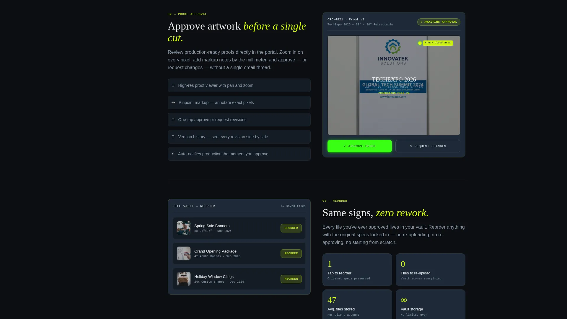
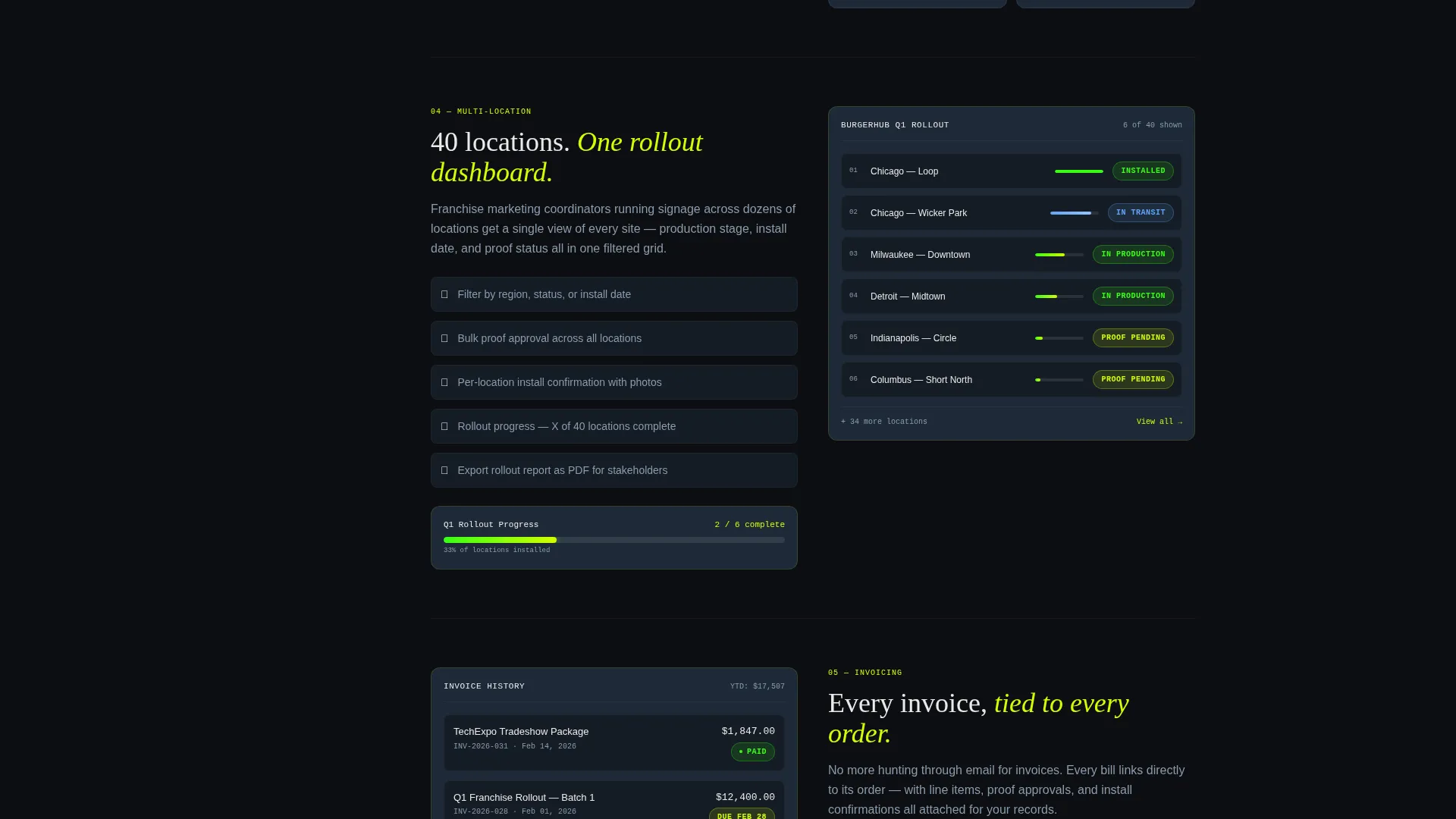
Each of the six capability sections uses a side-by-side layout: an annotated screenshot on one side and a spec breakdown on the other. Complexity escalates from a single banner reorder up to a two-hundred-location franchise rollout.
Scroll-Triggered Micro-Animations
As each feature section enters the viewport, progress bars fill, status badges flip, and map pins drop into position. These animations reinforce the live-portal feeling without requiring a real backend connection.
Dual-Path App Download Block
The primary call to action pairs App Store and Google Play badges. A secondary input field labeled "Text Me the Link" captures visitors who prefer not to tap a badge on desktop, reducing drop-off at the conversion point.
Data Command Color System
Void black, electric chartreuse, terminal phosphor green, cool slate, and bleached white work together so only the signals that matter stand out. Status indicators and progress bars use the brightest tones while background elements recede.
Page sections overview
| Section | Purpose |
|---|---|
| Header Hero | Introduce the portal with an animated product screenshot and headline |
| Anchor Nav Rail | Lock six spoke labels to the left for persistent scroll navigation |
| Order Tracking | Show real-time status bars and active order stages |
| Proof Approval | Demonstrate the proof review and approval flow with annotations |
| Reorder Section | Highlight one-tap reorder capability with a screenshot walkthrough |
| Multi-Location View | Prove the portal scales to franchise-size rollouts |
| Invoicing Section | Present invoice access and billing status within the portal |
| Install Scheduling | Show install crew dispatch, map pins, and crew en-route status |
| App Download call to action | Drive downloads via store badges and "Text Me the Link" input |
Design & branding system
The Acid Digital color system gives this template a radar-screen quality. Every color decision is intentional: backgrounds recede, signals pop, and the eye goes exactly where the action is.
- Void black (#0B0E11) as the primary background, cool slate (#1E2A38) for card surfaces, and bleached white (#EAEAEA) for body text keep the layout dark and focused
- Electric chartreuse (#D4FF00) marks live-status indicators and primary action elements, while terminal phosphor (#39FF14) signals success states and fills progress bars
- The screenshot hero uses a subtle chartreuse edge glow to make the portal feel live and energized rather than static
Mobile & speed optimization
The template is built with a single-page, section-led layout that keeps the experience streamlined on any screen size. The anchor nav and two-column sections are structured to adapt cleanly for mobile visitors.
- The sticky anchor navigation collapses gracefully on smaller screens so it does not obstruct content
- Scroll-triggered animations are scoped to section entry points, keeping the page feeling responsive rather than overloaded
- The dual-path call-to-action block stacks vertically on mobile, placing the "Text Me the Link" field prominently for on-the-go visitors
How this template helps you convert
The page earns the app download by letting visitors experience the portal's value before they ever tap a badge. Every design and layout decision reduces hesitation and builds momentum toward that final action.
- The annotated screenshot header puts three live orders in front of visitors immediately, creating a "this is exactly what I need" moment before any scrolling begins
- The escalating feature matrix sections walk visitors from simple reorders to full franchise rollouts, so buyers at every scale see themselves in the product
- The "Text Me the Link" secondary path removes the single biggest friction point for desktop visitors who want the app but won't tap a store badge from a browser
Other information about this template
Portal fits naturally into any sign shop's client-facing digital presence. It is designed as a standalone landing page rather than a multi-page website, so it deploys quickly and focuses visitor attention without distraction.
- The template style is Hub and Spoke with Anchor Navigation, a structure that works well for feature-rich portals with distinct capability categories
- The header concept is a Product Screenshot, which is a proven pattern for app and portal landing pages because it answers "what does this actually look like?" before the visitor has to ask
- Creative direction follows a Feature Matrix pattern, meaning each section builds on the last and the page tells a coherent capability story from top to bottom
- This template is categorized under Technology with a Sign and Banner Digital Presence subcategory, making it a focused choice for the sign industry's move toward client self-service tools
Theme
Data Command
Creative direction
Feature Matrix
Color system
Acid Digital
Style
Hub & Spoke (Anchor Nav)
Direction
App Download
Page Sections
Sticky Anchor Navigation Rail
Animated Product Screenshot Header
Two-column Feature Matrix Layout
Scroll-triggered Micro-animations
Dual-path App Download Block
Data Command Color System
Related questions
What kind of business is this template built for?
Does this template need live order data or a backend connection to work?
What is the "Text Me the Link" input field for?
Can the anchor navigation be adjusted to fewer or more sections?
Who are the target users shown in this template's messaging?



