Seamless API Gateway Landing Page Template
Endpoint is a scroll reveal landing page template built for API management research labs. It leads with a live-style dashboard header, animates statistics into view as visitors scroll, and drives sign-ups through a searchable directory gate. The design uses a deep terminal color palette that makes data feel authoritative and immediately trustworthy.
by Rocket studio
Quick summary
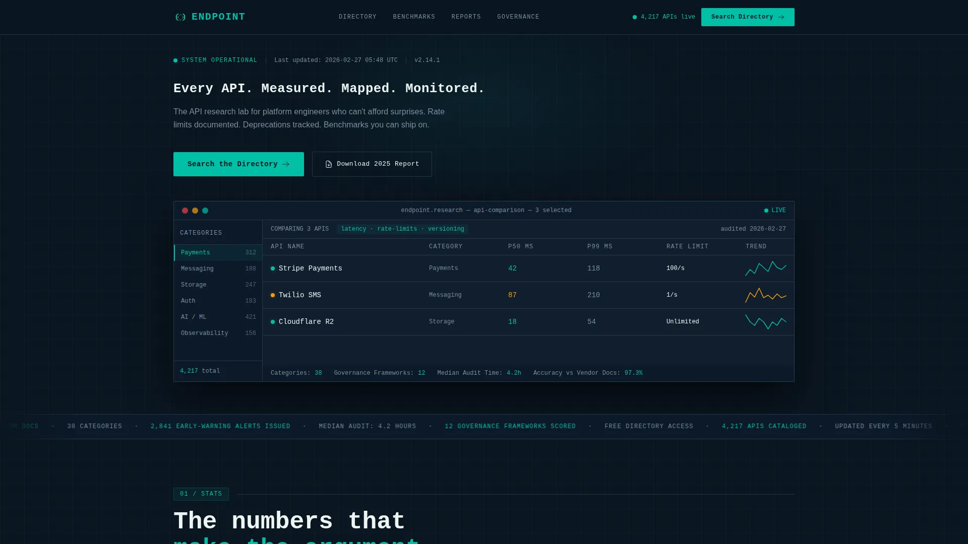
Endpoint is a single-page, scroll reveal landing page template for an API management research lab. It opens with an animated dashboard panel showing cataloged API counts, category filters, and latency benchmarks. Data blocks animate into view before explanatory copy, building authority through evidence. Two clear calls to action guide visitors toward a free directory and a downloadable report.
Who this template is for
This template is built for technical teams and research-focused organizations that need to present API intelligence with credibility. The layout speaks directly to people who evaluate infrastructure decisions under pressure.
- Platform engineers assessing third-party integrations and dependency risks
- Developer advocates producing API comparison guides and benchmarking content
- CTOs and technical leads weighing build-versus-buy decisions for microservice dependencies
What problem this template solves
Most landing pages for technical tools bury the evidence under marketing copy. Visitors with high technical fluency leave before trust is established. This template reverses that order entirely.
- It front-loads raw data so skeptical engineers see proof before they read a single sales sentence
- It structures scroll reveals to deliver statistics first, then context, removing friction for data-driven evaluators
- It gates the full directory behind a low-commitment free-access prompt rather than a hard paywall
What you get with this template
You get a fully structured scroll reveal landing page designed around the visual logic of a monitoring dashboard. Every section earns its place before the next one loads.
- An animated header dashboard panel with API counts, category filters, a comparison table, sparkline charts, and health-status indicators
- Progressive stat reveals with count-up animations, racing bar charts, row-by-row table population, and a region-by-region coverage map
- Two conversion pathways: a primary directory search gate and a secondary report download capture
Feature list
This section covers the core built-in capabilities delivered with the Endpoint template.
Animated Dashboard Header Panel
The header mimics a live monitoring tool. It shows a left sidebar with category filters, a main comparison table with three APIs side-by-side, sparkline latency charts, and colored health-status dots. A monospace headline types itself character by character above the panel.
Scroll Reveal Data Blocks
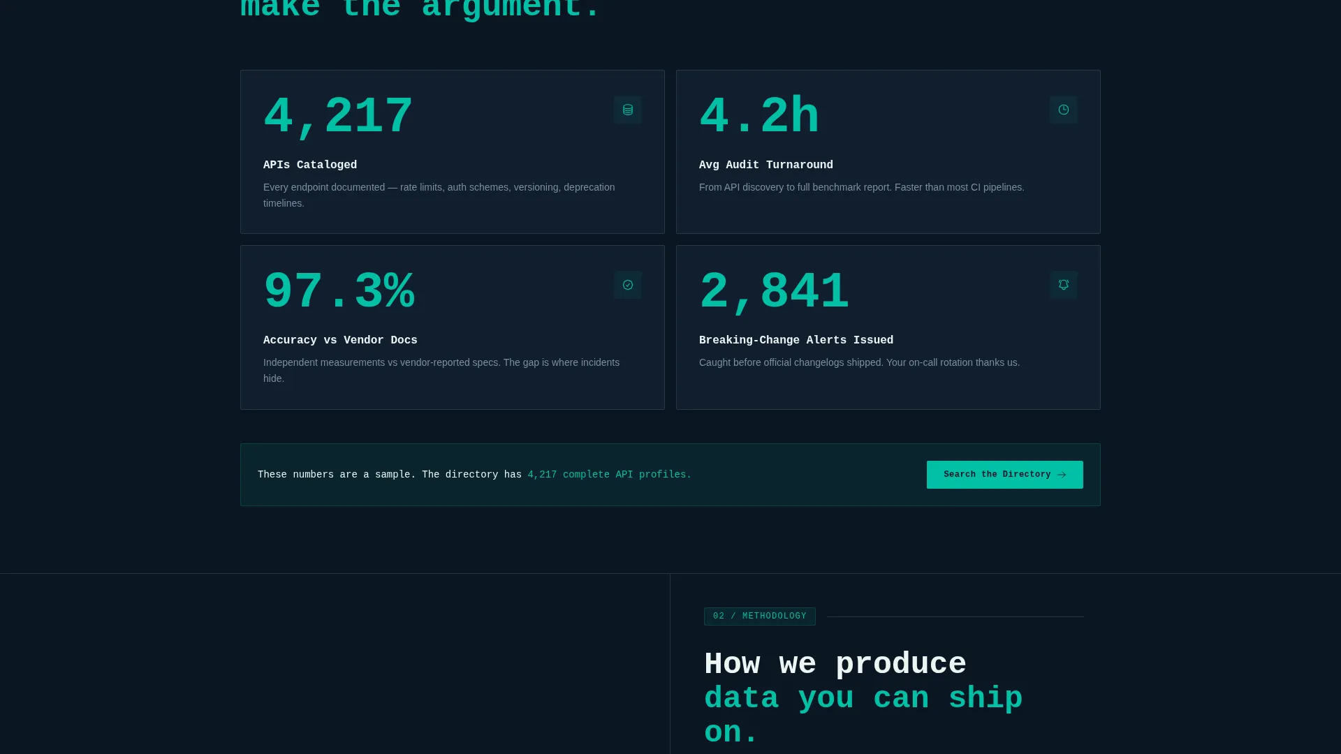
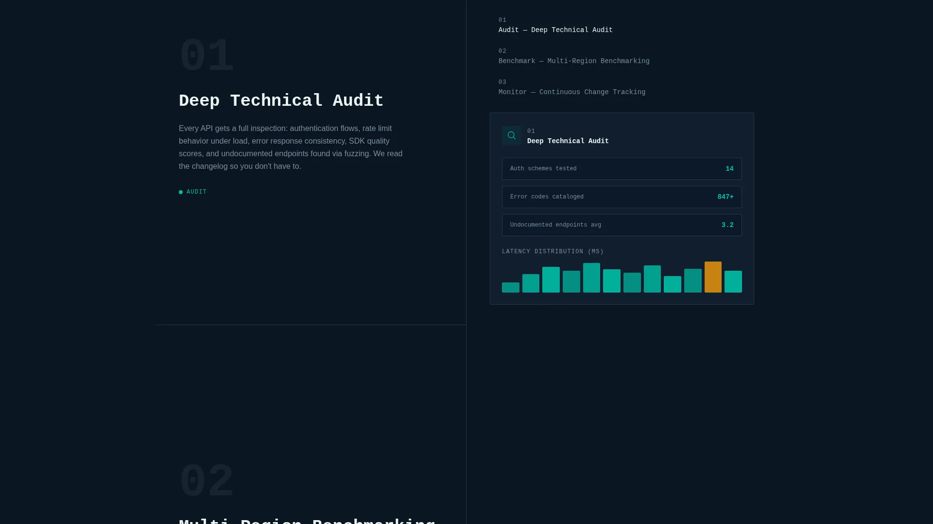
Each scroll position drops a new data block into view in a fixed sequence. The number appears first in large teal monospace type. A context sentence fades in beneath it. Then a supporting visualization builds itself, whether a bar chart, a comparison table, or a coverage map.
Count-Up Stat Animations
Key metrics animate upward to their final values as they enter the viewport. This draws the eye to numbers like total APIs cataloged, audit turnaround averages, and accuracy percentiles, making each figure feel earned rather than static.
Repeating Primary Call to Action
The "Search the Directory" button appears in the header dashboard and resurfaces after every third stat reveal. This spaced repetition builds familiarity before asking for commitment, reducing friction at the conversion point.
Secondary Lead Capture Prompt
A second call to action, "Download the 2025 API Landscape Report," targets higher-intent visitors willing to exchange an email address. It sits naturally within the scroll flow without interrupting the data narrative.
Teal Catalyst Color System
Interactive states, hover effects, and live-data accents all use primary teal. Muted slate builds card depth. Deep terminal black recedes so numbers breathe. Every color choice serves legibility and data clarity over decoration.
Page sections overview
| Section | Purpose |
|---|---|
| Dashboard Header Panel | Opens with animated API metrics and typed monospace headline |
| First Stat Reveal | Displays total APIs tracked with count-up animation |
| Supporting Bar Chart | Races into view to visualize category distribution |
| Comparison Table Block | Populates row by row with side-by-side API data |
| Coverage Map Section | Lights up regions progressively to show audit reach |
| Repeating call to action Block | Resurfaces "Search the Directory" button after stat sets |
| Report Download Section | Captures emails via landscape report secondary offer |
Design & branding system
The Teal Catalyst color system is built for data-dense interfaces that need to communicate reliability without decoration. Every visual decision reinforces the feeling of a well-maintained internal infrastructure dashboard.
- Deep terminal black (#0B1622) as the base background so teal and white data points stand out clearly
- Primary teal (#00BFA6) for interactive states, hover effects, health-status indicators, and live-data accents
- Muted slate (#3B4A5C) for card surfaces and secondary containers, creating layered depth across the comparison panels
- Sharp catalyst white (#EDF5F3) for all primary typography and key data point values
Mobile & speed optimization
The template is designed to keep the scroll reveal experience coherent across screen sizes. Animation sequences and card layouts adapt to narrower viewports without losing the data-first narrative.
- Stat blocks and comparison panels reflow to single-column layouts on smaller screens
- Count-up animations and chart builds are triggered by scroll position, keeping interactions meaningful at any viewport width
- The repeating call-to-action placement is preserved across breakpoints so conversion touchpoints remain accessible throughout the scroll
How this template helps you convert
The page is structured specifically to earn trust through evidence before asking anything of the visitor. Conversion is the natural result of the scroll experience, not an interruption.
- The dashboard header delivers immediate data density, so visitors with high technical fluency recognize the lab's depth within seconds of landing on the page.
- Repeating the primary call to action after every third stat reveal creates familiarity without pressure, making the directory feel like a logical next step rather than a sales push.
- The secondary report download targets a different intent layer, capturing researchers who want to study the data offline, widening the conversion surface without diluting the primary goal.
Other information about this template
This template is part of the Directory and Discovery theme family, pairing well with tools that present large, searchable datasets in a research or cataloging context. It is built with the Stats-First Impact creative direction in mind, meaning data visualization drives the narrative structure rather than supporting it.
- Template style: Scroll Reveal (Progressive), meaning each content block enters the viewport in a deliberate sequence
- Header concept: Dashboard Preview, using a monitoring-tool layout rather than photography or illustration
- Landing page direction: Click-Through, optimized to move visitors into a free-access searchable API directory
- No stock photography is used anywhere in the layout; all visual content is data-driven
- The monospace typeface used in the header headline and stat figures reinforces the terminal and infrastructure aesthetic throughout
Theme
Directory & Discovery
Creative direction
Stats-First Impact
Color system
Teal Catalyst
Style
Scroll Reveal (Progressive)
Direction
Click-Through
Page Sections
Animated Dashboard Header Panel
Scroll Reveal Data Blocks
Count-up Stat Animations
Repeating Primary Call to Action
Secondary Report Download Capture
Teal Catalyst Visual System
Related questions
Who is the primary audience for this landing page template?
Can I customize the statistics and data shown in the dashboard header?
Does this template include actual API data or directory functionality?
How does the scroll reveal animation sequence work?
Is this template suited for a team still building its API catalog?



