Hotel & Resort Multi-Property Portfolio Website Template
A split-screen hotel and resort portfolio landing page built around a dark Carbon Fiber palette and a structured Feature Matrix layout. Tab-switched property views, champagne gold highlights, and a bottom-bar app download prompt work together to guide visitors from casual browsing to booking intent. Designed for travel advisors, frequent travelers, and couples planning destination stays.
by Rocket studio
Quick summary
This is a single-page portfolio landing page for hotel and resort collections. It uses a 50/50 split-screen layout, a Feature Tab Switcher header, and a scrolling Feature Matrix to present properties in a structured, catalog-style flow. The Carbon Fiber color system keeps the visual tone dark and refined, with champagne gold reserved for interactive moments and calls to action.
Who this template is for
This template is designed for anyone who needs to present a curated collection of hotels or resorts in a visually authoritative way. It suits both commercial and advisory contexts where the presentation of property details must feel premium and organized.
- Travel advisors who build destination itineraries and need a polished client-facing directory
- Boutique hotel brands or resort groups presenting a multi-property portfolio to discerning guests
- Couples or frequent travelers who want a browsable, well-structured property comparison experience
What problem this template solves
Most hotel portfolio pages feel flat or cluttered. They either list properties in generic grids or bury key details inside slow-loading gallery pages. This template solves the comparison problem by structuring every property view around the same consistent matrix, so visitors can scan quickly and decide with confidence.
- Visitors can compare amenities, star ratings, and nightly rates without navigating away from the page
- The tab-switched header removes decision paralysis by organizing properties into clear categories upfront
- The app download flow is earned gradually, surfaced only after the directory has already demonstrated its depth
What you get with this template
You get a fully structured single-page layout built around the Directory and Discovery theme. Every section is designed to move visitors from passive browsing to active interest, with visual consistency throughout.
- A Feature Tab Switcher header with three property category tabs and full-bleed split-screen views
- A scrolling Feature Matrix with consistent columns for region, experience type, and price tier
- A slim bottom-bar call to action and a two-field app download form with a device toggle
Feature list
This template includes purpose-built components tied directly to the hotel and resort portfolio use case. Each one is described below.
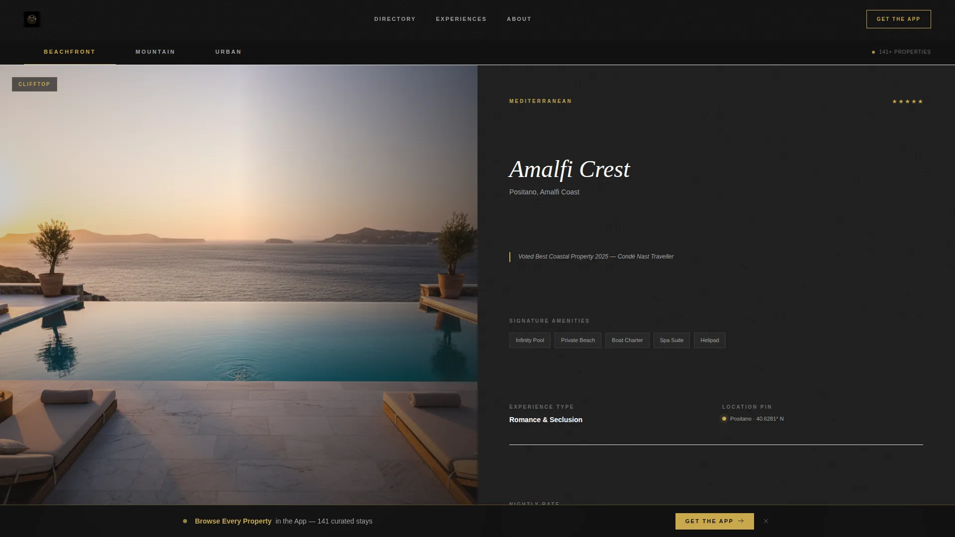
Feature Tab Switcher Header
Three horizontal tabs labeled "Beachfront," "Mountain," and "Urban" sit across the top of the viewport. Each tab triggers a full-bleed 50/50 split: cinematic property photography on the left, and a tight feature matrix on the right with amenity icons, star count, nightly rate range, and a micro-map pin. The active tab is highlighted in champagne gold; inactive tabs recede into graphite. Tab switches are instant, with no fade transition.
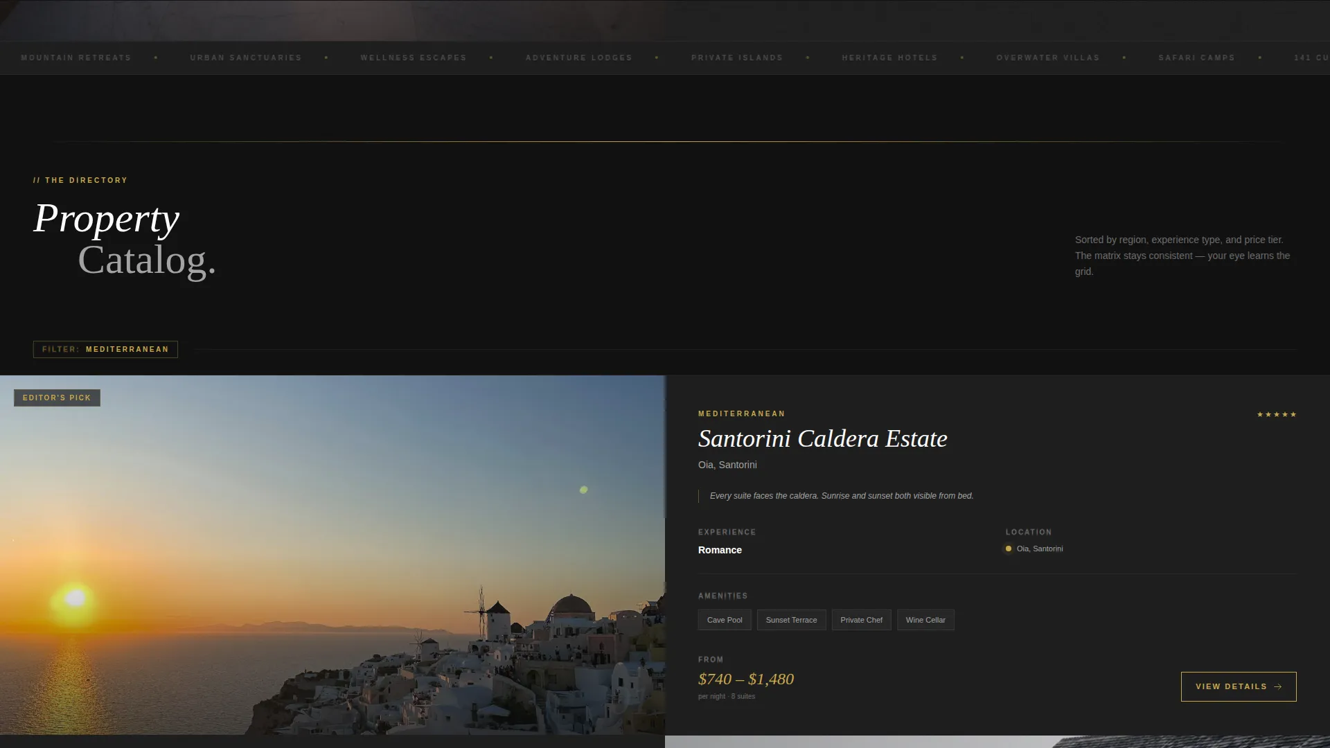
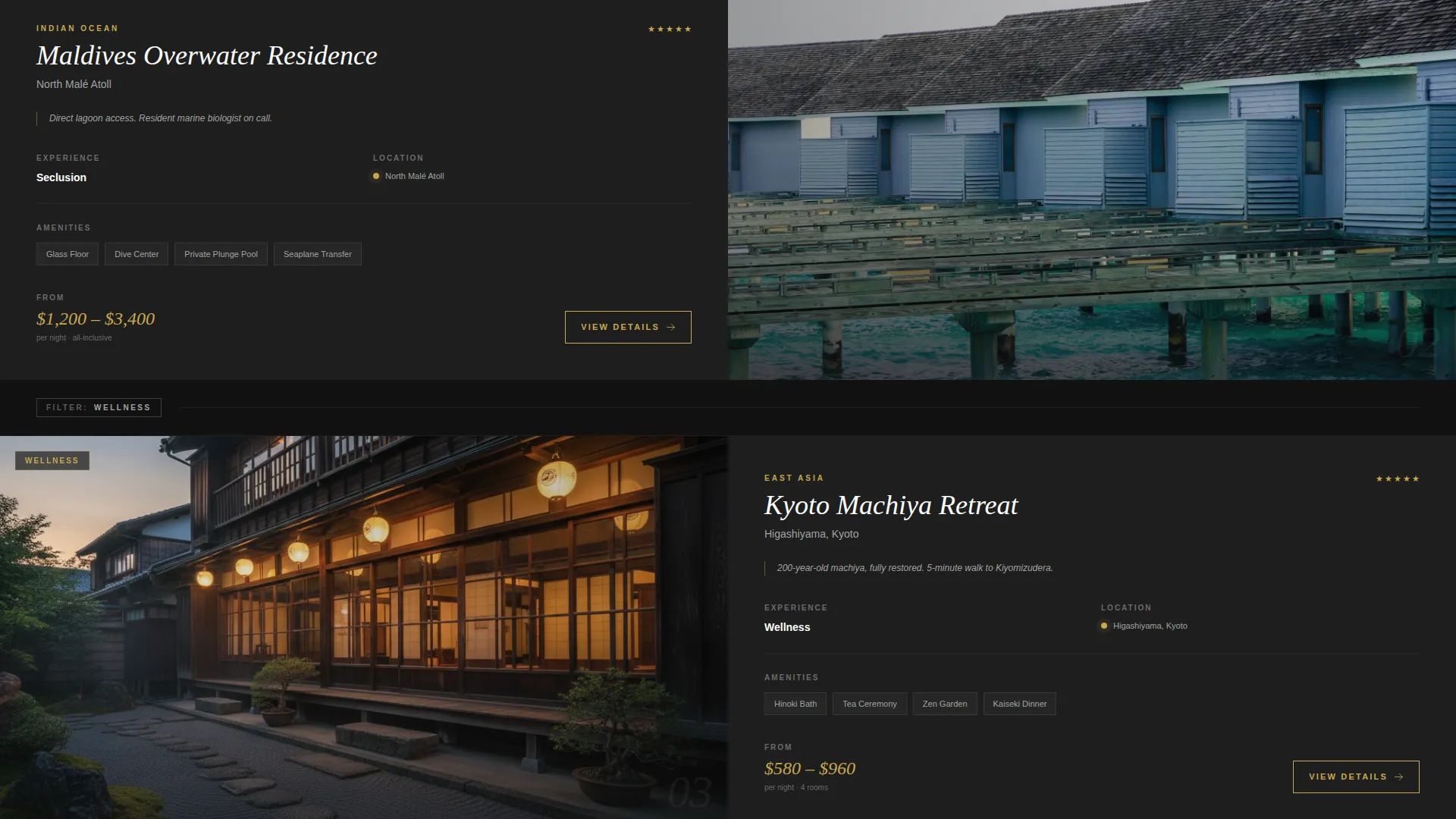
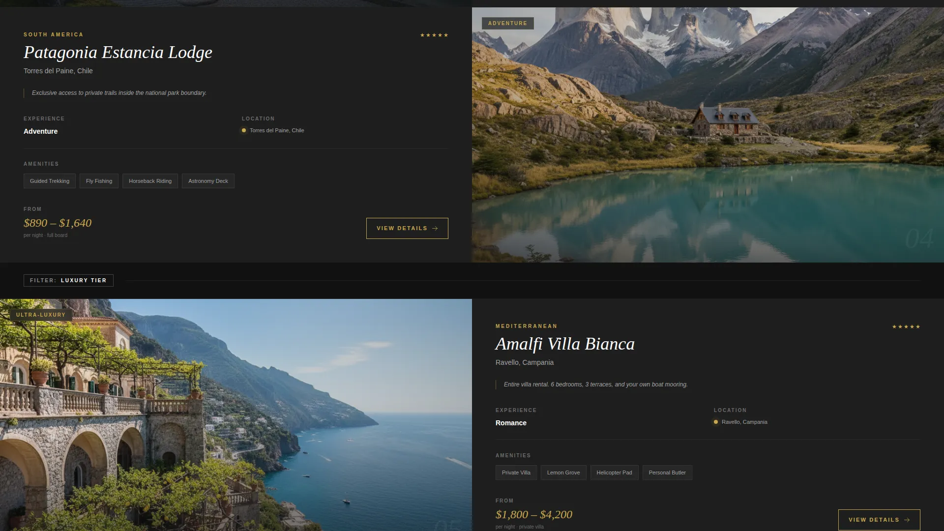
Scrolling Feature Matrix
Below the header, properties stack in split-screen pairs with photography on the left and specifications on the right. Each row introduces a new filter dimension: first by region, then by experience type such as wellness, adventure, or romance, then by price tier. The consistent column structure lets visitors scan faster with every scroll, building a catalog rhythm that feels organized and satisfying.
Guest Photo Carousel
Midway through the matrix, a horizontal carousel breaks the grid with guest-submitted photography. The images are raw, warm, and slightly imperfect by design. This section injects a human contrast before the matrix resumes with premium property rows, balancing editorial precision with authentic warmth.
Pinned App Download Bar
A slim bottom bar appears after the second scroll, carrying the primary call to action: "Browse Every Property in the App." The bar is pinned to the bottom of the viewport and styled in champagne gold on black. Tapping it reveals a two-field form requiring only an email address and a device toggle for iOS or Android.
QR Code Secondary Path
Alongside the final property row, a scannable QR code offers a direct path to the app. The accompanying line reads "Scan to start packing." This secondary conversion path captures visitors who prefer not to fill out a form and reinforces the app value without interrupting the scroll.
Carbon Fiber Visual System
The entire page is built on a four-tone palette: deep cockpit black at #121212 for backgrounds, woven graphite at #1E1E1E for surface layers, brushed titanium at #A3A3A3 for body text, and champagne gold at #C9A84C for interactive highlights, star ratings, and call-to-action borders. Property names and prices are set in champagne gold to draw the eye directly to key decision details.
Page sections overview
| Section | Purpose |
|---|---|
| Tab Switcher Header | Organizes properties into Beachfront, Mountain, and Urban tabs with split-screen views |
| Feature Matrix Rows | Stacks property pairs with consistent spec columns across region, experience, and price |
| Guest Photo Carousel | Breaks the grid with warm, human imagery to add authenticity mid-scroll |
| Pinned Download Bar | Delivers the app download call to action after visitor engagement is established |
| Final Property Row | Closes the directory with premium listings and a QR code secondary conversion path |
Design & branding system
The visual identity follows a Directory and Discovery theme expressed through the Carbon Fiber color system. Dark surfaces absorb light while metallic accents catch it, creating a contrast that makes property photography feel like illuminated windows against a dark cityscape.
- Backgrounds use deep cockpit black (#121212) and woven graphite (#1E1E1E) to keep focus on property content
- Brushed titanium (#A3A3A3) handles body text and labels; champagne gold (#C9A84C) marks names, prices, star ratings, and interactive borders
- Property photography is shot wide in natural golden-hour light with no people, giving each image a cinematic, place-first quality
Mobile & speed optimization
The split-screen layout is designed with touch-based browsing in mind. The pinned bottom bar and tab switcher both translate naturally to smaller viewports where thumb navigation dominates.
- The slim bottom bar is viewport-pinned and remains accessible throughout the scroll on mobile screens
- The two-field app download form is kept intentionally minimal to reduce friction on touch devices
- The QR code path provides an additional conversion option that works seamlessly on desktop without disrupting the mobile flow
How this template helps you convert
The conversion strategy in this template is deliberate and sequenced. Visitors are not asked to act before they have had a chance to engage with the directory.
- The Feature Tab Switcher delivers an immediate first impression, letting visitors self-select by property category before they scroll a single pixel
- The Feature Matrix builds comparison momentum across the scroll, so visitors arrive at the bottom bar already invested in the depth of the collection
- The pinned app download bar and QR code close the page with two low-friction paths, letting visitors choose the conversion method that suits them best
Other information about this template
This template is categorized under Hotel and Resort Website Templates in the Technology category. It is built as a single-page landing page in a Split Screen (50/50) format, making it well suited for portfolio-style directories that need to present multiple properties without requiring multi-page navigation.
- The template style and color system are consistent with first-class and luxury hospitality branding conventions
- The page is designed to support a mobile app promotion flow, making it a practical fit for travel brands with an existing or planned app product
- The niche focus is specifically the Hotel and Resort Portfolio Page use case, where property comparison and discovery are the primary visitor goals
Theme
Directory & Discovery
Creative direction
Feature Matrix
Color system
Carbon Fiber
Style
Split Screen (50/50)
Direction
App Download
Page Sections
Feature Tab Switcher Header
Scrolling Feature Matrix
Guest Photo Carousel
Pinned App Download Bar
QR Code Conversion Path
Carbon Fiber Visual System
Related questions
Who is this landing page template designed for?
Can I customize the property category tabs?
What does the app download flow include?
Is the Feature Matrix layout consistent across all property rows?
What color palette does this template use?


