AI for Pet Care Booking Website Template
Fetch is a split-screen landing page template built for pet care AI scheduling assistants. It uses a dark Carbon Fiber visual system and a Problem→Solution Arc layout to show visitors exactly why their current booking process is broken, and what a smarter alternative looks like. Every scroll panel pairs chaos on the left with clarity on the right.
by Rocket studio
Quick summary
Fetch is a single-page, split-screen landing page template designed for AI-powered pet care scheduling tools. It guides visitors through a side-by-side comparison of manual booking chaos versus intelligent, automated scheduling. The dark Carbon Fiber palette and signal green call-to-action elements create a focused, high-trust environment that moves multi-service pet care business owners toward converting.
Who this template is for
This template is built for teams selling or showcasing AI scheduling software aimed at the pet care industry. It speaks directly to the operational pain of running a busy, multi-service facility.
- Boarding kennel owners juggling multiple calendars across daily and overnight stays
- Mobile grooming fleet dispatchers coordinating staff across shifting daily routes
- Veterinary office managers balancing same-day urgent appointments with recurring wellness visits
What problem this template solves
Pet care businesses often rely on a patchwork of sticky notes, generic calendar apps, and phone calls to manage complex, overlapping schedules. That fragile system breaks down under real volume. This template is designed to make that pain visceral and visible for every visitor who lands on the page.
- Double-bookings, no-show gaps, and missed callbacks cost revenue and trust
- Dispatching groomers or walkers manually creates last-minute bottlenecks and errors
- Generic scheduling tools cannot anticipate conflicts or fill cancellations automatically
What you get with this template
You get a complete, conversion-focused landing page layout with a structured narrative arc built in. Every section is ready to populate with your product's content.
- A full split-screen (50/50) layout with a Problem→Solution Arc driving the scroll flow
- A sticky call-to-action bar that activates after the second scroll with a two-field sign-up form
- A secondary video path offering a 90-second side-by-side booking scenario comparison
Feature list
This template packages several purposeful design and layout features. Each one is drawn directly from the brief and serves a specific role in the conversion journey.
Split-Screen Problem and Solution Layout
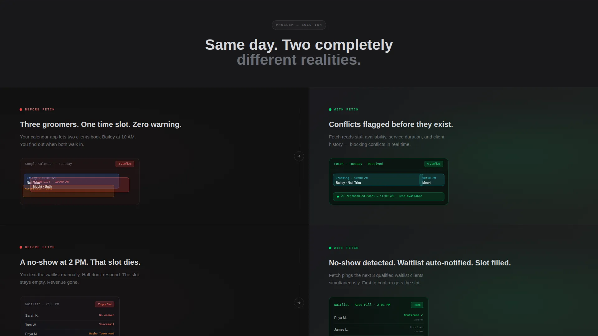
Every section is divided 50/50. The left panel shows a broken, manual scheduling scenario. The right panel reveals the AI-powered resolution. This rhythm of tension and relief repeats across every scroll section, building a cumulative case for switching.
Product Screenshot Header
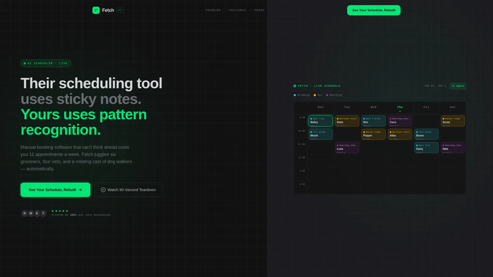
The right half of the viewport opens with a pixel-perfect weekly grid view. Columns run Monday through Saturday. Rows display color-coded appointment blocks: teal for grooming, amber for vet visits, and violet for boarding check-ins. A ghost cursor mid-drag completes the live-dashboard illusion.
Comparison Conversion Path
The primary call-to-action reads "See Your Schedule, Rebuilt" and appears in signal green at the base of every split panel. A slim sticky bar carries the same call-to-action after the second scroll. Clicking opens a two-field form asking for business name and current scheduling tool via dropdown.
Smart Waitlist and No-Show Sections
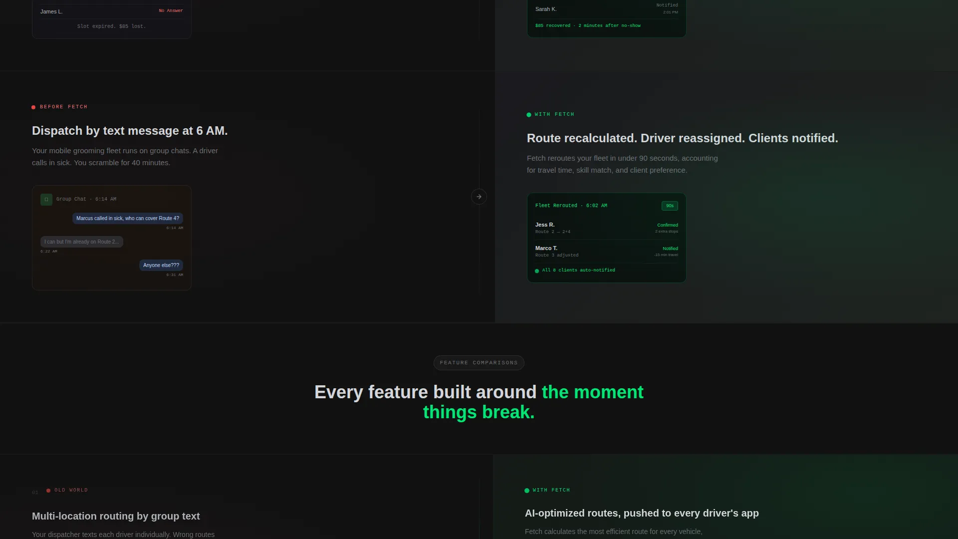
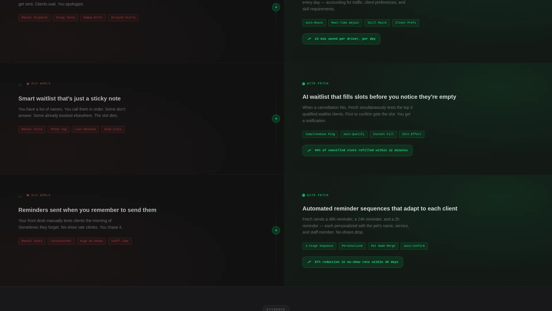
Dedicated scroll sections contrast manual phone-tag waitlist management against automated slot recovery. Each comparison panel escalates the evidence: multi-location routing versus manual dispatch, smart waitlist versus phone calls, automated reminders versus forgotten appointments.
Signal Green Active-State System
Signal green (#00E676) is used exclusively for live, actionable elements: confirmed appointment slots, active call-to-action buttons, and synced calendar indicators. It never decorates passive content. This restraint keeps visitor attention focused on the next action.
Secondary Video Engagement Path
A clearly marked secondary path invites visitors to watch a 90-second teardown video. The video format mirrors the page structure: a real booking scenario shown side by side, old tool versus new. It gives hesitant visitors a low-commitment way to engage before filling out the form.
Page sections overview
| Section | Purpose |
|---|---|
| Split Hero Header | Introduce headline and product screenshot side by side |
| Problem Panel One | Show chaotic calendar with conflict badges and missed calls |
| Solution Panel One | Reveal AI-resolved view of the same day |
| Multi-Location Comparison | Contrast manual dispatch routing with smart multi-location scheduling |
| Waitlist versus. Phone Tag | Show automated slot recovery against manual callback systems |
| Reminder versus. Forgotten | Compare automated client reminders with missed appointment follow-ups |
| Sticky call to action Bar | Float persistent "See Your Schedule, Rebuilt" action after scroll two |
| Video Teardown Path | Offer 90-second side-by-side booking scenario as secondary conversion |
| Sign-Up Form Panel | Capture business name and current scheduling tool via two-field form |
Design & branding system
The visual identity follows a Carbon Fiber color system designed to feel like the interior of a precision instrument panel. Every color choice is intentional and constrained.
- Deep cockpit black (#121212) and machined graphite (#2A2A2E) anchor all backgrounds, keeping focus on content
- Brushed aluminum (#B0B3B8) carries all body text and secondary labels, ensuring legibility against dark surfaces
- Signal green (#00E676) fires only on active states: confirmed slots, live call-to-action buttons, and synced calendar pulses
Mobile & speed optimization
The split-screen layout is structured to reflow cleanly on smaller viewports. The 50/50 panels stack vertically on mobile so neither side loses context or visual priority.
- Color-coded appointment blocks and ghost-cursor header elements remain visually distinct at smaller sizes
- The sticky call-to-action bar is designed to stay accessible across viewport widths without obscuring content
- The two-field sign-up form is minimal by design, reducing friction on both desktop and mobile interactions
How this template helps you convert
The entire page is engineered as a Comparison/Versus conversion experience. Visitors never have to imagine the value, they see it directly across from the problem it replaces.
- The left-panel chaos scenes make the visitor feel the cost of their current tool before any product claim is made, priming them to want the solution shown on the right.
- The sticky call-to-action bar and the repeated "See Your Schedule, Rebuilt" button ensure the conversion action is always one scroll away, never buried.
- The secondary video path catches visitors who need more proof before committing, giving them a fast, visual argument without requiring them to leave the page.
Other information about this template
Fetch fits naturally into the Directory and Discovery theme category. It is designed for technology-focused marketplaces and product showcase contexts where a strong visual argument matters more than long-form copy.
- The template style is classified as Split Screen (50/50) and follows a Problem→Solution Arc creative direction
- It falls under the Technology category with a subcategory of AI for Pet Care, targeting the Pet Care AI Scheduling Assistant niche
- The header concept is a Product Screenshot, making it well-suited for software products where showing the interface builds immediate credibility
Theme
Directory & Discovery
Creative direction
Problem→Solution Arc
Color system
Carbon Fiber
Style
Split Screen (50/50)
Direction
Comparison/Versus
Page Sections
Split-screen Problem and Solution Layout
Product Screenshot Hero Header
Sticky Signal Green Call to Action Bar
Two-field Conversion Form
Secondary Video Teardown Path
Signal Green Active-state System
Related questions
What type of business is this template designed for?
Can I customize the color scheme or appointment block colors?
What does the two-field sign-up form capture?
Does the template include the 90-second video or just the placement section?
Is this a single-page layout or a multi-page template?



