Consumer App & Platform Professional Website Template
Powder is a real-time ski condition landing page template built for snow sport enthusiasts who need fast, dense data before they hit the road. It combines a tab-switched hero interface, modular spec-card grid, and a lead-capture flow into one focused, single-page layout. The visual system runs deep navy, glacier white, and signal cyan to feel like a pre-dawn mountain morning.
by Rocket studio
Quick summary
Powder is a single-page landing page template for a real-time ski and snow condition app. It uses a Feature Tab Switcher hero, a spec-card grid to present live data capabilities, and a lead-generation flow built around early access signups. The design palette is dark, cold, and electric, purpose-built for mountain-obsessed early risers.
Who this template is for
This template is made for builders and product teams launching a snow and ski condition app or related platform. It speaks directly to an audience that checks conditions before dawn and values data over decoration.
- Dawn-patrol skiers who need base depths, lift counts, and drive times in one glance
- Families researching beginner-friendly runs across multiple resorts before booking a trip
- Backcountry tourers cross-referencing avalanche danger ratings, aspect, and elevation band before skinning up
What problem this template solves
Ski and snow condition information is fragmented. Skiers jump between resort websites, weather apps, and avalanche center pages before every outing. This template presents the landing page for an app that solves that problem by pulling everything into one real-time view.
- Scattered snowfall, grooming, and lift data forces multiple browser tabs and wasted time
- Generic app landing pages fail to show live data density, so visitors leave before they trust the product
- Early-access forms lose sign-ups when they appear before the app has proven its value
What you get with this template
You get a complete, modular landing page layout that showcases a data-rich ski condition app with confidence. Every section is structured to demonstrate the app's depth before asking for a signup.
- A three-tab hero interface simulating live resort cards, resort search filters, and avalanche danger roses
- A scrollable spec-card grid where each card leads with a bold metric and a miniature user interface screenshot
- Two lead-capture touchpoints: a sticky "Get First Tracks" bar with a region dropdown, and a bottom "Join the Beta Waitlist" form with an optional phone field for SMS alerts
Feature list
This template delivers a set of purpose-built components that work together to show app depth and earn visitor trust before the first form field appears.
Three-Tab Hero Interface
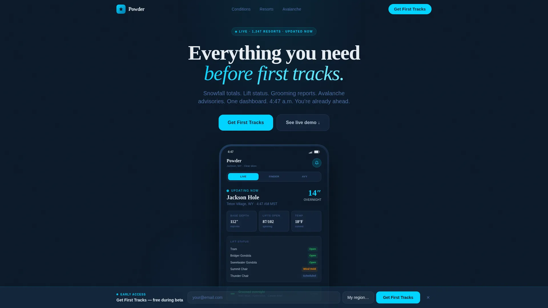
The header presents three tabs, "Live Conditions," "Resort Finder," and "Avy Alerts", over a simulated app interface rendered at device scale. Clicking any tab swaps the entire card content with a smooth crossfade, giving visitors an immediate sense of how the app behaves.
Live Resort Condition Card
The default hero state shows a resort card mid-update: 14 inches of overnight snowfall, 87 out of 102 lifts spinning, a wind hold flagged on the summit chair, and a green grooming icon on the main bowl. This single card communicates data density without any lifestyle photography.
Modular Spec-Card Grid
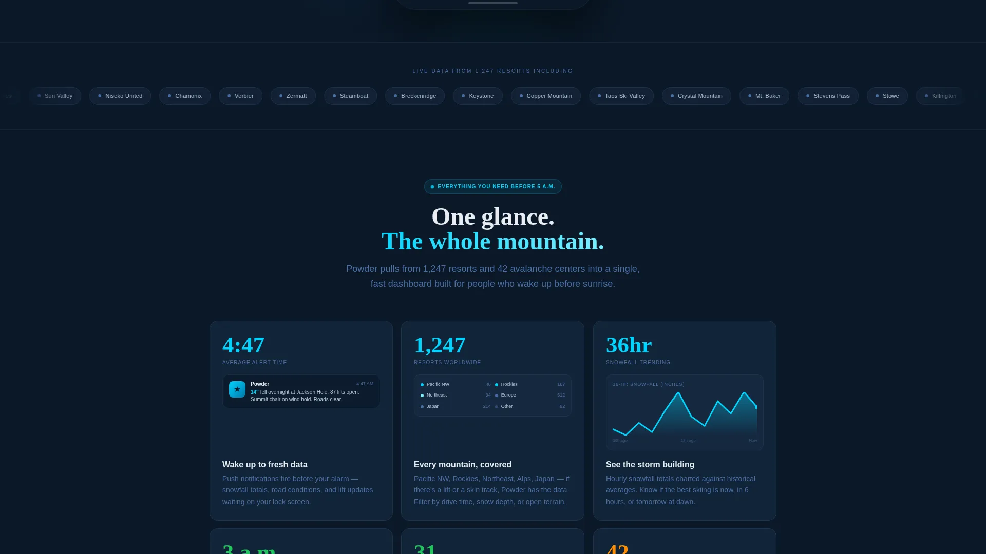
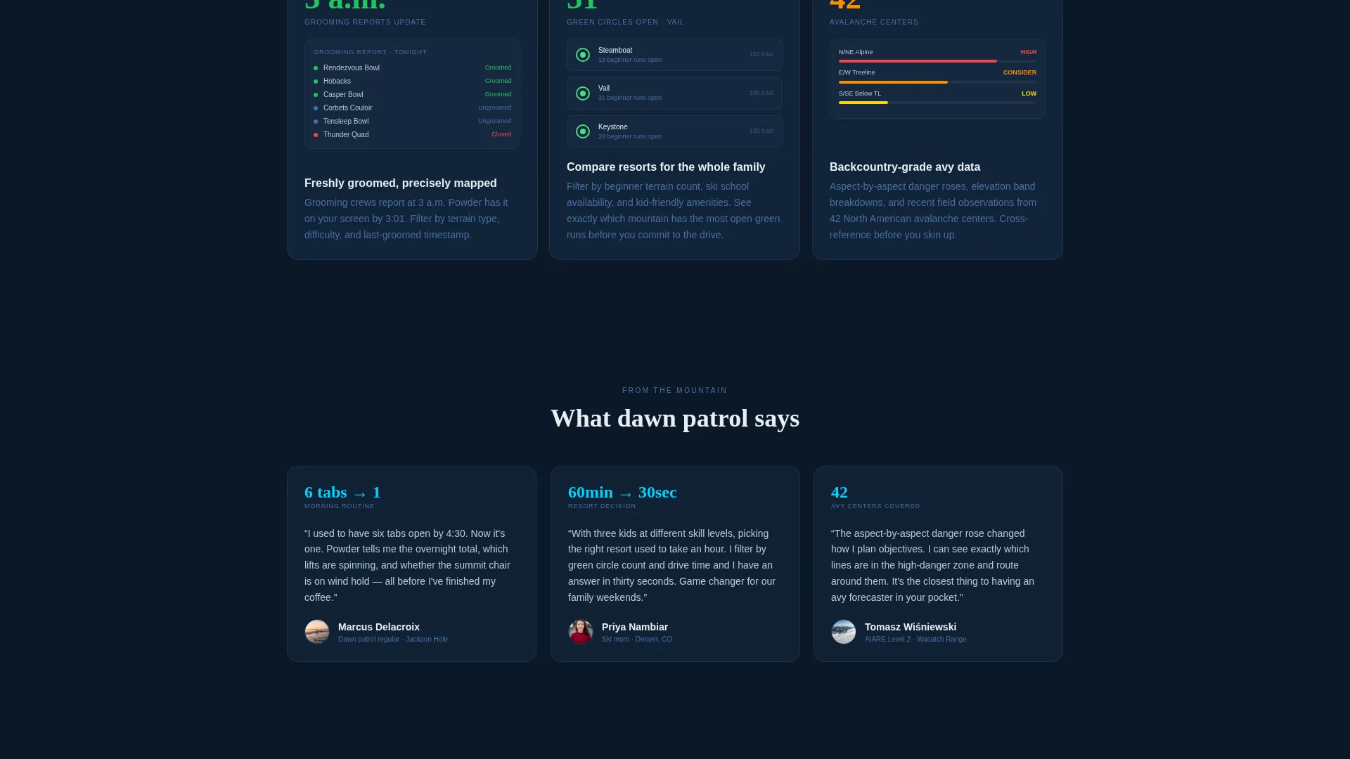
Below the hero, feature modules tile in a responsive two-to-three column grid. Each card leads with a bold metric, "4:47 a.m." for push-alert timing, "1,247 resorts" for coverage breadth, "36-hour snowfall graph" for trending data. The rhythm is additive, stacking capability card by card.
Sticky Lead-Capture Bar
After the second card row, a sticky bar anchors the primary call to action: "Get First Tracks." It holds a single email field and a resort-preference dropdown organized by region, so the first notification a user receives is already relevant to their mountain.
Beta Waitlist Form
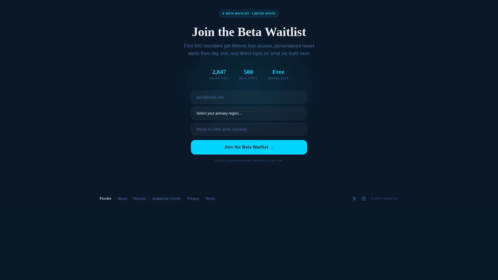
A secondary sign-up section at the bottom of the page adds an optional phone number field for SMS alert opt-in. The form is positioned after the full data story, so visitors arrive at it already convinced of the app's usefulness.
Avalanche Advisory View
The "Avy Alerts" tab renders color-coded danger roses and elevation band data inside the hero interface. This view speaks directly to backcountry tourers who need aspect and elevation context before committing to a route.
Page sections overview
| Section | Purpose |
|---|---|
| Tab Switcher Hero | Simulates live app interface across three data views |
| Overnight Snowfall Card | Leads spec grid with real-time snowfall metric |
| Push Alert Timing Card | Shows "4:47 a.m." to demonstrate notification capability |
| Resort Coverage Card | Highlights 1,247-resort breadth with user interface screenshot |
| Snowfall Trend Card | Introduces 36-hour graph for conditions trending |
| Sticky call to action Bar | Captures email and region preference after second card row |
| Beta Waitlist Form | Secondary sign-up with optional SMS phone field |
Design & branding system
The visual identity runs on a Midnight Blue color system that evokes a pre-dawn ski-area parking lot. Every color choice serves legibility and emotional tone at the same time.
- Deep twilight navy (#0B1929) as the primary background, glacier white (#E8EDF2) for card surfaces, and frozen steel (#4A6FA5) on secondary text and dividers
- Signal-flare cyan (#00D4FF) highlights live data values and interactive elements, creating sharp focal points against the dark field
- The overall palette reads dark, cold, and precise, no lifestyle photography, no gradients for their own sake, just sharp data on a cold background
Mobile & speed optimization
The card grid is built to reflow cleanly from a three-column desktop layout to a single-column mobile stack. The template is structured to support fast scanning on a phone screen at any hour.
- Responsive grid tiles from two-to-three columns on desktop down to a single-column stack on smaller screens
- Each spec card is self-contained, so content remains readable and complete at any breakpoint
- The sticky call to action bar is designed to stay visible during scroll without obscuring card content on narrow viewports
How this template helps you convert
This template earns the signup by demonstrating app value before the form ever appears. The page is structured as a progressive data reveal, not a pitch.
- The tab-switched hero lets visitors interact with a simulated live interface, building confidence in the app's real-time data depth before they read a single feature claim.
- The spec-card grid stacks capability in an additive rhythm, so by the time the sticky bar appears after the second card row, the visitor has already mentally used the app and understood its value.
- The region-preference dropdown in the signup form delivers immediate personalization, making the first notification relevant from day one and giving visitors a concrete reason to complete the form.
Other information about this template
This template belongs to the Directory and Discovery theme, which focuses on helping users find and compare structured data quickly. The Spec Sheet creative direction means every section leads with a number or a fact, not a headline promise. The Card Grid layout is modular, so individual cards can be reordered or swapped to match a product's actual feature set during customization.
- The template style is Card Grid (Modular), meaning sections are designed as independent units that tile responsively
- The header concept is the Feature Tab Switcher, a pattern suited to apps with multiple distinct data views
- The lead-generation direction is built around early access, with region-based personalization baked into the signup flow from the start
- The template sits in the Technology category under the Consumer App and Platform subcategory, making it a practical starting point for any snow condition or outdoor data app
Theme
Directory & Discovery
Creative direction
Spec Sheet
Color system
Midnight Blue
Style
Card Grid (Modular)
Direction
Lead Generation
Page Sections
Three-tab Hero Interface
Live Resort Condition Card
Modular Spec-card Grid
Sticky Lead-capture Bar
Avalanche Advisory View
Beta Waitlist Form
Related questions
Does this template require real live data to look convincing?
Can I change the tab labels in the hero section?
How does the sticky call to action bar work?
Can I add or remove spec cards from the grid?
Who is the beta waitlist form aimed at?



