Powertrack - Bold Utility Landing Page Template
Powertrack is a Bold Brutalist landing page template built for energy inventory management platforms. It opens with a live cost-estimator calculator, then drives visitors through a three-column comparison table and a momentum-building scroll toward a single demo click-through. No forms, no friction, just raw numbers and one clear call to action.
by Rocket studio
Quick summary
Powertrack is a single-page, click-through landing page template designed for utility inventory management platforms. It combines a live calculator header, a brutalist comparison table, and a high-energy scroll sequence to move operations professionals from curiosity to demo request, fast. The Electric Indigo color system and Bold Brutalist theme make every data point impossible to ignore.
Who this template is for
This template is purpose-built for energy software and SaaS teams selling inventory management tools to utility operators. If your buyers live in depots, substations, or regional operations centers, this page speaks their language.
- Operations managers at regional utilities who are still running asset tracking on spreadsheets
- Procurement leads at energy co-ops who routinely reorder parts they already have in stock
- Field supervisors who need real-time visibility into transformer, switchgear, and cable drum locations
What problem this template solves
Utilities lose significant budget every year to ghost inventory, expired assets, and manual counting cycles. The core problem is not the assets themselves, it is the inability to see them clearly. This template frames that problem visually and financially before your visitor ever reads a feature bullet.
- Ghost inventory and misplaced equipment draining procurement budgets without visibility
- Manual spreadsheet workflows that cannot flag expiration dates or field-checkout conflicts
- Buyers who need hard cost numbers before they will commit to a demo conversation
What you get with this template
You get a fully structured, single-page click-through landing page with distinct functional sections that escalate in energy from top to bottom. Every section is designed to build conviction and end with one action: booking a guided product demo.
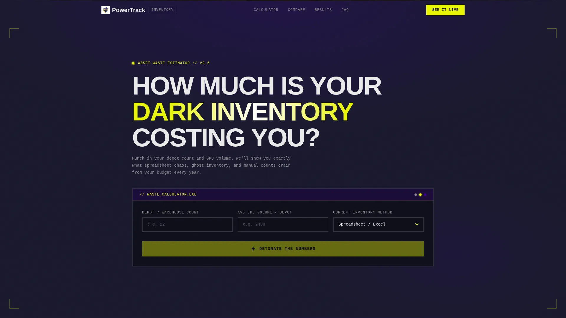
- A brutalist calculator module in the header that outputs dollar waste, ghost inventory percentage, and hours lost per year
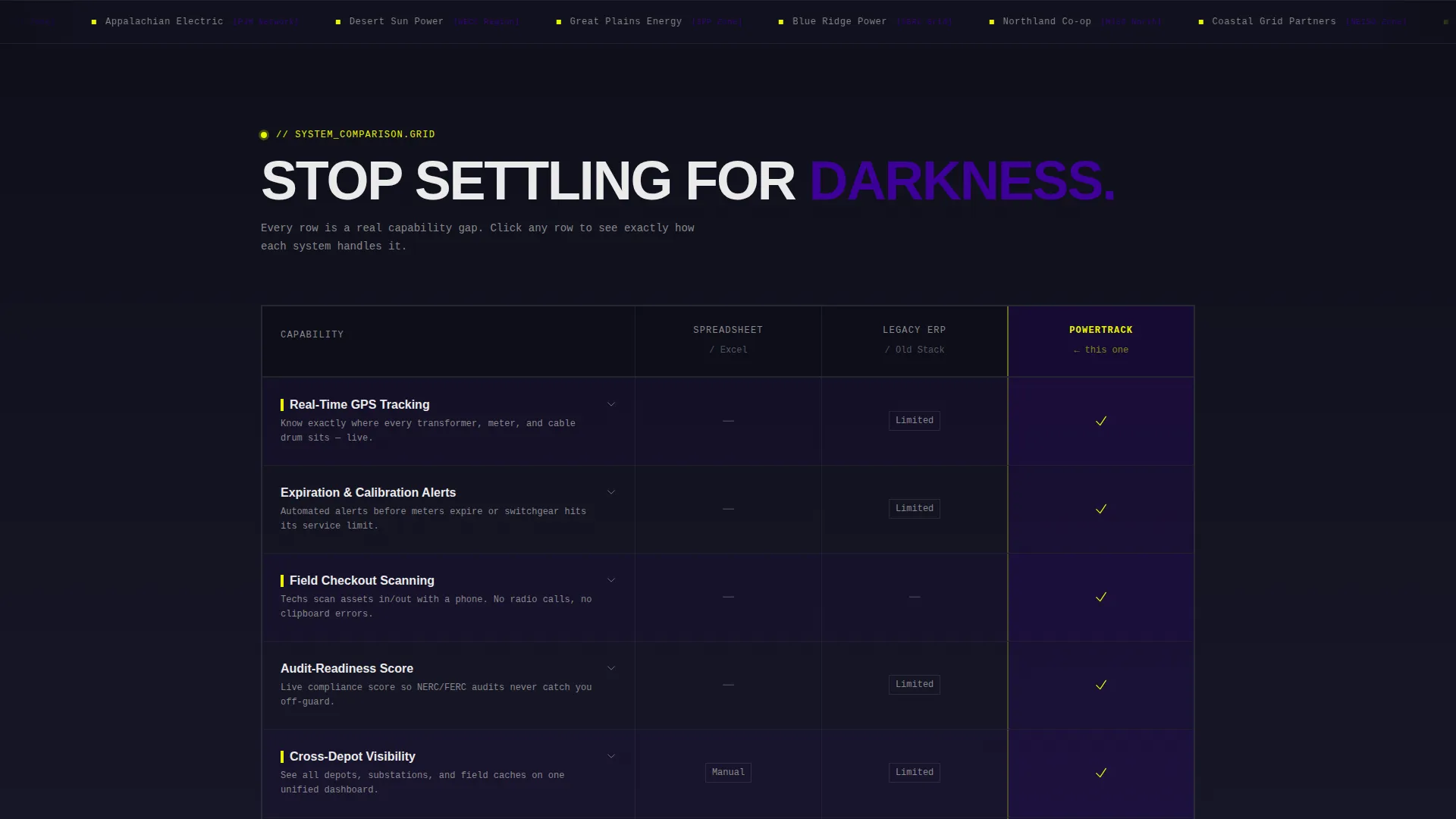
- A three-column comparison table pitting spreadsheet workflows and legacy ERP systems against your platform
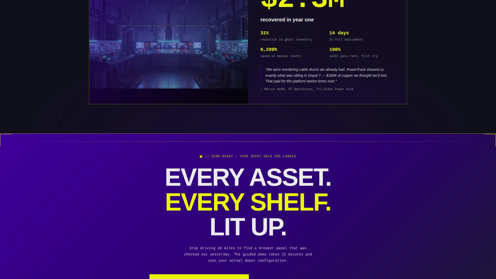
- A full-width call to action bar and a case study block anchored by a single large-type recovery figure
Feature list
This template is built around a specific set of interactive and visual components drawn directly from the design brief. Each one plays a defined role in the page's conversion sequence.
Live Cost-Estimator Calculator Header
The header module accepts three visitor inputs: depot count, average SKU (stock keeping unit) volume, and current inventory method selected from a dropdown. On submit, a concrete-split animated reveal displays estimated annual waste in dollars, ghost inventory percentage, and hours lost to manual counts. Output figures render in oversized Electric Indigo type against raw charcoal.
Three-Column Comparison Table
The comparison table lines up three inventory approaches side by side: spreadsheet chaos, legacy ERP (enterprise resource planning) systems, and this platform. Rows cover real-time GPS tracking, expiration alerts, field-checkout scanning, audit-readiness score, and integration time. Each row loads with a brutalist slide-in animation. The platform column displays safety-yellow checkmarks while competitor columns show concrete-gray dashes.
Launch Energy Scroll Sequence
After the calculator output detonates cost figures, the page builds momentum through a structured scroll. A live counter displays inventory movements across the network in real time. Below that, a case study block presents one number in massive type to anchor the value proposition before the final call to action fires.
Click-Through call to action Architecture
There are no forms on this page. The primary call to action, "See Your Inventory Lit Up," appears twice: locked to the bottom of the calculator output and again as a full-width brutalist bar after the comparison table. Each call to action carries forward calculator inputs into a pre-populated demo environment. A secondary text link beneath each call to action offers a downloadable Utility Inventory Waste Report via a single-field modal for visitors not yet ready to demo.
Bold Brutalist Visual System
The entire page is built on a raw, industrial design language. Indigo-poured concrete walls anchor section dividers. Safety yellow fires on every call to action, toggle state, and data highlight. Charcoal carries body text. Panel-white opens comparison grid cells so numbers breathe. Nothing is decorative, every accent functions as a signal.
Page sections overview
| Section | Purpose |
|---|---|
| Calculator estimator header | Captures depot inputs and reveals annual waste figures with animated concrete-split output |
| Comparison table block | Positions the platform against spreadsheets and legacy ERP across five tracked asset metrics |
| Live inventory counter | Shows real-time movement data across the network to reinforce platform scale and activity |
| Case study block | Anchors value with a single large-type recovery figure to build financial credibility |
| Full-width call to action bar | Drives demo click-through with primary action and secondary report download text link |
Design & branding system
The Powertrack template runs on an Electric Indigo color system styled through a Bold Brutalist visual identity. The palette is inspired by a substation control room at night, dark steel, fluorescent warning labels, and raw concrete surfaces.
- Deep voltage indigo (#3D0099) anchors backgrounds and section dividers throughout the page
- High-vis safety yellow (#E8F505) activates on every call to action, toggle state, and data highlight, nothing decorative
- Exposed-concrete charcoal (#1A1A2E) carries body text, while panel-white (#EAEAEA) opens comparison grid cells for readability
Mobile & speed optimization
The template is structured so its heaviest interactive element, the calculator, sits at the top of the page where engagement is highest. The brutalist layout system uses strong contrast and large type to maintain impact at any screen size.
- Oversized Electric Indigo output figures remain readable and dominant on smaller viewports
- The comparison table is designed with panel-white cell backgrounds to keep data clear and scannable on mobile screens
- call to action bars are full-width by design, making tap targets large and the action unmissable on touch devices
How this template helps you convert
Every design and copy decision in this template serves the single goal of moving a utility operations professional toward a guided product demo. The page does not ask for commitment up front. It earns it through escalating evidence.
- The calculator forces a personalized cost number into the visitor's hands before any product pitch begins, making the pain concrete and specific to their operation.
- The comparison table removes objections by visually demonstrating what this platform does that spreadsheets and legacy ERP systems cannot, row by row.
- The no-form call to action architecture removes friction entirely, one click carries the visitor's calculator data into a pre-populated demo, lowering the barrier to the next step.
Other information about this template
Powertrack is a template built for the energy software and SaaS market, specifically the energy inventory management niche. It is classified under the Technology category and uses a Click-Through landing page direction with a Calculator/Estimator header concept. The creative direction is Launch Energy, meaning the page is intentionally structured to build scrolling momentum and emotional intensity from the first number to the final call to action.
- The template style is a Comparison Table landing page, making it well-suited for competitive positioning in the utility inventory space
- The Bold Brutalist theme and Electric Indigo color system are cohesive and intentional, every visual choice reinforces the industrial, high-stakes context of energy asset management
- The secondary conversion path, the Utility Inventory Waste Report download, is designed to capture email addresses from visitors who are still in the research phase without disrupting the primary demo flow

Theme
Bold Brutalist
Creative direction
Launch Energy
Color system
Electric Indigo
Style
Comparison Table
Direction
Click-Through
Page Sections
Live Cost-estimator Calculator Header
Three-column Brutalist Comparison Table
Launch Energy Scroll Sequence
No-form Click-through Call to Action Architecture
Electric Indigo Bold Brutalist Design System
Related questions
Can I customize the calculator inputs for different utility types?
Does this template include the actual calculator logic or just the design?
Why are there no forms on this landing page?
Who is the comparison table designed to compete against?
Can this template work for an inventory SaaS product outside the energy sector?



