Elite Automotive Education Landing Page Template
Torque is a bold brutalist automotive training platform landing page built as a dashboard and data grid. It pairs a Glassmorphic instrument-cluster aesthetic with raw, oversized typography to convert shop managers and vocational instructors into platform users. The design proves competency gaps first, then hands over the diagnostic wrench through simulation-led lead generation.
by Rocket studio
Quick summary
Torque is a single-page dashboard landing page designed for an automotive diagnostic simulation platform. It uses brutalist web design principles, a Glassmorphic color system, and a Problem to Solution scroll arc to move independent shop techs, dealership service managers, and vocational instructors from skepticism to sign-up. The product itself is the hero. No stock photos. No filler.
Who this template is for
This landing page is built for a very specific type of buyer. It speaks directly to the people who train automotive technicians and need a better way to prove that training works.
- Independent shop technicians pursuing ASE certifications who want risk-free diagnostic practice between real jobs
- Dealership service managers onboarding new hires who cannot yet read a scan tool
- Vocational instructors building curricula that keep pace with hybrid drivetrains and Controller Area Network bus faults
What problem this template solves
Standard training website design fails technical audiences. Polished lifestyle imagery and generic layout structures do not build trust with mechanics or shop managers. This template rejects that approach entirely.
- Conventional web design hides competency gaps behind marketing language, leaving buyers unsure whether the platform actually works
- New technicians misdiagnose complex faults in the real world because training pages rarely demonstrate the depth of simulation available
- Instructors struggle to find a website layout that matches the technical seriousness of their curricula
What you get with this template
You get a complete, production-ready landing page that functions as a dense, data-rich diagnostic dashboard. Every section has a clear job to do, and every design decision serves conversion.
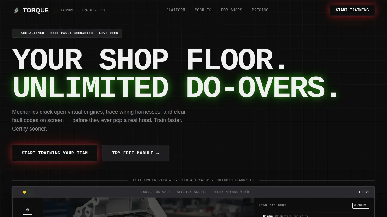
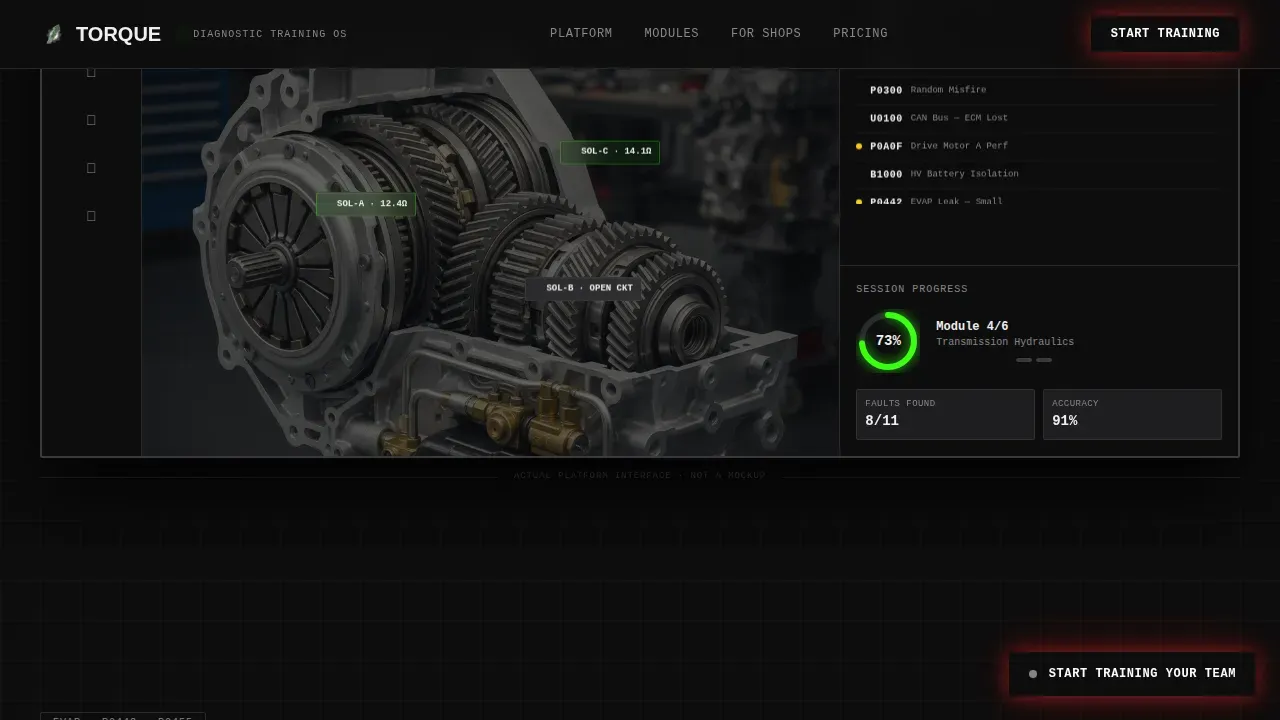
- A full-viewport hero page section with a brutalist slab frame showcasing the platform dashboard mid-lesson, floating diagnostic trouble-code widgets, and a learner progress ring
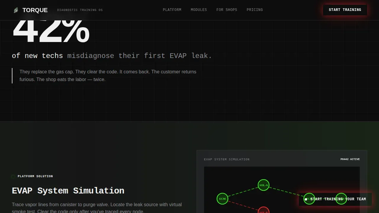
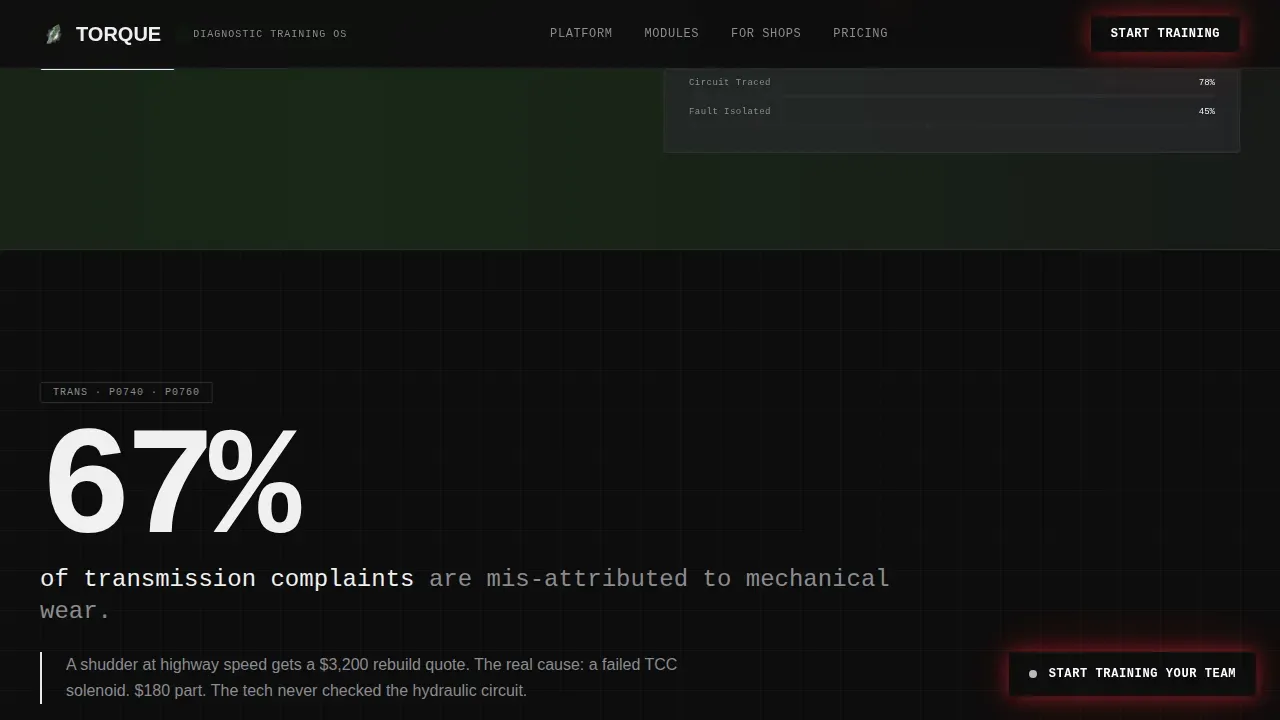
- A four-panel Problem to Solution scroll arc pairing stark failure statistics with slider-revealed simulation fixes across EVAP, transmission, CAN-bus, and high-voltage hybrid faults
- A persistent floating lead generation pill, a frosted-glass modal form, and a no-gate free module path that let the product sell itself
Feature list
This landing page delivers a focused set of design features, each grounded in brutalist web design principles and the specific demands of automotive training platforms.
Full-Viewport Dashboard Hero
The hero section showcases the platform's actual dashboard inside a brutalist slab frame. A translucent three-dimensional cutaway of a six-speed automatic transmission fills the screen, with a live diagnostic trouble-code feed in a frosted sidebar and a learner progress ring at 73%. Oversized monospace type stamps the headline above it: raw, bold, and impossible to ignore.
Problem to Solution Scroll Arc
Four tension-release panels alternate between brutal failure statistics set in massive knockout type and frosted-glass simulation cards that reveal the fix. Each panel escalates the stakes, from EVAP vapor line tracing to high-voltage hybrid battery isolation. Transition animations and slider-reveal interactions make each solution feel earned.
Asymmetric Bento Training Grid
An asymmetric bento grid showcases diagnostic categories with hover depth-reveal effects. Each cell in the grid acts as a portal into a specific training module. The layout uses frosted boxes over a graphite background, creating a visual hierarchy that is dense but scannable.
Persistent Floating Lead Generation Pill
After the first scroll, a brutalist pill button locks to the bottom-right corner and stays visible across the entire page. It triggers a frosted-glass modal asking for shop name, team size via a chunky toggle, and a single email field. The form is short by design, lowering the barrier to entry.
Social Proof with Cert Pass-Rate Metrics
Three shop testimonials appear with before-and-after certification pass-rate data, shop names, and technician counts. Numbers do the convincing. This section showcases real transformation in concrete terms, allowing users to match the platform's claims against outcomes they care about.
Scroll-Reveal and Parallax Animations
Scroll-reveal effects, parallax layers, float animations, shimmer effects, and pulsing progress bars create a site that feels alive without relying on heavy graphical assets. The animation system uses transition animations purposefully, reinforcing data points rather than decorating around them.
Page sections overview
| Section | Purpose |
|---|---|
| Hero Dashboard View | Showcase platform mid-lesson inside a brutalist slab frame |
| EVAP Problem Panel | Deliver the first stark failure stat and simulation fix |
| Transmission Fault Panel | Escalate stakes with shudder diagnosis and slider reveal |
| CAN-Bus Fault Panel | Expose communication fault scenario and platform solution |
| HV Hybrid Panel | Present high-voltage isolation challenge and resolution |
| Bento Module Grid | Display diagnostic training categories with hover depth reveals |
| Social Proof Row | Show cert pass-rate improvements from real shops |
| Lead Gen Call to Action | Dark brutalist slab driving team sign-up conversion |
| Floating call to action Pill | Persistent sign-up trigger fixed to bottom-right corner |
| Modal Lead Form | Frosted-glass form capturing shop name, team size, email |
| Footer Single Row | Minimal developer-style footer with essential links |
Design & branding system
The visual identity is built around what it feels like to peer through a smoked-glass instrument cluster at night. Every surface, font choice, and color decision reinforces the automotive training context. The design avoids glossy stock photos entirely, using raw product screenshots to build trust through authenticity.
- Colors: asphalt black (#0D0D0D) as the base background, translucent graphite (#2A2A2E) frosted panels at 60% opacity, electric diagnostic green (#39FF14) on progress bars and active states, and hot brake-caliper red (#FF2D2D) on alerts and primary calls to action
- Typography: JetBrains Mono for headlines and data elements delivers the monospace technical aesthetic suited to automotive themes; DM Sans handles body copy for readability
- Layout system: brutalist elements including exposed grid lines, raw slab frames, oversized white knockout type, and high-contrast boxes create a website design that stands apart from conventional training platforms
Mobile & speed optimization
This landing page is designed desktop-first for service managers on workstations and instructors on laptops, with a responsive mobile fallback for shop-floor access. The design avoids heavy graphical assets by keeping the visual weight on data and typography rather than large image files.
- Minimal CSS approach keeps the page lean; animations are handled through client-side components while static sections use server components for faster initial load
- The layout adapts fluidly across screen sizes, ensuring that the frosted panels, bento grid, and floating pill all remain functional and legible on smaller displays
How this template helps you convert
Brutalist design emphasizes functionality over aesthetic beauty, focusing on user experience at every scroll point. This page is engineered to move visitors toward a decision through a specific sequence.
- The hero page section establishes immediate product credibility by showing the dashboard in use, not a mockup, creating trust before a single word of copy is read
- The Problem to Solution arc proves the competency gap exists and that the platform fixes it, so by the time users reach the lead generation form, they are already convinced
- The no-gate free module path lets the product deliver its own sales pitch, encouraging sign-ups from visitors who want proof before commitment
Other information about this template
This template falls into the category of specialized brutalism design built for B2B software and EdTech platforms. It draws inspiration from industrial web page aesthetics and the kind of raw, direct visual language that younger, tech-savvy audiences respond to. Brutalist web design as a concept traces back to post-war architectural brutalism, characterized by exposed materials and functional honesty. Applied to web, it becomes a reaction against the uniformity of modern design.
- Designers and developers can adapt this template to other technical training verticals, portfolio projects, or creative agency website builds that demand a high-impact first impression
- The code structure separates server and client components, making it practical for developers to extend without rewriting the base layout
- This template showcases how neo brutalism and glassmorphic color systems can coexist, with white knockout type and frosted glass panels working together rather than against each other
- Examples of brutalist website design in other industries, such as e commerce and creative agency work, share the same core principle: let the content matter more than the decoration
- The Torque bold brutalist automotive training platform landing page template is a specialized web design layout created for automotive e-learning and technical training, and it can simplify the process of launching a credible training platform site
- Neo brutalism applied here adds a layer of polish to raw brutalist web design, making it feel less ugly and more like a deliberate, confident design statement
- The source layout makes it straightforward to swap colors, swap fonts, and apply changes that match a different brand without restructuring the underlying design system
Theme
Bold Brutalist
Creative direction
Problem→Solution Arc
Color system
Glassmorphic
Style
Dashboard/Data Grid
Direction
Lead Generation
Page Sections
Full-viewport Dashboard Hero Section
Problem to Solution Scroll Arc
Asymmetric Bento Training Module Grid
Persistent Floating Lead Generation Pill
Social Proof with Pass-rate Data
Scroll-reveal and Parallax Animation System
Related questions
Who is this landing page template made for?
Does this template require custom code to set up?
What makes the design brutalist rather than just dark?
Can this template be adapted for other training categories?
Is the lead generation form included in the template?



