Preppy Fashion Blog Website Template
Prep is an elegant lifestyle landing page template built for preppy fashion and living blogs. It uses a modular card grid layout, a rich Merlot and Smoke color system, and a vertical portrait header to set a refined editorial tone. The page guides free readers toward an annual membership through beautifully paced content and a focused upsell flow.
by Rocket studio
Quick summary
Prep is a single-page lifestyle template designed for preppy fashion and living content creators. It combines a masonry card grid, a portrait-orientation hero, and a tiered membership upsell section. The Merlot and Smoke palette gives it warmth and authority. Every scroll moment is crafted to feel like turning a page in a well-loved lifestyle annual.
Who this template is for
This template suits creators and publishers who run a lifestyle blog with a distinct, taste-led voice. It is especially well-matched for those whose audience already browses free content and needs a gentle, well-designed push toward paid membership.
- Preppy lifestyle bloggers covering fashion, travel, and home content
- Editorial-style content creators building a tiered membership program
- Couples or small creative studios launching a curated living publication
What problem this template solves
Most lifestyle blog pages either look too generic or bury the membership offer so deep that readers never reach it. This template solves both problems at once. It uses the content itself as proof of quality, then surfaces the upgrade offer at precisely the right scroll depth.
- Free content feels premium, which builds trust before asking for a commitment
- The upsell section appears naturally after the third card row, not as an interruption
- Locked content indicators appear gradually, building curiosity rather than creating friction
What you get with this template
The template delivers a complete, scroll-driven landing page organized around a masonry card grid and a structured membership conversion flow. Every section is designed to work together as a single cohesive reading experience.
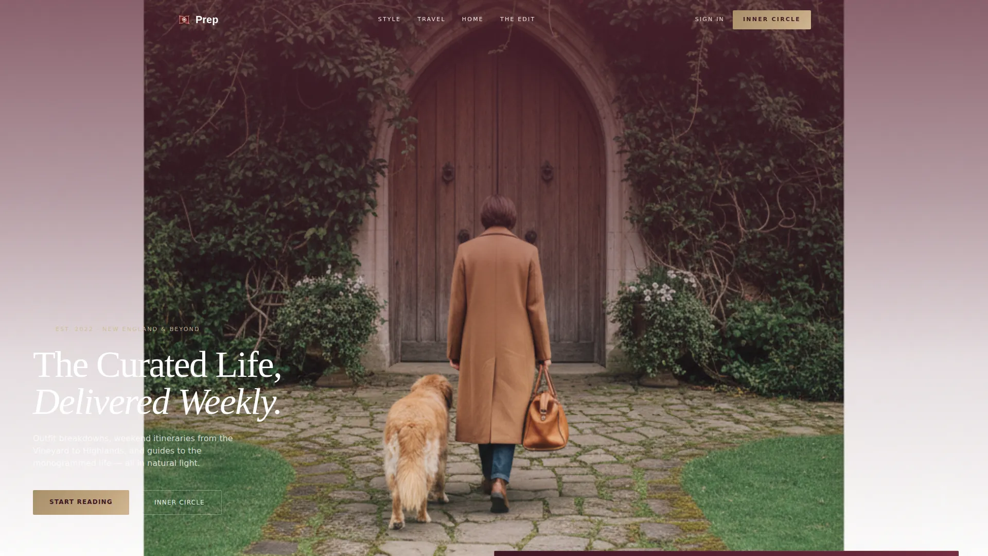
- A full-viewport portrait header with a merlot-to-linen gradient and low-left serif headline
- A modular card grid with hover overlays, varied card heights, and full-bleed photography slots
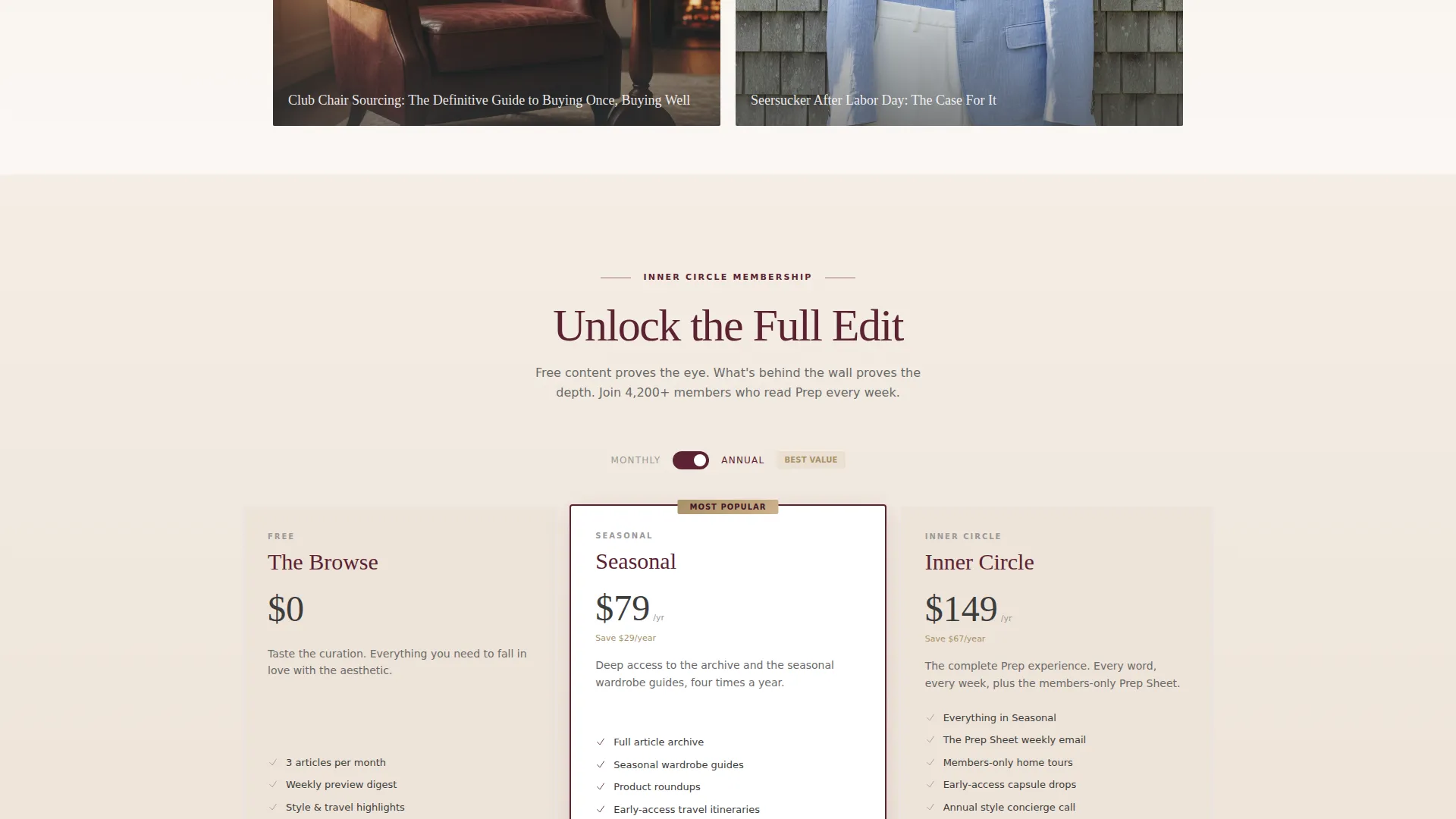
- A three-tier membership section with a pre-selected middle tier and a comparison grid
Feature list
This template includes purposeful components drawn directly from the editorial brief. Each one serves either the reading experience or the conversion goal.
Portrait Hero with Gradient Overlay
The header fills the full viewport in portrait orientation. A soft gradient fades from deep merlot at the top to antique linen at the bottom. The headline sits low-left, giving the eye a full journey across the image before landing on the page promise.
Masonry Card Grid Layout
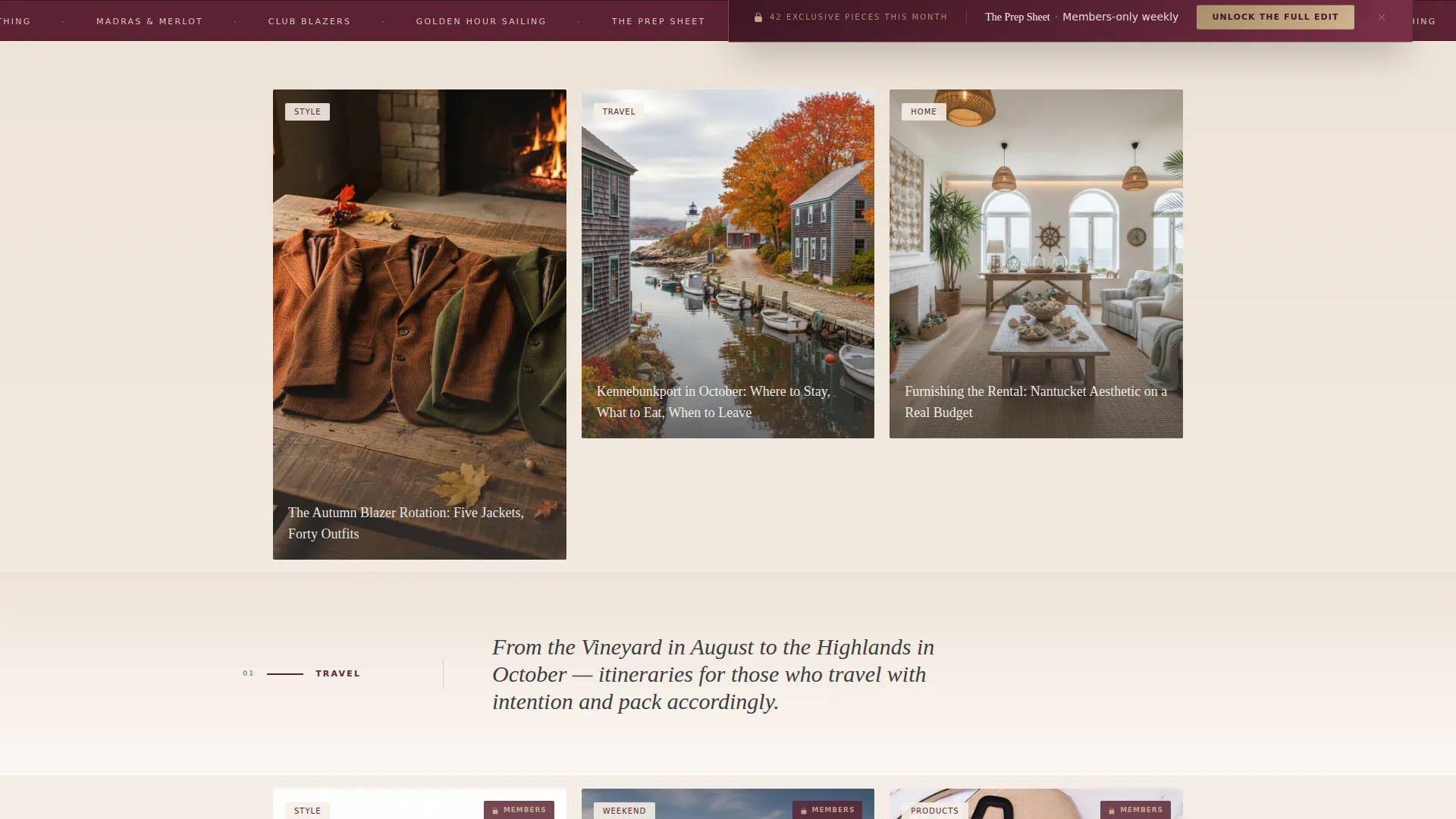
Content cards vary in height and column span, creating a rhythmic, editorial browsing experience. Each card features a full-bleed photograph. On hover, a translucent smoke overlay reveals the article title and a read-time stamp.
Content Pillar Dividers
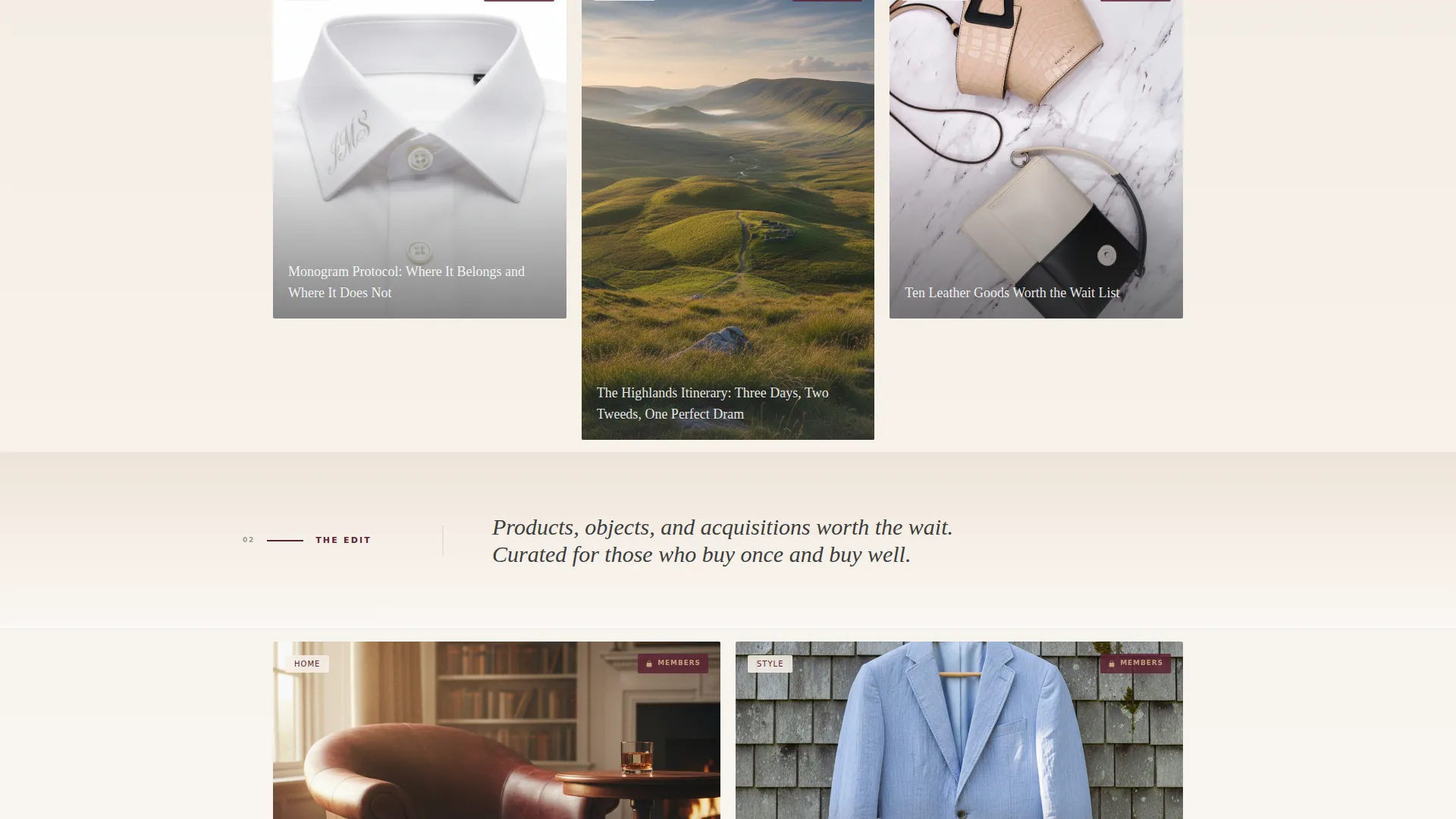
After every third row of cards, a full-width gradient band introduces the next content category. Each band carries a single sentence and a merlot rule line. This pacing keeps the scroll breathing rather than overwhelming the reader.
Floating Upgrade Bar
A persistent floating bar reading "Unlock the Full Edit" in rose-gold on merlot appears after the third card row. It stays visible as the reader continues scrolling, offering a low-friction path to membership without interrupting browsing.
Three-Tier Membership Section
Near the bottom of the page, three elegantly styled membership cards present the Free, Seasonal, and Inner Circle tiers. The middle tier arrives pre-selected. A comparison grid shows exclusive content counts, early-access perks, and the members-only weekly email.
Rose-Gold Lock Icons
As readers move deeper into the card grid, subtle rose-gold lock icons begin appearing on premium content cards. This gradual reveal builds awareness of what lives behind the membership wall without blocking the browsing experience.
Page sections overview
| Section | Purpose |
|---|---|
| Portrait Hero | Sets editorial tone and introduces the brand promise |
| Card Grid Rows | Displays lifestyle content across fashion, travel, and home |
| Pillar Divider Bands | Separates content categories with paced, branded transitions |
| Floating Upgrade Bar | Provides persistent, low-friction membership call to action |
| Locked Content Cards | Signals premium depth through subtle rose-gold lock indicators |
| Membership Tier Cards | Presents Free, Seasonal, and Inner Circle options side by side |
| Comparison Grid | Shows perks, content counts, and early-access benefits per tier |
| Gift Membership Link | Offers a secondary conversion path for readers buying for others |
| Email Signup Form | Captures email and preferred billing cycle for membership signup |
Design & branding system
The Merlot and Smoke color system gives this template a palette that feels considered and calm. It avoids the sweetness of typical lifestyle pinks while staying warm and approachable. Every color has an assigned role, so the visual hierarchy reads clearly at a glance.
- Deep merlot (#5B2333) anchors headlines and active navigation elements
- Charcoal smoke (#3D3D3D) handles body text and card border details; antique linen (#F4EDE4) washes backgrounds in soft vertical gradients that lighten as the page scrolls down
- Muted rose-gold (#C4A882) appears only on hover states, toggle highlights, premium badges, and the primary call-to-action button, reserving its warmth for moments where value is exchanged
Mobile & speed optimization
The card grid and portrait header are structured to adapt across screen sizes without losing the editorial feel. Masonry layouts reflow gracefully, and hover interactions can translate to tap states on touch devices.
- Cards reflow to single or double columns on smaller screens, preserving the full-bleed photo impact
- The floating upgrade bar remains accessible on mobile without obscuring primary content
- Gradient backgrounds use CSS-level color transitions, keeping the visual depth light on load
How this template helps you convert
This template earns the membership click by letting the content do the selling. The conversion flow is embedded in the browsing experience, not bolted on at the end.
- The masonry grid immerses readers in high-quality free content, building confidence in the publication's taste and depth before any ask appears.
- The floating upgrade bar and the gradual lock-icon reveal work together to create natural curiosity, making the membership feel like access rather than a paywall.
- The three-tier membership section with a pre-selected middle option and a clear comparison grid makes the decision simple, and the "Gift a Membership" secondary path opens an additional conversion route for this gift-giving audience.
Other information about this template
This template is built around the Soft Gradient theme and Card Grid (Modular) structure, with an Upsell and Upgrade conversion direction built into the layout from the ground up. It is designed specifically for the preppy lifestyle blog niche, where aesthetic trust is the primary purchase driver.
- The Immersive Visual creative direction means every section rewards slow, attentive browsing
- The Vertical and Portrait header concept is a deliberate editorial choice that differentiates this page from standard horizontal hero layouts
- The membership form is intentionally minimal, asking only for email and preferred billing cycle, since the target reader is assumed to have an existing account
- This template is suited for the Fashion and Lifestyle category, specifically the Preppy Fashion subcategory, where visual credibility and a refined sense of taste matter as much as the offer itself
Theme
Soft Gradient
Creative direction
Immersive Visual
Color system
Merlot & Smoke
Style
Card Grid (Modular)
Direction
Upsell/Upgrade
Page Sections
Portrait Hero with Gradient Overlay
Masonry Card Grid Layout
Content Pillar Divider Bands
Floating Membership Upgrade Bar
Three-tier Membership Section
Rose-gold Lock Icon System
Related questions
What type of content works best in the card grid?
Can I customize the membership tier names and comparison grid details?
How does the rose-gold lock icon system work?
Is the Gift a Membership option a separate page?
Who is the target audience this template is designed to attract?



