Pharmaceutical AI Scheduling Landing Page Template
Prescribe is a split-screen landing page template built for pharmaceutical AI scheduling assistants. It combines an interactive schedule preview, animated metrics, and a visceral before-and-after contrast to show district managers, field reps, and commercial ops teams exactly how intelligent auto-scheduling eliminates wasted hours and closes compliance gaps before a single form is filled.
by Rocket studio
Quick summary
Prescribe is a single-page, split-screen landing page template designed for pharmaceutical AI scheduling tools. It opens with a live-animation header where an AI fills a weekly schedule grid in real time. The page builds momentum through animated metrics, a territory heat map, and a sharp old-versus-new contrast, guiding every visitor toward one clear click.
Who this template is for
This template is purpose-built for teams in pharmaceutical sales operations who need to communicate the value of intelligent scheduling to a skeptical, data-driven audience.
- District managers overseeing large rep teams across multiple territories
- Field sales representatives losing hours each day to rescheduling and no-shows
- Commercial operations teams responsible for proving call-plan compliance to brand stakeholders
What problem this template solves
Pharmaceutical scheduling is still largely manual. Reps cross-reference formulary calendars, territory maps, and physician availability by hand, then spend more time repairing the plan when no-shows hit. A landing page that only describes this problem in text will not land. Visitors need to feel the contrast between the old way and the new way before they will act.
- Generic templates cannot carry the weight of a product demo, so the interaction goes missing
- Static layouts fail to communicate real-time AI behavior, making the tool look like just another calendar app
- Ops leaders need compliance proof points before they can justify internal adoption
What you get with this template
You get a fully structured, single-page layout designed around one idea: let the visitor experience the product before asking for a commitment. Every section is sequenced to build trust and urgency without a form in sight.
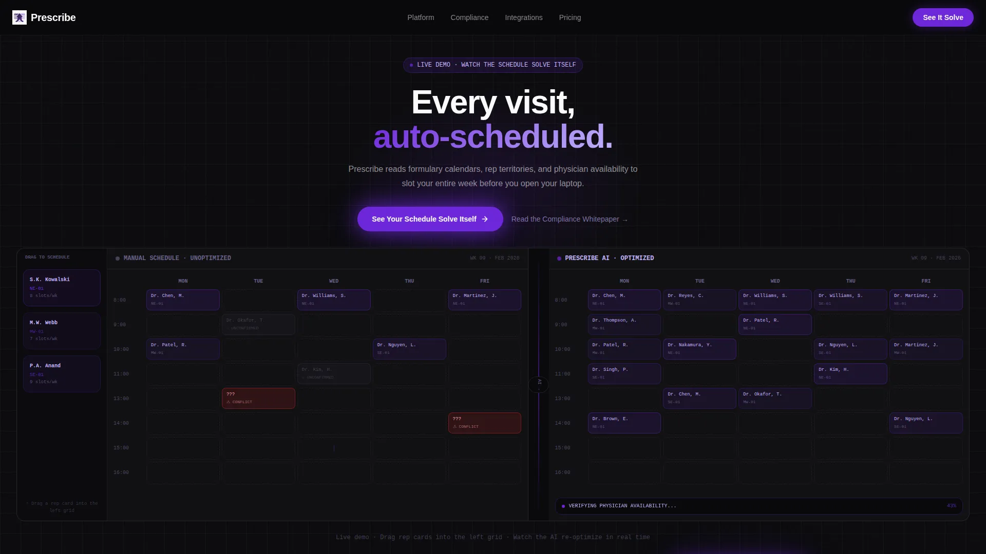
- An interactive 50/50 split-screen header with a draggable rep card, a ghost-slot schedule grid, and a live AI-fill animation on the right panel
- An animated metrics band, a side-by-side spreadsheet-versus-calendar contrast section, and a scroll-triggered territory heat map
- A sticky bottom call-to-action bar, a primary demo button, and a secondary compliance whitepaper text link
Feature list
This template is built around six distinct functional and visual capabilities drawn directly from the product brief.
Interactive Split-Screen Header
The header divides the viewport into two equal panels. The left panel displays a half-populated weekly schedule with visible gaps, ghost slots, and a blinking cursor. The right panel runs a live animation where physician names slide into open slots, territory colors resolve, and conflict badges dissolve as the AI works.
Draggable Rep Card Interaction
Visitors can drag a fictional rep card from a sidebar into the left schedule grid. The right panel immediately re-optimizes around the new input. This hands-on moment lets the visitor feel the product's logic without reading a single feature bullet.
Animated Launch Metrics Band
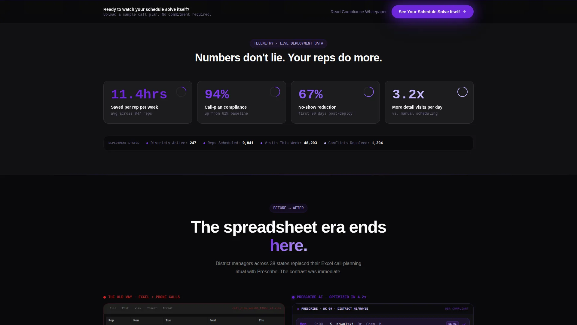
A scrolling metrics band appears immediately below the header. Numbers climb upward like launch telemetry, displaying hours saved per rep per week, call-plan compliance lift, and no-show reduction percentage. The animation communicates scale and credibility at a glance.
Before-and-After Contrast Section
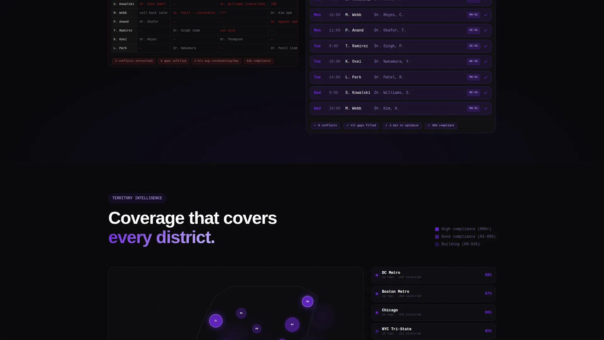
The split screen flips to show a messy spreadsheet screenshot on the left beside a clean Prescribe calendar view on the right. The visual gap between the two states is immediate and intentional, giving buyers the contrast they need to justify switching.
Scroll-Triggered Territory Heat Map
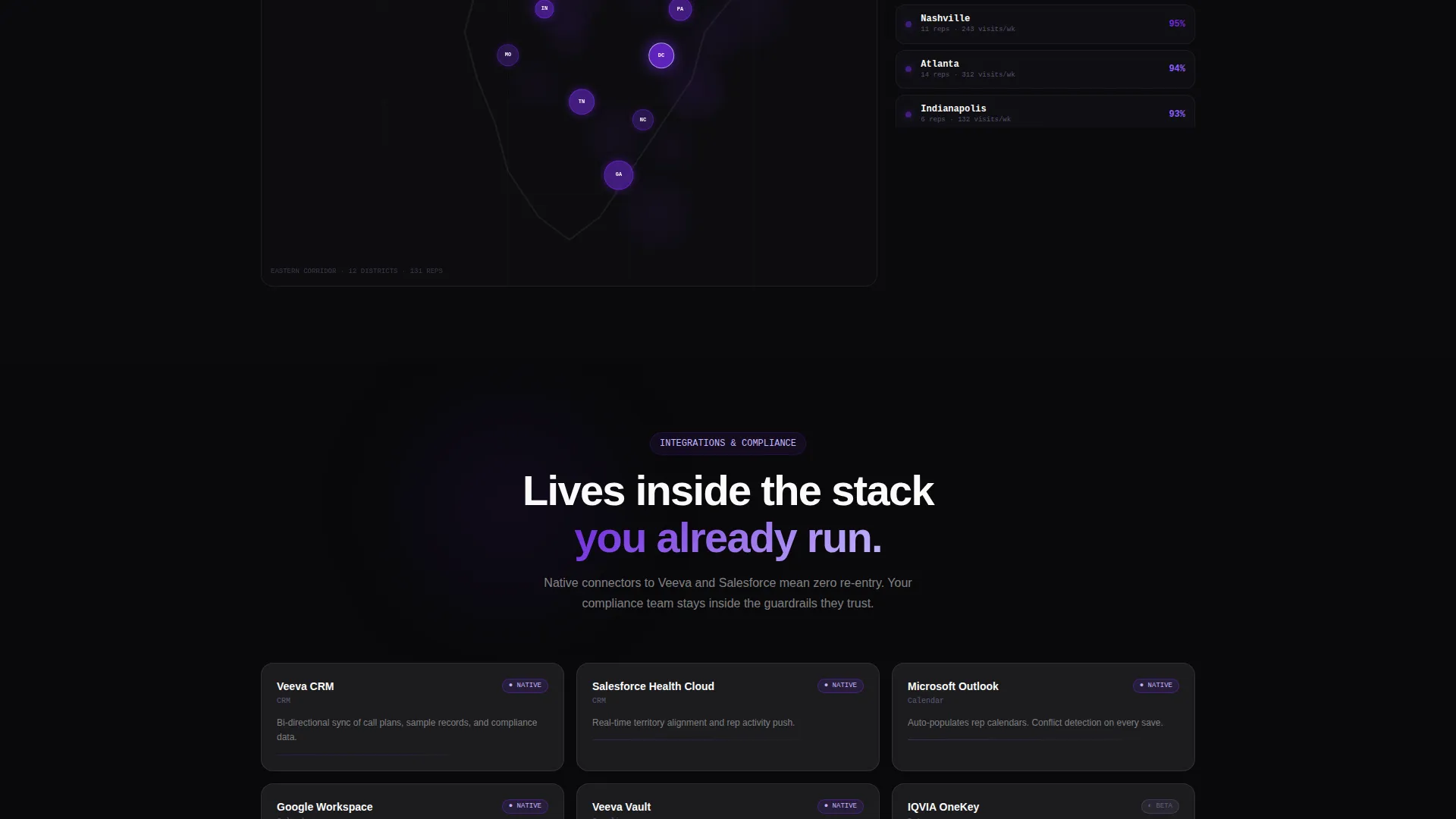
A territory map section reveals district coverage as the visitor scrolls. Districts light up in deep orbital violet, showing how the AI resolves geographic coverage rather than just filling time slots.
Sticky Click-Through Call to Action
The primary call-to-action button, labeled "See Your Schedule Solve Itself," appears first inside the interactive header and again as a persistent sticky bar after the second scroll fold. A secondary text link, "Read the Compliance Whitepaper," captures ops leaders who need internal justification before committing.
Page sections overview
| Section | Purpose |
|---|---|
| Interactive Header Panel | Introduce AI scheduling via live animation and draggable interaction |
| Animated Metrics Band | Show quantified impact with climbing numbers |
| Before-and-After Contrast | Visualize the gap between manual and automated scheduling |
| Territory Heat Map | Demonstrate geographic coverage intelligence |
| Integrations and Compliance | Surface compatibility and compliance trust signals |
| District Manager Quote | Add human proof from a credible user role |
| Sticky call to action Bar | Persist the primary conversion action across all scroll depth |
Design & branding system
The Void and Violet color system is built for a mission-control aesthetic. Backgrounds hold absolute void black (#09090B) so that violet and white elements carry all visual weight. Deep orbital violet (#6D28D9) drives every interactive element, and phosphor lilac (#C4B5FD) softens secondary labels and divider lines. Clinical white (#FAFAFA) surfaces all card and panel text for maximum contrast.
- Void black backgrounds keep the focus entirely on animated data elements and schedule content
- Deep orbital violet powers all toggles, hover states, progress rings, and the primary call-to-action button
- Phosphor lilac handles secondary labels and dividers so the visual hierarchy stays unambiguous
Mobile & speed optimization
The layout is structured to deliver the core interactive experience across screen sizes. The 50/50 split-screen collapses gracefully so the animation sequence remains legible and engaging on smaller viewports.
- The sticky call-to-action bar remains accessible at all scroll depths on mobile, keeping the conversion path uninterrupted
- Animated sections are sequenced to trigger on scroll, so content loads progressively rather than all at once
How this template helps you convert
This template converts by removing friction at every decision point. The visitor interacts with the product before they see a single form, which builds genuine intent rather than manufactured urgency.
- The draggable header interaction creates a personal, tactile connection to the product's value in under thirty seconds, making the visitor an active participant rather than a passive reader.
- The animated metrics band and before-and-after contrast section provide the quantified and visual proof that both field reps and ops leaders need to feel confident moving forward.
- The sticky call-to-action bar and the secondary whitepaper link serve two buyer types simultaneously, capturing both the rep who is ready to demo and the ops leader who needs compliance documentation first.
Other information about this template
Prescribe is categorized under Technology, with a focus on the AI for Pharmaceutical subcategory and the pharmaceutical AI scheduling assistant niche. It is built on the Directory and Discovery theme with a Launch Energy creative direction, meaning every design and copy decision is aimed at forward momentum and immediate proof. The template references an integration layer compatible with tools common in pharmaceutical sales operations, including Veeva and Salesforce, and includes placement for a Health Insurance Portability and Accountability Act (HIPAA) compliance badge. No stock photography or lifestyle imagery is used anywhere in the layout.
- Template style: Split Screen (50/50), single-page landing page layout
- Landing page direction: Click-Through, leading visitors to a guided product demo environment where they can upload a sample call plan
- Color system: Void and Violet, using #09090B, #6D28D9, #C4B5FD, and #FAFAFA
- Header concept: Interactive Preview with live AI animation and draggable rep card functionality
Theme
Directory & Discovery
Creative direction
Launch Energy
Color system
Void & Violet
Style
Split Screen (50/50)
Direction
Click-Through
Page Sections
Live AI Schedule Animation
Draggable Rep Card Input
Animated Metrics Telemetry Band
Before-and-after Visual Contrast
Scroll-triggered Territory Heat Map
Dual Call-to-action Architecture
Related questions
Who is this landing page template designed for?
Does this template include a lead capture form?
Can I customize the schedule grid and metrics in the header?
How does the draggable interaction work for visitors?
What compliance and integration elements are included in the layout?



