Specialist Pharmaceutical Software & SaaS Reviews & Social Proof Website Template
Prescribe is a Hub and Spoke anchor-nav landing page template built for a pharmaceutical mobile app. It uses a Data Command visual identity and a Spec Sheet creative direction to present workflow performance comparisons across five evidence sections. The design speaks directly to hospital pharmacy directors, outpatient pharmacists, and health system technology leaders who need hard numbers, not marketing copy.
by Rocket studio
Quick summary
Prescribe is a single-page, anchor-nav landing page template designed for a pharmaceutical mobile platform. It opens with an auto-typing code snippet showing a live drug interaction check, then guides visitors through five spoke sections, each presenting legacy workflow metrics against the platform's own data in a two-column comparison format. Every element earns its place on screen.
Who this template is for
This template is built for teams launching or marketing a pharmaceutical software platform that competes directly on measurable workflow performance. It targets technically literate buyers who respond to data before they respond to design.
- Hospital pharmacy directors managing backlogged prior authorization queues
- Outpatient pharmacists currently switching between multiple legacy systems per prescription fill
- Health system Chief Technology Officers who need 21 CFR Part 11 compliance evidence without expanding their validation team
What problem this template solves
Pharmaceutical software buyers are skeptical of marketing language. They want specific numbers, cited methodology, and a direct comparison to what they already use. A generic features page does not move them. This template is built to close that credibility gap with structured, evidence-first presentation.
- Prior authorization delays, high error rates, and slow formulary lookups are shown as measurable legacy problems, not vague inconveniences
- The versus layout makes the performance delta visible and specific at every scroll point
- The benchmark form captures qualified leads only after three sections of cumulative evidence have built the case
What you get with this template
The template delivers a fully structured, single-page layout with five anchor-nav spoke sections, two conversion paths, and a distinct Data Command visual identity. Every section follows a strict comparison format so no spoke reads like a product brochure.
- A header with a slowly auto-typing API response code block that renders character by character, followed by a single fade-in headline
- Five spoke sections (Integration, Compliance, Speed, Accuracy, Cost) each built as a two-column specification comparison table with teal-highlighted deltas
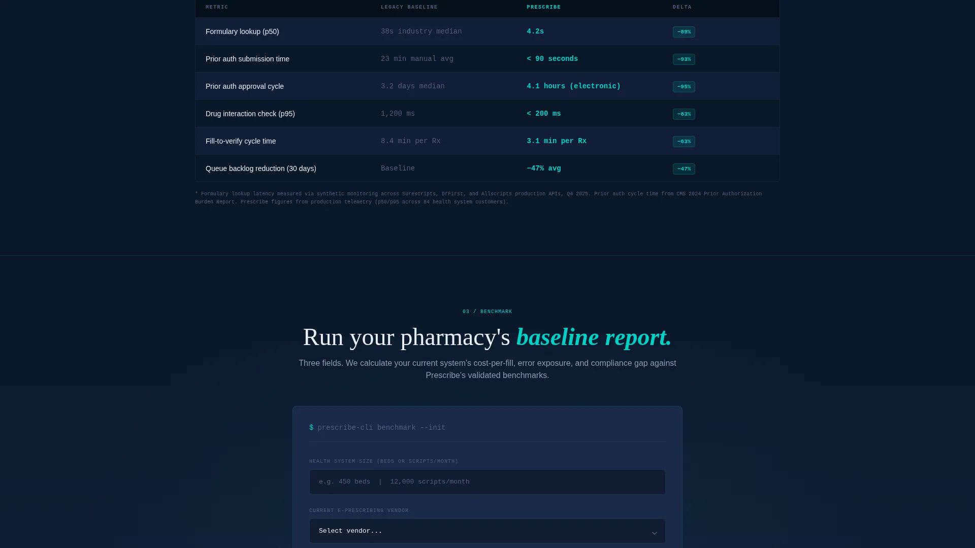
- A primary benchmark form (three fields: health system size, current e-prescribing vendor, work email) placed after the third spoke, plus a secondary email-gated PDF spec sheet download
Feature list
This section describes the key structural and functional capabilities built into the Prescribe landing page template.
Auto-Typing API Code Header
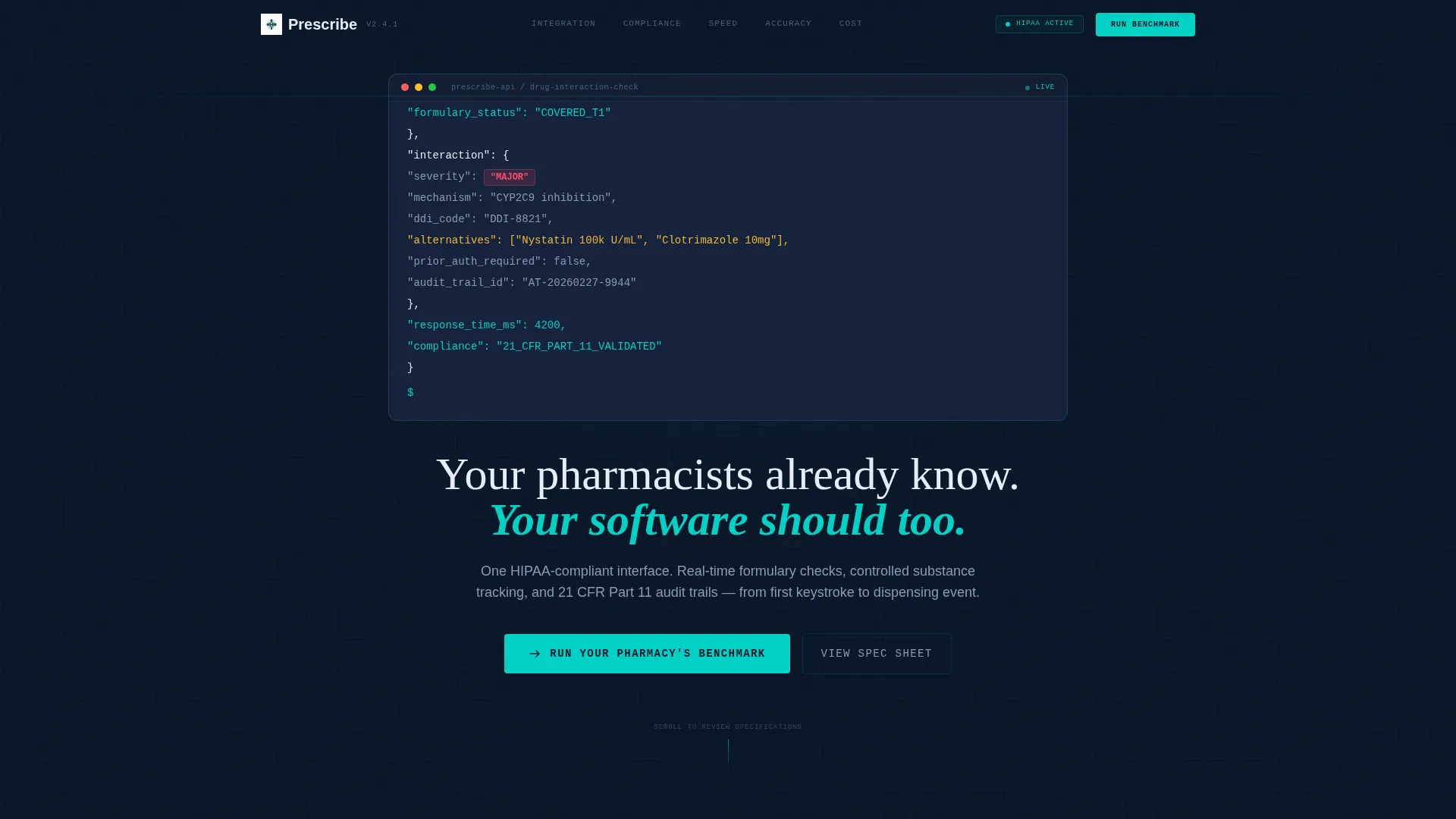
The header section renders a formatted JSON API response block character by character against the deep terminal navy background. The block shows a real-time drug interaction check result, including a severity flag, NDC codes, and therapeutic alternatives. The teal accent pulses on the "severity": "major" value before the headline fades in below.
Anchor Navigation with Five Spokes
A sticky anchor navigation bar pins to the top of the page and links to five named sections: Integration, Compliance, Speed, Accuracy, and Cost. This structure lets visitors jump directly to the performance dimension most relevant to their role without scrolling through unrelated content.
Two-Column Specification Comparison Tables
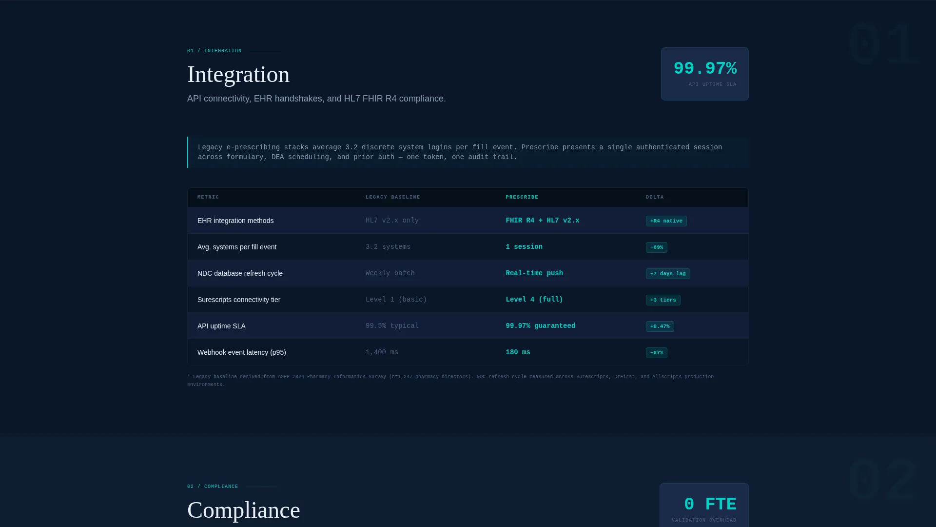
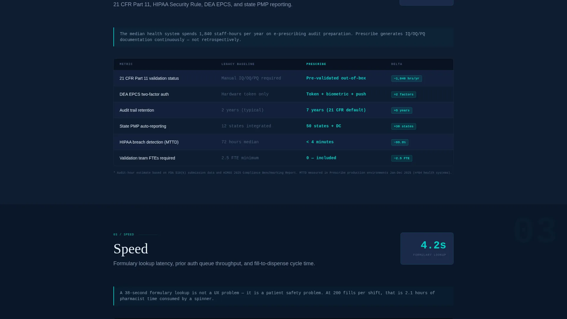
Each spoke section is built as a side-by-side table. The left column displays the legacy workflow metric (for example, average prior authorization time or audit preparation hours). The right column shows the platform metric. The performance delta is highlighted in alert teal so the difference reads at a glance.
Cumulative Evidence Conversion Flow
The primary call to action, "Run Your Pharmacy's Benchmark," appears after the third spoke. By that point, three sections of specific, cited data have already established the performance case. The form collects health system size, current e-prescribing vendor, and work email, qualifying leads before any sales conversation starts.
Dual Conversion Path Design
A secondary conversion path offers a downloadable full spec sheet in PDF format, gated behind email capture only. This gives budget-stage or research-stage visitors a lower-commitment entry point while still generating a qualified contact record.
Footnoted Methodology Callouts
Every data comparison section includes footnotes that cite the measurement methodology behind each metric. This approach addresses the skepticism of compliance-oriented buyers and positions the platform's numbers as auditable, not aspirational.
Page sections overview
| Section | Purpose |
|---|---|
| Auto-Typing Header | Opens with live drug interaction API code block and fade-in headline |
| Sticky Anchor Nav | Pins five spoke links to the top for fast in-page navigation |
| Integration Spoke | Compares legacy integration workflow metrics against platform benchmarks |
| Compliance Spoke | Shows 21 CFR Part 11 audit prep time reduction with cited data |
| Speed Spoke | Presents formulary lookup latency comparison, including 4.2s versus 38s median |
| Accuracy Spoke | Displays error rate per 1,000 fills comparison with teal delta callout |
| Cost Spoke | Breaks down operational cost metrics against legacy system baselines |
| Benchmark Form | Three-field primary call to action form placed after the third spoke section |
| Spec Sheet Download | Secondary email-gated PDF conversion path for research-stage visitors |
Design & branding system
The visual identity follows a Data Command theme built around a Midnight Blue color system. Every color choice is functional: it communicates state, hierarchy, or action rather than aesthetic preference. The result feels like a monitoring dashboard in a dimmed pharmacy cleanroom.
- Deep terminal navy (#0A1628) as the primary background, clinical steel (#1B2A4A) for card surfaces, phosphor white (#E8EEF5) for body text, and alert teal (#00D2C6) for interactive elements and data highlights
- Monospaced typography for the code header section, with teal pulsing on critical severity values to direct the eye without animation clutter
- Zero decorative elements: every visual component on screen carries informational weight, consistent with the Spec Sheet creative direction
Mobile & speed optimization
The template is structured so that the anchor navigation, comparison tables, and conversion forms remain fully usable on smaller screens. The data-heavy spoke layout adapts so that two-column comparison tables reflow cleanly for mobile viewport widths.
- Sticky anchor nav remains accessible on mobile so visitors can move between spokes without losing orientation
- The three-field benchmark form is compact by design, reducing friction for visitors completing it on a phone or tablet
- The code header animation is contained within the viewport so it does not cause layout shift when rendering on smaller displays
How this template helps you convert
The template is engineered around a specific conversion philosophy: earn the click by making the visitor's current system feel measurably obsolete before asking for any contact information.
- The auto-typing code header establishes technical credibility in the first seconds of the visit, signaling that this platform speaks the language of pharmacy operations professionals before a single marketing claim appears.
- The cumulative spoke structure builds evidence across Integration, Compliance, Speed, Accuracy, and Cost so that by the time the benchmark form appears after the third spoke, the visitor has already processed three sections of specific, cited performance data.
- The dual conversion path (benchmark form plus PDF spec sheet download) captures both decision-ready buyers and researchers in the same visit, without requiring a second campaign or separate landing page.
Other information about this template
This template is specifically designed for the pharmaceutical software and SaaS category, with a niche focus on pharmaceutical mobile app marketing. It sits at the intersection of clinical workflow technology and compliance-driven software sales.
- The HIPAA-compliant interface context and 21 CFR Part 11 compliance framing are baked into the Compliance spoke section, making it directly relevant to regulated health system procurement workflows
- The template is built as a Hub and Spoke layout with an Anchor Nav structure, a format well-suited to multi-dimension software comparisons where different buyer personas care about different performance axes
- Controlled substance tracking and e-prescribing workflow coverage are represented in the Integration and Accuracy spokes, ensuring the template addresses the full scope of the platform's documented capabilities
- The Comparison/Versus landing page direction means this template is best suited for campaigns targeting buyers who are actively evaluating alternatives to their current e-prescribing or pharmacy management systems
Theme
Data Command
Creative direction
Spec Sheet
Color system
Midnight Blue
Style
Hub & Spoke (Anchor Nav)
Direction
Comparison/Versus
Page Sections
Auto-typing API Code Header
Five-spoke Anchor Navigation
Two-column Comparison Tables
Cumulative Evidence Conversion Form
Email-gated PDF Spec Sheet Download
Footnoted Data Methodology
Related questions
Who is this template designed for?
Can I update the comparison metrics in each spoke section?
What conversion paths does this template include?
Why is the benchmark form placed after the third spoke rather than at the top?
Does the anchor navigation work on mobile devices?



