Meat Processing CRM Landing Page Template
Carcass is a Bold Brutalist landing page template built for a meat processing CRM platform. It uses a hub and spoke anchor navigation to guide plant managers, operations directors, and sales reps through a structured comparison of yield tracking, order management, USDA compliance, and receivables workflows, all within a terminal-grade industrial visual system.
by Rocket studio
Quick summary
Carcass is a single-page, anchor-navigated landing page template designed for a meat processing CRM platform. It presents a no-frills, data-driven argument against legacy tools and spreadsheets. Every section drives toward one diagnostic conversion goal: getting plant operators to run a plant comparison and see exactly what their current system costs them.
Who this template is for
This template was built for B2B SaaS companies serving the protein processing industry. It speaks directly to the people running production floors, not generic operations teams.
- Plant managers and operations directors who track yield data, manage USDA compliance, and review shift performance
- Sales representatives quoting box beef to regional distributors from mobile devices
- Finance and receivables teams monitoring customer credit and days sales outstanding
What problem this template solves
Generic CRM platforms were not designed for the rhythms of a processing plant. They cannot track trim yield by shift, automate Hazard Analysis and Critical Control Points (HACCP) records, or give a sales rep a live order status from a truck cab. This template gives a meat processing software platform a page that speaks the industry's language directly.
- Spreadsheets and legacy tools fail to connect kill-floor yield data with customer orders and compliance records in one view
- Plant operators waste time manually preparing USDA audit documentation that a purpose-built system could handle automatically
- Sales reps quoting box beef need real-time order-to-dock visibility, which generic CRMs do not provide
What you get with this template
The template delivers a fully structured, single-page layout with five anchor-linked content sections and a diagnostic conversion form. Everything is production-ready and built around the Acid Digital color system.
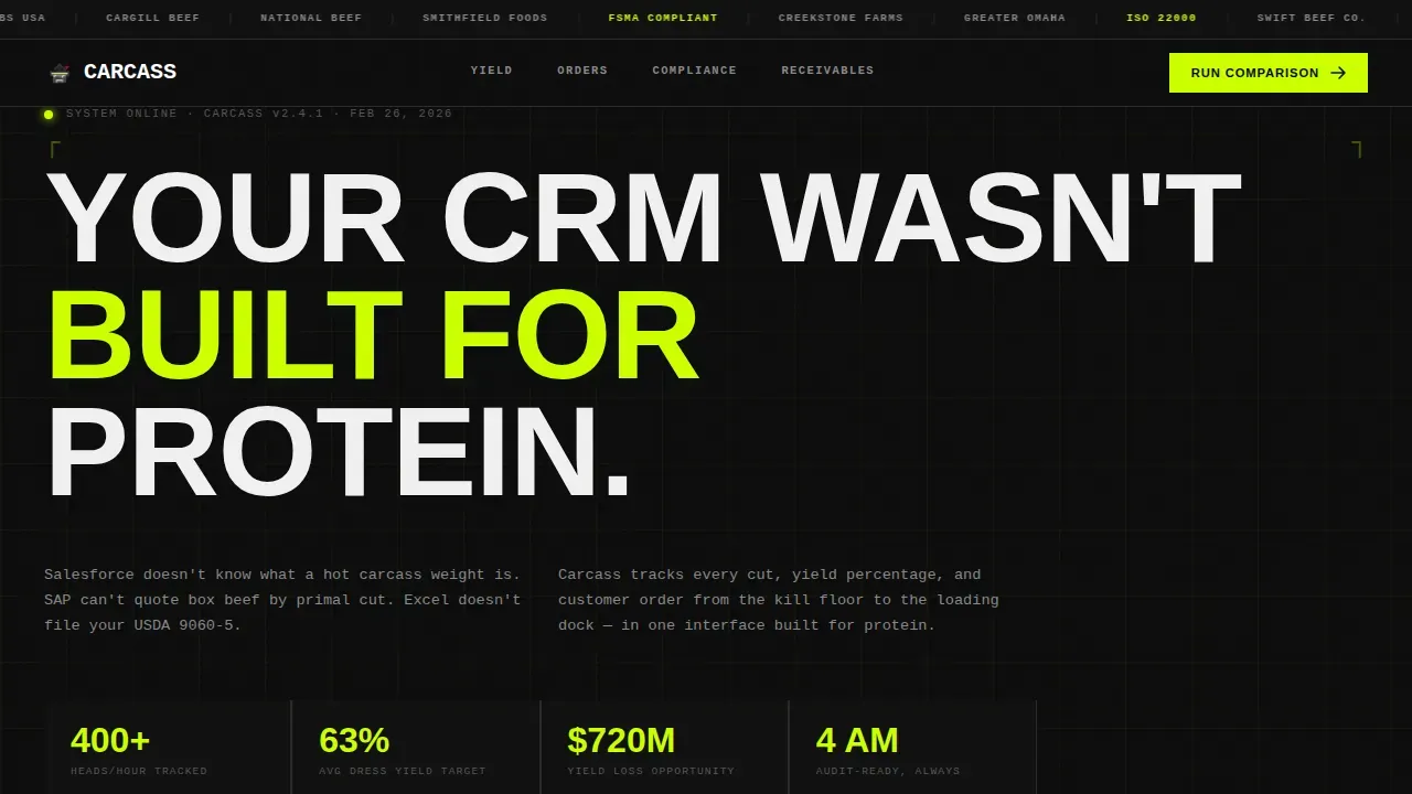
- A brutalist hero block with a full-width logo ticker showing compliance badges and industry brand marks, plus a 120-pixel condensed headline with no hero image
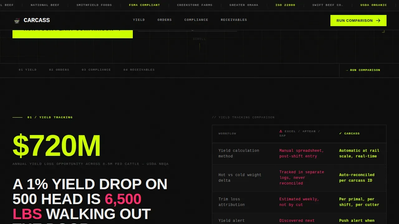
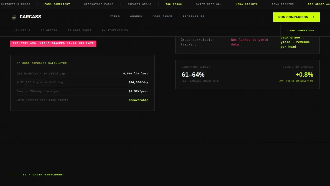
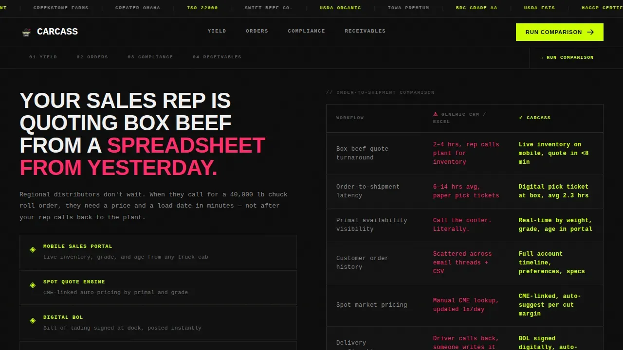
- Four spoke sections covering yield tracking, order and shipment management, USDA compliance, and receivables, each built around an oversized industry statistic and a side-by-side comparison table
- A primary diagnostic form asking for current system, daily head count, and sales rep count, plus a secondary gated PDF link for switching cost data
Feature list
This template includes purpose-built components matched to the workflow requirements of a meat processing CRM platform.
Hub and Spoke Anchor Navigation
A sticky anchor navigation bar lets visitors jump directly to the workflow section most relevant to them: Yield, Orders, Compliance, or Receivables. No scrolling past irrelevant content.
Industry Report Comparison Tables
Each spoke section opens with a damning industry statistic in oversized chartreuse numerals. A side-by-side comparison table follows, with the competitor column in muted gray and the platform column lit in electric green.
Brutalist Hero with Logo Ticker
The header features a horizontal scrolling ticker of meat processing brand logos, distributor marks, and compliance badges including USDA, HACCP, and SQF. Below it, a single all-caps condensed headline in 120-pixel type establishes authority before any body copy appears.
Diagnostic Conversion Form
The primary call to action is a short form asking three questions: current CRM or system via dropdown, average daily head count, and number of sales reps. The form makes the visitor's current pain quantifiable before requesting contact details.
Scroll-Triggered Counter Animations
Oversized statistics use scroll-triggered counter animations that activate as each section enters the viewport. Stagger reveals control when comparison table rows appear, keeping attention focused and the argument progressive.
Gated PDF Secondary Path
A plain text secondary link reads "See the full switching cost breakdown" and leads to a downloadable PDF gate. This provides a lower-commitment conversion path for visitors not yet ready to submit the diagnostic form.
Page sections overview
| Section | Purpose |
|---|---|
| Logo Ticker Header | Establish platform credibility with compliance badges and industry brand marks |
| Brutalist Hero | Deliver the core positioning statement in oversized all-caps condensed type |
| Yield Tracking Spoke | Compare yield accuracy between legacy tools and the platform using an industry statistic |
| Orders and Shipment Spoke | Show order-to-dock latency gaps and present a side-by-side tracking comparison |
| Compliance Spoke | Quantify USDA audit prep time and demonstrate digitized HACCP recordkeeping |
| Receivables Spoke | Address customer credit management and days sales outstanding comparison |
| Diagnostic call to action Form | Capture plant comparison leads with three targeted qualification fields |
| Footer | Minimal dark horizontal footer with navigation links and compliance marks |
Design & branding system
The visual identity runs on the Acid Digital color system layered over a Bold Brutalist design theme. Every surface is industrial, flat, and intentional.
- Color palette: pitch-black slab at #0D0D0D for backgrounds, raw concrete panel gray at #3A3A3A for section panels, electric chartreuse at #CCFF00 for buttons and data highlights, and biohazard magenta at #FF2D6B reserved for warning states and competitor callout columns
- Typography: JetBrains Mono for data and terminal-style labels, Oswald condensed grotesque set in all-caps for headlines, with the hero headline rendered at 120 pixels
- No hero image, no decorative gradients, no ornamental elements; authority comes from scale, contrast, and the cold efficiency of the layout
Mobile & speed optimization
The template is desktop-first by design, reflecting the primary users at plant workstations. Mobile support is present and practical for sales reps working from truck cabs.
- The anchor navigation, comparison tables, and diagnostic form are all usable on mobile viewports for field sales use cases
- The build is static-heavy with minimal JavaScript, relying on scroll-triggered animations and stagger reveals rather than heavy client-side rendering
- Interaction weight is kept lean: counter animations activate on scroll, comparison rows stagger into view, and no video or large image assets are required by the layout
How this template helps you convert
The page is engineered as a structured argument. Each scroll step escalates the visitor's awareness of what their current system costs them before a call to action appears.
- The logo ticker and compliance badges establish platform legitimacy in the first two seconds, so visitors trust the data that follows before reading a single word of body copy
- Each spoke section presents a damning statistic, then a comparison table, then moves the argument from inconvenience to financial loss per head, per shift, and per year, raising urgency before the diagnostic form arrives
- The diagnostic form converts by making the visitor's own numbers visible first, asking only three qualifying questions and framing the output as a personalized plant comparison rather than a sales pitch
Other information about this template
This template is part of a broader set of vertical SaaS landing page templates designed for industrial and enterprise software categories. A few additional details worth knowing before you build with it.
- The footer follows a minimal horizontal pattern with a dark background, suited for adding navigation links, legal copy, and compliance badge repetition
- The warning-state magenta at #FF2D6B is intentionally reserved for competitor comparison columns and alert contexts; using it outside those roles will dilute the visual hierarchy
- This template is localized for the United States market, using USD pricing references and imperial measurement conventions throughout
- The template style is Hub and Spoke with Anchor Navigation, meaning each major spoke section functions as a self-contained argument that also works in isolation if a visitor deep-links directly to a specific workflow anchor
Theme
Bold Brutalist
Creative direction
Industry Report
Color system
Acid Digital
Style
Hub & Spoke (Anchor Nav)
Direction
Comparison/Versus
Page Sections
Hub and Spoke Anchor Navigation
Industry Report Comparison Tables
Brutalist Hero with Logo Ticker
Diagnostic Conversion Form
Scroll-triggered Counter Animations
Gated PDF Secondary Path
Related questions
Who is this landing page template designed for?
Can I adapt the comparison tables to cover different workflow categories?
What does the diagnostic conversion form collect from visitors?
Does the template include the downloadable PDF for the secondary conversion path?
Does this template work if I only need three spoke sections instead of four?



