Healthcare Digital Presence Specialist Booking Website Template
Triage is a hub-and-spoke healthcare landing page built around a tool-first experience. Visitors filter by symptom, insurance carrier, and location radius before they ever scroll. Matched providers, a cost estimator, specialist comparison cards, and verified patient stories guide them from browsing to booking, all within a single, anchor-navigated page.
by Rocket studio
Quick summary
Triage is a healthcare directory and discovery landing page that puts a three-input search tool front and center. Visitors filter by symptom, insurance carrier, and zip code radius in under thirty seconds. Matched results, cost estimates, specialist comparisons, and patient stories then unfold in a structured hub-and-spoke layout that builds trust one spoke at a time.
Who this template is for
This template is built for teams running healthcare directory or patient-matching platforms who need a landing page that converts passive searchers into booked appointments.
- Healthcare platform operators and digital health startups who need a polished, structured patient intake experience
- Human resources professionals building provider lists for employee open enrollment resources
- Independent clinics and specialty practices that want to help new patients self-match before calling
What problem this template solves
Finding the right specialist is stressful, especially at odd hours or when you are new to a coverage plan. Most healthcare pages either overwhelm visitors with generic content or bury the search tool three scrolls down.
- Patients arrive without a clear path and leave before committing to a provider
- Insurance compatibility, location, and specialty are rarely searchable on the same screen
- Visitors with low intent need a lighter conversion option so their contact details are not lost
What you get with this template
This template delivers a fully structured, single-page layout designed around discovery and commitment. Every section earns the visitor's attention before asking for anything.
- A sticky anchor navigation rail that lets visitors jump between matched providers, cost estimates, comparisons, and patient stories
- A progressive three-panel booking form and a lightweight secondary email-capture path
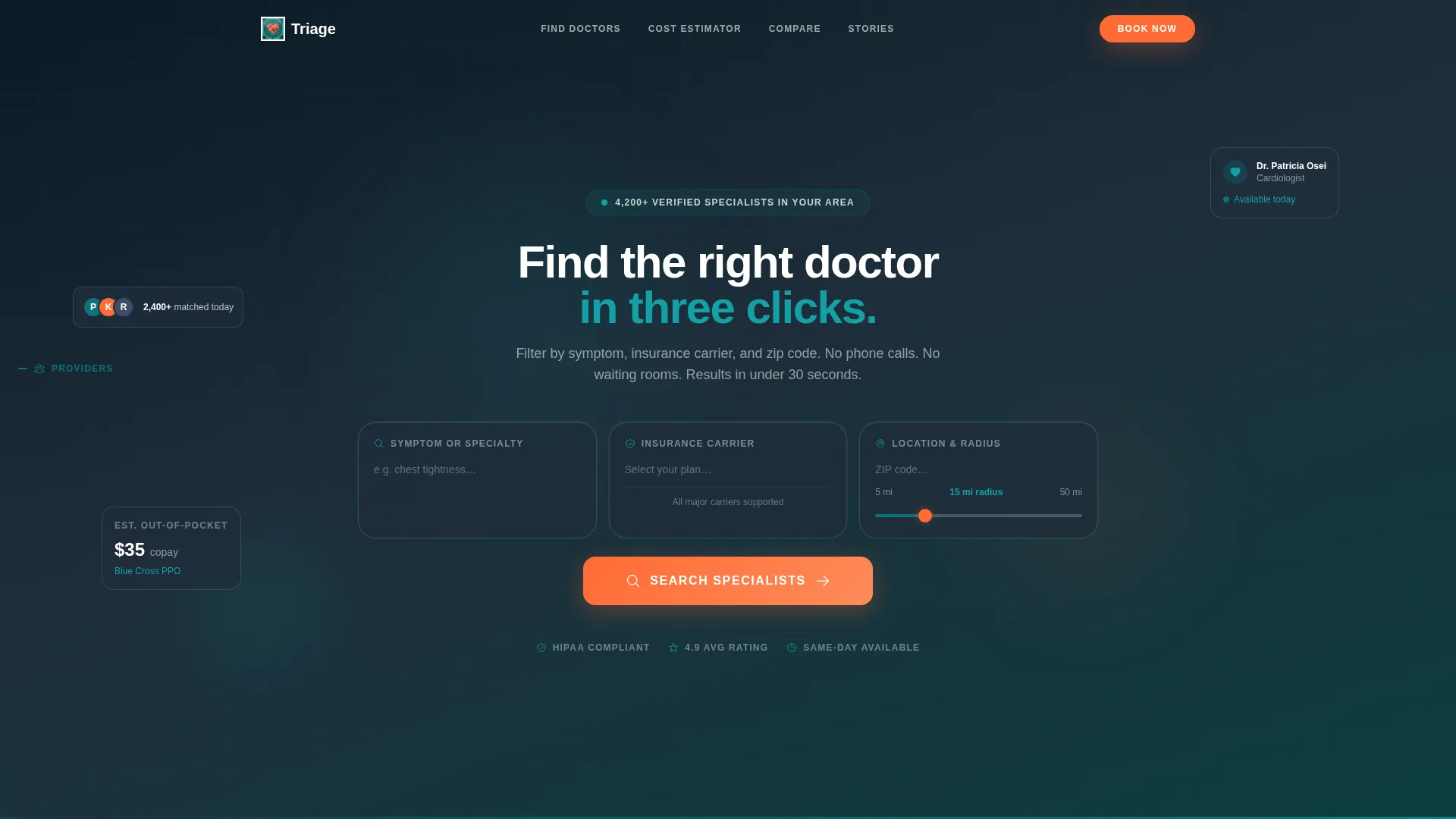
- A cohesive Teal Catalyst visual identity with dark glass panels, teal dividers, and pulse-orange calls to action
Feature list
This template is built around several purposeful components, each grounded in the healthcare discovery use case.
Three-Input Discovery Header
The header holds three dark glass panel cards: a symptom keyword field with autocomplete, an insurance carrier dropdown, and a location radius slider. No headline competes for attention. A single white line reads "Find the right doctor in three clicks." The pulse-orange search button is the most prominent element on screen.
Hub-and-Spoke Anchor Navigation
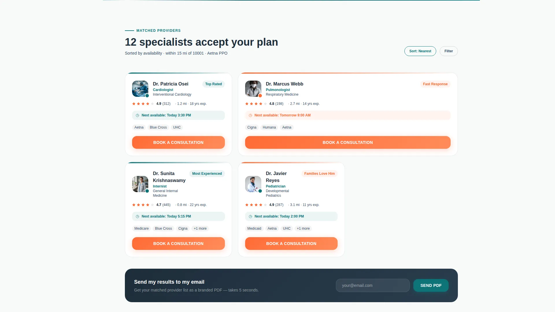
A sticky left-rail navigation anchors four content spokes: matched providers with ratings and availability, a cost estimator, a specialist comparison spoke, and a patient stories spoke. Visitors can jump directly to any spoke without losing context, keeping the experience focused and non-linear.
Cost Estimator Spoke
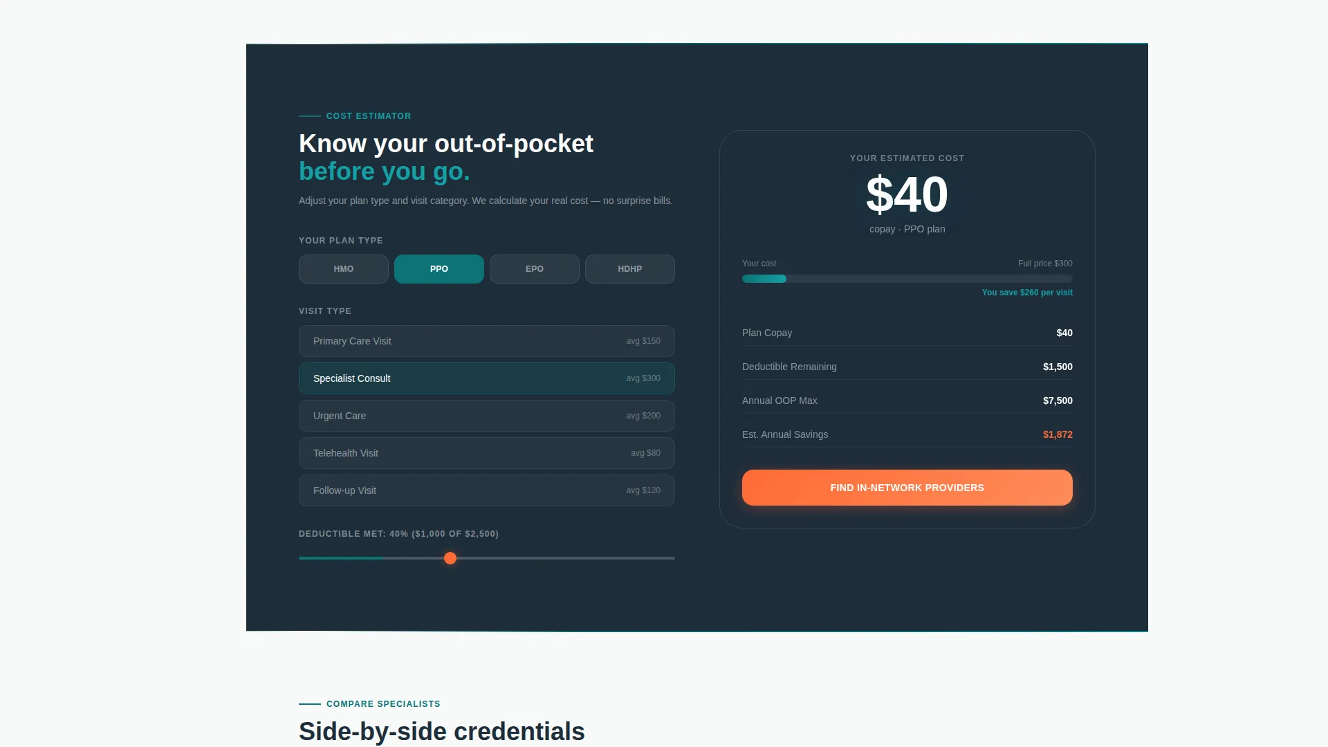
This spoke calculates estimated out-of-pocket costs based on the visitor's selected plan type. It gives price-sensitive patients a concrete reference point before they commit to booking, reducing drop-off caused by uncertainty about coverage.
Side-by-Side Specialist Comparison
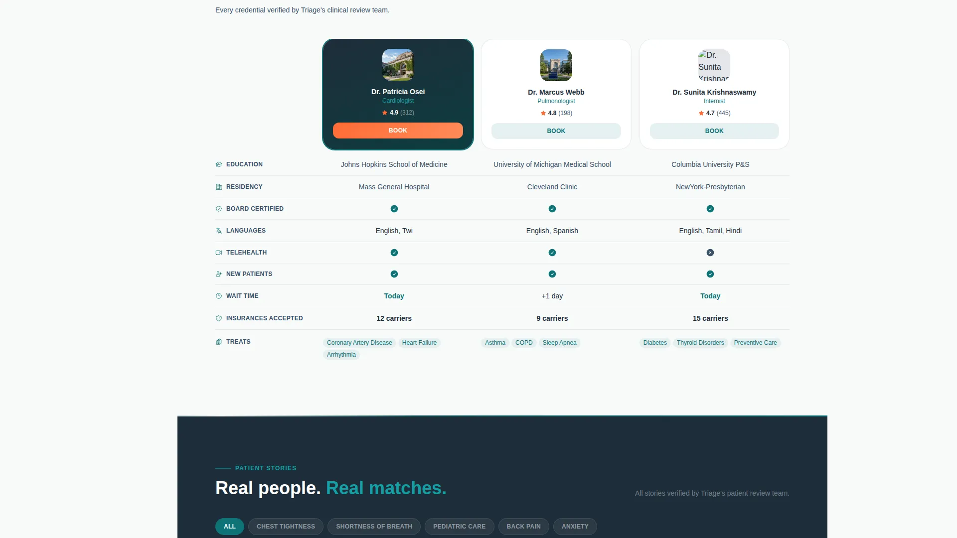
The comparison spoke presents credential cards for multiple specialists side by side. Visitors can evaluate qualifications, ratings, and availability without navigating away, making it easier to move from considering to deciding.
Progressive Booking Form
Clicking "Book a Consultation" opens a three-panel form. The first panel captures preferred date and time, the second asks for contact name and phone number, and the third offers an optional symptom description field. The structure keeps each step light and unintimidating.
Email Results Capture Path
A secondary conversion path labeled "Send My Results to My Email" collects a single email address and delivers the visitor's matched provider list as a branded portable document format file. This path serves visitors who are researching but not yet ready to book.
Page sections overview
| Section | Purpose |
|---|---|
| Discovery Header | Three-input symptom, insurance, and location search tool |
| Matched Providers Spoke | Displays rated providers with availability based on search inputs |
| Cost Estimator Spoke | Estimates out-of-pocket costs by plan type |
| Compare Specialists Spoke | Side-by-side credential and availability cards |
| Patient Stories Spoke | Verified reviews filtered to the visitor's condition |
| Progressive Booking Form | Three-panel form to capture consultation request details |
| Email Capture Path | Lightweight secondary form delivering results as a branded file |
| Fixed Mobile call to action Bar | Persistent "Book a Consultation" bar on smaller screens |
Design & branding system
The visual identity follows a Teal Catalyst color system built to feel calm, clinical, and immediately trustworthy. Dark panel backgrounds anchor the layout while a single bright accent drives every action.
- Deep surgical teal (#0D7377) acts as the primary brand anchor, washing across section dividers like corridor floor markings guiding visitors forward
- Charcoal scrub gray (#1E2D3A) fills text areas and panel backgrounds, paired with antiseptic white (#F7FAFA) for open breathing sections
- Pulse-orange (#FF6B35) appears only on calls to action and active state indicators, functioning like the single bright signal on a vitals monitor
Mobile & speed optimization
On smaller screens, the layout adapts so that the booking path stays accessible at all times. The experience is structured to reduce friction for mobile visitors who are searching urgently.
- The "Book a Consultation" call to action appears as a fixed bottom bar on mobile, always visible regardless of scroll position
- The dark glass panel cards and spoke sections reflow cleanly for narrower viewports, keeping inputs and content readable without horizontal scrolling
How this template helps you convert
The tool-first structure means visitors have already invested effort before any form appears. That investment increases the likelihood they complete the next step.
- The three-input header puts the discovery tool before any marketing copy, so visitors act before they scroll and arrive at results feeling engaged rather than sold to
- The spoke structure progressively deepens commitment, moving visitors from browsing matched providers to comparing credentials to reading patient stories before the booking form appears
- The dual conversion paths, a full booking form for high-intent visitors and a single-field email capture for lighter-intent visitors, ensure no contact opportunity is wasted
Other information about this template
This template is part of a broader Directory and Discovery theme designed for platforms that connect people with service providers. It pairs naturally with healthcare digital presence use cases where trust and specificity are essential.
- The template style is hub and spoke with anchor navigation, making it suitable for dense information architectures that need to stay scannable
- The Calculator and Tool First creative direction is a deliberate choice: it removes the cold start problem by giving visitors something to do the moment they land
- The header concept uses dark glass panels with frosted borders and subtle light gradients along card edges, evoking the glow of overhead clinical fluorescents
Theme
Directory & Discovery
Creative direction
Calculator/Tool First
Color system
Teal Catalyst
Style
Hub & Spoke (Anchor Nav)
Direction
Lead Generation
Page Sections
Three-input Discovery Header
Hub-and-spoke Anchor Navigation
Cost Estimator Spoke
Side-by-side Specialist Comparison
Progressive Three-panel Booking Form
Secondary Email Results Capture
Related questions
Can this template support both high-intent and low-intent visitors?
How does the hub-and-spoke navigation work on this page?
What does the progressive booking form collect?
Who is this landing page template built for?
Can the color scheme be customized for a different brand?



