AR-Enhanced HRM Landing Page Template
Prism is a split-screen landing page template built for an augmented reality-enhanced human resource management platform. It pairs a monochrome steel visual identity with dynamic motion design to contrast traditional HRM tools against spatial AR workflows. The layout drives a Comparison/Versus conversion path, guiding VP-level HR leaders and IT directors toward a side-by-side demo request.
by Rocket studio
Quick summary
Prism is a single-page, split-screen landing page template designed for an AR-enhanced human resource management platform. It uses a 50/50 layout, a monochrome steel color system, and progressive motion design to show visitors exactly why flat HRM data feels obsolete next to a spatial, dimensional alternative.
Who this template is for
This template speaks directly to enterprise decision-makers who are evaluating a step change in how their organizations manage people operations. The audience already knows HRM tools. They need to feel the gap between what they have and what is possible.
- VP-level HR leaders at companies with 500 or more distributed employees
- IT directors assessing enterprise platform integrations and spatial computing readiness
- Change-management consultants modernizing legacy people-ops for clients
What problem this template solves
Most HRM platform pages describe features in bullet points. That approach does not communicate the visceral difference between a flat dashboard and a three-dimensional AR workspace. Visitors leave without feeling the contrast.
- Static pages fail to convey the sensory leap from traditional HRM to AR-enhanced workflows
- Enterprise buyers need a structured, side-by-side argument before committing to a demo
- Generic landing pages do not address specific use cases like spatial onboarding or AR performance reviews
What you get with this template
You get a fully structured, conversion-focused single-page layout built around a Feature Matrix comparison framework. Every section is purposefully designed to widen the perceived gap between legacy tools and the AR alternative.
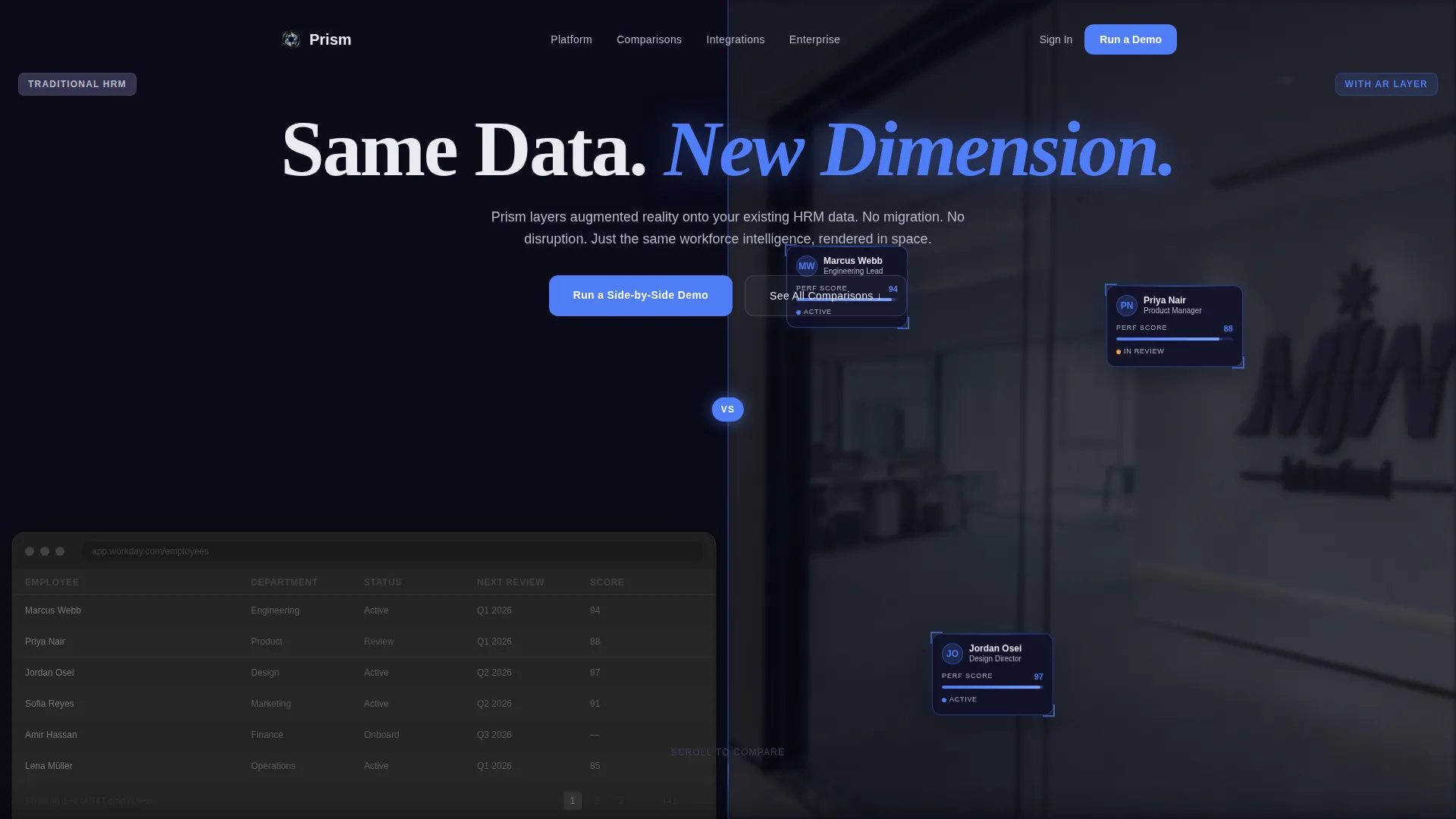
- A split-screen header with a pulsing electric-blue divider and dual-panel product screenshot
- A scrolling Feature Matrix with five side-by-side capability comparisons using progressive CSS motion
- Two conversion paths: a demo-request form and a gated PDF download for lower-intent visitors
Feature list
This template is built around six distinct design and layout capabilities, each grounded in the brief.
Split-Screen Header with AR Contrast
The header divides the viewport down the center. The left half shows a traditional HRM dashboard with dense columns and status badges. The right half renders the same data as a holographic AR workspace floating over a real office photograph. A thin electric-blue line pulses once on load to direct attention to the contrast. The headline "Same Data. New Dimension." fades in across both panels.
Progressive Feature Matrix Layout
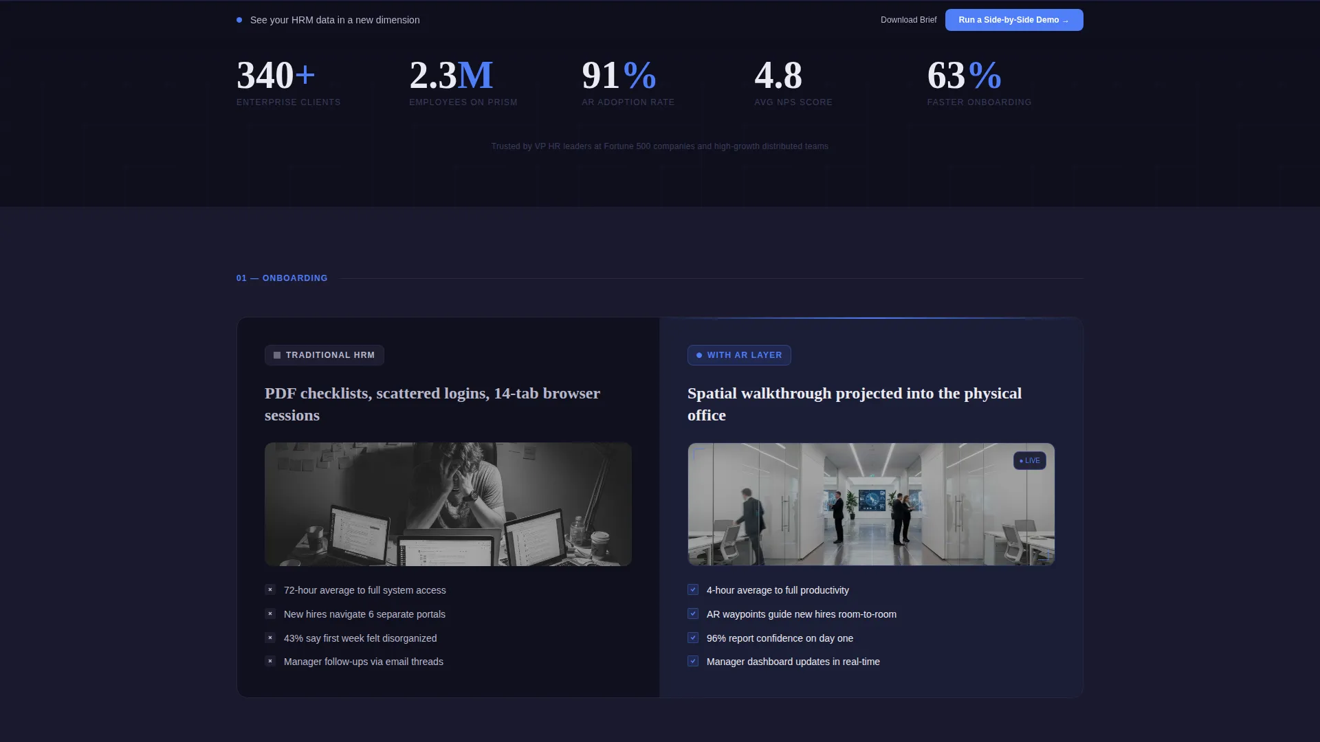
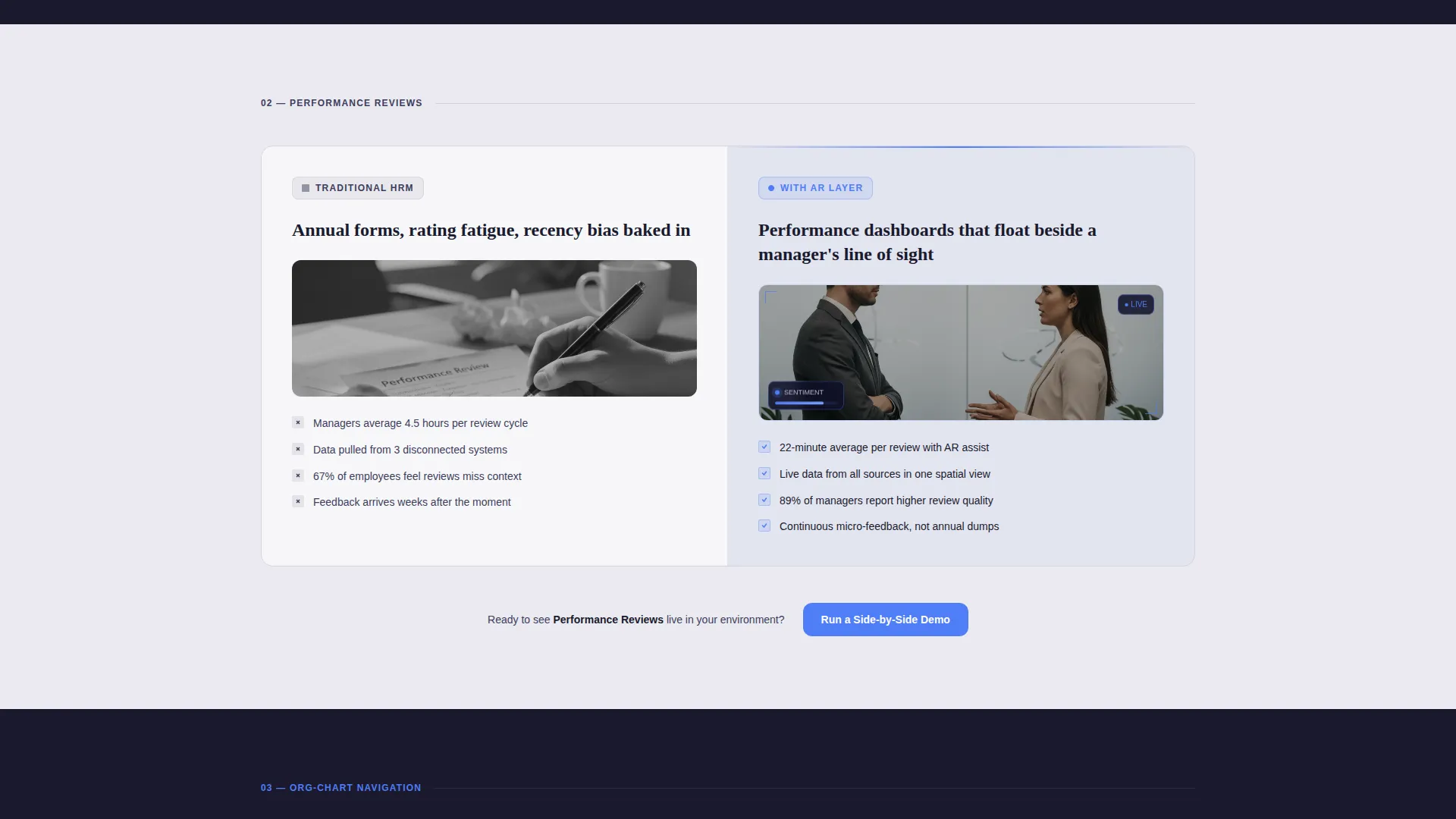
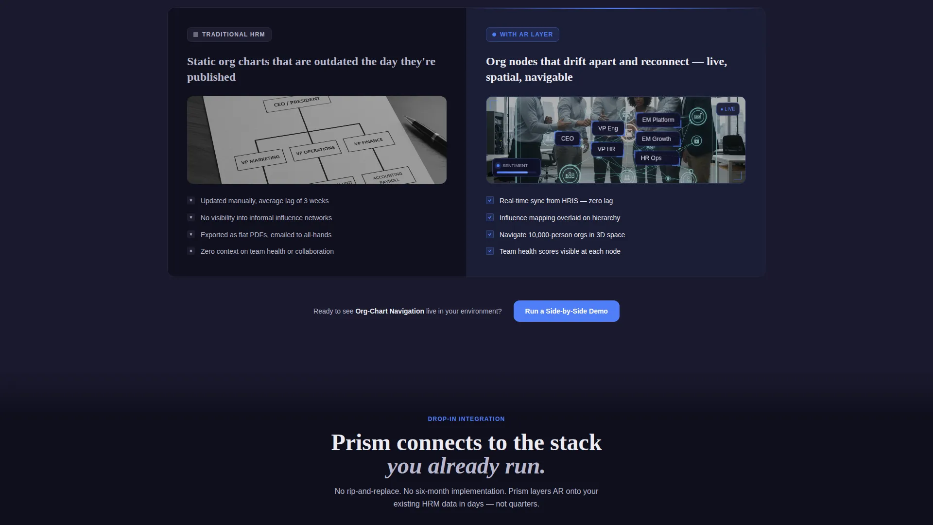
Five capability comparisons scroll in sequence: onboarding, performance reviews, org-chart navigation, real-time sentiment tracking, and spatial meeting analytics. Each row is a 50/50 split labeled "Traditional HRM" on the left and "With AR Layer" on the right. Motion intensity builds section by section, so the right column feels increasingly alive by the final row.
Dynamic Motion Design System
The right-hand AR column uses subtle CSS motion throughout. Cards tilt on scroll, data points pulse, and org-chart nodes drift apart and reconnect. This motion is not decorative. It makes the AR experience tangible for visitors who have never worn a headset.
Dual Conversion Path Structure
The primary call to action, "Run a Side-by-Side Demo," appears after every third comparison row and is pinned in a slim bottom bar after the header scrolls out of view. A secondary path offers "Download the Comparison Brief" as a gated PDF for visitors who are not yet ready to book. The demo form captures work email, current HRM platform, and headcount range.
Monochrome Steel Visual Identity
Backgrounds alternate between forge-black and polished chrome to create a visual rhythm across the page. Body text uses chrome on dark sections and gunmetal on light sections. The electric-blue accent appears only on interactive states, hover effects, and AR element outlines, making every glow feel intentional.
Depth-of-Field AR Imagery Direction
The header's right panel uses depth-of-field blur on the physical office environment to pull visual focus onto the floating data layer. This image direction signals spatial computing context without requiring the visitor to have prior AR experience.
Page sections overview
| Section | Purpose |
|---|---|
| Split-Screen Header | Introduce the AR contrast and headline |
| Onboarding Comparison Row | Compare AR walkthroughs to static onboarding |
| Performance Review Row | Show floating dashboards versus. flat review tools |
| Org-Chart Navigation Row | Contrast spatial node maps with grid charts |
| Sentiment Tracking Row | Demonstrate real-time AR sentiment versus. static reports |
| Spatial Meeting Analytics Row | Show meeting analytics floating in physical space |
| Demo Request Form | Capture work email, platform, and headcount |
| Comparison Brief Download | Secondary gated PDF path for lower-intent visitors |
| Pinned Bottom Bar call to action | Keep demo call to action visible after header scrolls away |
Design & branding system
The visual identity runs on a Monochrome Steel color system. Every tone is chosen for precision and contrast, not warmth. The palette feels industrial and calibrated.
- Core tones: forge-black (#1A1A2E), brushed gunmetal (#3D3D5C), polished chrome (#B8B8CC), and cold-white highlight (#EAEAF0)
- Single accent: electric-blue (#4F7DF7) reserved for interactive states, hover effects, and AR element outlines only
- Alternating section backgrounds between forge-black and polished chrome create a visual heartbeat across the scroll
Mobile & speed optimization
The Dynamic Motion theme is designed to feel fast and controlled. Motion is applied through CSS rather than heavy video assets, keeping the page responsive across devices.
- CSS-driven tilt, pulse, and drift animations reduce reliance on large video files
- Split-screen layout adapts to narrower viewports without losing the left-versus-right comparison structure
- The pinned bottom bar call to action maintains conversion access on mobile without obstructing content
How this template helps you convert
The Prism template earns the click through cumulative contrast. By the time a visitor reaches the form, they have already seen five side-by-side comparisons that make their current stack feel inadequate.
- The pulsing divider and split header create immediate visual tension, pulling the visitor into the comparison before they read a single word.
- Progressive motion escalation across five Feature Matrix rows builds a mounting sense that the AR side is alive while the traditional side is frozen, making the demo feel like the obvious next step.
Other information about this template
This template is built specifically for the AR-enhanced enterprise software category and aligns with spatial computing adoption at the VP and director level. It supports a structured sales argument suited to longer enterprise evaluation cycles.
- The form dropdown includes Workday, BambooHR, SAP SuccessFactors, and Other as current HRM platform options
- The headcount range field in the demo form helps qualify leads before the first conversation
- The gated PDF secondary path reduces bounce by offering value to visitors who need more time before booking
- The template is positioned for technology platforms operating at the intersection of human resource management and spatial computing
Theme
Dynamic Motion
Creative direction
Feature Matrix
Color system
Monochrome Steel
Style
Split Screen (50/50)
Direction
Comparison/Versus
Page Sections
Split-screen AR Contrast Header
Progressive Feature Matrix Rows
CSS Motion on AR Column
Dual Conversion Path Design
Monochrome Steel Color System
Depth-of-field Header Image Direction
Related questions
Who is this landing page template designed for?
What conversion actions does this template support?
Does the template include the AR animations or are those directional?
Can I adapt the Feature Matrix rows for different capabilities?
How does the pinned bottom bar work?



