Results-Driven Contact Lens Landing Page Template
Optic is a Bold Brutalist optometry landing page template built for independent optometrists and multi-location practices. It uses a scroll-reveal Problem-to-Solution arc, a live dashboard hero, and a charcoal-and-sky-blue palette to turn clinical confidence into immediate action. The primary call-to-action drives visitors toward a live mobile app demo.
by Rocket studio
Quick summary
Optic is a single-page, scroll-reveal landing page template designed for optometry practices. It opens with a floating dashboard preview, walks visitors through a Problem-to-Solution arc, and closes with a compelling app-download call-to-action. The Bold Brutalist visual style makes it feel authoritative and distinct from every generic health website on the market.
Who this template is for
This template was designed for eye care professionals who want a digital presence that reflects the precision of their practice. It suits a wide range of practice types and career stages.
- Independent optometrists who are tired of cookie-cutter health website designs
- Multi-location practices that need to present online booking across several offices clearly
- New optometrists opening their first practice who need to look established from day one
What problem this template solves
Most optometry websites bury the phone number, hide the booking link, and look identical to every other clinic in town. Patients do not wait. They click away. This template directly mirrors the frustrations clinicians already feel and then resolves each one visually as the visitor scrolls.
- Cluttered, generic layouts that make patients lose trust before they ever book
- Missed online bookings that go to the competitor because the process felt too difficult
- Paper-based intake forms and outdated presentation that signals a behind-the-times practice
What you get with this template
You get a fully structured, single-page landing page built around a progressive scroll experience. Every section is purposefully sequenced to move a visitor from recognition of pain to desire for the solution. Nothing is decorative for the sake of it.
- A scroll-reveal layout with problem blocks, solution reveals, booking flow sections, and a patient portal preview
- A dashboard hero section with realistic, specific sample patient data already populated
- A sticky secondary call-to-action button and a primary app-preview call-to-action that drive mobile demo downloads
Feature list
This template includes purpose-built components that serve the optometry context directly. Each one earns its place in the layout.
Dashboard Hero with Live Practice Preview
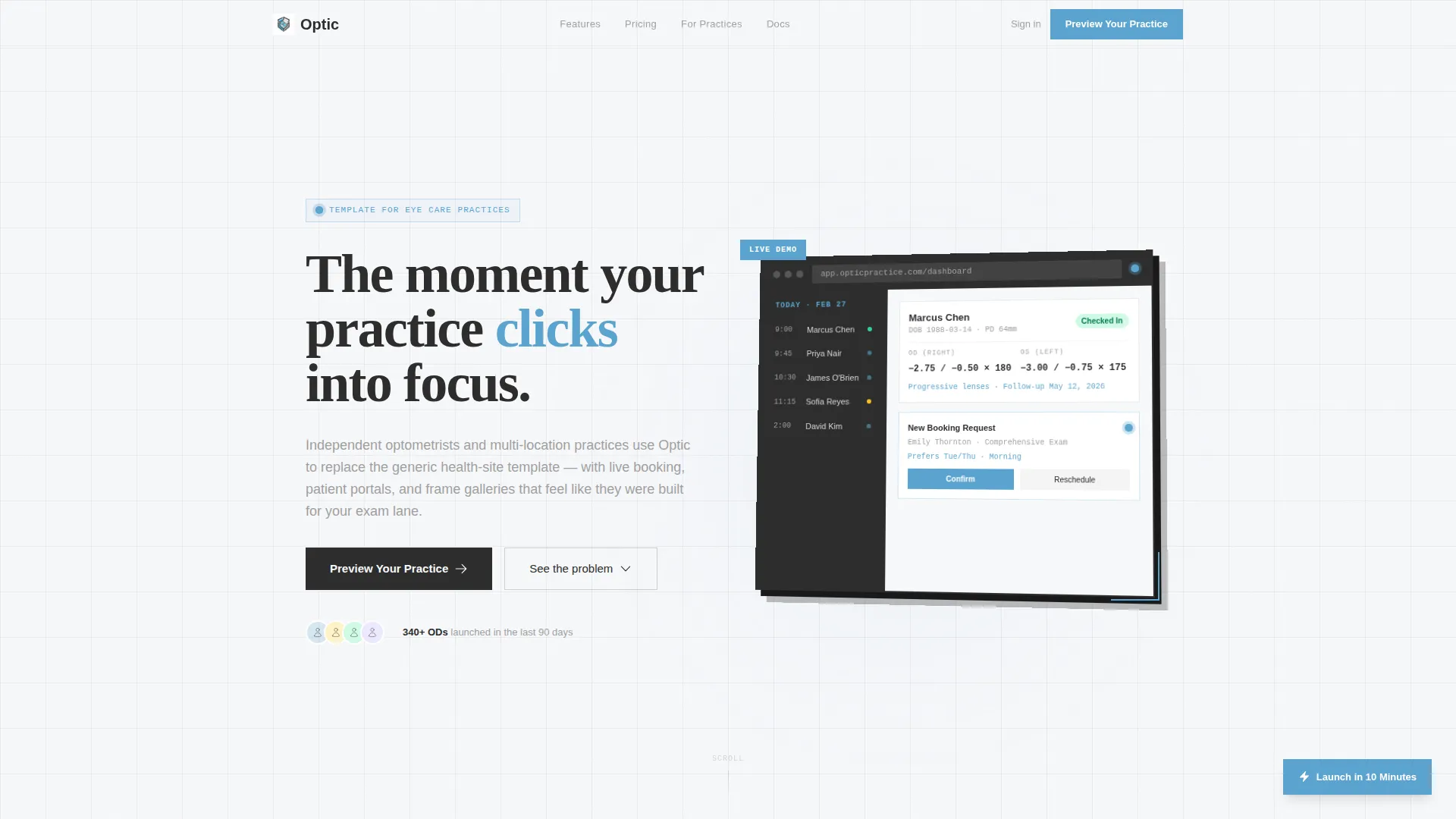
The header opens with a floating browser frame set against a charcoal background. It shows a live optometry practice dashboard: today's appointments, a patient record mid-edit with prescription history and pupillary distance, and a pulsing booking widget. Sample data is specific enough to feel real, reinforcing immediate trust.
Scroll-Reveal Problem-to-Solution Arc
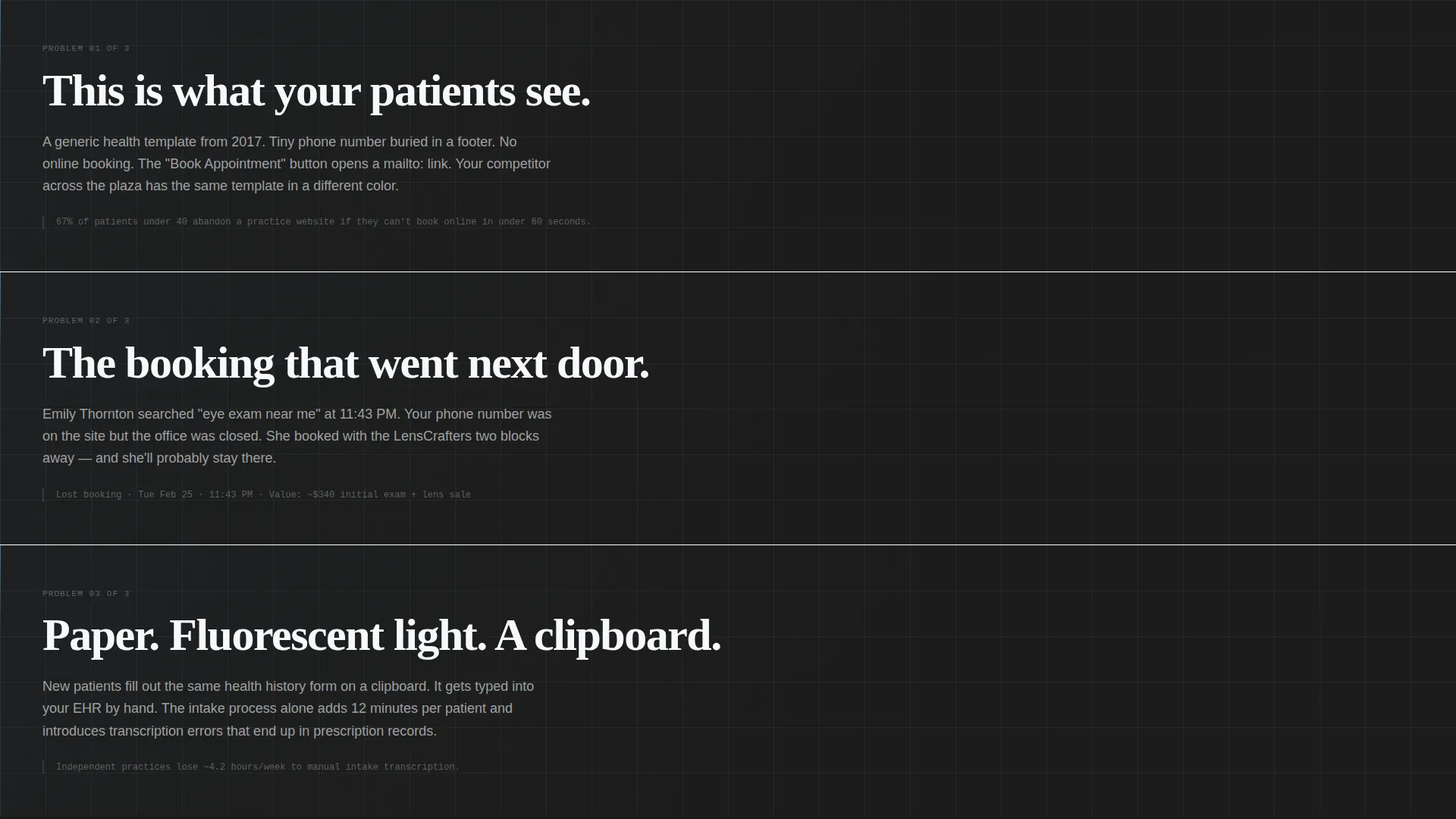
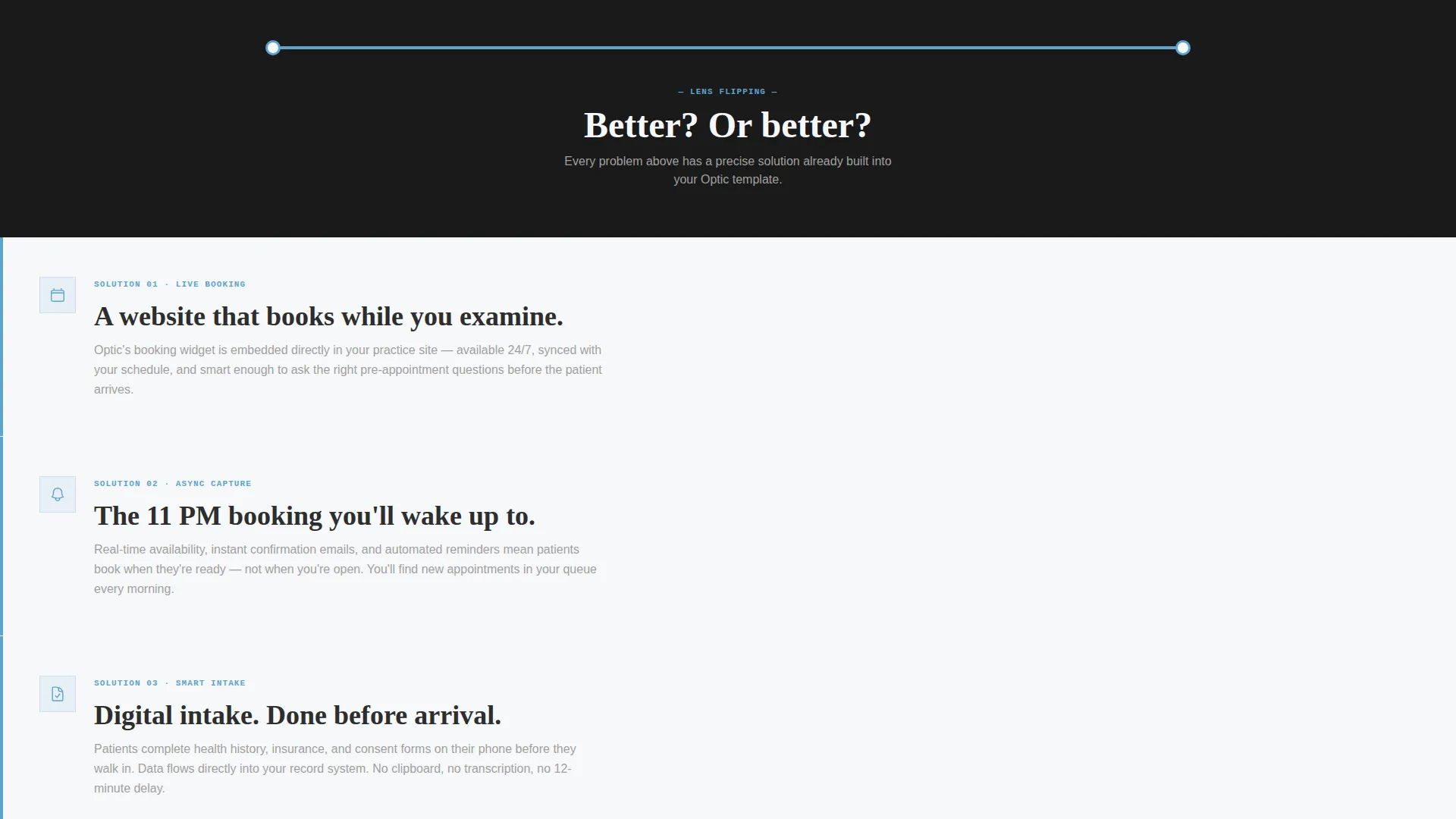
The page scrolls through three escalating problem blocks using oversized mono typography on dark slabs. After a sky-blue horizontal divider cuts across the page, each problem mirrors a matching solution section. Booking flows, patient portal layouts, and frame gallery sections assemble progressively as the visitor scrolls down.
Brutalist Typography and Visual System
Heavy-weight charcoal slab type dominates structural headings. Sky blue marks every interactive surface. White space is used clinically rather than decoratively. The result is a layout that reads like precision rather than decoration, appropriate for a clinical brand.
Sticky Secondary Call-to-Action Button
A persistent "Launch in 10 Minutes" button stays visible as the visitor scrolls. This creates a low-friction entry point for visitors who are ready to act before reaching the primary call-to-action at the bottom of the page.
Frame Gallery and Booking Flow Layouts
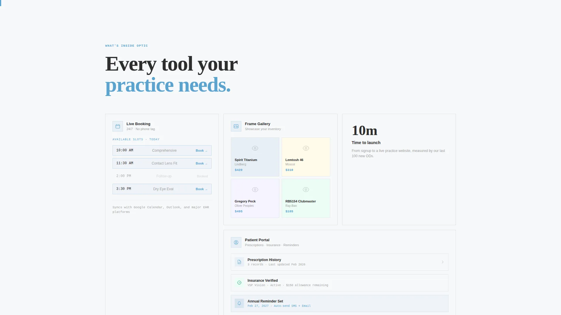
The template includes pre-structured sections for a frame gallery and an online booking flow. These sections are revealed progressively as part of the solution arc, showing visitors exactly how a polished optometry practice website handles product browsing and appointment scheduling.
Mobile App Download Call-to-Action
The primary call-to-action, "Preview Your Practice," links to a mobile app where optometrists can interact with a live demo template. The page earns this action by reflecting the visitor's own pain back at them before presenting the solution, making the download feel like a logical next step.
Page sections overview
| Section | Purpose |
|---|---|
| Dashboard Hero | Opens with a floating practice dashboard to establish credibility immediately |
| Problem Block One | Shows a cluttered generic website to trigger recognition in the visitor |
| Problem Block Two | Depicts a missed online booking to raise the stakes of inaction |
| Problem Block Three | Presents a paper intake form to highlight outdated practice presentation |
| Solution Divider | A sky-blue horizontal rule that signals the page shift from problem to solution |
| Booking Flow Reveal | Progressive reveal of a clean appointment booking section |
| Patient Portal Preview | Shows a structured patient record and prescription history layout |
| Frame Gallery Layout | Scroll-reveal section for product browsing and eyewear display |
| Primary Call-to-Action | "Preview Your Practice" app download section that closes the page |
Design & branding system
The Slate and Sky color system is built around four values that each carry a specific role in the layout. Nothing is arbitrary. The palette evokes a brutalist eye clinic with poured-concrete authority and one sharp window of clinical light.
- Charcoal slab (#2D2D2D) dominates structural blocks and heavy typographic elements; exposed concrete gray (#A0A0A0) handles secondary text and surface tones
- Clinical sky blue (#5BA4CF) marks every interactive and clickable surface, from buttons to dividers, making navigation instinctive
- Sharp white (#F7F8FA) is used like negative space on a Snellen chart, making content legible rather than decorative
Mobile & speed optimization
The scroll-reveal animation system is designed to work progressively, meaning components assemble as the visitor reaches them rather than loading all at once. This keeps the experience smooth on smaller screens without sacrificing the visual impact of the reveal sequence.
- Each solution section assembles on scroll, reducing visual clutter on mobile viewports
- The sticky call-to-action button remains accessible across all screen sizes, ensuring no visitor loses the entry point
- The dashboard hero is rendered as a rotated browser frame with a brutalist drop shadow, scaled appropriately for both desktop and mobile display
How this template helps you convert
This template is structured to earn the call-to-action rather than demand it. By the time a visitor reaches the primary button, they have already mentally rebuilt their website three times while scrolling through the problem arc.
- The problem-first scroll sequence creates recognition and discomfort before presenting any solution, making the solution feel genuinely necessary rather than marketed
- The realistic dashboard hero with specific sample data builds immediate credibility, signaling that this is a professional-grade product rather than a generic theme
- The dual call-to-action structure, one persistent and one closing, captures both the impulsive visitor and the one who needs to be convinced first
Other information about this template
This template is part of a broader optometry digital presence category within the technology template marketplace. It is designed to work as a standalone landing page for practices at any stage.
- The template style is classified as Scroll Reveal (Progressive), meaning each section animates into view as the visitor reaches it during natural scrolling
- The Bold Brutalist theme is intentional and distinct; it is not a medical-soft or pastel health template, making it well suited for practices that want to stand out
- The landing page direction is App Download, meaning the full conversion goal is a mobile demo interaction rather than a direct sign-up form submission on the page itself
Theme
Bold Brutalist
Creative direction
Problem→Solution Arc
Color system
Slate & Sky
Style
Scroll Reveal (Progressive)
Direction
App Download
Page Sections
Dashboard Hero with Practice Preview
Scroll-reveal Problem-to-solution Arc
Sticky Secondary Call-to-action
Booking Flow and Patient Portal Sections
Frame Gallery Layout
Bold Brutalist Visual Identity
Related questions
Who is this landing page template built for?
What is the primary call-to-action on this template?
Does this template include pre-built sections for booking and patient records?
Can a new practice use this template to look established right away?
What makes this template different from a standard health website template?



