Government Software & SaaS Reviews Website Template
Procure is a government point-of-sale landing page template built for procurement compliance teams. It features a split-screen hero with a live procurement terminal preview, an interactive department explorer, an audit trail simulator, and a compliance matrix. The design follows a Monochrome Steel palette engineered to match the authority and precision of government workstation environments.
by Rocket studio
Quick summary
Procure is a single-page landing page template purpose-built for government point-of-sale platforms. It pairs a data-command visual identity with deeply interactive sections, letting procurement officers and municipal IT directors explore real workflows before committing to a deployment. The goal is straightforward: earn the terminal download by letting visitors operate the product first.
Who this template is for
This template is designed for government technology teams that need to communicate compliance and operational precision at a glance. It speaks directly to decision-makers who live inside procurement workflows every day.
- County procurement officers managing fleet purchases and fund encumbrance
- Municipal IT directors preparing terminals for upcoming audit cycles
- State agency clerks operating under strict per-transaction reporting rules
What problem this template solves
Most software landing pages rely on marketing copy to describe a product's value. Government buyers do not respond to that approach. They need to see how a system handles requisition codes, multi-department approval chains, and audit-ready reporting before they will consider a deployment.
- Generic landing pages fail to demonstrate compliance workflows in a meaningful way
- Government procurement teams need proof of function, not promotional language
- Audit-cycle pressure means IT directors cannot afford to evaluate tools that feel uncertain
What you get with this template
This template delivers a fully structured, interactive single-page layout ready for a government point-of-sale product. Every section is purposefully sequenced to move a cautious, compliance-minded buyer toward a confident deployment decision.
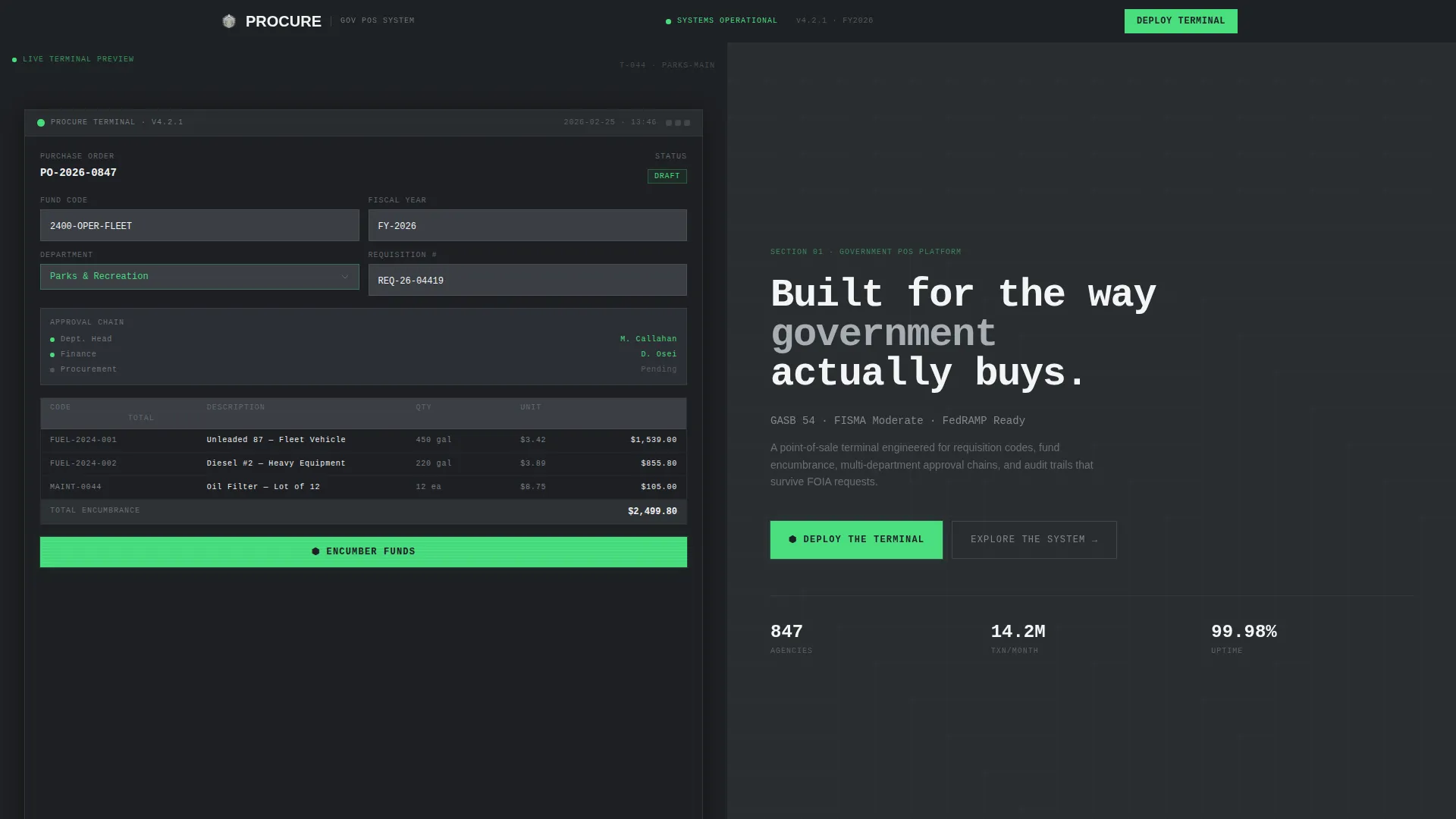
- A split-screen hero with a live-styled procurement terminal dashboard on the left and an oversized monospaced headline on the right
- An interactive department explorer, an audit trail simulator, and a state-toggled compliance matrix
- A two-step deployment flow with environment selection and a dot-gov email verification path
Feature list
This template includes purpose-built interactive components that demonstrate real procurement logic rather than describing it.
Split-Screen Hero Dashboard
The hero divides the viewport into two equal halves. The left panel renders a styled procurement terminal showing a partially completed purchase order, a visible fund code, a department dropdown set to "Parks and Recreation," a line-item cost table, and a signal-green "Encumber Funds" button. The right panel carries the headline in oversized monospaced type.
Interactive Department Explorer
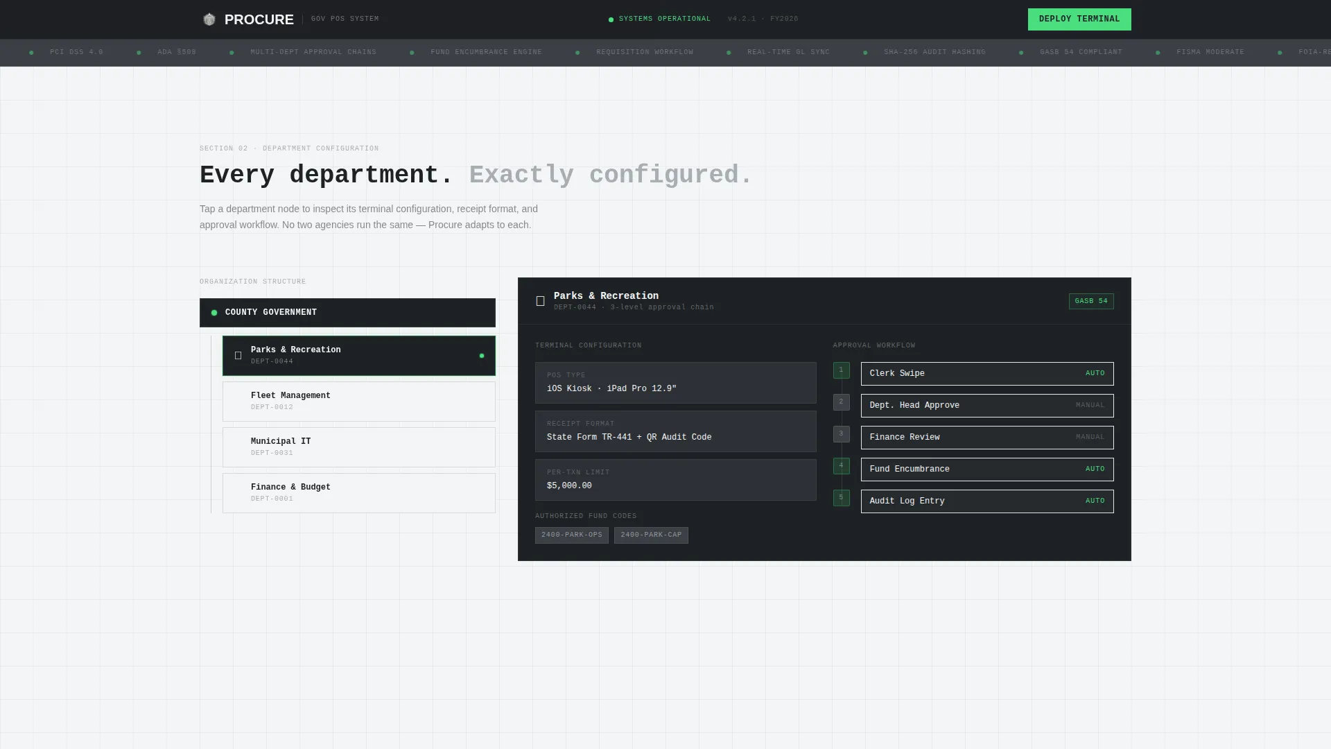
Section two presents a clickable organizational chart. Tapping any department node morphs the right panel to display that department's point-of-sale configuration, receipt format, and approval workflow. This lets visitors see how the system adapts to different agency structures without leaving the page.
Audit Trail Simulator
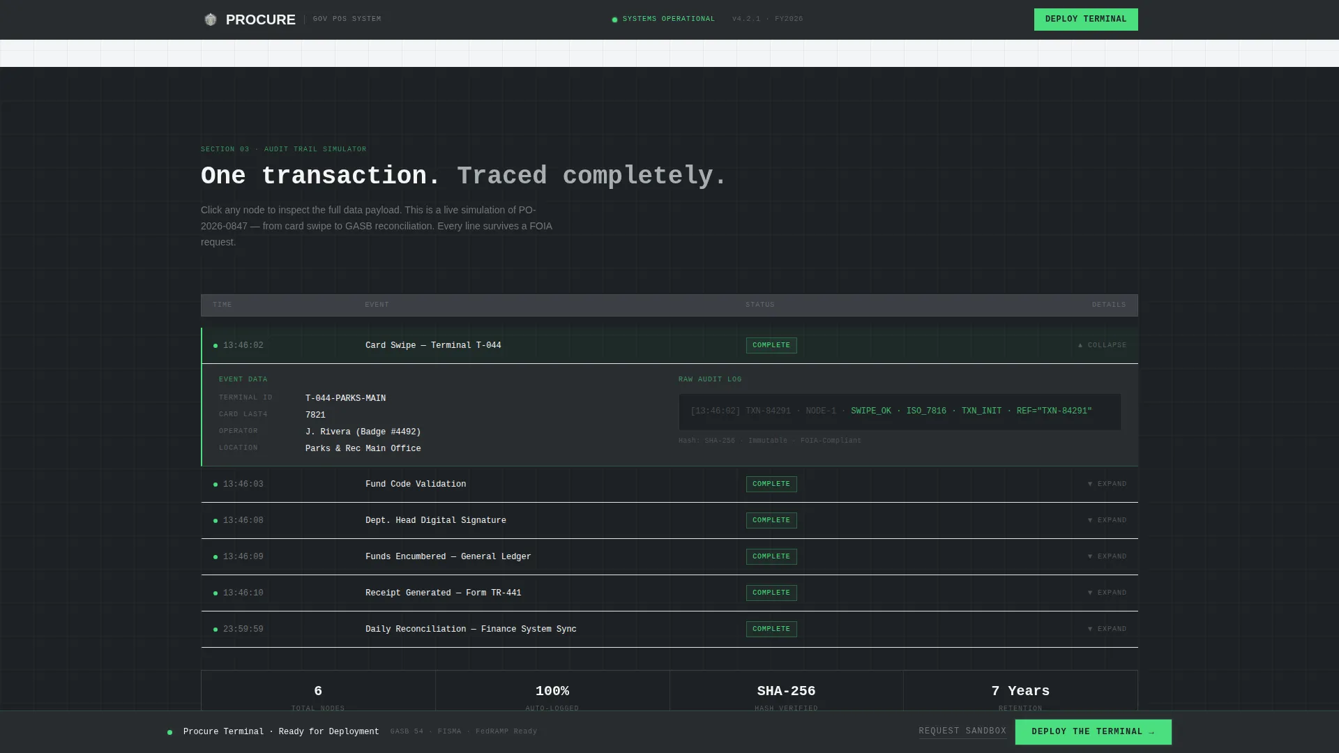
Section three presents a transaction timeline running from the initial swipe through to final reconciliation. Each node along the timeline is expandable, giving visitors a step-by-step view of how a single purchase moves through the system and surfaces in audit-ready records.
State Compliance Matrix
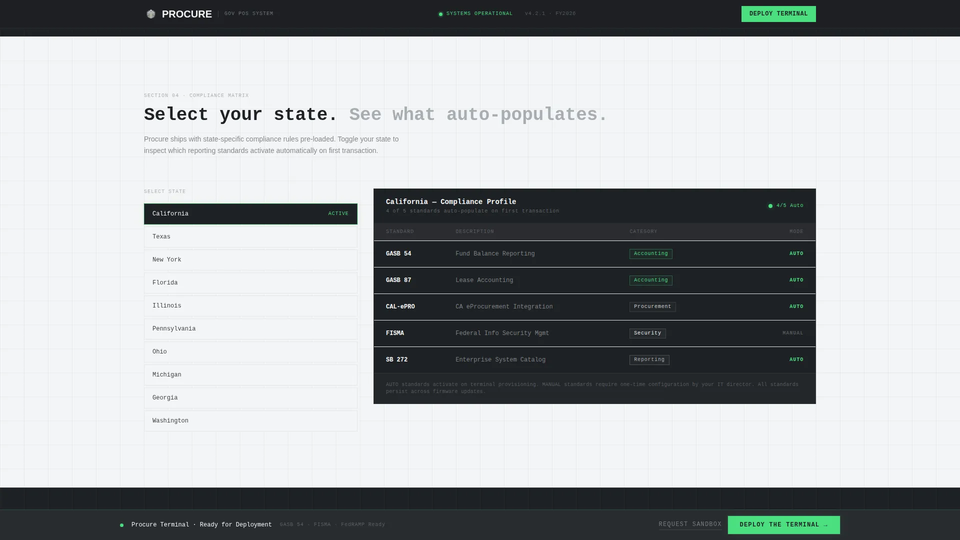
Section four offers a state-toggle control. Selecting a state auto-populates the relevant reporting standards for that jurisdiction. Visitors can verify at a glance which compliance frameworks apply to their agency before initiating a deployment.
Two-Step Deployment Flow
The primary call to action, labeled "Deploy the Terminal," appears first inside the hero dashboard and again as a sticky bar following the explorer sections. Activating it opens a two-step modal: choose a deployment environment (iOS kiosk, Android tablet, or Windows desktop), then enter a dot-gov email address to receive the provisioning link.
Sandbox Request Path
A secondary conversion path labeled "Request a Sandbox" serves IT directors who need to validate the system in a staging environment before an agency-wide rollout. This path runs parallel to the primary deployment flow without competing for visual priority.
Page sections overview
| Section | Purpose |
|---|---|
| Split-Screen Hero | Introduce the terminal with a live procurement dashboard and compliance-focused headline |
| Department Explorer | Let visitors tap department nodes to view department-specific configurations and workflows |
| Audit Trail Simulator | Walk through a single transaction timeline with expandable nodes from swipe to reconciliation |
| Compliance Matrix | Display jurisdiction-relevant reporting standards via a state-toggle control |
| Deployment Call to Action | Guide visitors through environment selection and dot-gov email verification to download |
| Linear Footer | Anchor the page with a single-row footer pattern for clean, uncluttered closure |
Design & branding system
The visual identity follows a Data Command theme built entirely around a Monochrome Steel color system. The palette evokes the casing of rack-mounted server hardware: controlled, uncluttered, and quietly authoritative. No stock photography and no illustration appear anywhere on the page. The product interface itself serves as the hero visual.
- Colors: gunmetal base (#3B3F45), brushed aluminum (#A8ADB3), classified-white (#F4F5F6), and signal-green (#4ADE80) reserved strictly for active-state indicators and primary calls to action
- Typography: JetBrains Mono for headlines and data values, DM Sans for body copy; data values render in pure white against dark panels
- Backgrounds alternate between gunmetal and classified-white across sections to create clear visual separation without decorative elements
Mobile & speed optimization
The template is built desktop-first to match the government workstation context where most procurement officers and IT directors evaluate tools. Tablet support is included to accommodate field-facing agency clerks and kiosk review scenarios.
- Desktop viewport is the primary design target, with the split-screen layout optimized for wide-format government monitors
- Tablet breakpoints support the interactive org chart and expandable audit nodes for staff reviewing configurations away from their desks
- Static sections use server components; interactive sections such as the org chart, timeline, and compliance matrix use client components to keep initial load lean
How this template helps you convert
Every interactive section in this template is engineered to reduce the hesitation that slows government purchasing decisions. Visitors are not asked to trust claims. They are invited to operate the product before downloading it.
- The hero dashboard puts a live procurement terminal in front of the buyer immediately, removing abstraction from the first impression and grounding the value proposition in recognizable workflow language.
- The department explorer, audit trail simulator, and compliance matrix each function as miniature proofs of competence, giving procurement officers and IT directors the evidence they need to justify a deployment request internally.
Other information about this template
This template is categorized under Government Software and SaaS within the Technology category. It is designed specifically for Business-to-Government contexts where procurement compliance, fund encumbrance, and FOIA-ready audit trails are non-negotiable requirements. The following details are relevant for teams evaluating this template.
- Animation intensity is high, including spotlight cards, beam animations, and interactive org chart transitions
- Interactivity level is very high, covering a clickable org chart, expandable audit nodes, a state compliance toggle, and a deployment modal
- The footer follows Pattern 1, a linear single-row layout that closes the page cleanly
- Social proof elements include compliance framework badges, transaction volume metrics, and deployment count indicators
- Localization targets the United States market with USD formatting and standard government procurement terminology
Theme
Data Command
Creative direction
Interactive Explorer
Color system
Monochrome Steel
Style
Split Screen (50/50)
Direction
App Download
Page Sections
Split-screen Procurement Terminal Hero
Interactive Department Explorer
Expandable Audit Trail Simulator
State-toggled Compliance Matrix
Two-step Terminal Deployment Flow
Monochrome Steel Visual Identity
Related questions
Who is this template designed for?
Does the template include real data or placeholder content?
Can the interactive sections be customized for different departments?
What deployment environments does the call-to-action flow support?
Is this template suited to a single agency or a multi-department rollout?



