Procurement Platform Landing Page Template
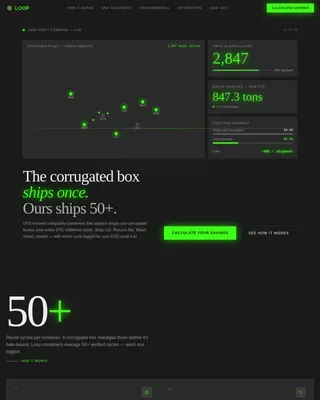
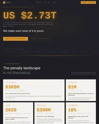
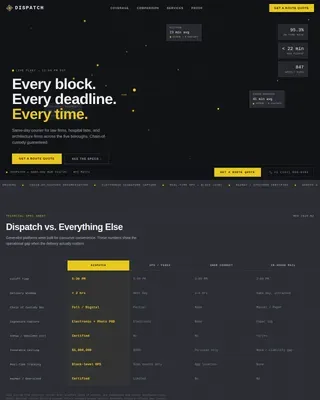
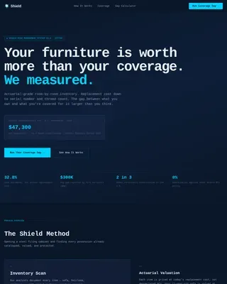
Procure is a card grid landing page template built for procurement platforms. It combines a live-dashboard hero, a Stats-First card layout, and an embedded ROI calculator into a single conversion-focused page. Designed around a Carbon Fiber color system, it gives CPOs, procurement analysts, and operations directors a compelling way to present spend visibility, contract control, and supplier intelligence.
by Rocket studio
Quick summary
Procure is a modular card grid landing page template for procurement platforms. It opens with a full-bleed, isometric dashboard hero and moves visitors through a data-driven card sequence toward an embedded ROI calculator. The two-step lead generation flow earns trust before asking for contact details.
Who this template is for
This template is designed for teams building a market presence around procurement software or supply chain technology. It speaks directly to buyers who live inside the numbers and need a reason to believe before they fill out a form.
- Chief Procurement Officers managing spend across multiple enterprise resource planning systems
- Procurement analysts and operations directors at mid-market manufacturers struggling with maverick spend
- Product marketers and growth teams launching or repositioning a procurement platform
What problem this template solves
Procurement platforms face a specific challenge: the buyer already knows their pain in detail. They need proof, not promises. A generic software landing page loses them in the first scroll. Procure solves this by leading with real metrics and letting the product speak first.
- Fragmented supplier data and scattered purchase orders make it hard to show clear value at a glance
- Rogue spend and approval delays are invisible problems that need visible solutions to drive urgency
- Traditional lead forms ask for too much too early, causing qualified buyers to drop before converting
What you get with this template
You get a fully structured, single-page layout that guides a procurement buyer from first impression through to a personalized savings estimate and a soft lead capture step. Every section has a clear job, and the design system holds the page together visually.
- A panoramic, full-bleed dashboard hero section composited at an isometric angle with live data indicators
- A modular card grid with alternating dark-on-light and light-on-dark cards, each opening with an oversized metric
- An interactive, embedded ROI calculator card and a two-step lead generation form integrated into the page flow
Feature list
This template is built around six structural capabilities, each grounded in the source brief.
Panoramic Dashboard Hero
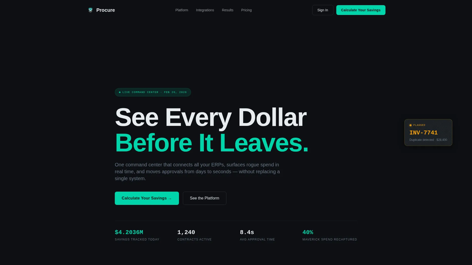
The header spans the full viewport width and displays a composited screenshot of the platform at a slight isometric angle. It shows a spend waterfall, a supplier risk heatmap, and a contract renewal timeline simultaneously. A single headline, "See Every Dollar Before It Leaves," fades in over the live data view. The data is mid-motion: a savings counter ticking upward, a compliance score at 97 percent, and a flagged invoice pulsing amber.
Stats-First Card Grid
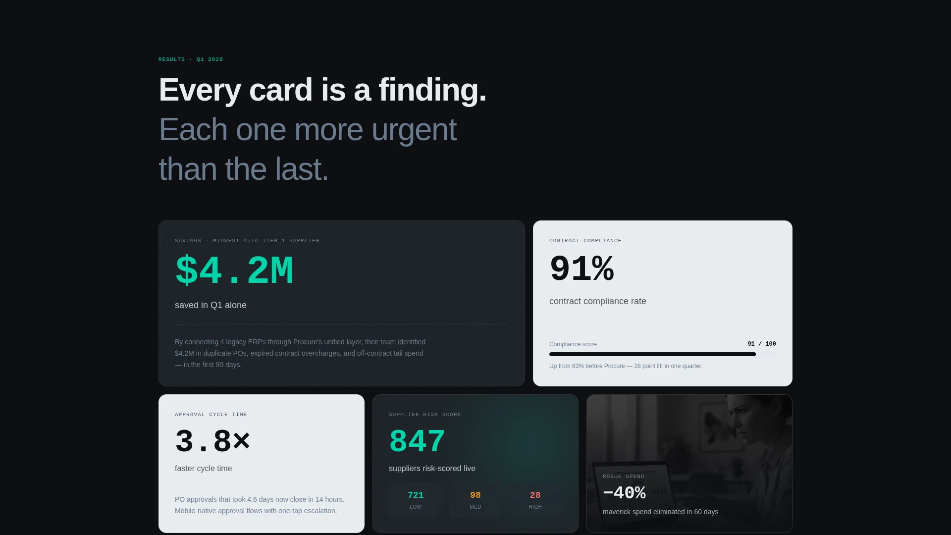
Every card in the modular grid opens with a single oversized metric before revealing the supporting context. Examples include "$4.2M saved in Q1" before the case study, "3.8x faster cycle time" before the feature breakdown, and "91% contract compliance" before the integration story. Cards alternate between dark-on-light and light-on-dark, creating a visual rhythm that mirrors the carbon fiber weave of the color system.
Embedded ROI Calculator
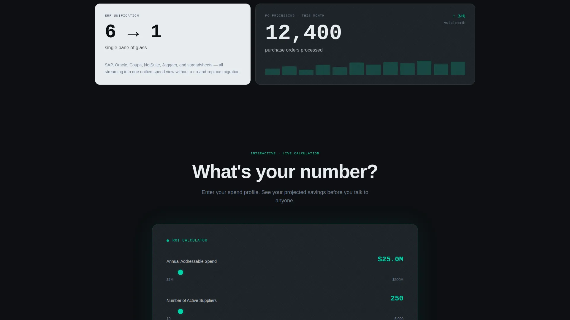
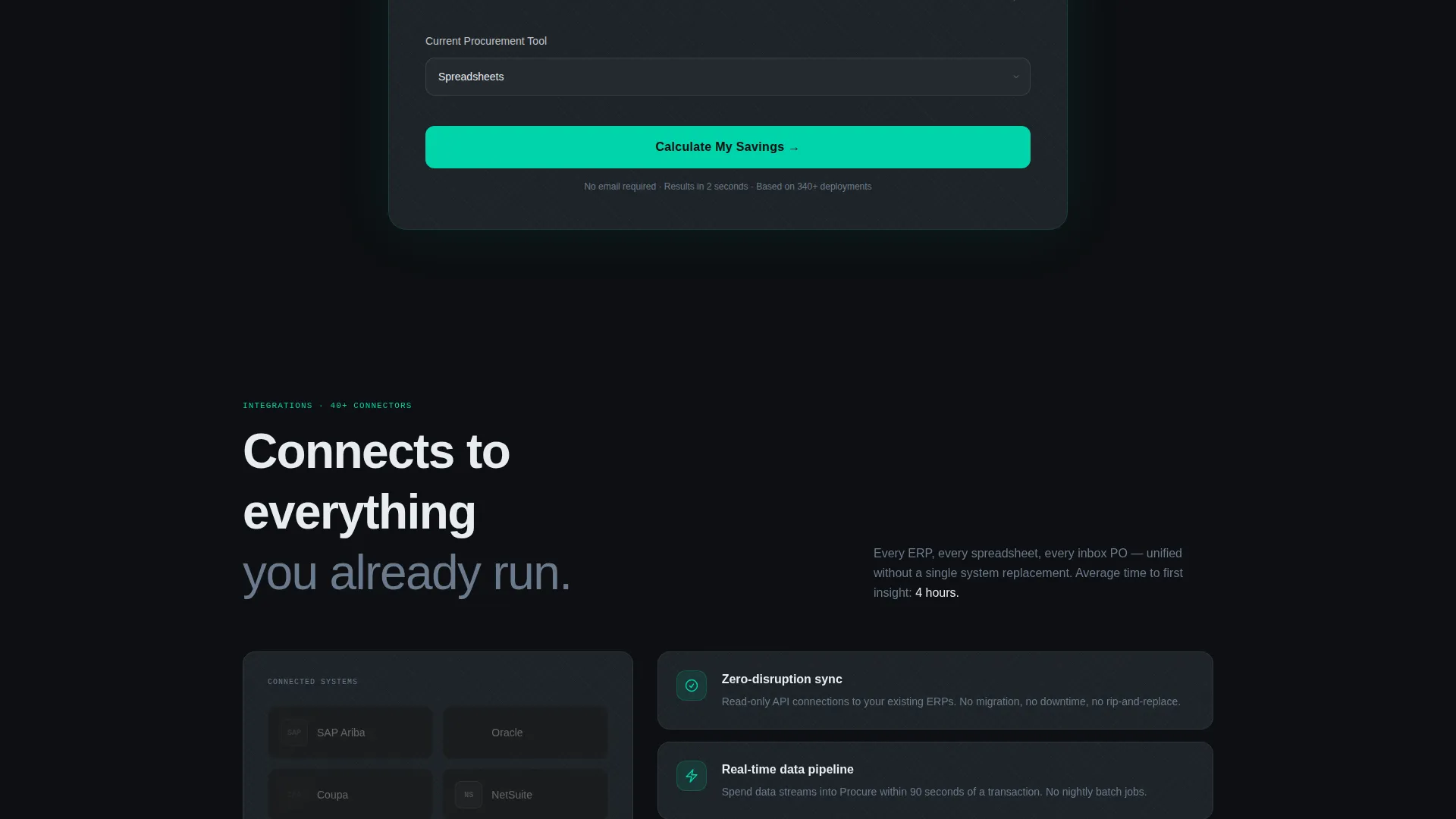
A dedicated interactive card breaks the grid midway through the page. It asks visitors for their annual addressable spend, number of suppliers, and current procurement tool. A dropdown covers common platform options and spreadsheet-only workflows. The calculator renders a projected savings range in real time before any lead form appears.
Two-Step Lead Generation Flow
After the ROI calculation renders, a second step appears asking for name, work email, and company size. The call to action at this stage is "Get Your Full Procurement Audit." The primary entry-point call to action earlier on the page is "Calculate Your Savings," which routes directly to the calculator. The calculator earns the click before the form asks for anything.
Data Command Visual Theme
The page uses a Carbon Fiber color system built around deep cockpit black, woven graphite, titanium mid-tone, signal white for card surfaces, and electric teal reserved exclusively for live data points, active states, and calls to action. The palette conveys a technical, layered identity with no decorative elements.
Modular Section Architecture
The card grid layout is built in a modular structure, meaning individual cards and sections can be rearranged or replaced without breaking the overall visual rhythm. This makes the template adaptable for different procurement platform offerings while keeping the Stats-First narrative intact.
Page sections overview
| Section | Purpose |
|---|---|
| Panoramic Dashboard Hero | Establishes platform credibility with a live, isometric dashboard view and a single bold headline |
| Stats-First Card Row | Opens the grid with oversized proof metrics before revealing supporting case study context |
| Feature Breakdown Cards | Presents core platform capabilities each anchored by a specific performance figure |
| ROI Calculator Card | Lets visitors calculate a personalized savings estimate before any contact form appears |
| Integration Story Cards | Shows compliance and connectivity context in alternating light and dark card format |
| Two-Step Lead Form | Captures name, work email, and company size after the savings estimate is already visible |
Design & branding system
The visual identity follows a Data Command theme that feels technical and purposeful. Every color and spacing decision reinforces the idea that the platform is precise, always-on, and built for serious operators.
- Carbon Fiber palette: deep cockpit black (#0D0F12), woven graphite (#1E2328), titanium mid-tone (#6B7B8D), signal white (#E8ECF0) for card surfaces, and electric teal (#00D4AA) for live data, active states, and calls to action
- No stock photography and no illustrations; the product dashboard is the hero visual throughout the page
- Alternating dark-on-light and light-on-dark cards create a weave-like rhythm that mirrors the carbon fiber aesthetic
Mobile & speed optimization
The modular card grid structure adapts naturally to narrower viewports, stacking cards vertically without losing the Stats-First narrative flow. The page is built to maintain its visual hierarchy on any screen size.
- Card components reflow from a multi-column grid to a single-column stack on smaller screens, preserving the metric-first reading order
- The ROI calculator input fields and dropdown are sized for touch interaction, keeping the conversion path intact on mobile devices
- Heavy visual elements like the isometric dashboard hero are structured so the headline and primary call to action remain prominent above the fold on all devices
How this template helps you convert
The page is engineered around a deliberate conversion sequence. It builds confidence before it asks for anything.
- The panoramic dashboard hero establishes immediate product credibility and creates the mission-control feeling that the target buyer recognizes. The primary call to action, "Calculate Your Savings," appears here, directing attention toward the calculator rather than a generic sign-up form.
- The Stats-First card grid sustains momentum by delivering proof metrics at every scroll step. Each card functions like a finding in an analyst briefing, making the next card feel more urgent than the last.
- The embedded ROI calculator and two-step lead form complete the conversion path. Visitors see their personalized savings projection first. Only then does the "Get Your Full Procurement Audit" form appear, reducing friction and improving the quality of leads captured.
Other information about this template
This template is categorized under Logistics and Supply Chain, specifically within the Supply Chain Technology subcategory and the Procurement Platform niche. It is well-suited for teams competing in or adjacent to established procurement software markets.
- The ROI calculator dropdown is pre-loaded with common tool references including SAP Ariba, Coupa, Jaggaer, spreadsheets, and a "none" option, making it relevant to buyers at any stage of procurement maturity
- The template style is Card Grid (Modular), which means layout blocks are independent and can be reordered to match different platform messaging strategies
- The intersection match score for this template against its category, subcategory, and niche combination is 13, indicating a high degree of relevance for supply chain technology buyers
Theme
Data Command
Creative direction
Stats-First Impact
Color system
Carbon Fiber
Style
Card Grid (Modular)
Direction
Lead Generation
Page Sections
Panoramic Isometric Dashboard Hero
Stats-first Modular Card Grid
Embedded Real-time ROI Calculator
Two-step Lead Generation Flow
Carbon Fiber Data Command Design System
Modular Section Architecture
Related questions
Who is this landing page template designed for?
What makes the ROI calculator different from a standard lead form?
Can the card grid layout be customized for different platform messaging?
Does the template use stock photography or illustrations?
What information does the two-step lead form collect?