Supplier Relationship Management Landing Page Template
Procure is a split-screen supplier relationship management landing page template built for procurement-focused platforms. It pairs oversized amber data points with structured explanations across a deep graphite canvas, guiding procurement directors, operations managers, and CFOs through an evidence-led case for supplier visibility. Two gated downloads drive conversions without pressure.
by Rocket studio
Quick summary
Procure is a single-page template designed for supplier relationship management platforms. It uses a Stats-First split-screen layout to walk procurement leaders through escalating evidence, ending with two gated content offers. Every amber number earns its place, and every section moves the reader closer to downloading the benchmark report.
Who this template is for
This template is built for procurement and supply chain software companies that need to speak directly to operational buyers. It works best when the audience already lives inside supplier complexity and needs to be shown a way out.
- Procurement directors managing 200 or more suppliers across multiple regions
- Operations managers who measure risk in missed delivery windows and halted production lines
- CFOs looking for margin recovery through supplier consolidation but lacking the visibility to act
What problem this template solves
Most supplier management platforms lead with features. Procurement buyers do not respond to feature lists. They respond to data that mirrors their own experience. This template solves the mismatch between what platforms want to say and what buyers need to hear before they commit.
- Generic landing pages fail to establish urgency for buyers who already know their problem
- Procurement decision-makers need evidence, not promises, before they engage with a gated offer
- A weak conversion path loses high-intent visitors who would download a report but will not fill out a long form
What you get with this template
You get a fully structured single-page layout built around a Stats-First creative direction. The template hands you the architecture; your content fills in the evidence.
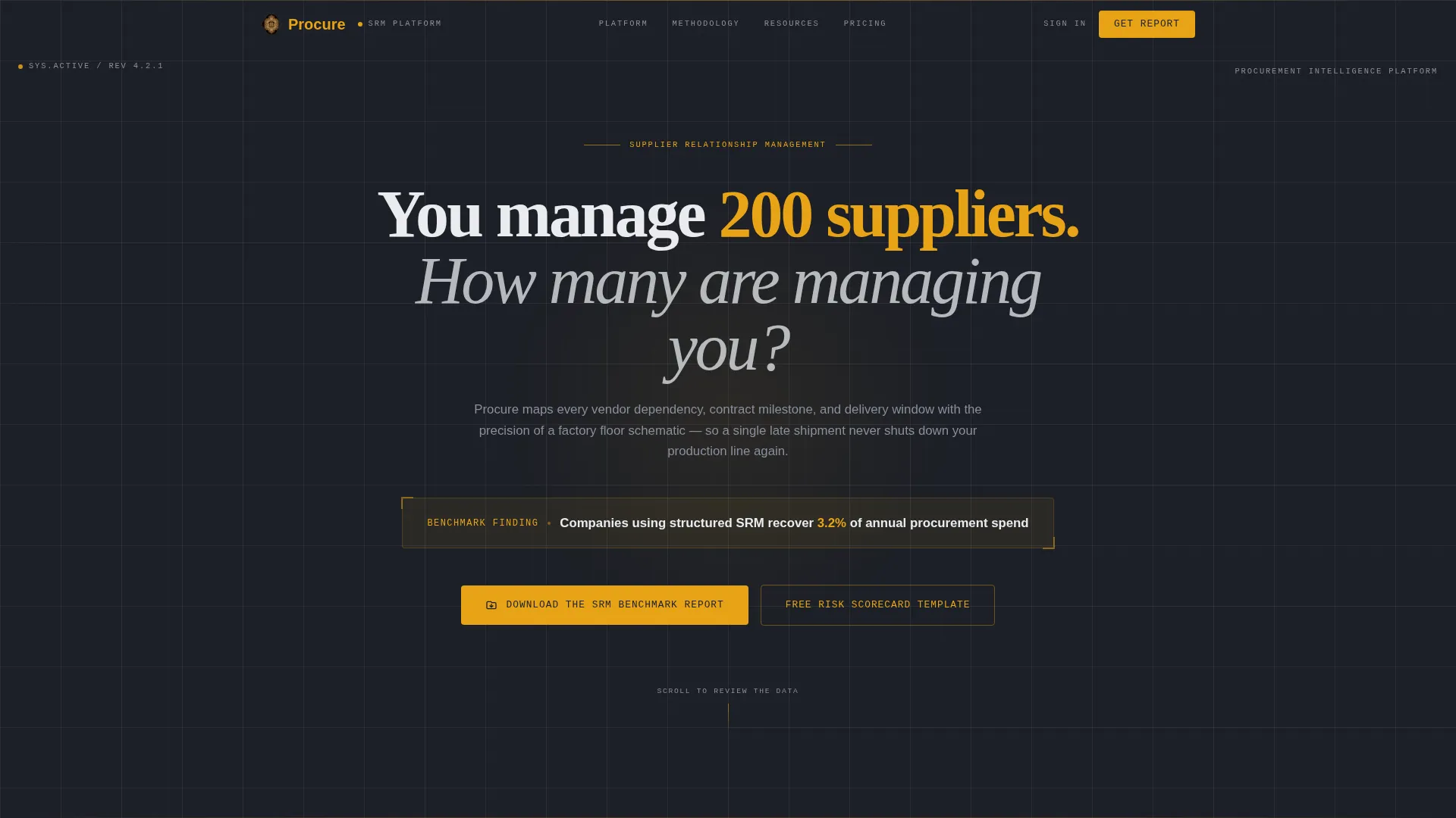
- A centered giant headline section with an ambient amber stat displayed below stark white type on deep graphite
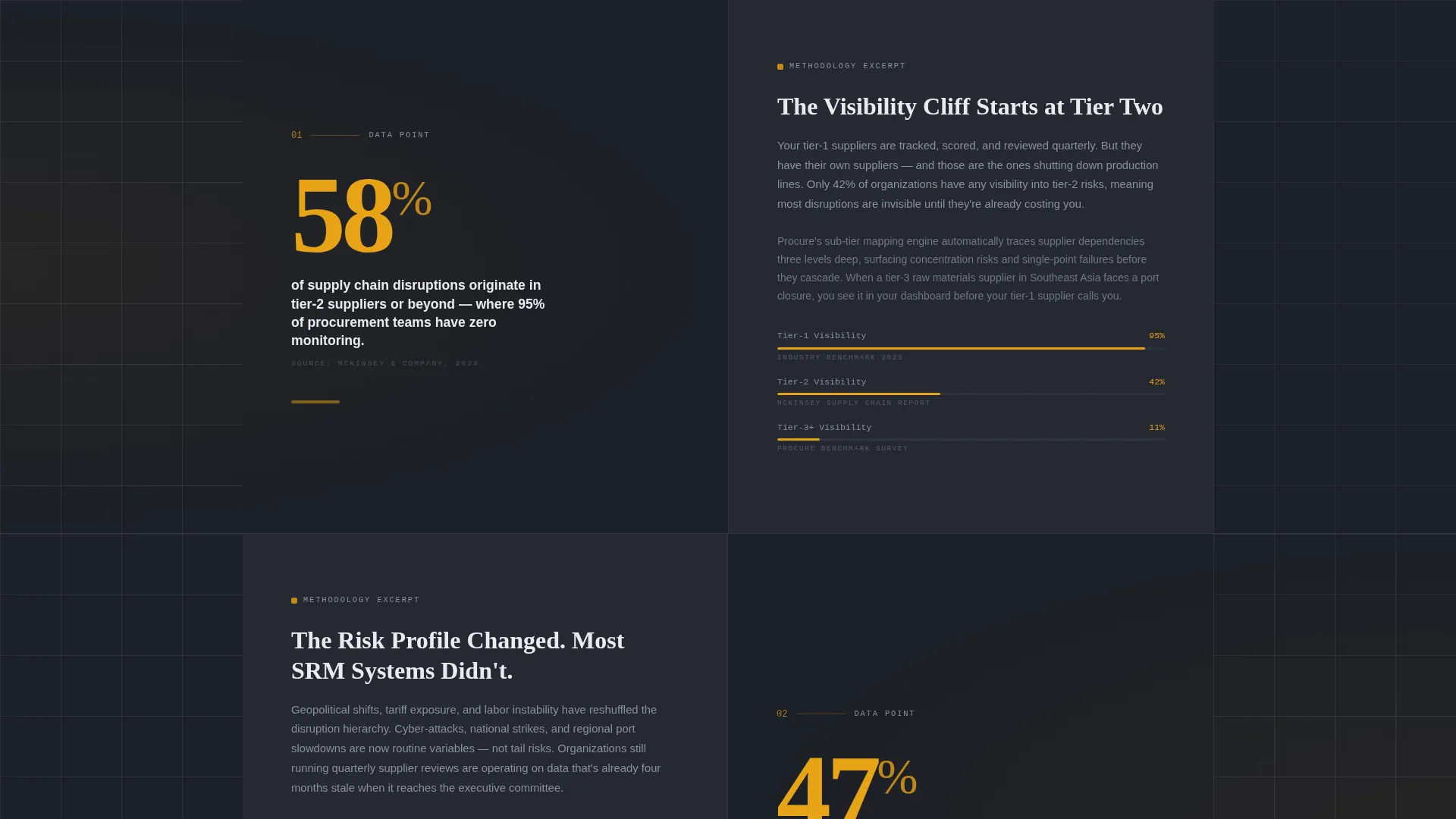
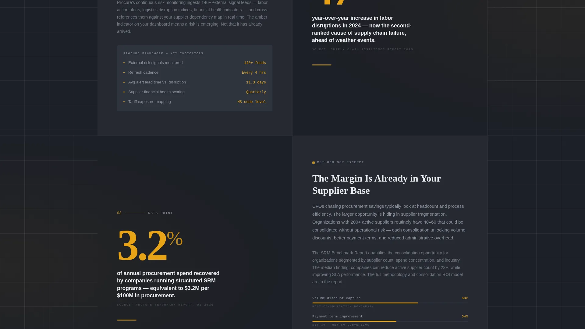
- Three split-screen stat sections, each pairing an oversized amber number on the left with an explanation panel on the right
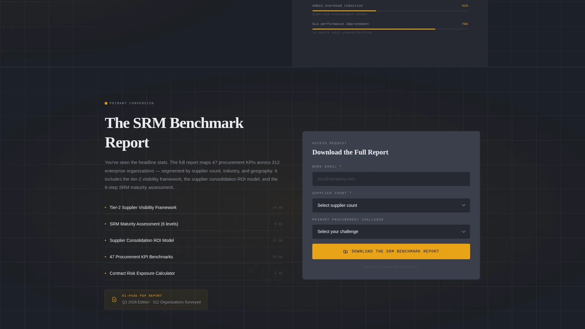
- A primary content offer form gated behind work email, supplier-count company size, and a procurement challenge dropdown, plus a lighter secondary download gated behind email only
Feature list
A paragraph introduces the feature set and explains how each element serves the procurement buyer's decision journey.
Giant Headline with Ambient Stat
The header section uses a single centered headline in condensed mechanical type on a deep graphite background. A single amber stat sits below it like a dashboard readout, establishing credibility before the visitor scrolls.
Stats-First Split Screen Layout
Each of the three core content sections divides the viewport into equal left and right panels. The left panel leads with an oversized amber number. The right panel follows with the explanation, framework reference, or resource preview that gives the number its meaning.
Escalating Evidence Architecture
The scroll sequence is deliberately ordered. Individual metrics appear first, then systemic supply chain risks, then the compounding cost of inaction. The structure mirrors how procurement buyers build an internal case for change.
Dual Gated Content Offers
The primary call to action, a benchmark report download, appears after the third stat section. A secondary offer, a supplier risk scorecard template, requires only an email address. Both offers are positioned to match the visitor's level of commitment at each scroll depth.
Niche-Native Lead Capture Form
The primary form qualifies leads using supplier count rather than headcount. A short dropdown captures primary procurement challenge. This framing signals platform expertise and filters for genuinely relevant leads.
Engineering Blueprint Visual System
The full charcoal and amber color system is applied consistently across all sections. Signal amber appears only on data points, buttons, and status elements that demand attention. Blueprint white handles all body text and grid lines. The result reads like a control room display, not a marketing page.
Page sections overview
| Section | Purpose |
|---|---|
| Giant Headline Header | Opens with stark white centered headline and a single amber stat below |
| Stat Section One | Left panel shows first oversized amber number; right panel explains individual metric |
| Stat Section Two | Left panel shows second amber number; right panel addresses systemic supply chain risk |
| Stat Section Three | Left panel shows third amber number; right panel frames the cost of inaction |
| Primary call to action Form | Gated benchmark report download with work email, supplier count, and challenge dropdown |
| Secondary Download | Lighter-commitment offer for supplier risk scorecard gated behind email only |
Design & branding system
The visual identity is built on an Engineering Blueprint theme. Every color choice and typographic decision reinforces the feeling of a precision instrument, not a marketing brochure.
- Deep graphite (#1C1F26) as the primary background, technical charcoal (#3A3F4B) for card surfaces and secondary panels, signal amber (#E8A317) reserved strictly for data points and interactive elements, and blueprint white (#E9ECF0) for body text and grid lines
- Condensed mechanical typeface used in the headline section to give the impression of stamped type rather than typeset copy
- Amber appears only where a number, a button, or a status demands action; it never decorates empty space
Mobile & speed optimization
The split-screen layout is structured to reflow gracefully on smaller viewports. The stat-first hierarchy remains intact when the two-column grid collapses to a single column, so mobile readers still encounter the amber number before the explanation.
- Oversized amber numbers remain visually dominant even on narrow screens, preserving the Stats-First creative direction
- The dual gated form sections are kept lightweight with minimal input fields, reducing friction on mobile devices
How this template helps you convert
The template earns conversions by giving away high-value data first and positioning the gated offer as the obvious next step, not the first ask.
- Three stat sections build a factual case for change before any offer appears, so the visitor arrives at the primary call to action already primed to want more detail.
- Two conversion paths serve two levels of buyer readiness; the lighter scorecard download captures early-stage visitors while the full benchmark report captures those ready to evaluate a platform.
Other information about this template
This template is part of a broader Logistics and Supply Chain category and is purpose-built for the supplier relationship management niche. It fits naturally into a Supply Chain Technology product context where the buyer is technical, data-literate, and skeptical of vague claims.
- The template style is a 50/50 split screen, a format well-suited to pairing evidence with explanation across every section
- The page direction is Content and Resource delivery, meaning conversion is driven by genuine informational value rather than aggressive sales messaging
- The header concept, Giant Headline Centered, is a deliberate structural choice that uses negative space and typographic weight to establish authority before the visitor scrolls
Theme
Engineering Blueprint
Creative direction
Stats-First Impact
Color system
Charcoal & Amber
Style
Split Screen (50/50)
Direction
Content/Resource
Page Sections
Giant Headline with Ambient Stat
Stats-first Split Screen Layout
Escalating Evidence Architecture
Dual Gated Content Offers
Niche-native Lead Capture Form
Engineering Blueprint Visual System
Related questions
Who is this landing page template designed for?
Can I replace the amber stat numbers with my own data?
What makes the dual download conversion path effective?
How does the lead capture form qualify visitors differently?
Is this template suitable for a content-led demand generation strategy?