AI for Nonprofit Pricing Website Template
Procureoptimize is a card grid landing page template built for nonprofit AI price optimization platforms. It leads with a live calculator tool, surfaces commodity price comparisons in frosted glass panels, and guides procurement directors from real savings data to a frictionless two-step sign-up. The design runs on Electric Indigo with signal cyan accents that make every cost delta impossible to miss.
by Rocket studio
Quick summary
Procureoptimize is a modular, card-grid landing page template designed for nonprofit AI price optimization platforms. It opens with an interactive price calculator, builds trust through discoverable data cards, and converts visitors through a low-friction freemium sign-up flow. Every visual element serves the goal of turning procurement guesswork into visible, actionable savings.
Who this template is for
This template is built for teams launching or marketing an AI-powered procurement platform aimed at nonprofit organizations. It speaks directly to the people who feel procurement pain most acutely.
- Operations directors at mid-size food banks and shelters who compare supplier invoices manually every week
- Development officers who need to present cost-per-meal efficiency metrics to grant boards and funders
- Volunteer procurement leads making large, time-sensitive purchases without reliable price benchmarks
What problem this template solves
Nonprofit procurement teams lose real money because wholesale price data is scattered, slow, and inaccessible. This template addresses that gap head-on by leading with utility rather than promises.
- Visitors arrive to a working tool, not a brochure, so trust is built before any ask is made
- The modular card layout reveals price intelligence layer by layer, reducing overwhelm and holding attention
- The freemium conversion path removes the risk barrier for budget-conscious organizations that cannot afford to guess
What you get with this template
This template delivers a fully structured, single-page layout with every section and component specified and ready to customize. It is organized around a card-first discovery experience.
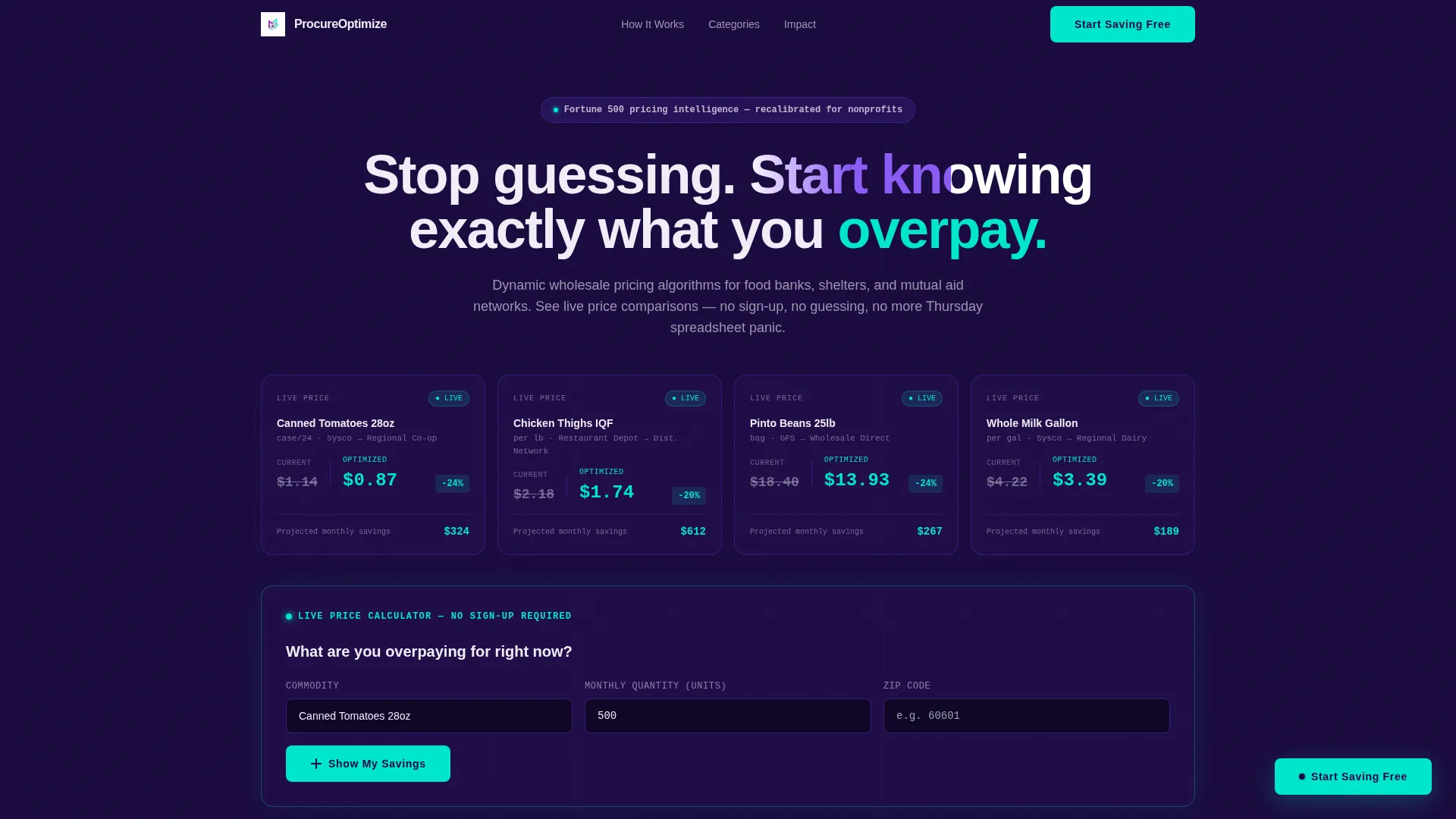
- A hero section with dark glass panel cards showing live-style commodity price comparisons in signal cyan
- An interactive price calculator embedded in the hero that returns lowest unit cost and projected annual savings without requiring sign-up
- Modular commodity category cards, grant impact cards, case study cards, and cost benchmarking cards arranged in a scrollable grid
Feature list
This template packages a focused set of purpose-built components. Each one serves a specific stage of the nonprofit buyer's decision journey.
Live-Style Price Comparison Panels
The hero opens with a grid of frosted, semi-transparent glass panels. Each panel displays a commodity name, two competing prices, and a monthly savings callout rendered in signal cyan. The panels create an immediate sense of live data, setting the platform's value proposition before the visitor reads a single headline.
Embedded Hero Price Calculator
A dedicated calculator card sits at the center of the hero grid. Visitors enter a commodity, a quantity, and a zip code to receive the lowest available unit price alongside a projected annual savings figure. No account or sign-up is needed, which means the visitor experiences real value before any commitment is asked.
Flip-Card Commodity Discovery Grid
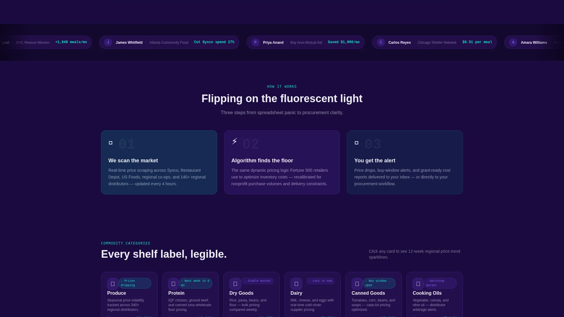
Below the hero, commodity category cards for produce, protein, dry goods, and dairy flip on click to reveal regional price trend sparklines. This interaction keeps the grid engaging and lets procurement leads explore the categories most relevant to their organization without leaving the page.
Grant Impact Card
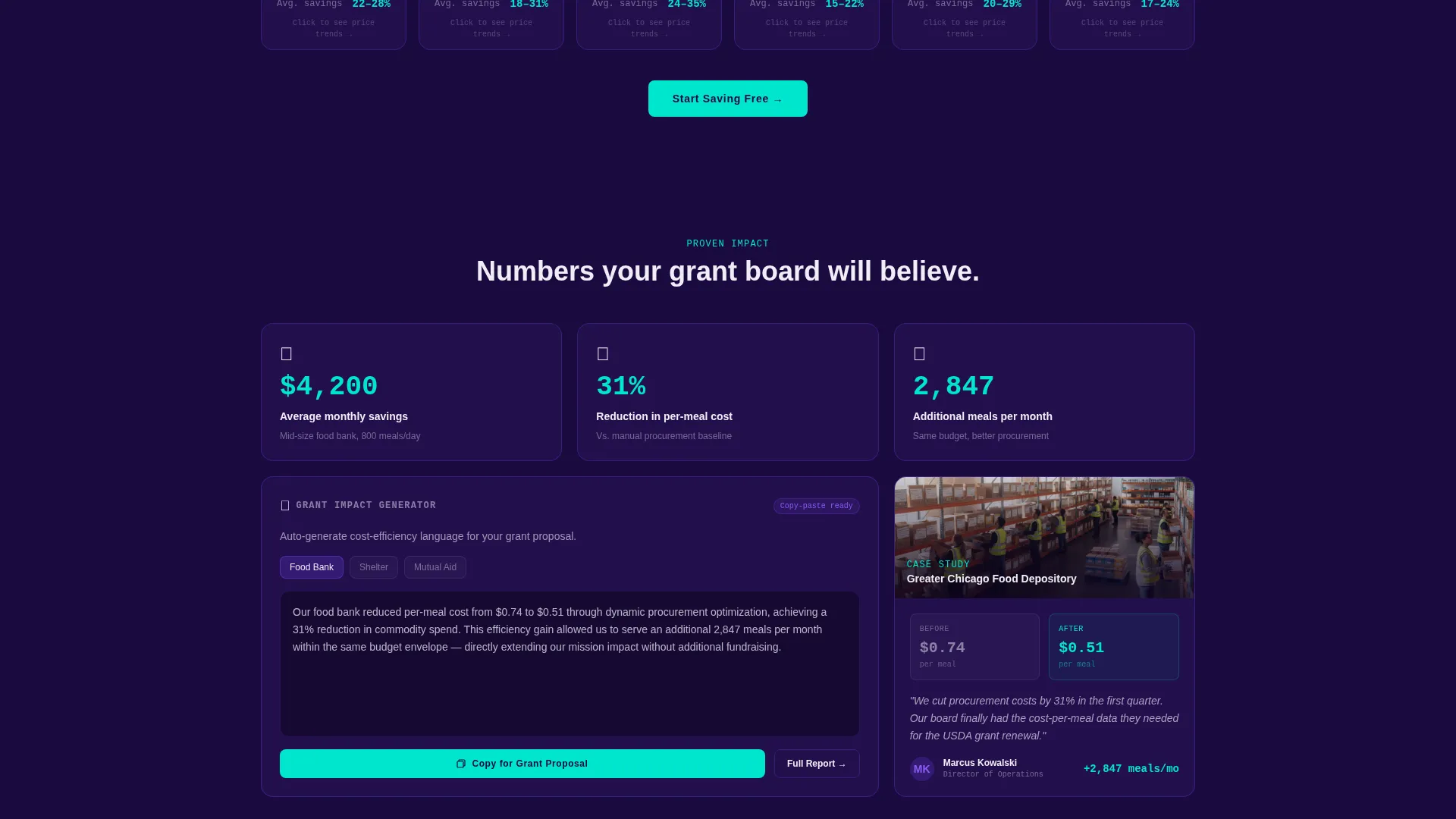
A dedicated card auto-generates a cost-efficiency paragraph formatted for grant proposals. Development officers can read a ready-to-use text block that connects procurement savings to funding outcomes, giving them a concrete artifact within seconds of scrolling.
Case Study and Benchmarking Cards
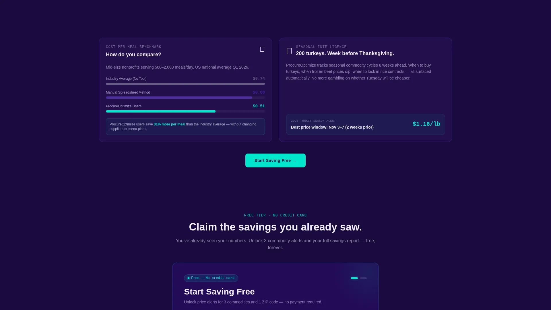
A case study card shows a real food bank's before-and-after procurement spend. A separate benchmarking card compares the visitor's estimated per-meal cost against the platform's optimized average. Together these cards anchor abstract savings claims in credible, specific numbers.
Two-Step Freemium Sign-Up Form
The primary conversion flow is a two-step form. Step one collects organization name and primary commodity category via dropdown. Step two collects email and monthly procurement budget via a slider rather than a text field, reducing input friction. The free tier unlocks price alerts for three commodities and one zip code.
Page sections overview
| Section | Purpose |
|---|---|
| Hero Glass Panels | Display live-style commodity price comparisons with signal cyan savings callouts |
| Hero Calculator Card | Let visitors calculate lowest unit price and annual savings with no sign-up required |
| Commodity Category Grid | Flip cards revealing regional price trend sparklines by category |
| Grant Impact Card | Auto-generate a cost-efficiency paragraph ready for grant proposal use |
| Case Study Card | Show a food bank's before-and-after procurement spend as social proof |
| Cost Benchmarking Card | Compare visitor's per-meal cost against platform-optimized average |
| Floating call to action Button | Repeat the "Start Saving Free" action after every third card row |
| Savings Report Gate | Offer a downloadable PDF savings report behind the two-step sign-up form |
| Two-Step Sign-Up Form | Collect org name, category, email, and budget slider to unlock the free tier |
Design & branding system
The visual identity follows a Directory and Discovery theme built around the Electric Indigo color system. The palette is intentionally dark and data-forward, so numerical information commands full attention.
- Deep void indigo (#1A0A3E) forms the primary background, creating the contrast needed for glowing price data
- Charged violet (#6C3FE2) appears on interactive card borders and hover states to signal clickability without distraction
- Signal cyan (#00E5CC) drives live data accents, savings callouts, and the primary call-to-action button, making critical numbers instantly legible
- Clean chalk (#F0EDF7) covers card surfaces and body text to keep the reading layer bright against the dark background
Mobile & speed optimization
The modular card grid layout is structured for clean reflow across screen sizes. Each card is self-contained, which makes responsive stacking predictable and readable.
- Card-based layout allows columns to collapse gracefully from multi-column desktop grids to single-column mobile stacks
- The hero calculator and flip-card interactions are designed as lightweight, touch-friendly components to remain usable on smaller screens
- Floating call-to-action buttons stay anchored at consistent scroll intervals, keeping the conversion path accessible without crowding the viewport
How this template helps you convert
The conversion architecture follows a Calculator-First strategy. Visitors see real numbers before they see a form, which shifts the emotional frame from skepticism to confirmation.
- The hero calculator delivers a personalized savings figure with zero commitment required, so the visitor arrives at the sign-up form already holding proof of value
- The floating "Start Saving Free" button appears at regular intervals throughout the scroll, reducing the distance between intent and action at any point on the page
- The secondary "See Your Full Savings Report" path gives grant writers a concrete, downloadable artifact, creating a second conversion lane that serves a distinct audience segment
Other information about this template
This template is built on a Card Grid structure with a modular layout system, which means individual cards can be reordered, removed, or duplicated to match the specific commodity focus or organizational scope of any platform. The Directory and Discovery theme makes it well-suited for platforms that want visitors to feel they are exploring a curated data environment rather than reading a pitch.
- The template style is Card Grid (Modular), designed for flexible content arrangement without rebuilding page structure
- The landing page direction is Freemium and Trial, with two distinct conversion paths built in: a free tier activation and a gated PDF report
- The header concept, Dark Glass Panels, creates a mission-control atmosphere consistent with the platform's data-driven positioning
Theme
Directory & Discovery
Creative direction
Calculator/Tool First
Color system
Electric Indigo
Style
Card Grid (Modular)
Direction
Freemium/Trial
Page Sections
Live-style Price Comparison Panels
Embedded No-sign-up Calculator
Flip-card Commodity Grid
Grant Impact Card
Case Study and Benchmarking Cards
Two-step Freemium Sign-up Form
Related questions
Who is this landing page template designed for?
Does the hero calculator require visitors to create an account?
What does the freemium conversion flow include?
Can the card grid layout be customized for different commodity categories?
Is this template suitable for development officers preparing grant applications?



