SaaS Social Proof & ROI Evidence Website Template for B2B Buyers
Proof is a bento grid SaaS testimonials landing page built for skeptical buyers mid-evaluation. It leads with an interactive ROI calculator in the hero, then delivers a structured evidence grid of video testimonials, live metrics, before/after dashboards, and customer logos. The result is a high-trust, conversion-focused page that turns customer wins into a compelling case for switching.
by Rocket studio
Quick summary
Proof is a single-page bento grid testimonials template designed for SaaS companies. It opens with a live ROI calculator that outputs real, aggregated numbers before the visitor scrolls. The evidence grid below stacks video testimonials, metric tiles, dashboard comparisons, and logo stacks into an asymmetric layout that builds a clear, data-driven argument for your product.
Who this template is for
This template is built for SaaS marketing and demand generation teams who need to convert skeptical, mid-funnel buyers. It fits companies that have strong customer results but struggle to present them in a way that moves deals forward.
- SaaS companies targeting VP-level and technical buyers during active vendor evaluations
- Marketing teams building a standalone proof page to support sales conversations
- Growth teams looking to capture high-intent leads at the moment of greatest curiosity
What problem this template solves
Most testimonial pages are static walls of quotes that buyers skim and forget. They do not answer the real question a procurement lead or a CTO is asking: "What will this actually do for my team?" This template reframes the entire page around that question.
- Skeptical buyers need numbers, not narratives, and the calculator delivers aggregated data upfront
- Mid-evaluation visitors comparing vendors need layered proof across formats, not a single quote
- Sales and marketing teams need a lead capture moment that feels earned, not forced
What you get with this template
You get a fully structured, single landing page that leads with an interactive tool and follows with a dense, varied evidence grid. Every section has a specific job: earn attention, build trust, and invite action.
- An embedded ROI calculator hero with three sliders and animated real-time outputs
- An asymmetric bento grid containing video testimonial cards, metric tiles, dashboard cards, and logo stacks
- Two layered conversion paths: a lightweight two-field email form and a guided reference-call qualifier
Feature list
This section describes the core built-in capabilities of the Proof template as designed in the source brief.
Live ROI Calculator Hero
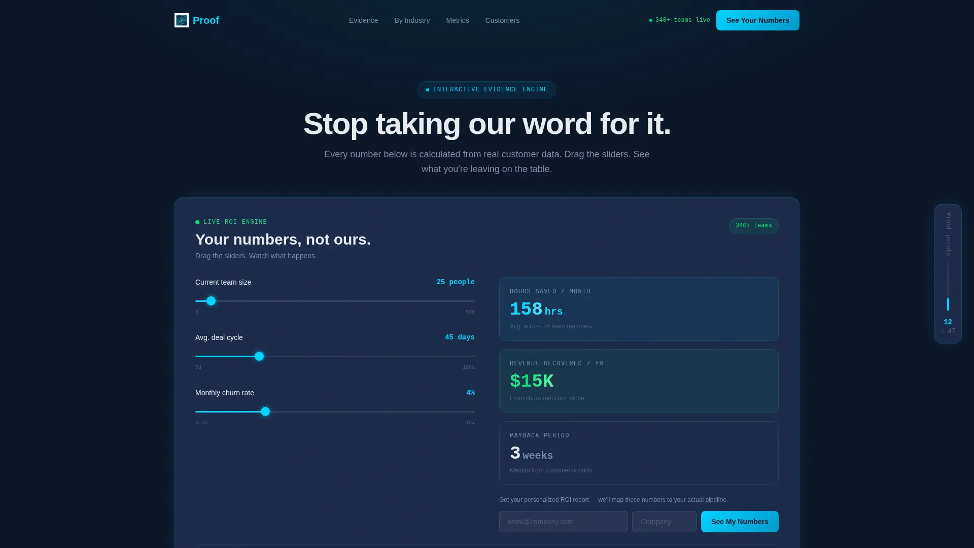
The hero section embeds a functional ROI calculator directly into the page. Visitors adjust three sliders: current team size, average deal cycle in days, and monthly churn percentage. As they drag, animated output figures update in real time, showing projected hours saved, revenue recovered, and payback period in weeks. A single line beneath the outputs anchors the numbers in reality: "These numbers aren't projections. They're averages from 340+ teams already using us."
Asymmetric Bento Grid Layout
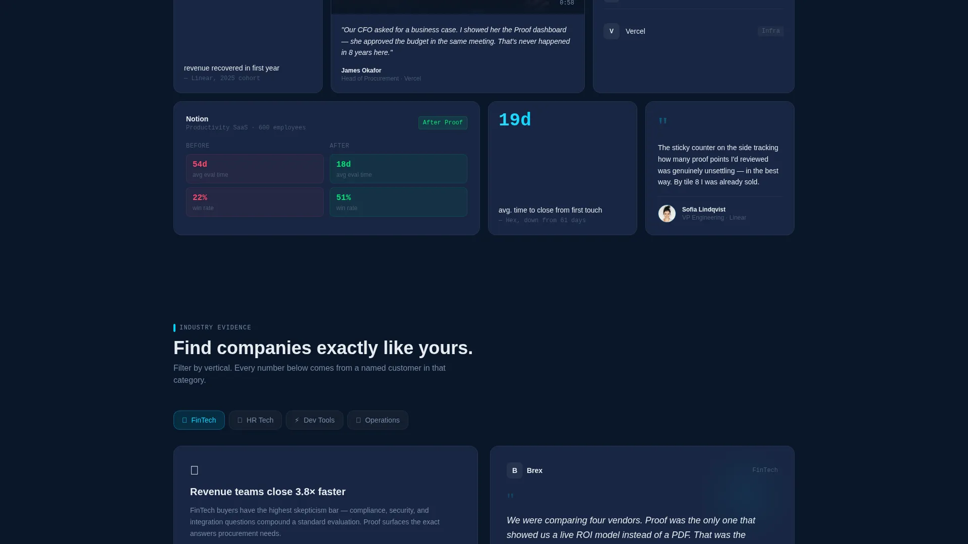
The evidence grid uses cells of varying shapes and weights. Large landscape cards hold 90-second video testimonials with play buttons and pull-quote overlays. Small square tiles display single bold metrics in electric cyan on navy. Medium cards show before/after dashboard comparisons from named companies. Narrow vertical cards stack three customer logos with industry tags. No two rows feel identical, giving the page a sense of accumulating evidence as the visitor scrolls.
Staggered Scroll Animation
As the visitor scrolls through the bento grid, cards stagger into view one by one. This animation creates a deliberate pacing effect, making each proof point feel like a new piece of evidence rather than a cluttered list. The sensation reinforces the page's core argument: the case for switching keeps getting stronger.
Sticky Proof Progress Tracker
A sticky side tab remains visible as the visitor scrolls the grid. It tracks and displays how many proof points the visitor has reviewed out of the total available, for example "You've reviewed 12 of 47 results." This element keeps buyers engaged and signals the depth of available evidence without overwhelming them upfront.
Two-Path Lead Capture System
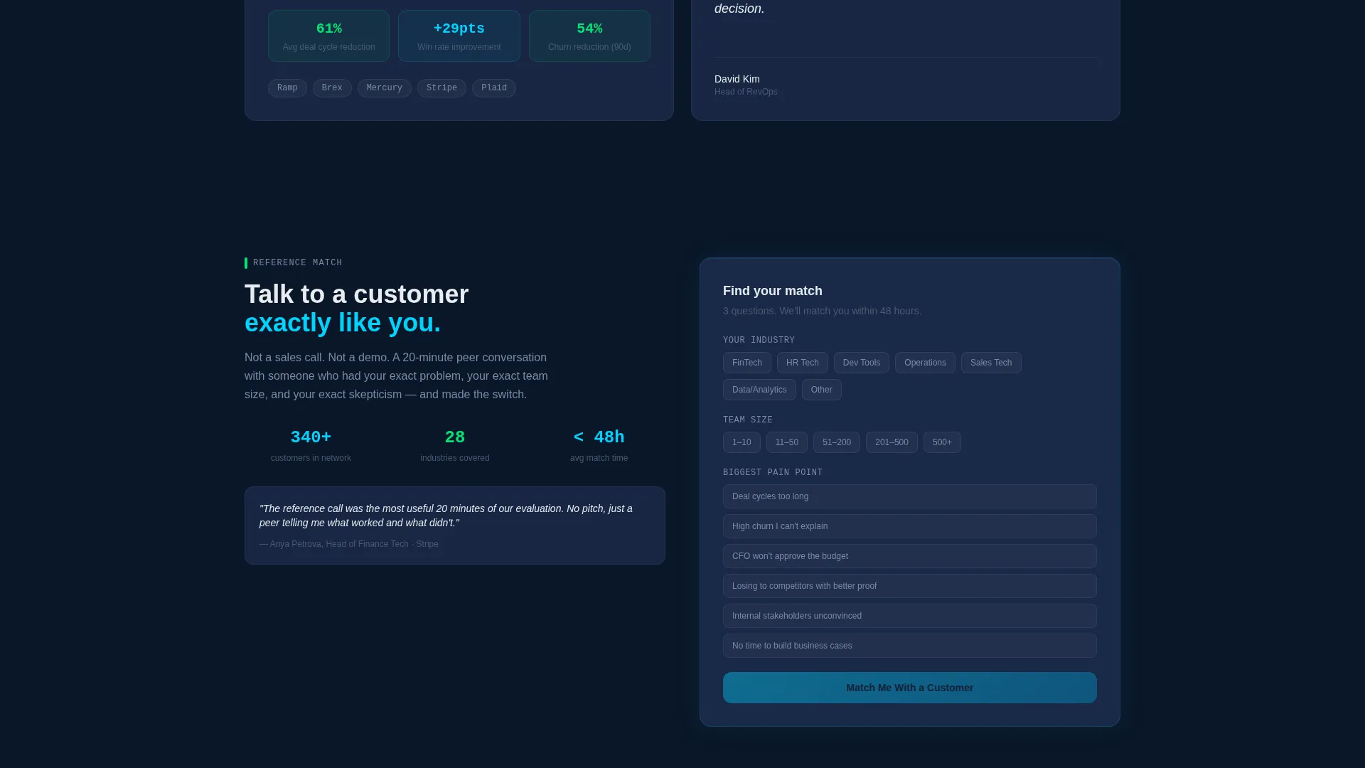
The primary conversion path is a two-field form placed inside the calculator output area, at the exact moment of highest curiosity. Visitors enter their work email and company name to receive a personalized ROI report. A secondary path at the bottom of the page opens a short qualifier covering industry, team size, and biggest pain point, then matches the visitor with a reference call from a similar company.
Midnight Blue Visual System
The color palette uses deep terminal navy as the primary background, steel-blue for card surfaces, electric cyan on interactive elements and live data outputs, and cool white for body text. Signal green appears selectively on positive metrics such as revenue increases, churn reductions, and time saved. The overall effect resembles a mission control environment: dark, focused, and purposeful.
Page sections overview
| Section | Purpose |
|---|---|
| ROI Calculator Hero | Opens the page with an interactive, slider-driven calculator that outputs aggregated customer data in real time |
| Calculator Output Form | Captures work email and company name at the moment of highest engagement |
| Bento Evidence Grid | Delivers video testimonials, metric tiles, dashboard comparisons, and logo stacks in an asymmetric layout |
| Sticky Proof Tracker | Keeps a running count of proof points reviewed to encourage continued scrolling |
| Reference Call Qualifier | Closes the page with a secondary conversion path that matches visitors to a peer reference call |
Design & branding system
The Proof template uses a Startup Velocity theme built on a Midnight Blue color system. Every design choice is intentional: the dark palette keeps attention on the glowing data, and color is used as a signal rather than decoration.
- Background: deep terminal navy (#0A1628); card surfaces: steel-blue midtone (#1B2A4A); accent: electric cyan (#00D4FF); body text: cool white (#E8ECF1)
- Signal green (#00E676) appears only on positive metric outputs such as revenue up, churn down, and time saved, never as a general accent
- Typography is set in cool white against dark surfaces for high contrast, with electric cyan reserved for interactive elements and live data figures
Mobile & speed optimization
The bento grid layout adapts to narrower viewports by reflowing card weights and stacking cells vertically. The calculator sliders and animated outputs are designed to function on touch interfaces so mobile visitors get the same interactive experience.
- Bento grid cells reflow to a single-column or two-column stack on smaller screens, preserving readability of metrics and pull quotes
- Slider controls in the ROI calculator are touch-friendly, maintaining the core interactive experience on mobile devices
- Staggered card animations are lightweight by design, ensuring the scroll effect does not interfere with the page's visual flow on lower-powered devices
How this template helps you convert
The Proof template is structured around a specific conversion philosophy: earn the click with math before asking for anything. Each section is ordered to reduce resistance and increase intent.
- The ROI calculator at the top gives visitors a personalized output using their own inputs before any form appears, making the "See Your Numbers" call to action feel like a natural next step rather than a cold ask.
- The layered evidence grid builds cumulative trust across multiple proof formats, so by the time a visitor reaches the bottom of the page, they have seen metrics, video, dashboards, and logos from companies like theirs.
- The secondary reference-call path at the bottom converts visitors who are not yet ready to share their email but are willing to speak with a peer, capturing a second segment of high-intent buyers who might otherwise leave without engaging.
Other information about this template
The Proof template is a focused, single landing page designed to fit within a broader SaaS company website or to stand alone as a dedicated proof asset for sales teams.
- The template is built in a bento grid style, a layout pattern that is well suited to SaaS company testimonials pages because it allows varied proof formats to coexist without visual clutter
- The Startup Velocity theme and Midnight Blue color system are part of a consistent design language that signals credibility to technical and executive buyers
- The "Talk to a Customer Like You" qualifier at the bottom is a differentiated conversion element not commonly found in standard testimonials page templates
- The sticky proof tracker is a unique engagement mechanic that communicates the breadth of available evidence while keeping the visitor in motion through the grid

Theme
Startup Velocity
Creative direction
Calculator/Tool First
Color system
Midnight Blue
Style
Bento Grid
Direction
Lead Generation
Page Sections
Live ROI Calculator with Animated Outputs
Asymmetric Bento Grid Evidence Layout
Sticky Proof Progress Tracker
Two-path Lead Capture Flow
Staggered Card Scroll Animation
Signal-coded Color System
Related questions
Can I customize the ROI calculator inputs and outputs for my product?
Does the bento grid support both video and static content?
How does the two-path lead capture system work?
Who is the target visitor this page is designed for?
Can this template be used as a standalone page rather than part of a full website?



