Proof - Precision Bakery Landing Page Template
Proof is a bakery analytics dashboard landing page template built for vertical SaaS platforms targeting multi-location bakery operators. It opens with an interactive savings estimator, walks visitors through a Problem-to-Solution scroll arc, and closes with a sticky comparison table. The Monochrome Steel visual system makes every data point feel urgent and every click feel earned.
by Rocket studio
Quick summary
Proof is a single-page dashboard template designed for bakery analytics platforms. It opens with a live savings calculator, guides visitors through a structured Problem-to-Solution narrative, and converts through a sticky side-by-side comparison table. The design uses a forge-dark palette with electric chartreuse accents to make critical data impossible to ignore.
Who this template is for
This template is built for SaaS founders and product teams launching a bakery operations platform. It speaks directly to buyers who run real kitchens and feel the pain of imprecise cost control.
- Bakery owners managing three to fifteen locations who currently price products from intuition rather than data
- Head bakers who sense a margin leak but cannot isolate the source across shifts and ovens
- Operations managers juggling multiple spreadsheets before sunrise and needing a single command view
What problem this template solves
Most bakery operators piece together their numbers from disconnected spreadsheets, handwritten waste logs, and end-of-month reports that arrive too late to act on. This template exists to show those operators that a better system is within reach.
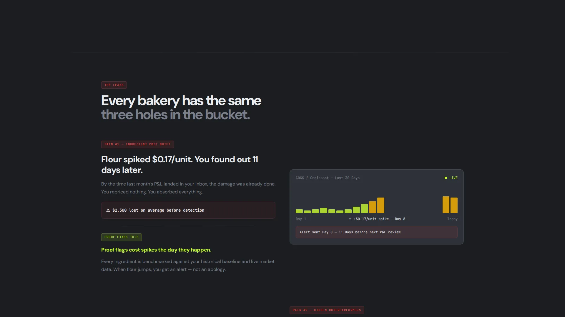
- Ingredient cost drift goes unnoticed for days, quietly eroding margins on every batch
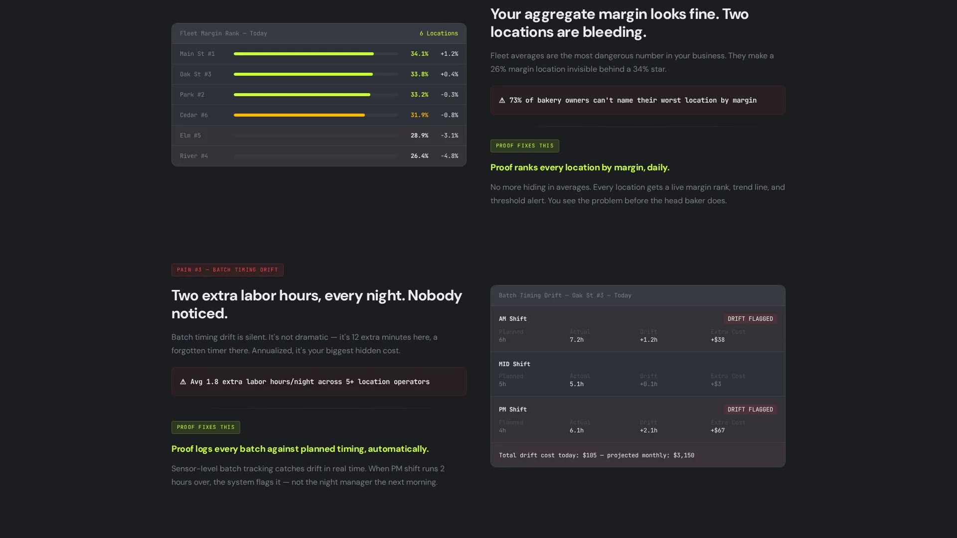
- Underperforming locations stay hidden inside aggregate numbers, masking where the real losses live
- Batch timing variance adds unnecessary labor hours each night, compounding costs that gut-feel pricing never recovers
What you get with this template
You get a fully structured, conversion-focused landing page that functions as both a product demo and a sales argument. Every section is designed to move a skeptical bakery operator from recognition to action.
- An interactive calculator header that personalizes the savings estimate before any scroll happens
- A visual Problem-to-Solution arc with animated data grid transitions showing chaos reorganized into clarity
- A sticky two-column comparison table and dual call-to-action buttons wired to pre-filled estimator fields
Feature list
This template packages several purpose-built components that work together to build trust and drive sign-ups.
Interactive Savings Estimator
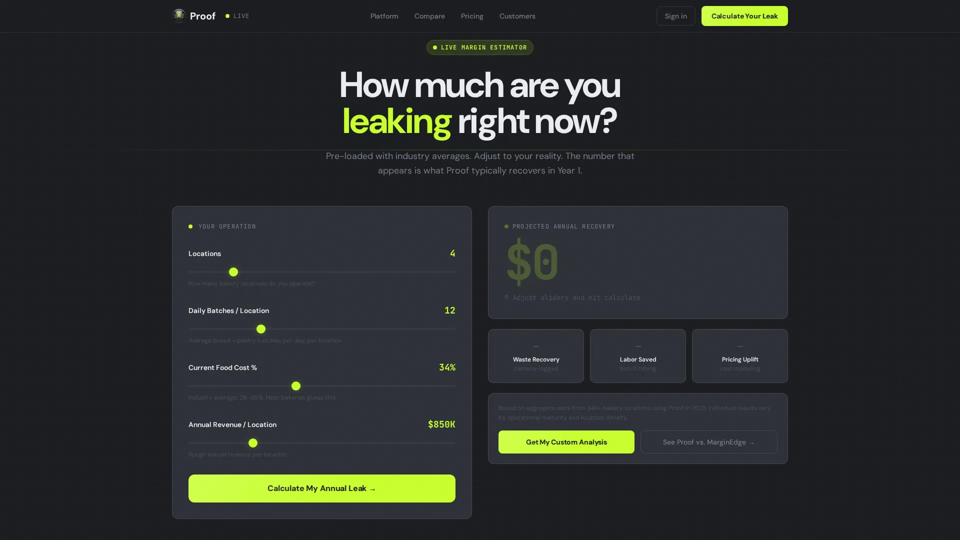
The header section is a live calculator, not a hero image. Visitors enter their number of locations, average daily batches, and current food-cost percentage. The tool animates a projected annual savings figure in electric chartreuse, ticking upward like a register display the moment they hit calculate.
Animated Problem-to-Solution Data Grid
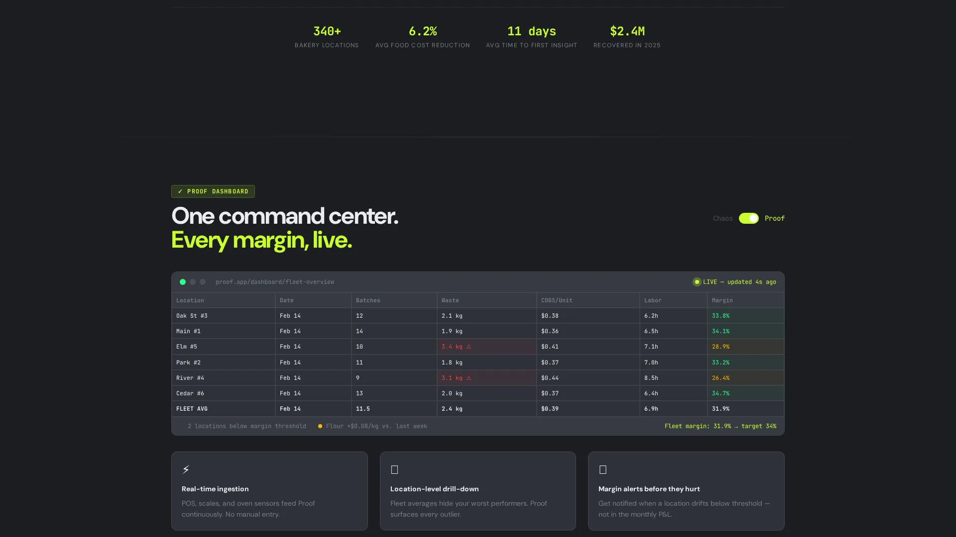
The first content section renders a chaotic data grid representing disconnected spreadsheets and handwritten waste logs with blinking, misaligned cells. The second section shows the same data reorganized inside the platform dashboard, with clean rows snapping into place and margins turning green. The contrast is immediate and visual.
Pain-Paired Solution Sections
Each scroll beat below the arc pairs a specific, named pain point against the platform screen that resolves it. Examples built into the template include unnoticed ingredient price spikes, location-level performance gaps hidden by aggregate data, and nightly labor cost drift from batch timing variance.
Sticky Comparison Table
A two-column table appears mid-page and stays anchored as visitors scroll. It contrasts the visitor's current stack against the platform row by row, covering areas like waste tracking, margin review frequency, and pricing methodology. Each row is a quiet argument for switching.
Pre-Filled call to action Routing
The primary call-to-action button reads "Calculate Your Leak" and routes back to the header estimator with fields pre-filled from scroll interactions. This loop personalizes the conversion moment and makes the visitor's estimated loss feel quantified before they are asked for an email.
Dual Call-to-Action Architecture
A secondary call-to-action button opens a detailed feature-by-feature breakdown. The two-button layout lets high-intent visitors self-select their next step without friction.
Page sections overview
| Section | Purpose |
|---|---|
| Calculator Estimator Header | Opens with a personalized savings figure to hook visitors immediately |
| Chaotic Data Grid | Shows the broken reality of disconnected spreadsheets and manual logs |
| Clean Dashboard View | Demonstrates the platform's organized, real-time data layout |
| Pain-Solution Pairings | Connects specific operational pain points to named platform screens |
| Sticky Comparison Table | Contrasts the visitor's current tools against the platform row by row |
| Dual call to action Block | Routes visitors to the estimator or the detailed comparison page |
Design & branding system
The visual identity runs on a Monochrome Steel palette that feels like a stainless-steel prep counter under halogen light. Every color decision is functional, not decorative.
- Background uses forge-dark (#1B1D21), panel surfaces use brushed-steel (#2E3138), and all typography and data labels use high-contrast signal white (#EAECEF)
- Electric chartreuse (#C8FF2E) appears exclusively on live metrics, toggle states, and call-to-action buttons, reserving its visual weight for moments that demand attention
- The overall aesthetic channels Startup Velocity: clinical, relentless, and stripped of any element that does not earn its place on the screen
Mobile & speed optimization
The template is structured to remain readable and functional at any screen size. Dashboard-style layouts with dense data grids require deliberate mobile handling, and this template accounts for that.
- Data grid sections are designed to reflow cleanly on smaller viewports without losing the visual contrast between the chaotic and clean states
- The sticky comparison table adapts to a scrollable format on mobile so the side-by-side argument stays intact
- Interactive calculator inputs are sized and spaced for touch use, keeping the estimator functional on phones and tablets
How this template helps you convert
The page earns the click by making losses feel personal and quantified before asking for anything from the visitor.
- The header calculator delivers a personalized savings number in the first ten seconds, giving visitors an immediate, self-generated reason to keep reading
- The Problem-to-Solution scroll arc tightens like a ratchet, pairing every specific pain point with a named platform screen so the value is visible and concrete
- The sticky comparison table and pre-filled call to action loop close the argument by the time the visitor reaches the bottom, removing friction from the final conversion step
Other information about this template
This template is part of the Startup Velocity theme collection and is optimized for Bakery Vertical SaaS platforms. It is built with the Dashboard and Data Grid template style in mind, making it a strong fit for any food-operations analytics product that needs to demonstrate data clarity at a glance.
- The Comparison and Versus landing page direction used here suits any SaaS product competing against legacy spreadsheet workflows in a specialist vertical
- The template supports a secondary call-to-action labeled "See Proof versus. MarginEdge," which is designed as a placeholder for a competitor comparison page and can be relabeled for any named competitor
- The Problem-to-Solution Arc creative direction and Calculator header concept are reusable frameworks that can be adapted to other food-service verticals with minimal structural changes
Theme
Startup Velocity
Creative direction
Problem→Solution Arc
Color system
Monochrome Steel
Style
Dashboard/Data Grid
Direction
Comparison/Versus
Page Sections
Interactive Savings Calculator Header
Animated Problem-to-solution Data Grid
Named Pain-point Solution Pairings
Sticky Two-column Comparison Table
Pre-filled Call to Action Estimator Loop
Dual Call-to-action Button Layout
Related questions
Can I adapt this template for a food-service SaaS product outside bakeries?
Does the calculator run live calculations, or is it a visual mockup?
How does the sticky comparison table work on mobile devices?
Can I change the call-to-action button labels?
Is this template suitable for a product that is still in early access or beta?



