E-Commerce Startup Brand About Us & Proof Website Template
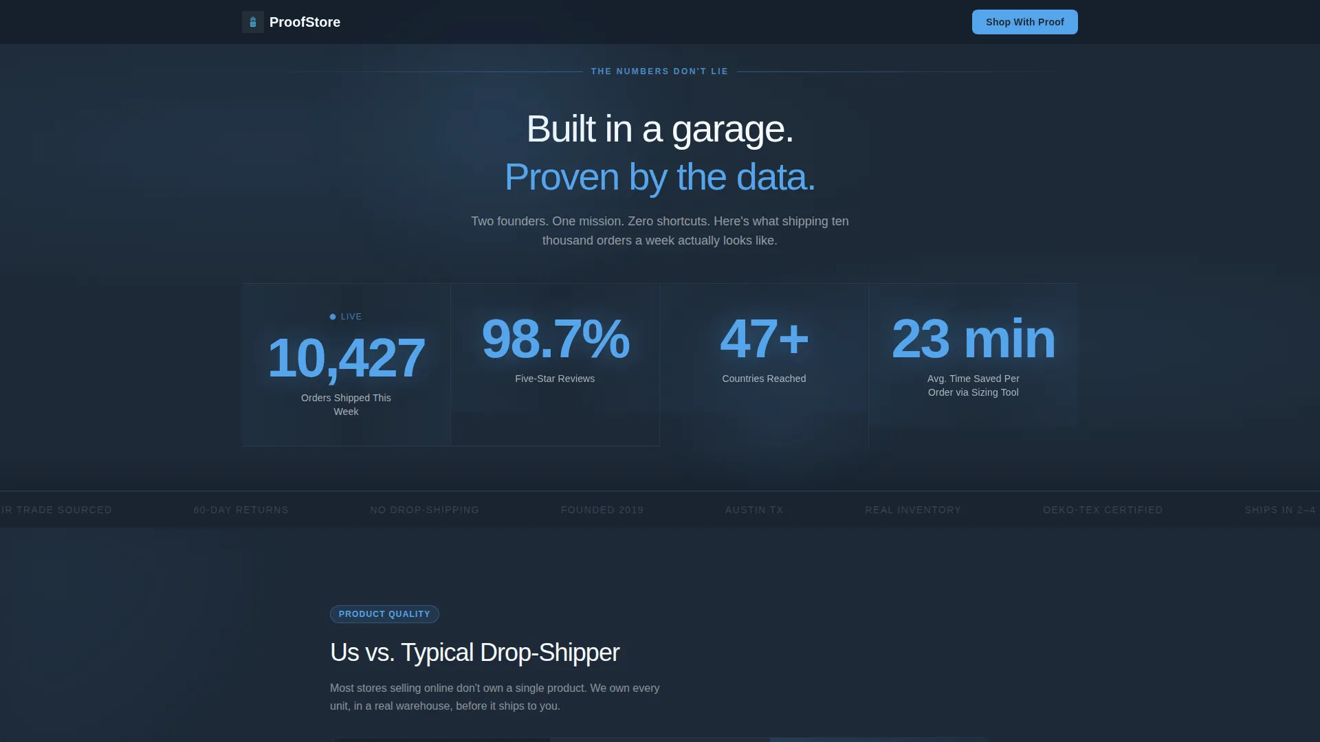
Proofstore is a single-page eCommerce about us landing page built for startup brands that need to earn trust fast. It leads with a bold metrics wall, then walks visitors through a series of comparison tables that put your brand's commitments side by side with industry norms. The result is a page that converts skeptics into confident buyers without asking for trust upfront.
by Rocket studio
Quick summary
Proofstore is a startup eCommerce about us landing page that opens with hard numbers and builds confidence through structured comparison tables. It is designed for scrappy brands that ship real product, stand behind their sourcing, and want first-time visitors to see the receipts before they ever hit the buy button.
Who this template is for
This template fits founders who have built something real and need a page that shows it. It speaks directly to the moment when a visitor arrives skeptical and leaves convinced.
- First-time visitors who arrived from a social ad and need immediate proof before browsing
- Loyal repeat buyers who want to understand the people and values behind the brand
- Wholesale buyers evaluating whether this brand is credible enough to stock
What problem this template solves
Most eCommerce about us pages are thin on proof. They offer a short origin story, a founder photo, and a vague mission statement. That approach fails the moment a skeptical visitor arrives.
- Visitors from paid ads need evidence, not storytelling, to cross the trust threshold
- Wholesale and B2B buyers need clear, scannable proof of quality and ethics before committing
- Brands with strong sourcing and returns policies have no structured format to communicate that advantage
What you get with this template
This template gives you a full single-page layout built around evidence and contrast. Every section is designed to move a doubting visitor one step closer to confident action.
- A full-width stats and metrics header that displays key brand numbers in large sky-blue numerals
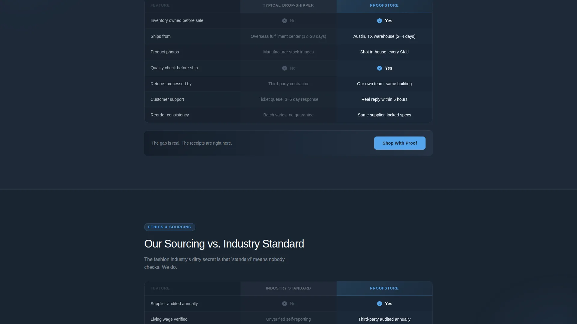
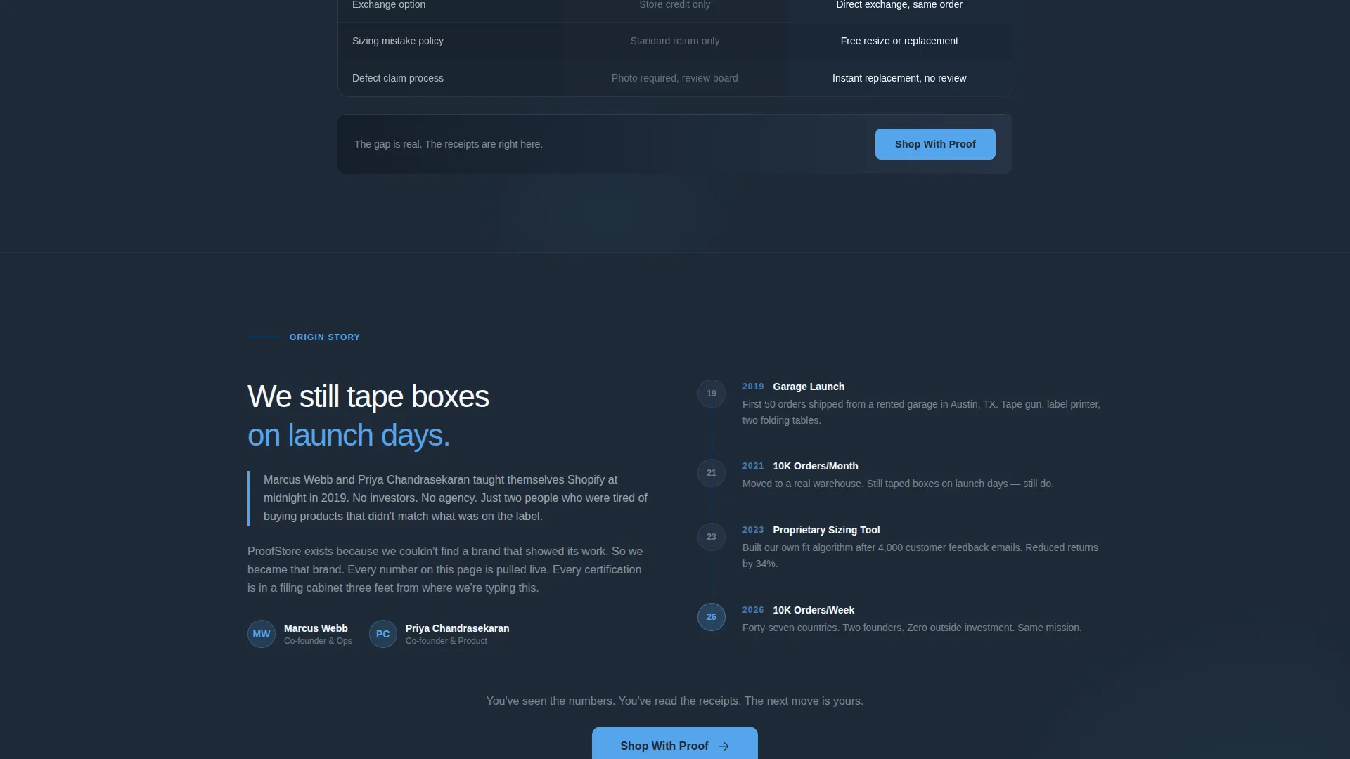
- A series of two-column comparison tables covering product quality, sourcing standards, and returns policy
- Pinned call-to-action buttons and secondary text links placed at the end of every comparison block
Feature list
This template is built around a tight set of purposeful components. Each one earns its place by doing conversion work.
Animated Metrics Header Wall
The header is a full-width dark slate bar that displays live-count-style numbers on load. Orders shipped, five-star reviews, countries reached, and hours saved through a proprietary sizing tool all tick upward in oversized sky-blue numerals. The numbers land before the visitor scrolls a single pixel.
Multi-Table Comparison Layout
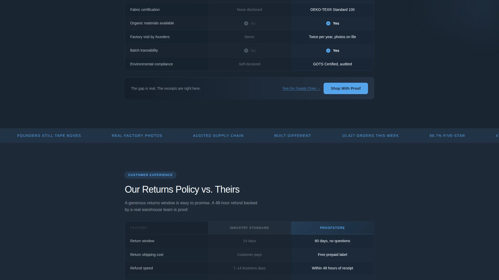
The scroll is structured as a series of two-column comparison tables. Each table places competitor norms in muted graphite on the left and this brand's commitments in sky-blue checkmarks and bold white type on the right. The sequence escalates from product quality to ethics to customer experience.
Pinned call to action Per Table Block
A primary call-to-action button reading "Shop With Proof" is pinned to the bottom of every comparison table. This placement ties the moment of maximum conviction directly to the next step, reducing the gap between persuasion and action.
Supply Chain Modal Path
A secondary text link reading "See Our Supply Chain" sits beneath each sourcing comparison table. It opens a lightweight modal displaying factory photos and certifications, giving buyers who need deeper proof a clear path without leaving the page.
Slate and Sky Color System
The entire layout uses a four-tone palette: deep charcoal slate for backgrounds, mid-tone graphite for secondary surfaces, open sky blue for action accents, and cloud white for text. The system creates visual hierarchy that guides the eye through each comparison block naturally.
Page sections overview
| Section | Purpose |
|---|---|
| Stats Metrics Header | Opens with brand numbers that establish immediate credibility |
| Us versus. Drop-Shipper | Compares product quality against typical drop-shipping norms |
| Sourcing versus. Standard | Shows how brand sourcing differs from industry defaults |
| Returns Policy Comparison | Highlights the brand's returns approach against common alternatives |
| Shop With Proof call to action | Drives visitors to the best-sellers collection at peak conviction |
| Supply Chain Modal | Provides factory photos and certifications for deeper due diligence |
Design & branding system
The visual identity is built around the Slate and Sky color system. It feels like a co-working space early in the morning: efficient, direct, and moving fast.
- Deep charcoal slate (#1E2A38) anchors primary backgrounds, mid-tone graphite (#4A5568) fills secondary surfaces, open sky blue (#56A5EC) drives all action accents and metric highlights, and cloud white (#F7FAFC) handles text and negative space
- Typography pairs oversized sky-blue numerals for metric headers with bold white body type in table cells, creating strong contrast at every comparison point
- No photography or founder portraits appear in the header; the design leads entirely with data and structured proof
Mobile & speed optimization
The layout is structured to stay readable and functional on smaller screens without sacrificing the visual impact of the comparison tables.
- Each two-column comparison table is designed to reflow cleanly so neither column becomes unreadably narrow on mobile viewports
- The pinned call-to-action button at the bottom of each table block remains accessible and tappable at standard mobile touch sizes
- The lightweight modal for supply chain content keeps additional media contained so it does not disrupt the main page scroll experience
How this template helps you convert
Conversion in this template is not driven by emotional appeals. It is driven by structured contrast. Every layout decision is built to move a skeptical visitor through a deliberate proof sequence.
- The metrics header captures attention instantly and anchors the brand in real performance data before the visitor reads a single line of copy
- The escalating comparison tables build a cumulative case across quality, sourcing, and customer experience, making the gap between this brand and competitors wider with every scroll
- The pinned "Shop With Proof" call to action appears at the exact moment each table reaches its strongest point, shortening the distance between conviction and the click
Other information about this template
This template is part of the Startup Velocity theme family, which is designed for early-stage and growth-phase eCommerce brands that compete on transparency and operational credibility. A few additional details worth noting:
- The template style is classified as a Comparison Table layout, making it particularly suited to brands in crowded product categories where differentiation is hard to communicate through standard hero-and-copy formats
- The header concept follows a Stats and Metrics creative pattern, which works well for brands that have accumulated measurable proof points such as order volumes, review counts, or geographic reach
- The Feature Matrix creative direction structures the body of the page, meaning the scroll is designed as a progressive evidence sequence rather than a narrative story
- The Comparison and Versus landing-page direction means the primary persuasion mechanism is contrast, not inspiration, which is a strong fit for category-aware buyers who have already compared options before arriving
Theme
Startup Velocity
Creative direction
Feature Matrix
Color system
Slate & Sky
Style
Comparison Table
Direction
Comparison/Versus
Page Sections
Animated Metrics Header Wall
Multi-table Comparison Layout
Pinned Shop with Proof Call to Action
Supply Chain Modal Path
Slate and Sky Color System
Related questions
Can I edit the comparison table content to match my brand's specific claims?
Does this template include the supply chain modal with photos and certifications?
Is this template suitable for a brand that does not yet have large order or review numbers?
How many comparison tables are included in the template?
Who is the primary visitor this page is designed to convert?



