Healthcare Software Specialist Careers Website Template
Proposalflow is a Bold Brutalist healthcare landing page template built for benefits brokers, HR directors, and third-party administrators. It features a live comparison table, stats-first scroll storytelling, and a three-step lead capture form. The design uses deep charcoal and clinical sky blue to make carrier data feel decisive, urgent, and impossible to ignore.
by Rocket studio
Quick summary
Proposalflow is a single-page template designed for healthcare proposal and quote platforms. It opens with a working carrier comparison table, walks visitors through impact statistics, and closes with a progressive lead generation form. Every design decision pushes toward one outcome: the visitor builds their first proposal before they leave.
Who this template is for
This template is built for teams that sell or manage healthcare quoting at volume. If your audience spends hours assembling proposals manually, this page speaks directly to their frustration.
- Benefits brokers managing multiple group renewals simultaneously
- HR directors who need clean, board-ready carrier comparisons fast
- Third-party administrators tired of rebuilding the same proposal document every cycle
What problem this template solves
Healthcare quoting is slow by default. Brokers wait days for carrier numbers, rebuild spreadsheets from scratch each renewal, and still deliver proposals that feel unfinished. This template addresses that friction directly.
- It replaces the generic hero image with a live, working comparison table that proves the product's value on arrival
- It uses oversized statistics to name the exact pain before explaining the solution
- It earns lead capture by letting visitors interact with the tool before asking for any information
What you get with this template
You get a fully structured, single-page layout built around a stats-first scroll narrative and an interactive comparison table header. Every section is designed to move a skeptical buyer from curiosity to commitment.
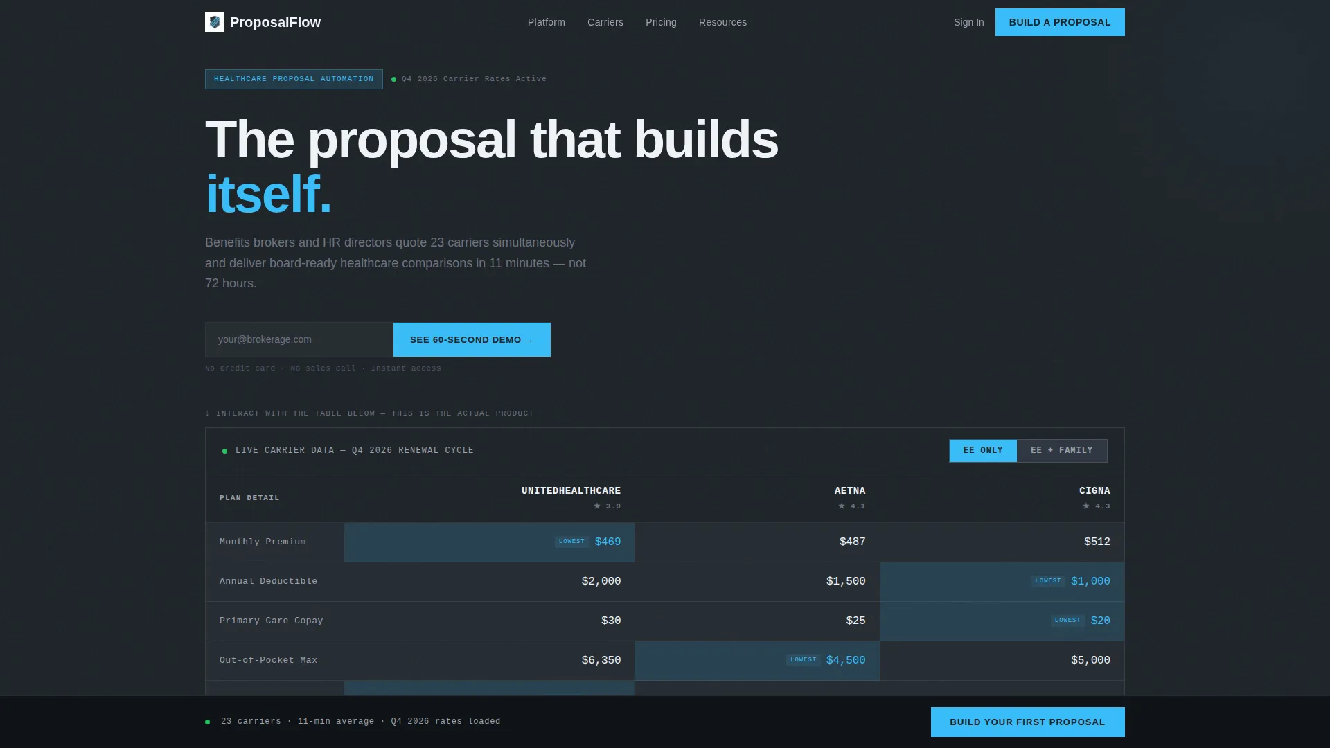
- An interactive three-column carrier comparison table with sortable columns and employee or family tier toggles
- A sticky bottom call-to-action bar with a three-step progressive lead capture form
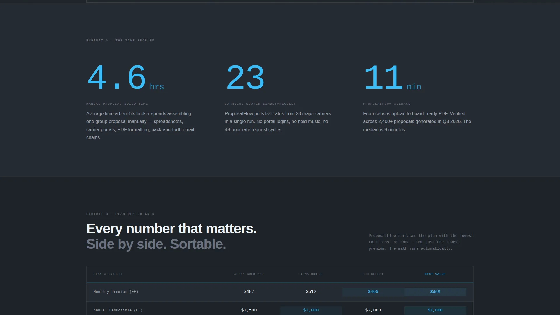
- Stats-first scroll blocks that open each section with a single oversized statistic before any explanatory text
Feature list
This template includes purpose-built components designed specifically for the healthcare proposal and quote space.
Interactive Carrier Comparison Table
The header section loads a fully functional comparison table showing three carriers side by side. Visitors can click column headers to re-sort results and toggle between employee-only and family plan tiers. Cells highlight automatically in sky blue when the lowest cost value surfaces, making the product's capability visible before any sign-up is required.
Stats-First Scroll Sections
Each scroll position opens with a single, brutally large statistic rendered in sky blue at display scale. The stat hits first, then a context paragraph follows in concrete gray. This sequence builds a persuasive case across the full page, moving from time-cost pain to speed-of-delivery proof.
Progressive Three-Step Lead Form
The primary call-to-action form is structured as a three-step sequence. Step one collects employee count and state. Step two asks for current carrier and renewal date. Step three captures name, company, and email. Breaking the form into steps reduces perceived friction and improves completion rates.
Sticky Bottom Call-to-Action Bar
After the visitor scrolls past the interactive preview, a brutalist black bar locks to the bottom of the viewport. It holds the primary "Build Your First Proposal" call to action and stays visible throughout the remainder of the page scroll without interrupting content reading.
Secondary Demo Conversion Path
A lighter conversion option sits beneath the header table for visitors not ready to commit. The "See a 60-Second Demo" prompt captures only an email address, giving hesitant visitors a low-stakes entry point while still moving them into the funnel.
Comparison Table Content Blocks
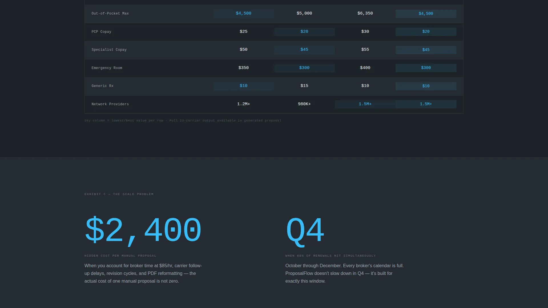
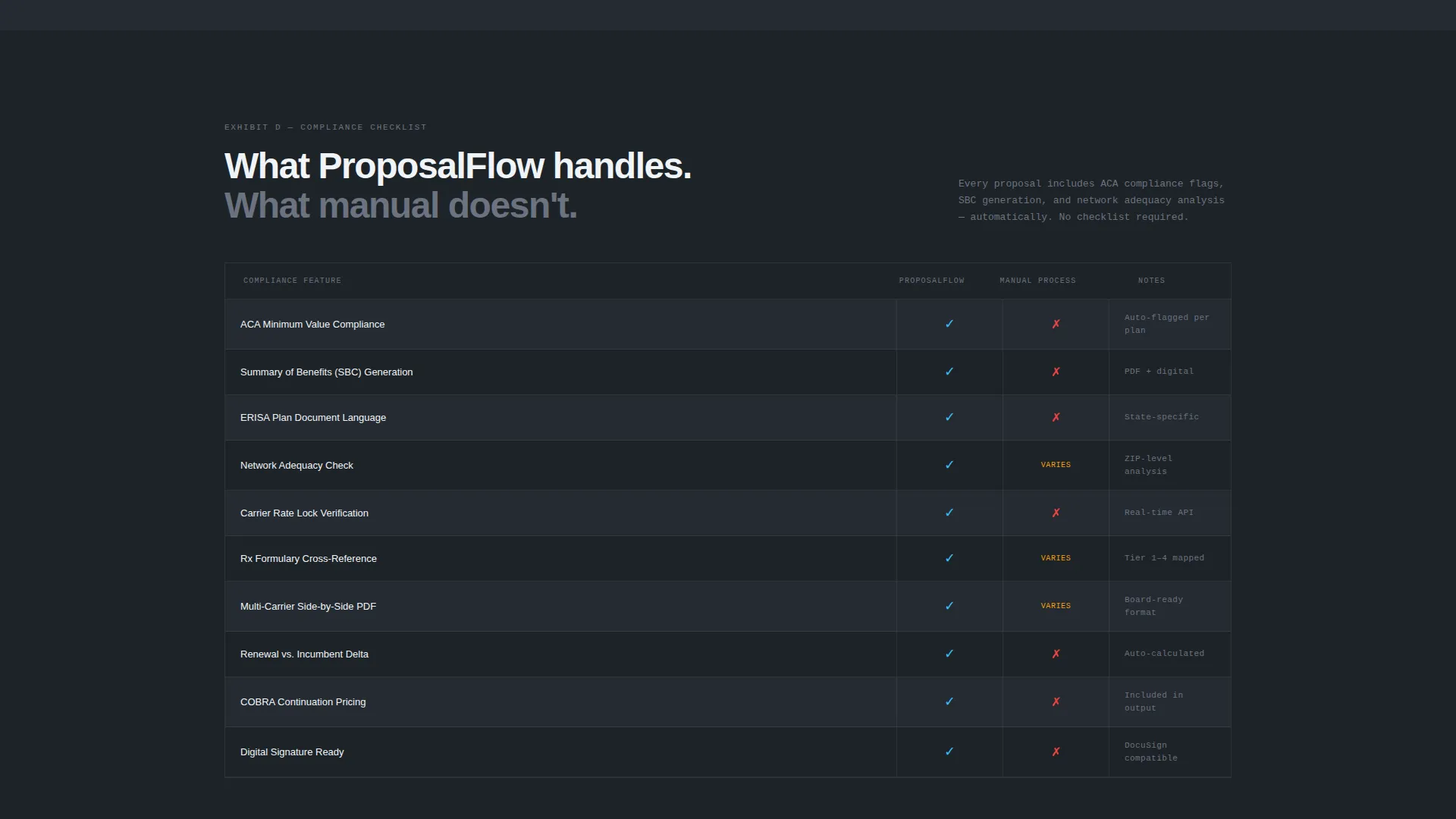
Between the stats sections, detailed comparison tables reappear with increasing specificity. The sequence moves from cost summaries to plan design grids to compliance checklists, building a closing-argument structure that layers evidence across the scroll.
Page sections overview
| Section | Purpose |
|---|---|
| Interactive Header Table | Live carrier comparison drives immediate product proof |
| Secondary Demo Prompt | Low-commitment email capture beneath the header |
| First Stats Block | "4.6 hours" statistic names the manual quoting pain |
| Cost Summary Table | Side-by-side premium and deductible comparison |
| Second Stats Block | "23 carriers" statistic establishes platform scale |
| Plan Design Grid | Detailed plan structure comparison across carriers |
| Third Stats Block | "11 minutes" statistic delivers the speed payoff |
| Compliance Checklist Table | Regulatory and plan compliance comparison view |
| Sticky call to action Bar | "Build Your First Proposal" locked to viewport bottom |
| Three-Step Lead Form | Progressive form collects qualified lead data |
Design & branding system
The visual identity follows a Bold Brutalist theme built on a Slate and Sky color system. The palette is built for authority and clinical precision, not warmth or decoration.
- Deep charcoal slate (#1E2328) dominates every background and header bar; poured-concrete gray (#6B7280) carries body text and supporting copy
- Clinical sky blue (#38BDF8) fires only on interactive elements, toggle states, and the oversized statistics that carry the most persuasive weight
- Almost-white vapor (#F0F4F8) fills table cell backgrounds, and all body text on dark blocks is set in vapor white for maximum contrast
Mobile & speed optimization
The template is structured to present comparison tables and stats blocks cleanly across screen sizes. The brutalist layout translates well to narrower viewports because it avoids decorative layers.
- Oversized statistics and monospaced number typography maintain visual impact on mobile without requiring image assets
- The sticky call to action bar is designed to remain functional and unobtrusive at mobile viewport heights
- The progressive form steps reduce input burden on touch devices by breaking the full form into focused single-question screens
How this template helps you convert
The page earns the lead rather than demanding it. Every scroll position is designed to reduce resistance before the ask arrives.
- The interactive comparison table in the header lets visitors experience the product's core value immediately, before any form or sign-up prompt appears
- The stats-first scroll structure names the buyer's exact pain in their own terms, building recognition and trust across each section before the primary call to action locks into view
Other information about this template
This template is built within the Technology and Healthcare Software category, specifically targeting the Healthcare Proposal and Quote niche. It is well suited for platforms competing in a space where trust and speed of proof are the primary buying signals.
- The template style is a Comparison Table layout, which is the dominant format for communicating carrier data clearly and credibly
- The Bold Brutalist theme is a deliberate contrast to polished, illustrative SaaS templates common in adjacent categories
- The header concept is classified as an Interactive Preview, meaning the product demonstration is the first thing a visitor encounters rather than a value proposition headline
- The creative direction is Stats-First Impact, a format that leads with verified numbers before context, which aligns with how benefits professionals evaluate new tools
- The lead generation direction supports both a high-intent primary path and a lower-commitment secondary path, giving the page two functional conversion entry points
Theme
Bold Brutalist
Creative direction
Stats-First Impact
Color system
Slate & Sky
Style
Comparison Table
Direction
Lead Generation
Page Sections
Interactive Carrier Comparison Table
Stats-first Scroll Blocks
Progressive Three-step Lead Form
Sticky Bottom Call to Action Bar
Secondary Demo Conversion Path
Layered Comparison Table Sections
Related questions
Who is this landing page template designed for?
Can I change the carrier names and plan data in the comparison tables?
How does the three-step lead form work in practice?
Does the sticky call to action bar appear on the template by default?
Can I update the statistics shown in the scroll sections?



