Dental Lab Management Software Landing Page
Prosthetic is a bold brutalist landing page template built for dental lab management software. It combines a live dashboard preview header, an embedded ROI calculator, and layered glassmorphic data panels to show every case, technician, and invoice at a glance. Designed for lab owners, office managers, and production leads who need clarity fast.
by Rocket studio
Quick summary
Prosthetic is a single-page landing page template for dental lab management software. It leads with a full-width dashboard screenshot, drops an interactive ROI calculator directly below the fold, and scrolls through feature modules rendered as actual user interface components. The brutalist glassmorphic design communicates precision, density, and operational confidence from the first pixel.
Who this template is for
This template is built for software teams and founders selling vertical SaaS products to dental labs. It speaks directly to operations-heavy buyers who respond to data, not stock photography.
- Lab owners managing multiple technicians across shifts who need proof the software works before they commit
- Office managers processing paper prescriptions from dozens of dental practices who want to see a faster path
- Production leads and SaaS marketers who need a landing page that earns trust through product density, not marketing fluff
What problem this template solves
Dental lab software buyers are skeptical. They have seen generic SaaS landing pages with cartoon illustrations and bullet-point promises. They need to see the actual product working under real conditions before they consider a download.
- Generic templates fail to communicate operational depth, leaving lab managers unconvinced the software can handle their case volume
- Most landing pages bury the value proposition behind email gates and vague feature lists instead of showing live data and real metrics
- There is no easy way for a visitor to calculate their own time and cost savings without leaving the page or waiting for a demo
What you get with this template
You get a production-ready landing page that puts the product front and center. Every section is structured to build conviction layer by layer, from the dashboard header down to the download call to action.
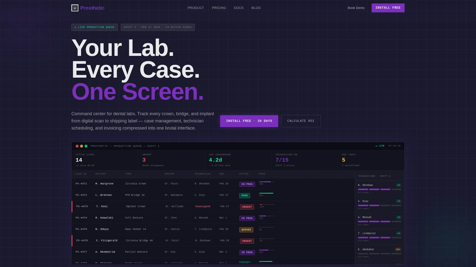
- A full-width dashboard preview header showing a live production queue with case statuses, technician assignments, and real-time turnaround metrics
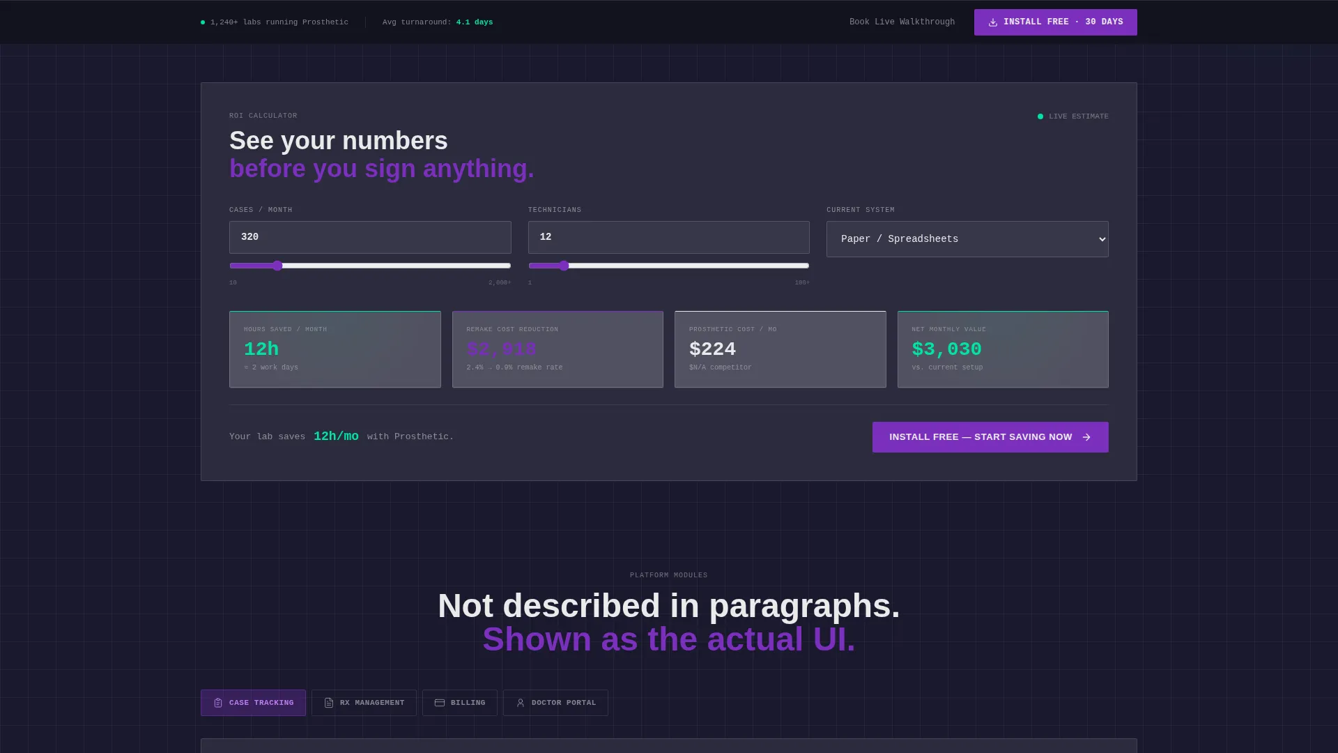
- An embedded interactive ROI calculator that accepts three inputs and instantly outputs estimated hours saved, remake reduction, and monthly cost comparison
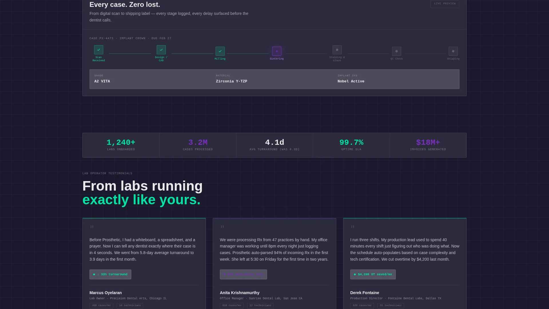
- Glassmorphic feature modules rendered as actual user interface components for case tracking, Rx management, billing, and a doctor portal
Feature list
This template ships with a set of purpose-built sections and interactive components. Each one is grounded in the operational reality of running a dental lab.
Full-Width Dashboard Header
A pixel-accurate screenshot of the app interface fills the header. It shows fourteen cases mid-shift, three flagged urgent in electric violet, a technician sidebar, and a mint-colored turnaround metric. The headline "Your Lab. Every Case. One Screen." is punched through in heavy brutalist type.
Embedded ROI Calculator
The calculator sits directly below the dashboard, before the visitor scrolls to any feature section. It takes three inputs: cases per month, number of technicians, and current software via dropdown. Output cards animate into view showing hours saved, remake reduction, and a monthly cost comparison.
Layered Glassmorphic Feature Modules
Each major feature, including case tracking, prescription management, billing, and the doctor portal, is presented as a frosted glass panel showing the actual user interface component. Sections stack as the visitor scrolls deeper, creating a layer-by-layer product reveal.
Floating Download Bar
A brutalist action bar is pinned to the bottom of the viewport at all times. It carries the primary call to action "Install Free for 30 Days" alongside paired iOS and desktop platform icons. The bar also contextualizes the calculator output, placing the download prompt beside the visitor's personal savings number.
Live Walkthrough Secondary Path
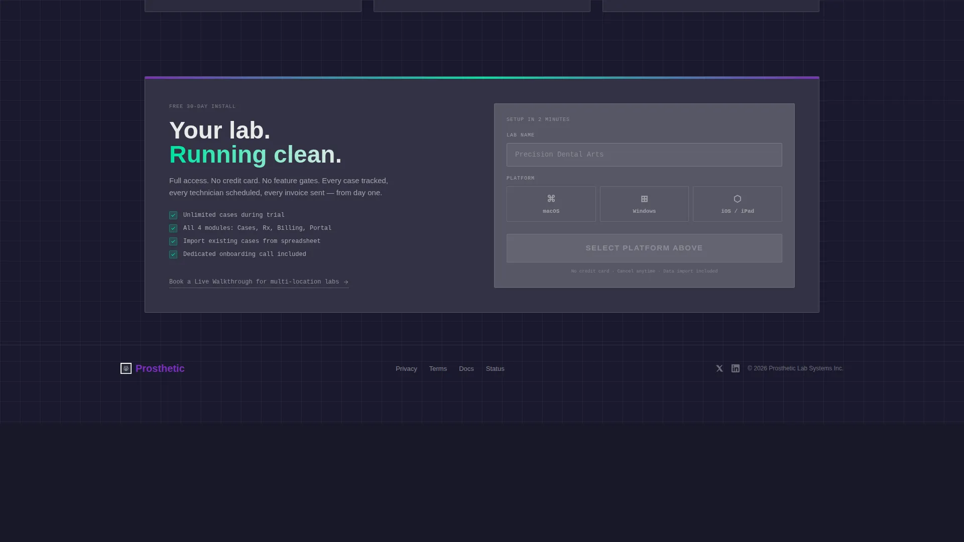
A secondary conversion option, "Book a Live Walkthrough," is available for larger labs that need multi-location setup support. It sits alongside the primary download path without competing for attention.
Calculator-Driven Conversion Flow
Once the ROI calculator produces an output, the result is used directly as conversion fuel. The download button appears beside the personalized metric, turning a data point like "147 hours saved per month" into an immediate reason to act.
Page sections overview
| Section | Purpose |
|---|---|
| Dashboard Header | Show live production queue and establish product credibility immediately |
| ROI Calculator | Let visitors calculate personal time and cost savings before scrolling |
| Case Tracking Module | Display case status user interface as a glass panel data component |
| Rx Management Module | Show prescription workflow as a functional user interface panel |
| Billing Module | Present invoicing interface as an embedded product component |
| Doctor Portal Module | Illustrate the client-facing portal with actual user interface elements |
| Floating call to action Bar | Pin the download action at the viewport bottom throughout the scroll |
| Live Walkthrough call to action | Offer a secondary booking path for larger multi-location labs |
Design & branding system
The visual identity is Bold Brutalist delivered through a Glassmorphic color system. Every color choice is functional, not decorative, which mirrors the no-nonsense mindset of the dental lab audience.
- Core palette: deep slab charcoal (#1A1A2E) background, frosted panels at 12% white opacity, electric clinical violet (#7B2FBE) for active states and progress bars, sterile mint (#00E5A0) for completion indicators, and sharp bone white (#EAEAEA) for all typography
- Typography uses heavy brutalist slab weight for headlines, creating visual punch that competes with the dense data panels without losing hierarchy
- The aesthetic is described as a surgical-grade monitor glowing in a darkened lab, with glass panels hovering over void and every visual element earning its place through function
Mobile & speed optimization
The template is designed with a workstation-first visual language, but the layout is structured to translate clearly on smaller screens. Dense data panels reflow without losing the sense of depth or product believability.
- Glassmorphic panels use layered blur and opacity rather than heavy image assets, keeping the visual effect lightweight across devices
- The floating call to action bar adapts to smaller viewports, maintaining the download prompt and platform icons without obscuring content
- The ROI calculator inputs are form-based and designed for quick interaction, reducing friction for mobile visitors who want to see their numbers fast
How this template helps you convert
Prosthetic is engineered around a specific conversion sequence. Every design and layout decision pushes a skeptical lab professional toward the download without applying pressure that would feel out of place for a technical audience.
- The dashboard header establishes immediate product credibility by showing real data density before the visitor reads a single marketing sentence, removing the first layer of doubt
- The ROI calculator creates a personalized financial case for the software, so by the time the visitor reaches the feature modules, they are already anchored to a specific savings number that belongs to them
- The floating download bar ensures the primary call to action is always visible, and it contextualizes itself beside the calculator output so the decision to download feels logical rather than pressured
Other information about this template
This template is designed for the dental lab vertical SaaS category and pairs well with product launches, app store campaigns, and direct-download acquisition flows. It is a strong fit for teams that want to lead with product proof rather than brand storytelling.
- The template style is Dashboard and Data Grid, making it well-suited for any software product where showing the interface is more persuasive than describing it
- No email gate is placed before the download, reducing friction and supporting a direct install-first acquisition model
- The lab name field is the only input required at download, keeping the onboarding entry point as light as possible
- The overall page direction is App Download, meaning every section feeds toward platform selection rather than a lead capture form
Theme
Bold Brutalist
Creative direction
Calculator/Tool First
Color system
Glassmorphic
Style
Dashboard/Data Grid
Direction
App Download
Page Sections
Full-width Dashboard Preview Header
Embedded Interactive ROI Calculator
Layered Feature Module Sections
Floating Brutalist Call to Action Bar
Secondary Live Walkthrough Path
No-gate Direct Download Flow
Related questions
Who is this landing page template designed for?
Can I adapt the ROI calculator inputs for a different software product?
Does this template require a separate design tool to customize?
What is the primary call to action on this landing page?
Is the dashboard header image a real product screenshot or a placeholder?



