IT Services & Consulting Portfolio Website Template
Provision is a scroll reveal landing page template built for cloud architecture consultancies. It presents your services through progressive, animated sections, glass panel metrics, a capability matrix, before-and-after comparisons, and case study cards, all styled in a dark, iridescent visual system that feels as sharp and precise as the infrastructure you deliver.
by Rocket studio
Quick summary
Provision is a single-page, scroll reveal landing page template designed for cloud architecture consulting firms. It opens with four glowing Dark Glass Panels displaying key performance metrics, then unfolds service tiers, a comparison matrix, and case study cards as the visitor scrolls. The result is a page that proves competence quietly before a word of sales copy is read.
Who this template is for
This template is built for technical consultancies that help engineering teams fix costly, brittle cloud infrastructure. It speaks directly to the people who commission that work.
- Series B startup founders and chief technology officers watching their cloud bills climb every quarter
- Platform engineering leads migrating monolith applications to containerized, Kubernetes-based stacks
- Cloud consultants and infrastructure agencies who need a landing page that matches their technical credibility
What problem this template solves
Most consulting landing pages lead with words. Provision leads with proof. The template solves the credibility problem that technical buyers face when evaluating a new vendor.
- Visitors arrive skeptical and leave before reading the pitch if nothing immediately signals competence
- Technical buyers need to see outcomes and architecture thinking, not a generic services list
- Early-stage leads need a low-commitment path to engage before they are ready to book a call
What you get with this template
The template delivers a complete, single-page layout structured around progressive evidence accumulation. Each scroll depth adds a new layer of proof.
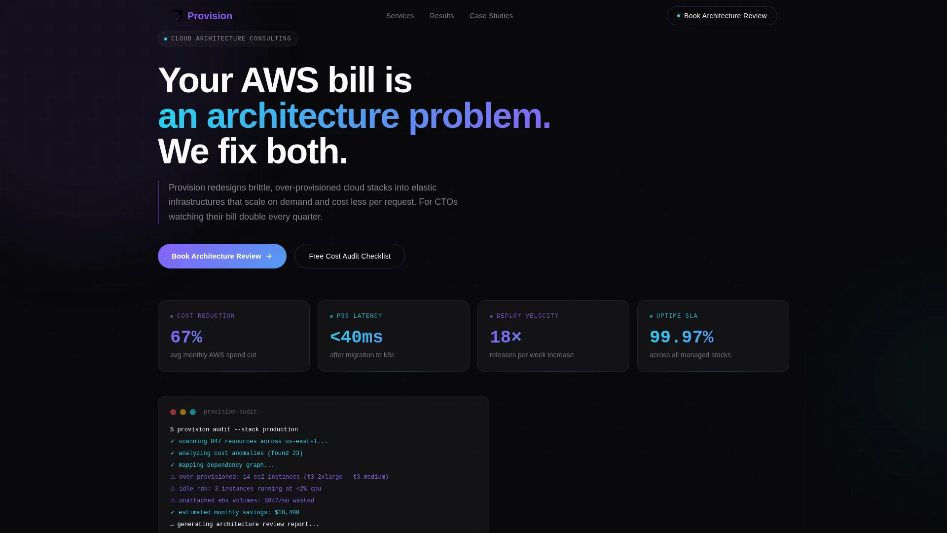
- A header built from four translucent Dark Glass Panels displaying live-style metrics: latency reduced, monthly spend cut, deploy frequency, and uptime percentage
- A three-act scroll sequence covering service descriptions, a current-state-versus-future-state comparison matrix, and flipping case study cards
- A dual lead capture system with a primary "Book an Architecture Review" call to action and a secondary downloadable Cloud Cost Audit Checklist gated by email
Feature list
This template ships with six core components, each grounded in the source brief.
Dark Glass Panel Header
Four translucent, frosted-glass rectangles float against a void black background. Each panel holds a single glowing metric. As the cursor moves, iridescent edge reflections shift across each panel, making data feel like living architecture rather than static copy.
Progressive Scroll Reveal Sequence
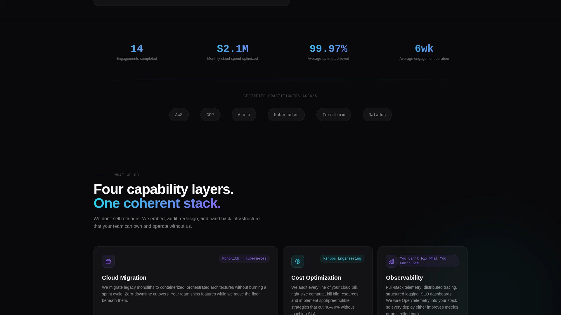
The page teaches through accumulation. The first scroll depth expands the glass panels into full service descriptions. The second materializes a comparison matrix row by row. The third flips case study cards from problem to outcome. Visitors arrive curious and leave convinced.
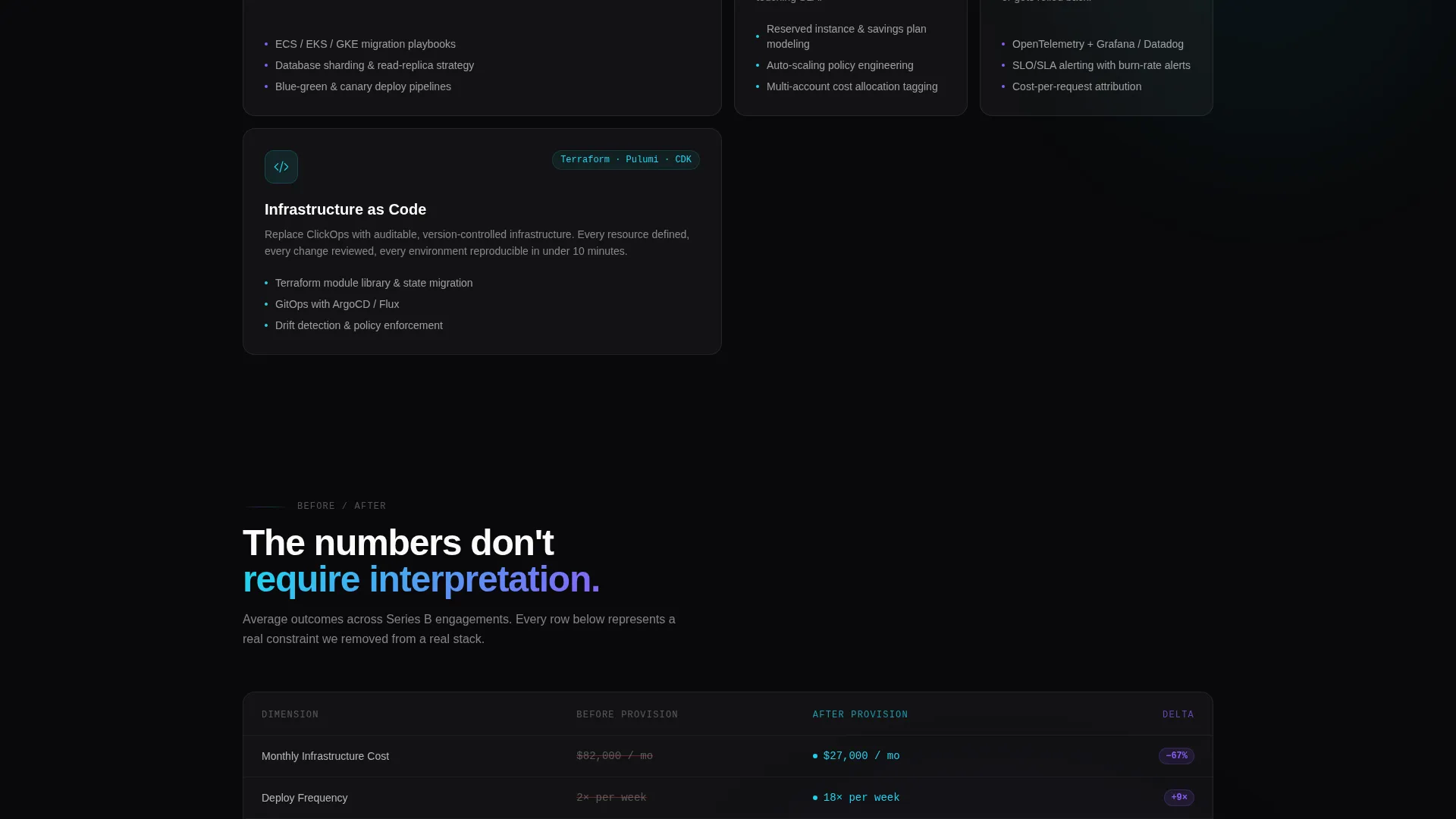
Current State versus. Future State Matrix
A structured comparison matrix animates in as the visitor reaches it. Each row contrasts the client's current infrastructure reality against the post-engagement outcome. It neutralizes objections before the visitor can fully form them.
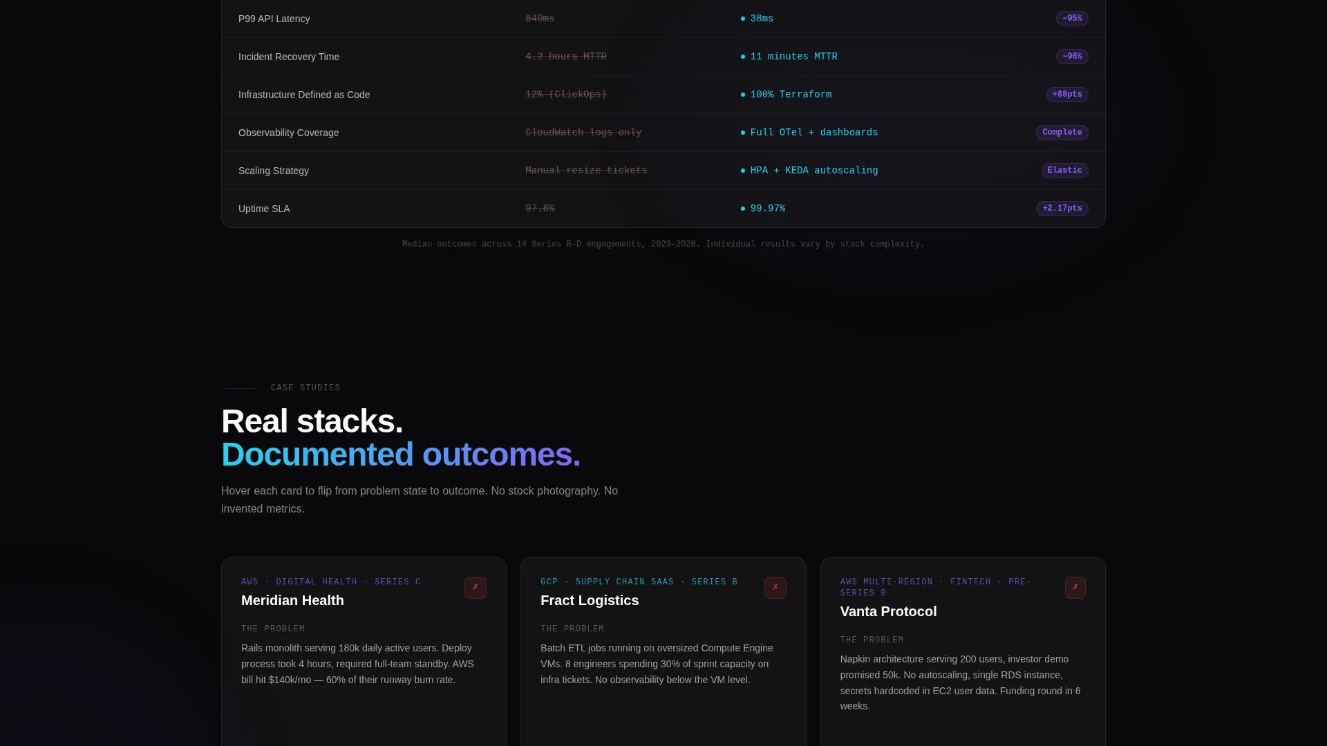
Flipping Case Study Cards
Case study cards start face-down on the problem. As each card enters the viewport, it flips to reveal the outcome. This format turns proof points into a kinetic experience rather than a testimonials section.
Primary Lead Capture Form
The "Book an Architecture Review" call to action appears first as a persistent ghost button in the navigation bar. At the bottom of the page, it solidifies into a full-width section with a three-field sequential form: current cloud provider, monthly infrastructure spend range, and work email.
Secondary Gated Asset Path
A separate opt-in flow offers a free Cloud Cost Audit Checklist in exchange for an email address only. This captures earlier-stage leads who are not yet ready for a discovery call but are already concerned about their infrastructure spend.
Page sections overview
| Section | Purpose |
|---|---|
| Glass Panel Header | Display four key proof metrics upfront |
| Service Expansion Layer | Reveal migration, cost, observability, and infrastructure-as-code services |
| Comparison Matrix | Contrast current state against post-engagement outcomes |
| Case Study Cards | Flip from problem to outcome as visitor scrolls |
| Primary call to action Section | Convert ready-to-buy leads with a three-field form |
| Checklist Gated Opt-in | Capture earlier-stage leads with a free audit resource |
Design & branding system
The visual identity channels Startup Velocity energy through an iridescent color system that feels synthetic, luminous, and precise. Color is treated as a reward for interaction, not a background texture.
- Core palette: void black (#09090B) for all backgrounds, signal white (#FAFAFA) for body typography, holographic violet (#8B5CF6) and plasma cyan (#22D3EE) reserved for gradients on interactive and animated surfaces only
- Violet and cyan appear exclusively as shifting gradients on hover states, animated elements, and interactive surfaces, never as flat fills
- Typography stays in signal white throughout, ensuring maximum readability against the dark void background at every scroll depth
Mobile & speed optimization
The template is structured to remain legible and performant on smaller screens, where technical buyers often do their first pass research.
- The glass panel header and comparison matrix reflow into stacked, single-column layouts on mobile viewports
- Scroll reveal animations are scoped to viewport entry, so elements only animate when they are actually visible, reducing unnecessary processing
- The sequential lead capture form reduces friction on mobile by presenting one field at a time rather than a full form grid
How this template helps you convert
Provision is engineered around a single conversion philosophy: remove doubt before you ask for the meeting.
- The header metrics establish credibility within the first viewport, so visitors have a reason to keep scrolling before reading a single line of persuasive copy
- The progressive matrix and case study flip sequence accumulate layered evidence across three scroll depths, systematically addressing the objections a technical buyer would raise
- The dual call-to-action structure captures both high-intent leads ready for a discovery call and lower-intent leads who need a resource first, expanding the total addressable pipeline from one page
Other information about this template
This template is a strong fit for cloud architecture consulting practices operating across major infrastructure platforms. A few additional notes for teams evaluating it.
- The three-field lead form is designed to segment leads by cloud provider (Amazon Web Services, Google Cloud Platform, Microsoft Azure, or multi-cloud) and monthly spend range, giving your sales team useful context before the first call
- The Cloud Cost Audit Checklist opt-in functions as a standalone secondary funnel and can support content-driven campaigns independently of the primary call to action
- The iridescent color system and Dark Glass Panel aesthetic align closely with how engineering-led audiences perceive technical authority, making the design a strategic choice, not just a visual one
- The template is built under the Startup Velocity theme, using the AI Iridescent color system, Feature Matrix creative direction, and a Scroll Reveal (Progressive) template style
Theme
Startup Velocity
Creative direction
Feature Matrix
Color system
AI Iridescent
Style
Scroll Reveal (Progressive)
Direction
Lead Generation
Page Sections
Dark Glass Panel Metric Header
Three-act Progressive Scroll Reveal
Current State Versus. Future State Matrix
Flipping Case Study Cards
Dual Lead Capture System
AI Iridescent Visual Identity
Related questions
Who is this landing page template designed for?
Does the page support two different lead capture paths?
What services does the template cover in the scroll sequence?
Can this template support consultancies working across multiple cloud providers?
What makes the visual design appropriate for a technical audience?



