Cloud Architecture Technology Cost Calculator Website Template
Provision is a scroll-reveal landing page template built for cloud architecture managed services. It opens with an interactive Feature Tab Switcher and a cloud cost calculator that delivers value before a single line of copy is read. The design uses a dark terminal aesthetic in deep black, teal, and orange to speak directly to CTOs, DevOps leads, and finance teams tired of unpredictable infrastructure bills.
by Rocket studio
Quick summary
Provision is a high-performance landing page template for cloud architecture managed services. It leads with an interactive cost calculator and a visual before-and-after architecture switcher. The design is built around a dark terminal color system and a comparison-first content flow that moves technical buyers from skepticism to action fast.
Who this template is for
This template is designed for managed cloud service providers who need to win over highly technical, skeptical buyers. It speaks the language of people who read infrastructure bills and Terraform configs for a living.
- Series A startup CTOs running lean engineering teams on fragile, hand-built infrastructure
- DevOps leads who have inherited a messy predecessor stack full of untagged resources and overlapping security groups
- Finance and operations leaders staring at a cloud bill that doubled overnight with no clear explanation
What problem this template solves
Most cloud service landing pages bury value beneath paragraphs of marketing copy. Technical buyers disengage the moment a page feels like it was written for a boardroom instead of a terminal window.
- Visitors leave before they understand what the service actually fixes or saves them
- There is no immediate proof of value, so trust never builds and conversion stalls
- The gap between "this sounds interesting" and "I want to talk to someone" is too wide without a tool or comparison to bridge it
What you get with this template
You get a fully structured single-page layout that front-loads value with an interactive calculator and a visual architecture comparison. Every section is sequenced to reduce friction and build conviction progressively.
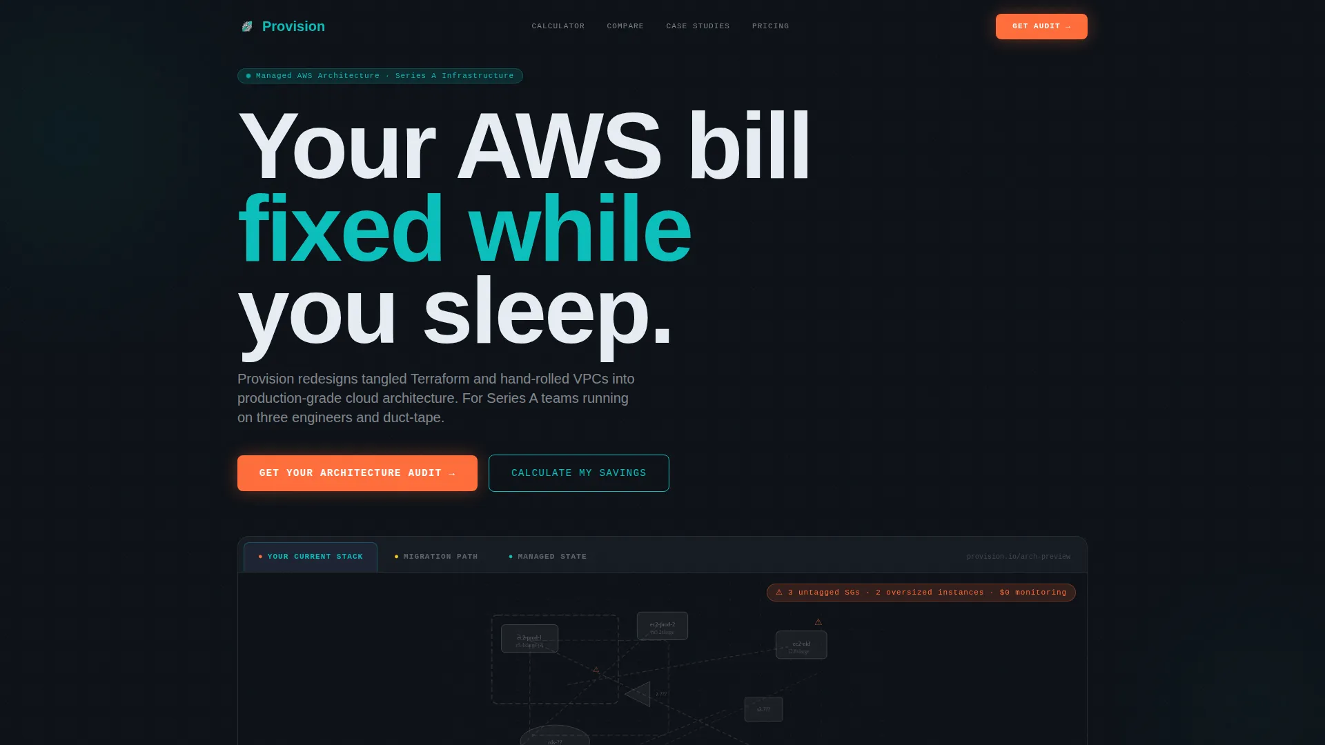
- A Feature Tab Switcher header showing a messy architecture versus a clean managed state, rendered in real contrast
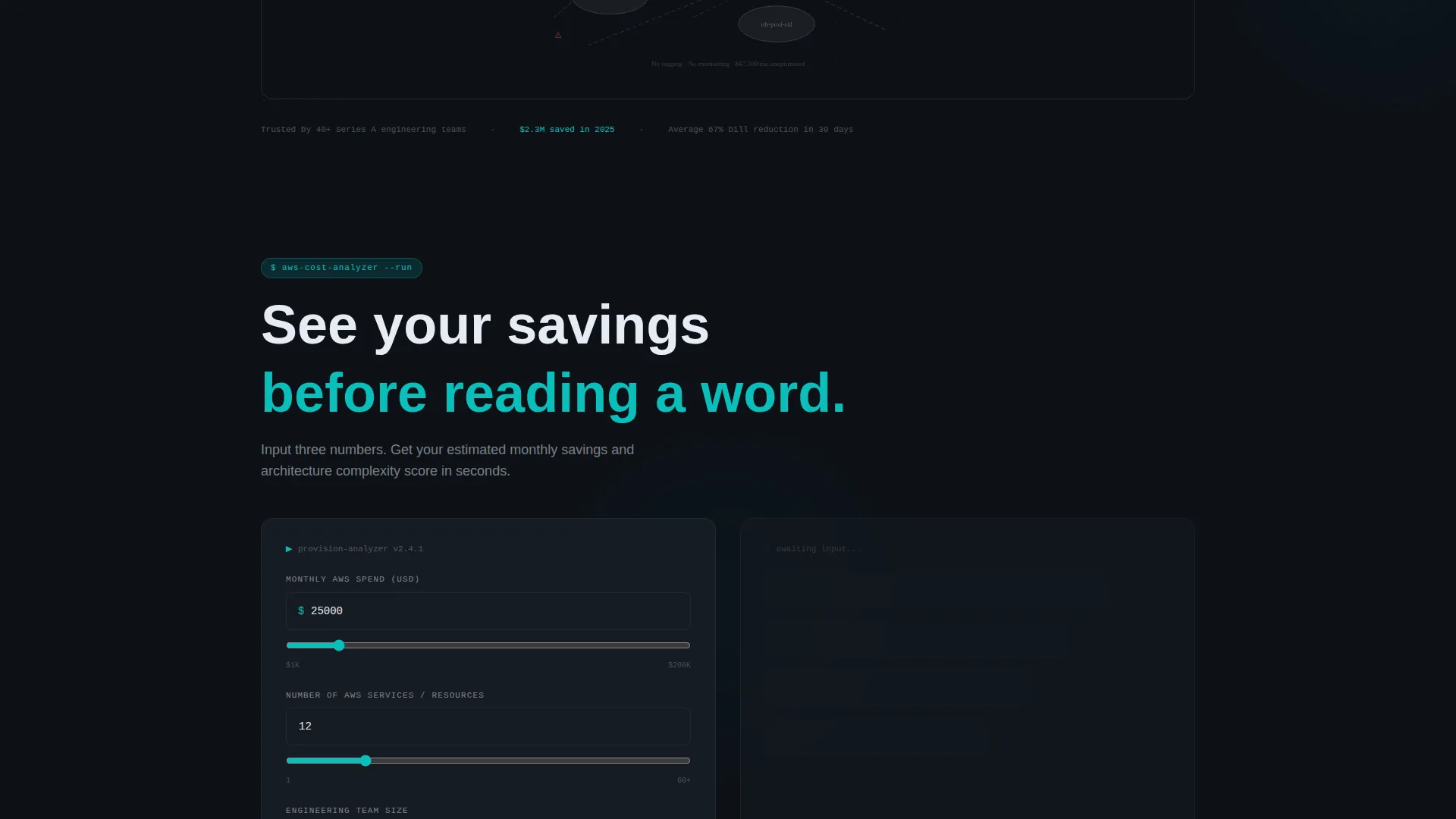
- A cloud cost calculator section that outputs estimated savings and an architecture complexity score before the visitor reads body copy
- A versus table, case study cards, staffing cost comparison, and two distinct conversion paths built into the page flow
Feature list
This template is built around high-intent components that do the selling before a sales team ever gets involved.
Interactive Architecture Tab Switcher
The header includes three clickable tabs labeled "Your Current Stack," "Migration Path," and "Managed State." Each tab renders a different architecture diagram state. The default view shows a messy topology in muted grays. Clicking "Managed State" snaps it into a clean, teal-and-white labeled diagram with cost annotations. The contrast is immediate and visual.
Cloud Cost Calculator
Positioned directly below the header, the calculator asks for monthly Amazon Web Services spend, number of services, and team size. It outputs estimated savings and an architecture complexity score. Visitors receive a concrete, personalized data point before they read a single paragraph of copy.
Twelve-Dimension Versus Table
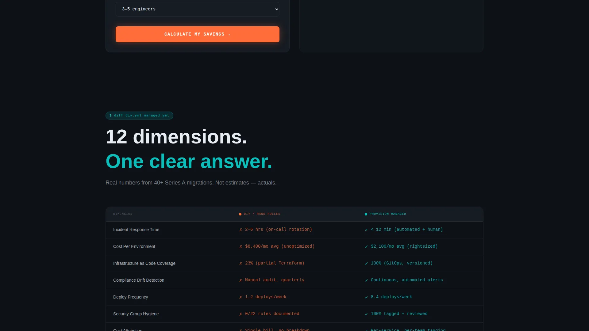
A structured comparison table sets do-it-yourself infrastructure management against the managed service across twelve dimensions. These include incident response time, cost per environment, compliance drift, and deploy frequency. The table makes the decision feel analytical rather than emotional, which is exactly what technical buyers need.
Progressive Scroll Reveal Layout
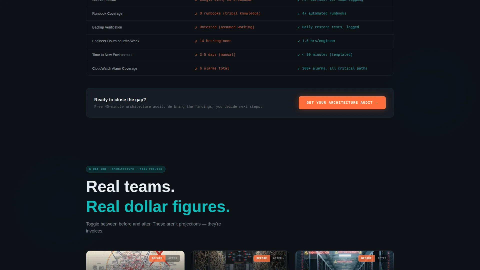
Every section below the header animates into view as the visitor scrolls. Case study cards slide in with real dollar figures and before-and-after architecture diagrams. The staffing comparison section reveals the true cost of a three-person DevOps team versus a service retainer. Each reveal earns the next scroll.
Dual Conversion Path Design
The primary call to action is "Get Your Architecture Audit" in hot deploy orange, pinned below the calculator results and repeated after the versus table. A secondary path, "Download the Build versus. Buy Analysis," gates a PDF behind an email address alone. This catches visitors who are convinced but not yet ready for a sales conversation.
Targeted Lead Capture Form
The audit form collects company name, current cloud provider, monthly infrastructure spend range, and a single open-text field for the biggest infrastructure pain point. The form is short enough to feel low-effort but specific enough to qualify leads before the first conversation.
Page sections overview
| Section | Purpose |
|---|---|
| Tab Switcher Header | Show before-and-after architecture contrast visually |
| Cloud Cost Calculator | Deliver personalized savings estimate before body copy |
| Versus Comparison Table | Compare managed service against DIY across 12 dimensions |
| Case Study Cards | Build trust with real figures and architecture diagrams |
| Staffing Cost Comparison | Show retainer cost versus a full DevOps team |
| Architecture Audit call to action | Primary conversion point after calculator and table |
| Build versus. Buy Gate | Secondary email-gated PDF for undecided visitors |
| Lead Capture Form | Collect qualified prospect details for audit conversations |
Design & branding system
The visual identity follows a Startup Velocity theme built entirely around a dark terminal aesthetic. Every color choice is deliberate and engineered to reduce cognitive load for a technically-minded audience.
- Deep terminal black (#0D1117) as the base, catalyst teal (#0ABFBC) for structure and data, and signal white (#E6EDF3) for readable body text
- Hot deploy orange (#FF6D3A) is reserved exclusively for calls to action and urgent data points, making every conversion moment impossible to miss
- The overall feel is a dark-mode operations dashboard at 2 AM, where density signals competence and clean teal output signals that something just worked
Mobile & speed optimization
The progressive scroll reveal layout is structured to load content in sequence, keeping the experience focused and lightweight as the visitor moves down the page.
- Each section animates into view only when reached, preventing unnecessary rendering of off-screen components
- The calculator and tab switcher are designed as self-contained interactive blocks that work cleanly within a single-column mobile layout
- The form and dual call to action paths are structured to remain accessible and visually clear on smaller screens without layout collapse
How this template helps you convert
This template is built on a Calculator-First creative direction, which means visitors receive proof of value before they are ever asked to take action. Every section is sequenced to earn trust progressively.
- The cost calculator outputs personalized savings data immediately, giving visitors a financial reason to stay and read before any marketing copy appears
- The versus table and case study cards remove abstract claims by showing specific dimensions and real figures, making the service feel proven rather than promised
- Two conversion paths, one high-intent audit form and one low-friction PDF download, capture buyers at different stages of readiness so no qualified visitor leaves empty-handed
Other information about this template
This template is built specifically for the cloud architecture managed service category and is well-suited to agencies or independent service providers competing in a market where buyers are highly informed and resistant to generic marketing language.
- The Scroll Reveal (Progressive) template style means sections load and animate in sequence, creating a paced, story-like experience that rewards attention
- The Comparison/Versus landing page direction makes this template especially effective for buyers who are actively evaluating whether to build in-house or hire a managed service
- The calculator-first layout aligns with how technical buyers evaluate new vendors: they want numbers before narratives
- This template works well for cloud architecture services targeting teams that use infrastructure-as-code tooling such as Terraform, or those managing environments on major cloud providers
Theme
Startup Velocity
Creative direction
Calculator/Tool First
Color system
Teal Catalyst
Style
Scroll Reveal (Progressive)
Direction
Comparison/Versus
Page Sections
Interactive Architecture Tab Switcher
Cloud Cost Calculator
Twelve-dimension Versus Table
Progressive Scroll Reveal Sections
Dual Conversion Path Design
Targeted Lead Capture Form
Related questions
Who is the Provision template designed for?
What makes the header different from a standard hero section?
What are the two conversion paths included in the template?
Does the versus table cover specific comparison dimensions?
Can the template support services beyond a single cloud provider?



