Infrastructure as Code Landing Page Template
Provision is a dark-mode infrastructure as code landing page template built for platform engineering teams, DevOps leads, and startup CTOs. The modular card grid layout uses a Stats-First comparison structure to show the cost of staying with manual workflows, row by row, before presenting a faster, version-controlled alternative. Every section earns the visitor's attention before asking for a click.
by Rocket studio
Quick summary
Provision is a single-page landing page template designed for infrastructure as code platforms. It uses a modular card grid layout with a Stats-First creative direction. Every card opens with an oversized metric, then contrasts old manual workflows against the platform way. The result is a visible scorecard that builds conversion pressure naturally as the visitor scrolls.
Who this template is for
This template is built for technical product teams who need to communicate platform value fast. It speaks the language of engineers without losing the clarity that decision-makers need.
- Platform engineering teams looking to showcase version-controlled infrastructure workflows
- DevOps leads and startup CTOs who need to replace manual console operations with deployable code
- Infrastructure as code platforms that want a conversion-focused landing page with real technical credibility
What problem this template solves
Most infrastructure tooling pages either overwhelm visitors with feature lists or undersell the real pain of manual workflows. Provision fixes this by making the cost of the status quo visible before asking for any commitment.
- Visitors leave before converting because the page never connects with their daily friction
- Generic hero paragraphs fail to land with technical audiences who respond to data, not taglines
- No clear comparison framework means visitors cannot see why switching is worth the effort
What you get with this template
The template delivers a complete, ready-to-customize landing page structure with a strong visual identity and a deliberate conversion flow built in from the first section.
- A product screenshot header with three hard-hitting stat pills placed below the image
- A modular versus card grid covering deploy speed, rollback reliability, onboarding time, drift detection, and audit compliance
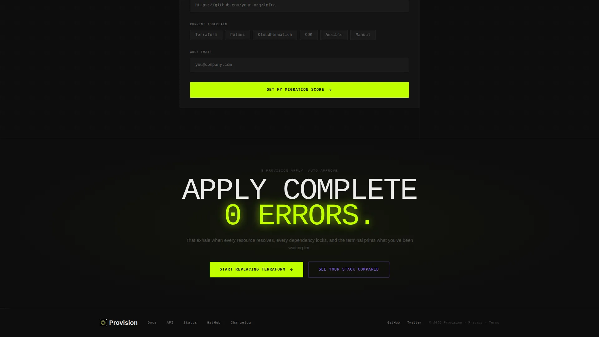
- A floating bottom bar with a primary call to action and a secondary path that opens a single-field comparison form
Feature list
This template ships with purpose-built sections and interaction patterns designed to move technical visitors toward conversion without friction.
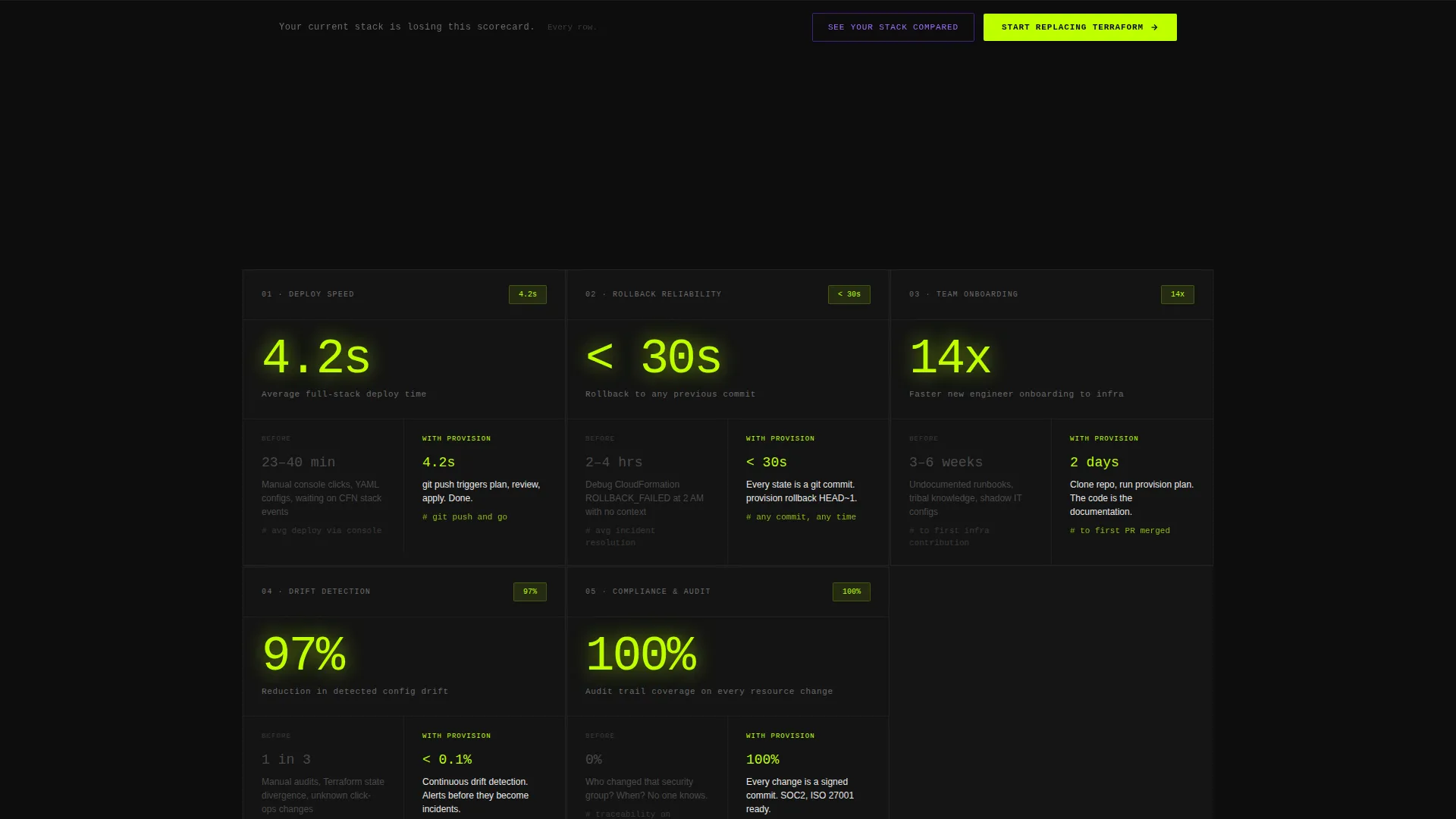
Stats-First Card Grid Layout
Each card in the modular grid opens with a single oversized metric. Context follows the number, not the other way around. This keeps technical visitors engaged and communicates value in the first two seconds of each card.
Versus Comparison Framework
Every card is structured as a side-by-side frame. The left column shows the old way, with friction stats in muted gray. The right column shows the platform way, with velocity stats in electric lime. The visitor watches their current workflow lose, row by row.
Product Screenshot Header
The header places a pixel-perfect platform screenshot at the center. It shows a diff view with 14 resources added, 2 modified, and 0 destroyed, using green and violet syntax highlighting. No hero paragraph competes with it.
Floating Primary Call to Action Bar
A sticky bottom bar appears after the visitor passes the third card. It pins the primary call to action in view without interrupting the scroll. The bar appears only once the page has already earned the visitor's attention.
Secondary Comparison Form Path
A secondary call to action opens a lightweight form. Visitors paste a repository URL or select their current toolchain from a chip selector, enter a work email, and receive a personalized migration complexity score. The form asks for commitment only after delivering a clear value signal.
Dark-Mode Visual Identity System
The Acid Digital color system uses terminal black, electric lime, synthetic violet, and phosphor white throughout the layout. Lime dominates calls to action and stat callouts. Violet marks interactive hover states and comparison highlights. The palette is built to make data points pop against the dark background.
Page sections overview
| Section | Purpose |
|---|---|
| Screenshot Header | Anchors the page with a live diff view and three stat pills |
| Stat Pills Row | Delivers hard metrics before the visitor decides to scroll |
| Versus Card Grid | Contrasts old workflows with platform velocity, card by card |
| Deploy Speed Card | Highlights time-to-deploy improvement with an opening metric |
| Rollback Reliability Card | Shows rollback success rates versus manual stack debugging |
| Onboarding Time Card | Compares team ramp time with and without the platform |
| Drift Detection Card | Quantifies configuration drift reduction across environments |
| Audit Compliance Card | Frames reviewable, version-controlled history as a compliance asset |
| Floating call to action Bar | Pins the primary action after the third card appears |
| Comparison Form | Captures lead intent with a repo URL or toolchain chip selector |
Design & branding system
The visual identity is built around the Acid Digital color system. It channels Startup Velocity through a dark-mode palette that feels like a live terminal at midnight with neon linting highlights.
- Terminal black (#0D0D0D) as the dominant background, electric lime (#BFFF00) for calls to action and stat callouts, synthetic violet (#7B2FFF) for hover states and comparison highlights, and phosphor white (#EAEAEA) for body text
- A dark editor aesthetic that makes every number and data point stand out without visual noise
- Lime-dominant calls to action and violet interactive states create a clear visual hierarchy that guides attention through each card
Mobile & speed optimization
The modular card grid layout is built to adapt across screen sizes without losing the versus comparison structure that drives the page's core argument.
- Each card in the grid stacks cleanly on smaller screens, keeping the left-column and right-column comparison readable at any viewport width
- The floating bottom bar is designed to remain visible and tappable on mobile without covering critical content
- The single-field comparison form keeps input to a minimum, reducing friction for visitors on touch devices
How this template helps you convert
Provision is built around a single conversion insight: show the cost of staying before asking for a change. Every layout decision reinforces this logic.
- The stat pills in the header land three hard data points before the visitor reads a single sentence, establishing credibility without a hero paragraph.
- The versus card grid builds a cumulative scorecard across five categories, so by the time the floating call to action bar appears, the visitor has already seen their current workflow lose on every metric.
- The secondary comparison form lowers the commitment barrier by offering a personalized migration complexity score in exchange for a work email and a toolchain selection.
Other information about this template
Provision is categorized under Technology, within the Cloud and DevOps subcategory, and targets the infrastructure as code niche specifically. It is designed for platform teams that want a landing page as fast and deliberate as the deploys they are selling.
- The template style is Card Grid (Modular), making it easy to reorder, add, or remove comparison cards as the platform's positioning evolves
- The header concept is a Product Screenshot, a design choice that builds immediate credibility with technical visitors who recognize a real diff view on sight
- The creative direction is Stats-First Impact, meaning every card leads with a number rather than a feature name or a marketing claim
- The landing page direction is Comparison/Versus, which is proven to convert technical audiences by making the cost of inaction concrete and visible
- The Startup Velocity theme and Acid Digital color system are consistent design choices that signal speed, precision, and technical confidence throughout the page


Theme
Startup Velocity
Creative direction
Stats-First Impact
Color system
Acid Digital
Style
Card Grid (Modular)
Direction
Comparison/Versus
Page Sections
Stats-first Modular Card Grid
Versus Comparison Framework
Product Screenshot Header
Floating Primary Call to Action Bar
Single-field Comparison Form
Acid Digital Visual Identity
Related questions
Who is this landing page template designed for?
Can I customize the comparison cards for my platform's specific use cases?
What does the secondary call to action form collect?
Does this template include the floating bottom bar by default?
Is this template suitable for a technical audience that distrusts typical marketing pages?


