White-Label Meal Planning App Landing Page Template
Provision is a bento grid landing page template built for white-label recipe and meal planning platforms. It features an interactive cost-and-time calculator, animated capability cards, a sticky "Build versus. Buy" comparison bar, and a two-step lead capture form. The result is a focused, high-momentum page that turns skeptical buyers into booked demos fast.
by Rocket studio
Quick summary
Provision is a single-page landing page template designed for white-label recipe and meal planning app businesses. It opens with a live calculator, unfolds into an animated bento grid of feature cards, and closes with a detailed comparison table. Every section is built to answer a real objection before the visitor thinks to ask it.
Who this template is for
This template speaks directly to people selling a technical product to busy, skeptical buyers. If your pitch needs to prove ROI before a prospect will book a demo, this layout does that work for you.
- Startup founders building a white-label recipe or meal planning app who need to attract early B2B customers
- Product managers at grocery apps or wellness platforms looking to replace a competitor feature quickly
- White-label software-as-a-service sellers who need a polished, conversion-focused landing page ready to deploy
What problem this template solves
Selling a technical platform to business buyers is hard when your landing page looks like every other software pitch. Prospects need proof, not promises. They want to see numbers, comparisons, and real capability before they fill in a form.
- Most software landing pages bury the value proposition in dense paragraphs that busy product managers skip entirely
- B2B buyers comparing build versus buy need a structured, visual argument, not a generic hero section and a features list
- Without a live interactive element, first-time visitors leave before they understand what the platform actually saves them
What you get with this template
You get a complete, structured landing page layout packed with interactive components and a clear conversion path. Every section is intentionally sequenced to build confidence and reduce friction before the call to action.
- An interactive calculator header, animated bento grid capability cards, a sticky comparison bar, and a two-step lead capture form
- A full visual identity system using deep graphite, holographic lilac, electric seafoam, chalk white, and signal pink
- A logical section flow that answers objections in order, from cost proof to brand fit to data reliability
Feature list
This template is built around specific interactive and structural components drawn directly from the brief. Each feature serves a distinct conversion purpose.
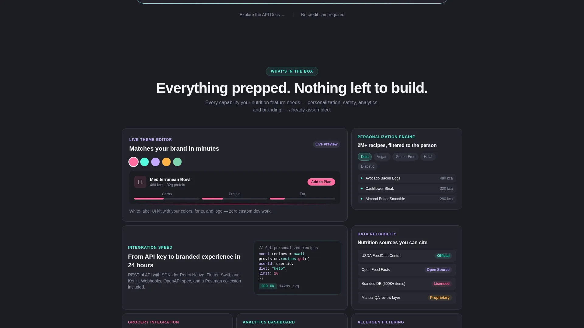
Interactive Cost and Time Calculator
The header leads with a three-question estimator using pill-shaped selectors. Visitors choose their user scale, existing recipe database status, and target launch window. Two columns animate in real time, stacking in-house build costs against the flat monthly platform figure. Numbers move like a stock ticker, and iridescent gradients pulse brighter as the savings gap widens.
Bento Grid Capability Cards
After the calculator, the page opens into a grid of feature cards covering the recipe personalization engine, allergen filtering, grocery list generation, branded user interface kit, and analytics dashboard. Cards flip, expand, or slide to reveal content. They stagger on scroll, and iridescent borders shift as the visitor moves down the page.
Sticky Build versus. Buy Bar
A persistent bottom bar labeled "Build versus. Buy" follows the visitor through the full page. It anchors to a detailed feature-by-feature comparison table covering time to market, ongoing maintenance cost, personalization depth, compliance updates, and scalability. This keeps the core buying argument visible at every scroll position.
Live Theme Editor Preview
One bento card directly addresses the brand-fit objection by opening a live theme editor preview. This lets prospects see how the platform adapts to their own visual identity without leaving the page.
Nutrition Source Transparency Card
A dedicated card surfaces data credibility by showing the nutrition source stack, including a database transparency section with recognizable data source logos. This answers the data reliability objection in a single, scannable moment.
Two-Step Lead Capture Form
The primary call to action triggers a two-step form. Step one collects company name and app URL, with a toggle for businesses not yet launched. Step two presents a desired features checklist and a preferred demo date selector. A secondary text link for technical buyers points toward API documentation.
Page sections overview
| Section | Purpose |
|---|---|
| Calculator Header | Prove ROI instantly with live build-versus-buy cost math |
| Bento Capability Grid | Showcase platform features through animated, interactive cards |
| Brand Fit Card | Address visual identity concerns with a live theme preview |
| Data Transparency Card | Build trust by surfacing nutrition data source information |
| Comparison Table | Detail feature parity across build-in-house and buy options |
| Sticky Comparison Bar | Keep the build-versus-buy argument visible throughout the scroll |
| Primary call to action Block | Drive demo bookings via the two-step lead capture form |
| API Docs Link | Offer a low-friction entry path for technical evaluators |
Design & branding system
The visual identity follows a Directory and Discovery theme layered over an AI Iridescent color system. The overall effect is technological and alive without ever tipping into garish territory.
- Deep graphite (#1B1D23) sets the primary background; chalk white (#F4F4F6) handles body text; warm signal pink (#FF6B9D) marks every call to action and comparison highlight
- Holographic lilac (#C4A8FF) and electric seafoam (#56FCE2) appear as gradient accents that shimmer along card edges and activate on hover states
- Iridescent borders and micro-interactions reward scrolling, with gradients pulsing brighter as the savings gap in the calculator grows
Mobile & speed optimization
The bento grid layout is structured to reflow naturally across screen sizes. Card-based layouts translate well to narrower viewports without losing the visual hierarchy that drives conversion.
- Pill-shaped calculator selectors and staggered card animations are designed to remain usable on touch screens
- The sticky "Build versus. Buy" bar and floating call-to-action button maintain their positions on mobile scroll, keeping the primary action reachable at any point
How this template helps you convert
Every section of this template is sequenced to reduce a specific objection before moving the visitor forward. The result is a page that earns trust gradually and then asks for commitment at the right moment.
- The calculator opens by making the financial case personal. Visitors build their own proof in the first ten seconds, which means they arrive at the features section already convinced of the cost argument.
- The bento grid and comparison table then handle every remaining doubt, from brand fit to data quality to technical depth, before the call to action asks for a demo booking.
Other information about this template
This template is built for the white-label recipe and meal planning app niche within the broader consumer app and platform category. It sits at the intersection of Technology and a high-intent B2B buying journey.
- The template style is Bento Grid, the creative direction is Launch Energy, and the header concept is Calculator and Estimator
- The landing page direction is Comparison and Versus, and the visual theme is Directory and Discovery with an AI Iridescent color system
- A secondary conversion path, labeled "Explore the API Docs," is included as a chalk white text link to serve technical buyers who need documentation before a sales conversation
- The two-step form includes a toggle for companies that have not yet launched an app, making the template suitable for pre-launch as well as live platforms


Theme
Directory & Discovery
Creative direction
Launch Energy
Color system
AI Iridescent
Style
Bento Grid
Direction
Comparison/Versus
Page Sections
Live Cost and Time Calculator
Animated Bento Grid Cards
Sticky Build Versus. Buy Bar
Live Theme Editor Preview
Nutrition Source Transparency Card
Two-step Lead Capture Form
Related questions
Who is this landing page template designed for?
What interactive elements does the template include?
Can the template support two different types of buyers?
How does the comparison table work?
Is this template suitable for a business that has not launched yet?


