AI for Higher Education Education Website Template
Provost is a card-grid landing page template built for higher education AI analytics dashboards. It guides university leadership from raw institutional data to clear, actionable intelligence. The page flows from problem to solution to proof, using a dark Carbon Fiber visual system, animated data cards, and two conversion paths designed to capture decision-ready and research-stage visitors alike.
by Rocket studio
Quick summary
Provost is a single-page, card-grid landing page template designed for higher education AI analytics products. It targets provosts, enrollment vice presidents, and institutional research directors. The layout moves visitors through a deliberate arc: anxiety-inducing pain points, AI-powered solutions, and hard institutional proof. Every section is built to earn trust and drive demo requests.
Who this template is for
This template speaks directly to the people responsible for institutional outcomes. It is built for teams who need to show leadership-level stakeholders what the product does before a single sales call happens.
- Provosts and academic affairs leaders tracking four-year completion rates and graduation velocity
- Enrollment vice presidents monitoring demographic shifts in incoming cohorts
- Institutional research directors who build board-level reports under tight, recurring deadlines
What problem this template solves
Higher education analytics products are hard to sell with generic SaaS landing pages. The buyers are skeptical, data-literate, and short on time. A page that does not immediately signal domain expertise loses them before the second scroll.
- Decision-makers cannot connect a generic dashboard screenshot to their specific retention or enrollment problems
- At-risk student identification often happens too late, and the page needs to surface that urgency immediately
- Institutional research teams spend excessive hours producing reports that are outdated on delivery, and the template must make that pain visible
What you get with this template
You get a fully structured, modular card-grid landing page ready to represent a higher education AI analytics dashboard. The layout is organized into three distinct card rows that escalate from pain to solution to proof.
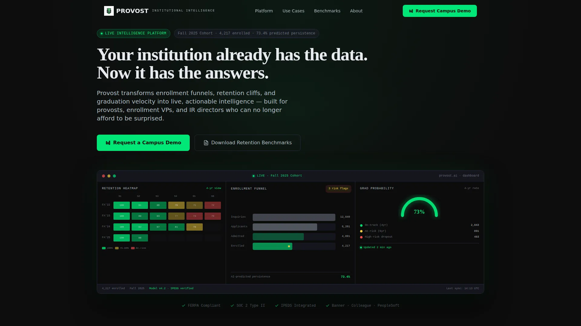
- A full-viewport dashboard preview header with specific, plausible cohort metrics and a self-typing headline
- Three card rows covering pain points, product features, and institutional case studies, each with hover animations and micro-interactions
- Two conversion paths: a primary demo request form with progressive disclosure fields and a secondary gated PDF download for earlier-stage visitors
Feature list
This section covers the core functional and design components included in the template.
Full-Viewport Dashboard Header
The header displays a live-feel screenshot of the analytics product across the full viewport. It shows a cohort retention heatmap, a predictive enrollment funnel with AI-flagged risk segments, and a graduation probability gauge. Specific numbers such as "Fall 2025 Cohort, 4,217 enrolled, 73.4% predicted persistence" are embedded to ground the product in real institutional scale.
Animated Problem-to-Solution Card Row
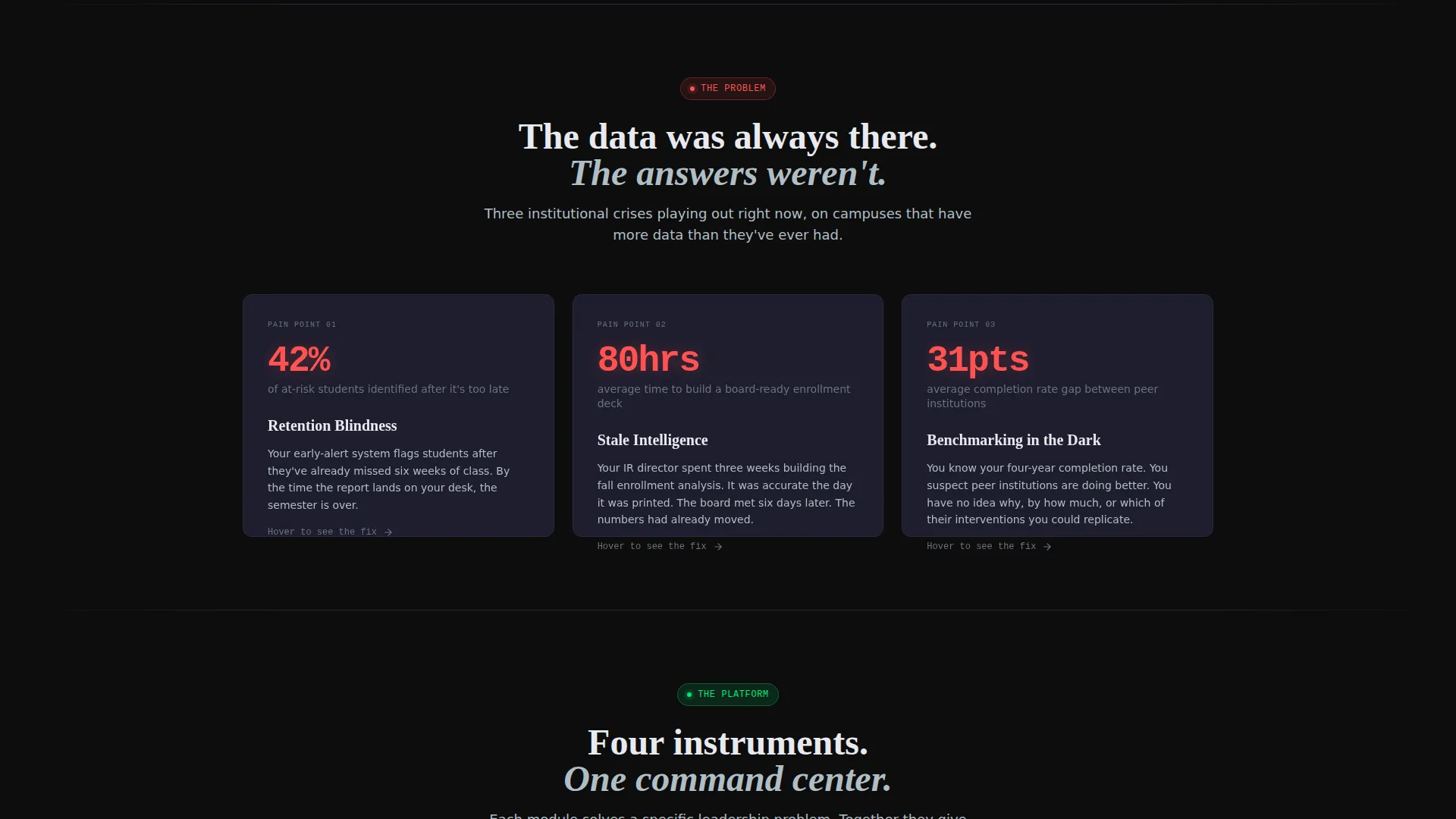
The first card row presents three pain-point modules using stark, credible statistics. Each dark card flips on hover to reveal the corresponding AI-driven solution. A micro-animation shows the relevant dashboard widget assembling itself, turning abstract claims into visible product behavior.
Feature Storytelling Card Row
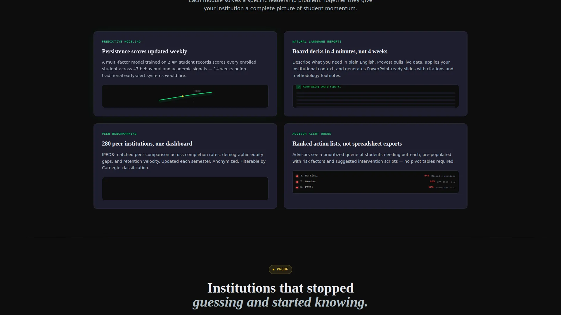
The second row goes deeper into product capabilities: predictive modeling, natural-language board report generation, and peer benchmarking. Each card functions as a self-contained story supported by a small animated chart, giving technically literate buyers something specific to evaluate.
Institutional Proof Card Row
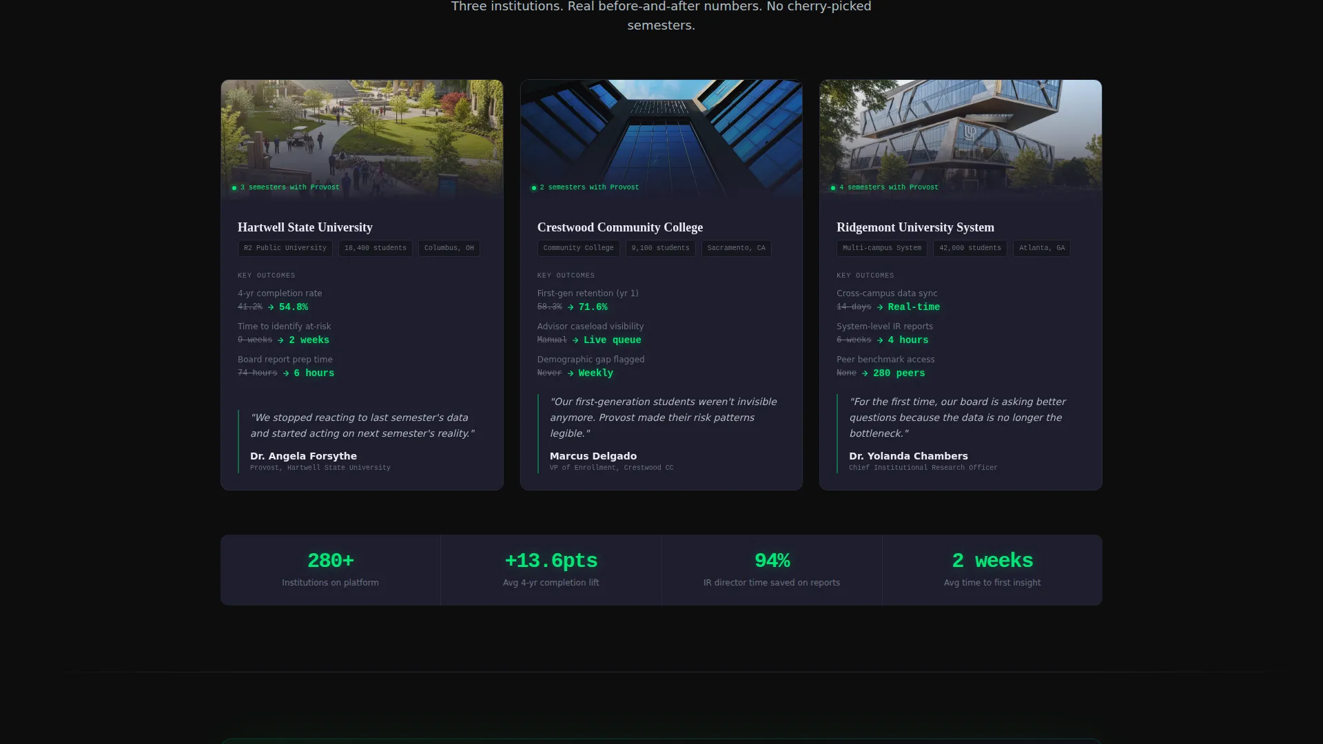
The third row presents before-and-after case study cards from representative institutions. These cards show metric shifts in a format that mirrors how provosts and research directors already think about performance data.
Progressive Disclosure Lead Form
The primary conversion module uses a four-field form sequence: institution name with autocomplete from the Integrated Postsecondary Education Data System (IPEDS) database, role title, enrollment size range, and email address. This order signals product familiarity with higher education and reduces friction for qualified buyers.
Gated Secondary Conversion Path
A secondary call-to-action offers a downloadable Retention Benchmarks Report. It captures email and institution in two fields only, giving research-stage visitors a lower-commitment entry point while still delivering qualified leads.
Page sections overview
| Section | Purpose |
|---|---|
| Full-Viewport Header | Anchors product credibility with a live dashboard preview and self-typing headline |
| Pain Point Cards | Surfaces three urgent institutional problems with blunt statistics |
| Solution Reveal Cards | Flips each pain card to show the AI-powered answer with animated widget assembly |
| Feature Detail Cards | Explains predictive modeling, report generation, and peer benchmarking in depth |
| Case Study Cards | Delivers before-and-after institutional proof to validate product outcomes |
| Primary Demo call to action | Full-width conversion module with a four-field progressive disclosure form |
| Secondary PDF call to action | Two-field gated download capturing email and institution for earlier-stage leads |
| Persistent Top-Right Button | Fixed "Request a Campus Demo" button visible throughout the entire scroll |
Design & branding system
The visual identity is built on a Carbon Fiber color system that evokes a spacecraft instrument panel or a high-stakes situation room. Every element is purposeful and restrained.
- Core palette: cockpit black (#0D0D0D) for backgrounds, woven graphite (#1E2E1E is written in brief as #1E1E2E) for card surfaces, telemetry green (#00E676) for active data signals and AI-flagged elements, and brushed aluminum (#B0BEC5) for secondary text and divider lines
- Each card reads as a self-contained glowing readout against absolute darkness, keeping information hierarchy tight and scannable
- Typography and layout follow a Directory and Discovery theme where data surfaces only when contextually relevant, reinforcing the command-center aesthetic
Mobile & speed optimization
The card-grid layout is built with responsiveness in mind, ensuring the modular structure adapts naturally across screen sizes without losing hierarchy.
- Card rows reflow into single-column stacks on smaller screens, preserving the problem-to-solution narrative sequence
- Hover interactions and micro-animations are scoped to the card level so they do not interfere with the overall scroll performance on mobile devices
How this template helps you convert
The entire page is engineered around a single conversion goal: getting qualified higher education decision-makers to request a campus demo or share their contact information.
- The full-viewport dashboard header creates immediate product recognition, letting visitors mentally place themselves inside the tool before reading a single feature claim
- The escalating three-row card structure lowers visitor anxiety row by row, moving from acknowledged pain to visible solution to institutional proof, so the demo request feels like a logical next step rather than a cold ask
- Two conversion paths serve two distinct buyer readiness levels, capturing both decision-ready leaders and research-stage institutional analysts in the same page flow
Other information about this template
This template is designed specifically for the higher education technology market and is a strong fit for teams marketing AI-powered institutional analytics platforms.
- The template style is Card Grid (Modular), which suits products with multiple distinct capabilities that benefit from side-by-side visual comparison
- The creative direction follows a Problem to Solution Arc, a proven structure for complex B2B software products where buyers need to feel understood before they consider a demo
- The header concept is a Dashboard Preview, which is particularly effective for analytics products where showing the actual interface is more persuasive than describing it
- The landing page direction is Lead Generation, with all design and copy decisions subordinated to capturing qualified institutional contacts
- The Directory and Discovery theme makes this template adaptable for other data-heavy technology products beyond higher education analytics
Theme
Directory & Discovery
Creative direction
Problem→Solution Arc
Color system
Carbon Fiber
Style
Card Grid (Modular)
Direction
Lead Generation
Page Sections
Full-viewport Dashboard Preview Header
Animated Pain-point Flip Cards
Feature Storytelling Cards with Animated Charts
Institutional Case Study Proof Cards
Progressive Disclosure Lead Capture Form
Dual Conversion Path Architecture
Related questions
Can I replace the dashboard screenshot in the header with my own product interface?
How does the hover-flip animation work on the pain point cards?
Is the IPEDS autocomplete field in the lead form functional out of the box?
Can I use only one of the two conversion paths?
Does the template work for analytics products outside of higher education?



