Higher Ed Tech Integration Landing Page Template
Provost is a higher education technology landing page template built for platforms that unify siloed university software. It features a bold centered headline, a three-column comparison table, a five-question integration diagnostic quiz, and a Team and People section. The design uses a Corporate Precision aesthetic with a calm Soft Mist color palette.
by Rocket studio
Quick summary
Provost is a single-page landing page template designed for higher education technology platforms. It unifies the pitch for tools that connect Student Information Systems, Learning Management Systems, Customer Relationship Management platforms, and financial aid into one interface. The layout leads with a commanding headline, builds trust through a comparison table, and converts through a personalized diagnostic quiz.
Who this template is for
This template speaks directly to the people who live inside university software chaos every day. It is built for teams selling technology to higher education institutions that struggle with disconnected systems.
- Chief Information Officers at mid-size universities managing too many vendor integrations
- Registrar office directors and provost teams who need accurate enrollment yield data fast
- University IT teams running shadow databases because core systems do not communicate
What problem this template solves
University technology stacks are notoriously fragmented. Registrars export spreadsheets manually, IT teams maintain duplicate data sources, and leadership cannot get a clean enrollment picture without waiting days. A generic software landing page does not speak to those realities. This template does.
- Visitors cannot quickly see how a platform compares to their current manual workflow or existing middleware
- Prospective buyers need a way to self-qualify their integration complexity before booking a demo
- The page must build credibility with skeptical, data-literate higher education buyers fast
What you get with this template
You get a complete, structured landing page built specifically for the higher education technology market. Every section is purposeful and ordered to move a cautious institutional buyer from curiosity to action.
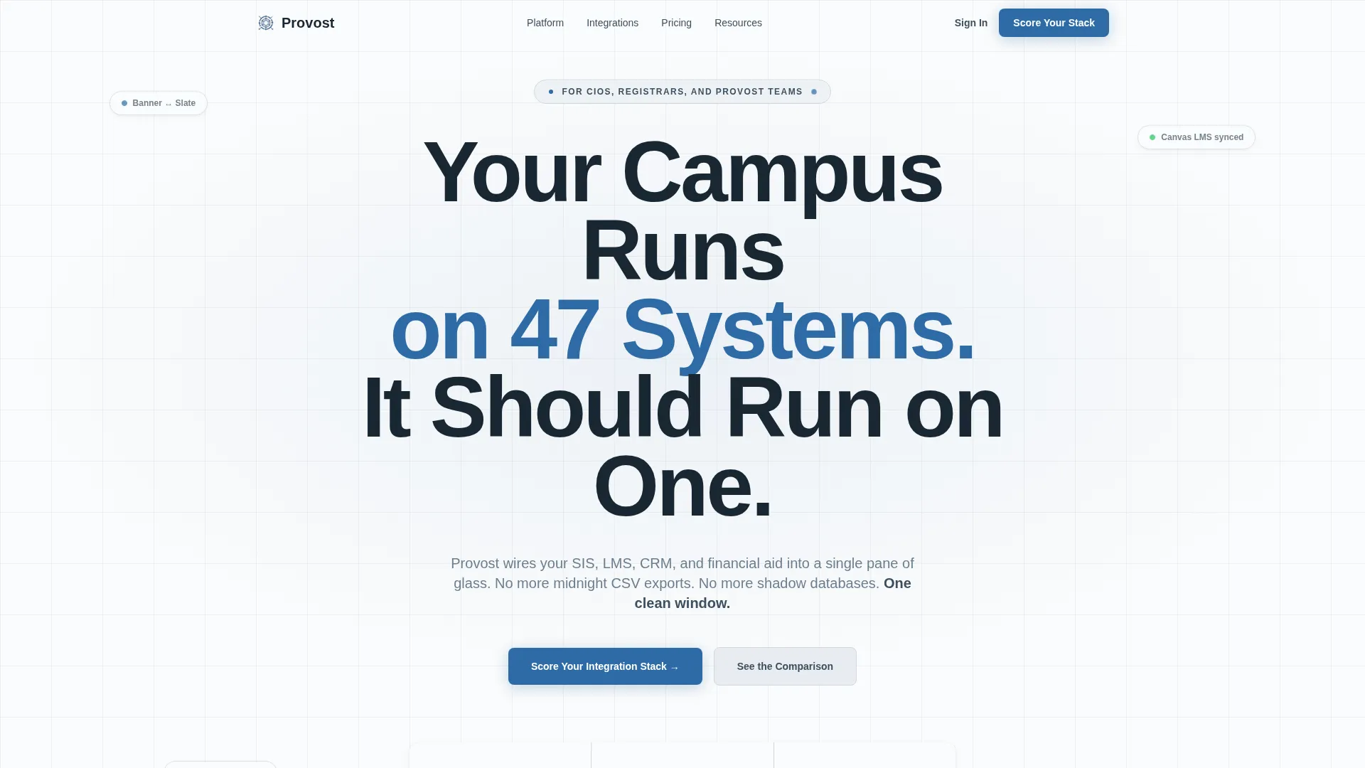
- A giant centered headline section with an animated counter cycling through real integration proof points
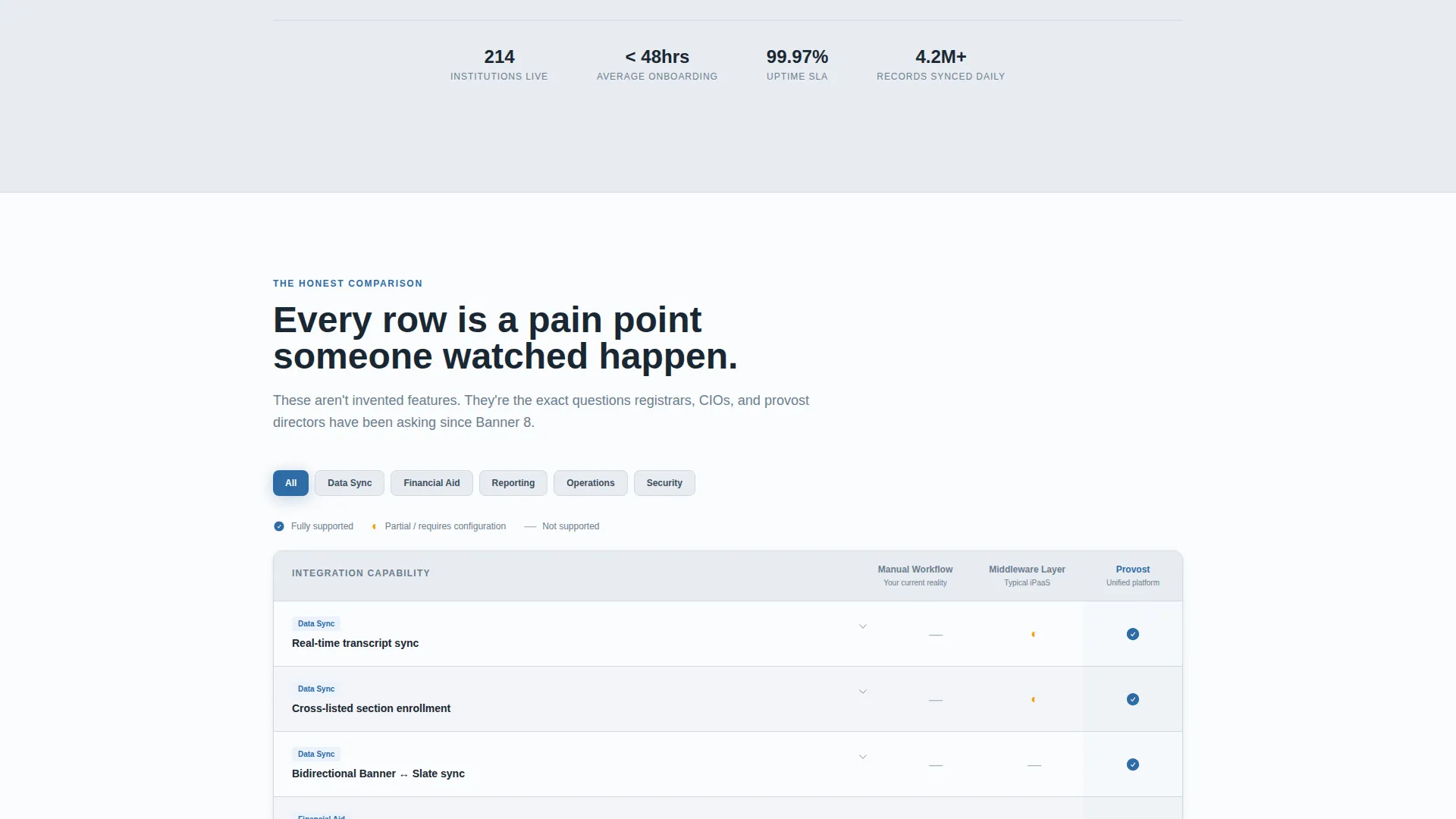
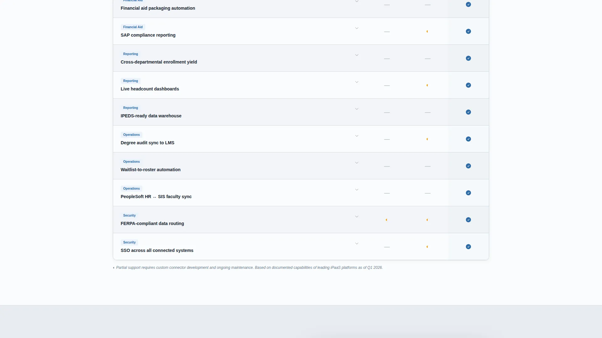
- A three-column comparison table covering legacy workflows, competitor middleware, and the platform
- A five-question quiz flow that scores integration complexity and delivers a personalized tier result
Feature list
This template includes purposefully designed components drawn directly from the needs of higher education technology buyers and the sales teams serving them.
Giant Centered Headline Block
The header displays an oversized geometric sans-serif headline set at roughly 8 viewport width units on a chalk white background. A subline names the three core personas. An animated counter cycles through live integration statistics to add proof without clutter.
Three-Column Comparison Table
The comparison table is the structural spine of the page. Rows cover specific integration pain points such as real-time transcript sync, financial aid packaging, and cross-departmental reporting. Columns compare legacy manual workflow, competitor middleware, and the platform. Checkmarks appear in provost blue and placeholder markers appear in mist gray.
Five-Question Integration Diagnostic Quiz
The primary call-to-action launches a short diagnostic. Visitors answer five questions covering active system count, current Student Information System vendor, biggest data bottleneck, team size, and integration budget range. Results deliver a complexity score with a tier label and a recommended next step.
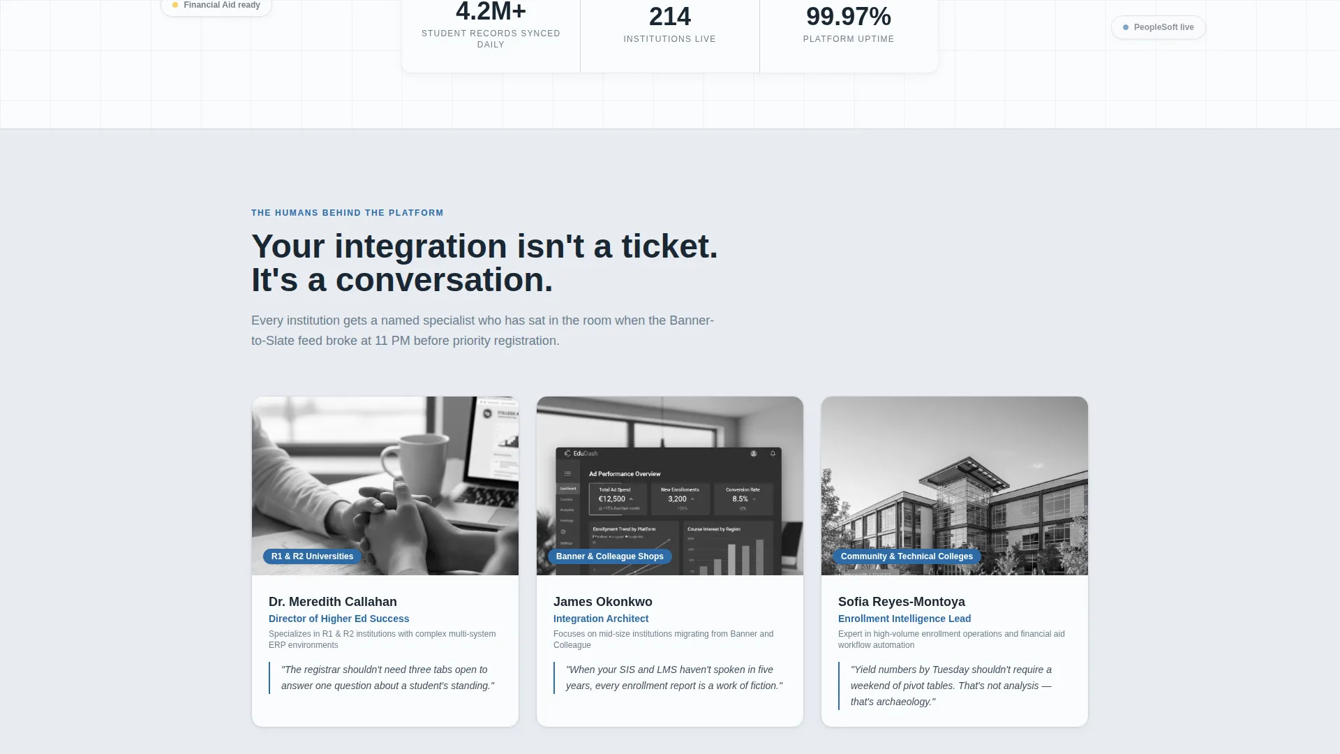
Customer Success Team Section
Three named customer success leads are presented with portrait photography and paired with the institution type each person specializes in. This section adds human credibility and grounds the platform in real higher education contexts.
Persona-Specific Subline and Proof Counter
Below the main headline, a single subline addresses Chief Information Officers, Registrars, and Provost Teams by name. The animated counter injects live-feeling metrics into the negative space of the hero, reinforcing platform scale without a separate proof section.
Secondary Conversion Path
A static footer link reads "Request Architecture Review" for visitors who already understand their needs and want to skip the quiz. This secondary path captures high-intent buyers who prefer direct contact over self-assessment.
Page sections overview
| Section | Purpose |
|---|---|
| Hero Headline Block | Establish the core value proposition with oversized type and animated proof counters |
| Persona Subline | Address CIOs, Registrars, and Provost Teams directly beneath the headline |
| Customer Success Team | Build human trust with named team members and institution specializations |
| Comparison Table | Show feature-level differences across legacy workflow, middleware, and platform |
| Quiz Diagnostic Flow | Score visitor integration complexity and deliver a personalized tier result |
| Quiz Results Display | Present complexity tier label and recommended next step after quiz completion |
| Footer Conversion Link | Offer a direct "Request Architecture Review" path for high-intent visitors |
Design & branding system
The visual identity follows a Corporate Precision theme. Every color and typographic choice is restrained and deliberate, designed to feel authoritative to institutional buyers without being cold or bureaucratic.
- Morning fog gray (#E8ECF1) for section backgrounds, slate pencil (#3D4F5F) for body text and table borders, and chalk white (#FAFBFC) for card surfaces and alternating table rows
- Provost blue (#2E6BA6) used exclusively for calls-to-action, active quiz toggle states, and comparison table checkmarks
- Clean geometric sans-serif typography at large display sizes in the header, with consistent sizing and spacing throughout
Mobile & speed optimization
The layout is built to remain readable and functional across screen sizes. Institutional buyers often review vendor pages on mobile during commutes or between meetings, so the template accounts for that context.
- The oversized headline scales proportionally using viewport-width units so it reads clearly on smaller screens without overflow
- The comparison table uses clear row-level formatting and alternating chalk white rows to stay scannable on narrow viewports
- The quiz flow is structured as a linear step-by-step sequence, which works naturally on touch screens without complex interactions
How this template helps you convert
Every section of this landing page is sequenced to move a skeptical higher education buyer forward. The page does not rely on a single call-to-action. It layers multiple trust signals before asking for anything.
- The comparison table gives buyers objective evidence before they reach any conversion element, reducing resistance and increasing confidence in the platform
- The quiz diagnostic converts passive readers into active participants by making self-qualification feel useful rather than salesy, and delivers a personalized result that creates a natural reason to follow up
Other information about this template
This template is part of the Education and Training category, specifically the EdTech and Learning Platform subcategory, with a niche focus on Higher Ed Technology. It is designed for single-page use as a focused landing page, not a multi-page site.
- The Intersection Match Score for this template is 13, reflecting strong alignment between the design direction, template style, conversion approach, and niche
- The template style is a Comparison Table layout, and the landing page direction is a Quiz and Assessment conversion flow
- The header concept is Giant Headline Centered, and the creative direction is Team and People, both of which are reflected in the built sections
- The color system is named Soft Mist and the theme is Corporate Precision, giving the page a calm, trustworthy feel suited to institutional purchasing decisions
Theme
Corporate Precision
Creative direction
Team & People
Color system
Soft Mist
Style
Comparison Table
Direction
Quiz/Assessment
Page Sections
Giant Centered Headline with Proof Counter
Three-column Comparison Table
Five-question Diagnostic Quiz
Customer Success Team Section
Persona-targeted Subline Block
Secondary Footer Conversion Link
Related questions
Who is this landing page template designed for?
What does the quiz section actually do?
Does the comparison table come pre-filled with content?
Can I use this template without a quiz tool already set up?
Is this template only for large university software vendors?



