Psychology Education Directory Website Template
Psyche is a card grid landing page template built for psychology video lesson libraries. It uses a botanical color palette, a persona-selector header, and a case study narrative layout to present clinician-led video content to HR directors, therapists-in-training, and organizational consultants. The design feels like a well-organized field notebook, precise, credible, and visually calm.
by Rocket studio
Quick summary
Psyche is a single-page template for psychology video lesson libraries. It leads with a persona selector, flows into a modular card grid organized by psychological domain, and earns both primary and secondary conversions before asking for anything. The botanical color system and editorial typography make the page feel authoritative without feeling clinical or cold.
Who this template is for
This template is built for educators and professionals who need to present structured, credible psychological content online. If you run a video-based training library and need a page that speaks directly to different professional roles, Psyche fits the brief precisely.
- HR directors building manager training curricula around behavioral frameworks
- Therapists-in-training and practitioners logging continuing education hours
- Organizational consultants who need a polished, credible resource to share with workshop participants
What problem this template solves
Most content library pages dump everything on the visitor at once. They show no awareness of who is reading, offer no narrative structure, and ask for an email before earning any trust. Psyche solves each of those problems in sequence.
- Visitors self-select a role upfront, so the most relevant content surfaces first
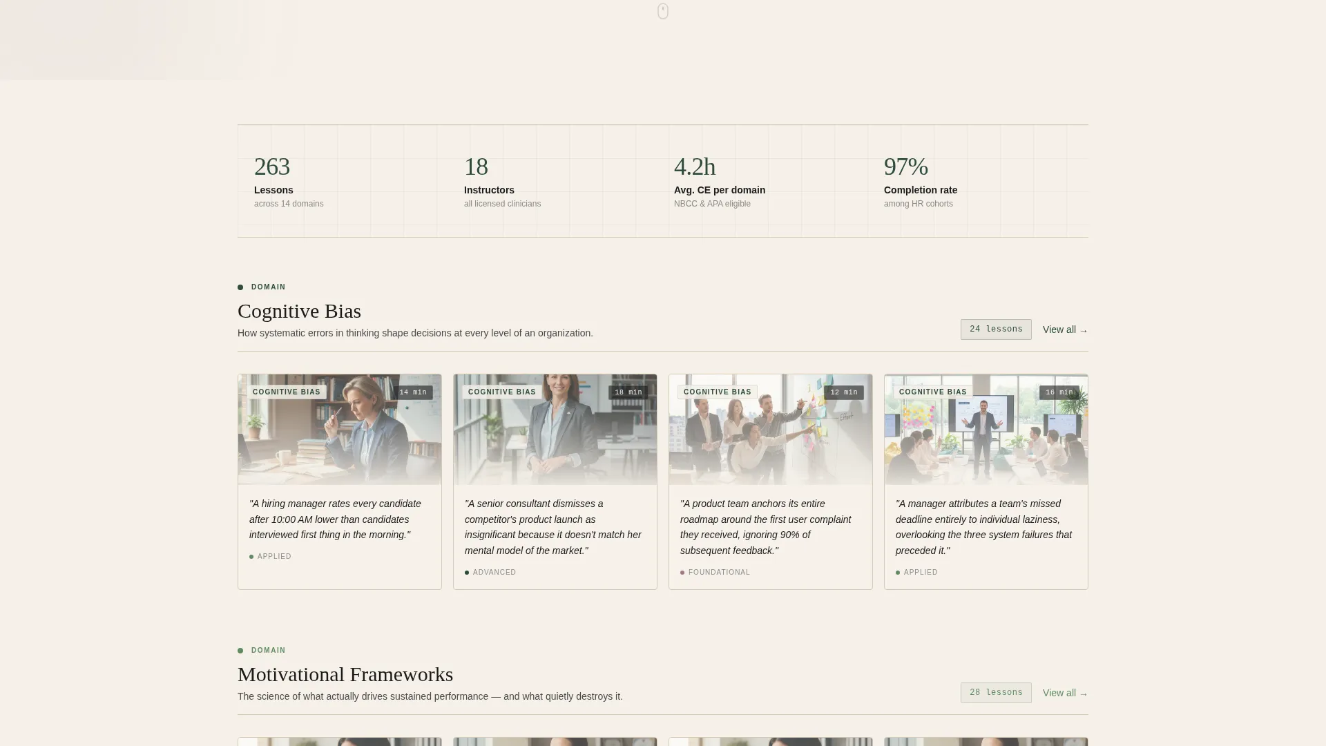
- Lesson cards open with a one-sentence clinical scenario, earning scroll before asking for a click
- Both conversion actions appear only after the visitor has passed through at least two domain rows
What you get with this template
You get a fully structured, single-page layout designed for psychology education content. Every section has a defined purpose, and the visual language stays consistent from top to bottom.
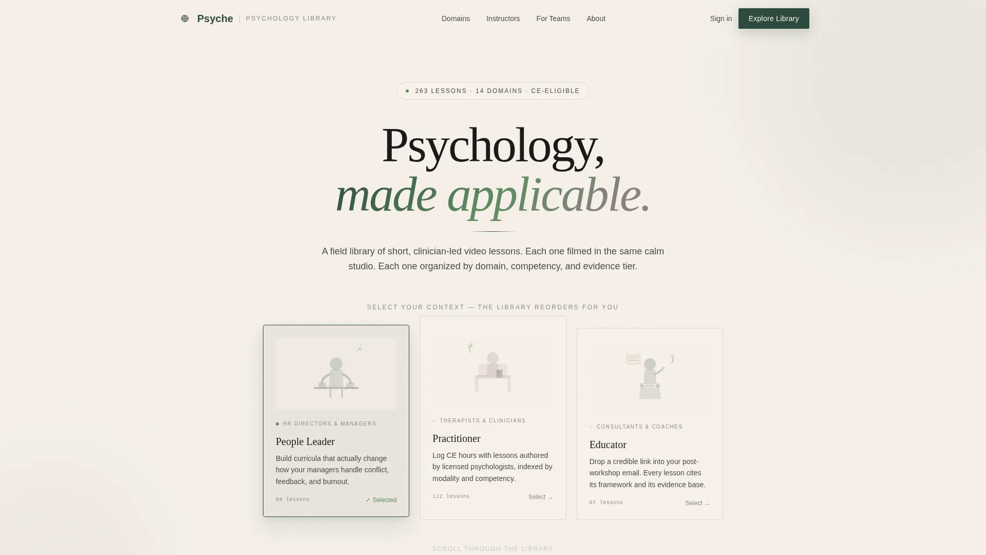
- A persona-selector header with three illustrated role cards that reorder page content on selection
- A modular card grid organized by psychological domain, with hover-reveal lesson details
- Two gated conversion paths and a persistent mobile call-to-action bar
Feature list
This template includes purpose-built components that support content credibility, role-specific navigation, and a measured approach to converting engaged visitors.
Persona Selector Header
Three illustrated cards sit centered on a parchment background. Each depicts a silhouetted figure in context: conference table, therapy chair, and lectern. Selecting a persona reorders the content below without navigating away from the page.
Case Study Narrative Card Grid
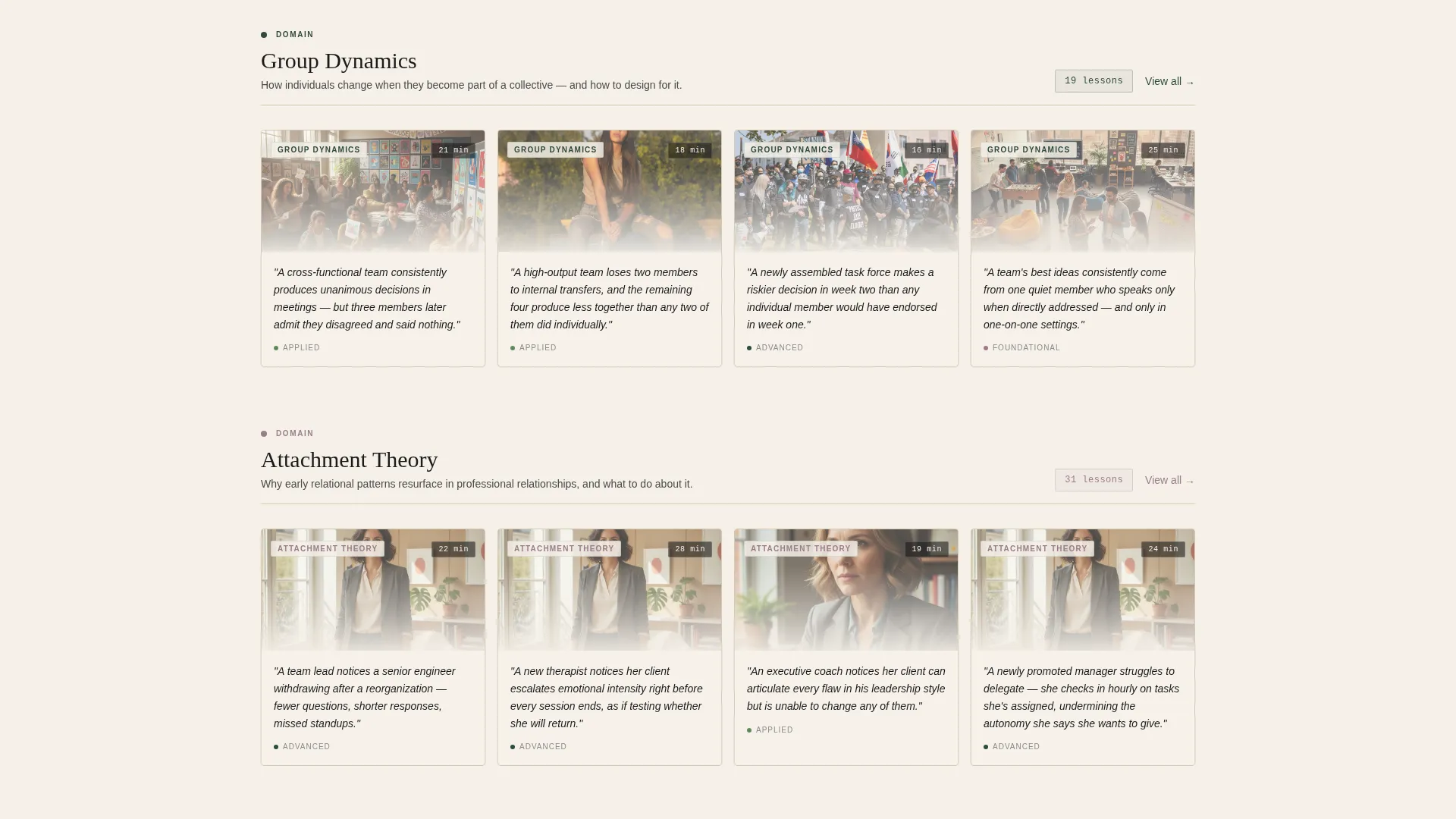
Each lesson card opens with a one-sentence clinical scenario before revealing the lesson title, duration, and instructor on hover or tap. Cards are organized by psychological domain, including cognitive bias, attachment theory, motivational frameworks, and group dynamics.
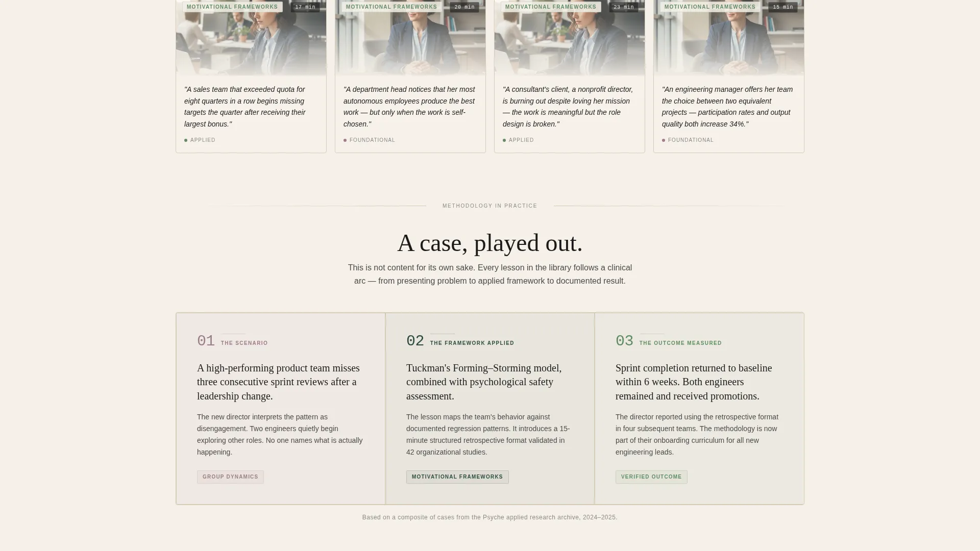
Three-Card Full-Width Case Study Break
Midway through the grid, a horizontal section spans the full page width across three connected cards. These cards present a single case study in sequence: the scenario, the framework applied, and the outcome measured.
Dual Conversion Path Design
The primary call-to-action gates full library access behind a professional email and role selector. A secondary path offers a free curriculum map PDF download requiring only an email. Both actions appear after meaningful content engagement.
Persistent Mobile Call-to-Action Bar
On mobile, a bottom bar carrying the primary call-to-action in living-stem green appears only after the first scroll interaction. It stays visible throughout the session without interrupting the reading flow.
Editorial Botanical Typography System
All type is set in ink-weight serif and editorial weights that feel like a well-produced reference book. Categories and tags use pressed-flower mauve. Navigation and section dividers use deep fern. The system creates visual hierarchy without decorative excess.
Page sections overview
| Section | Purpose |
|---|---|
| Persona Selector Header | Lets visitors self-identify by role and reorders content relevance |
| Domain Row One | Introduces the first psychological topic area via scenario-led cards |
| Domain Row Two | Continues lesson browsing across a second framework category |
| Full-Width Case Study | Demonstrates methodology across a three-card narrative sequence |
| Domain Rows Three and Four | Extends content depth and variety before the conversion moment |
| Primary Conversion Gate | Captures professional email and role for full library access |
| Curriculum Map Download | Offers a free PDF resource as a lower-commitment secondary path |
Design & branding system
The visual identity follows a Corporate Precision theme expressed through a botanical color palette. Every color has a defined role, and the palette stays consistent across all states and components.
- Deep fern (#2D4A3E) anchors navigation and section dividers; warm parchment (#F5F0E8) dominates backgrounds; pressed-flower mauve (#9C7C8B) marks categories and tags; annotation ink (#1B1B1B) handles all typography
- Living-stem green (#5E8C61) activates on hover states and progress indicators, adding a subtle sense of motion without breaking the calm visual register
- All illustrations are line-drawn with fern and mauve fills, evoking textbook plates from a boutique academic press rather than stock photography
Mobile & speed optimization
The layout is designed to translate cleanly to smaller screens without losing its editorial character. The modular card grid stacks naturally, and the persistent mobile bar keeps the primary action reachable at all times.
- Card grid columns collapse to a single-column scroll on mobile, keeping the case study narrative intact
- The persistent bottom call-to-action bar appears only after the first scroll, so it does not interrupt the initial page impression
How this template helps you convert
Conversion is earned through content exposure, not front-loaded pressure. The template sequences the visitor experience so that both actions feel like natural next steps.
- The persona selector creates immediate relevance, so visitors engage with content that matches their role rather than skimming a generic list of lessons.
- Clinical scenario cards build credibility row by row, and the full-width case study demonstrates that the library delivers methodology, not just content, before either conversion gate appears.
Other information about this template
Psyche sits at the intersection of psychology education, professional development, and content marketing. It is well-suited for teams building structured training resources that need to appeal to multiple professional audiences from a single page.
- The curriculum map download functions as a low-friction lead magnet, letting cautious visitors engage without committing to full library access
- The template style is a card grid (modular), making it straightforward to add or remove lesson cards as the library grows
- The three illustrated persona cards use no photography and no faces, which keeps the visual tone neutral and professional across diverse audiences
- The parchment-dominant palette and editorial typography system position the product closer to an academic reference tool than a consumer video platform
Theme
Corporate Precision
Creative direction
Case Study Narrative
Color system
Botanical
Style
Card Grid (Modular)
Direction
Content/Resource
Page Sections
Persona Selector Header
Case Study Narrative Card Grid
Three-card Full-width Case Study
Dual Conversion Path Design
Persistent Mobile Action Bar
Editorial Botanical Typography
Related questions
Can I customize the persona categories for a different professional audience?
What does the hover-reveal card behavior look like in practice?
How does the full-width case study section work?
Is the curriculum map download separate from the main library access gate?
Does this template use stock photography anywhere in the design?



