No-Code Enterprise Software Complete Professional Website Template
Publish is a no-code content management system landing page template built for marketers, founders, and creators who need to ship websites without writing a single line of code. It uses a modular card grid layout, a Feature Tab Switcher header, and a Dynamic Motion visual style to demonstrate the product clearly and drive app downloads with minimal friction.
by Rocket studio
Quick summary
Publish is a single-page no-code content management system landing page template. It combines a Feature Tab Switcher header, a modular card grid of animated feature cards, and a low-friction app download call to action. The Dynamic Motion theme and Slate & Sky color system give it a sharp, professional look suited to software and SaaS audiences.
Who this template is for
This template is built for people who ship websites and products without relying on a development team. It speaks directly to the people doing the work themselves.
- Startup founders who update their own landing pages outside business hours
- Marketing managers who need to swap campaign content between meetings
- Freelance designers handing clients a self-service content dashboard they can actually use
What problem this template solves
Most software landing pages either over-explain or under-demonstrate. Visitors leave before they understand the value. This template solves that by letting the product speak through motion and modular proof points instead of paragraphs of copy.
- Visitors rarely read long feature lists, so static text fails to build confidence
- Download pages with long forms create friction that kills conversions before they start
- Generic layouts make it hard to show that a no-code tool is genuinely fast and intuitive
What you get with this template
You get a fully structured, single-page landing page template ready to customize in a no-code environment. Every section is pre-built and purposefully sequenced to move visitors from curiosity to download.
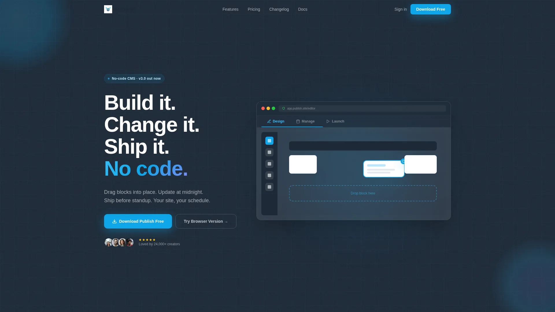
- A Feature Tab Switcher header with three labeled tabs and a browser-frame product mockup
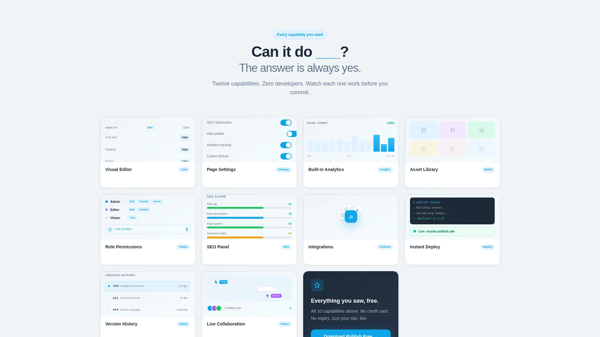
- A modular card grid section with six animated feature cards and hover interactions
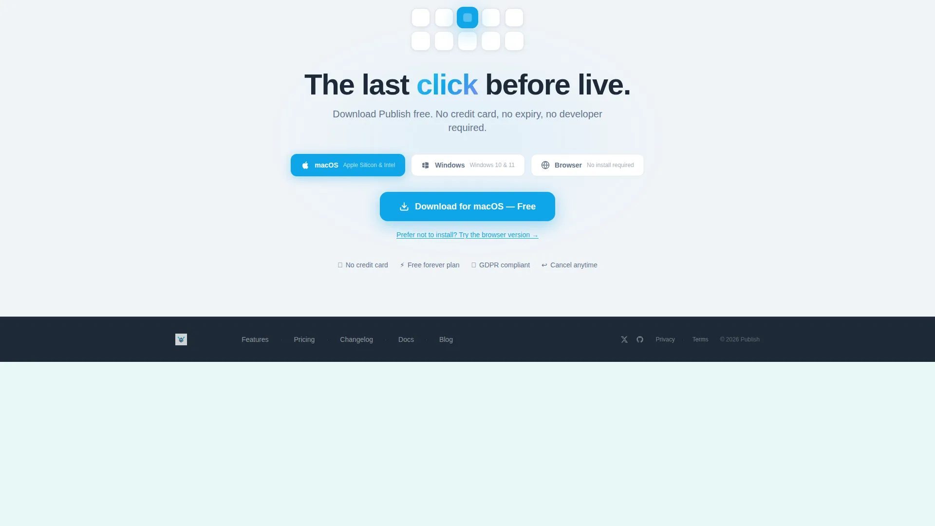
- A persistent floating download button and a full-width call-to-action banner with platform toggles
Feature list
This template includes a focused set of built-in components that reflect the Publish product experience from first scroll to final click.
Feature Tab Switcher Header
Three labeled tabs ("Design," "Manage," "Launch") sit above a browser-frame mockup. Each tab triggers a smooth crossfade to a different product screen. The active tab underline slides with spring-eased motion, and the headline stacks each phrase with a stagger delay so the words arrive like keystrokes.
Animated Feature Card Grid
Six modular cards represent individual product capabilities: visual editor, asset library, role permissions, SEO panel, analytics, and integrations. Each card contains a looping micro-animation showing the feature in action. Hovering a card lifts it with a soft shadow and reveals a one-sentence explanation.
Persistent Floating Download Button
A floating call-to-action button appears after the hero section and follows the visitor down the page. It reads "Download Publish Free" and requires no form fields. One click initiates the download, removing every barrier between interest and action.
Full-Width Download Banner
After the feature card grid, a full-width banner reinforces the primary call to action. It includes platform toggles for macOS, Windows, and browser use. A secondary option to "Try the Browser Version" gives hesitant visitors a zero-install path.
Dynamic Motion Theme
All interactive elements use purposeful motion. Card hover states lift with soft shadows, tab transitions use spring-eased crossfades, and micro-animations loop inside each feature card. The motion system makes the page feel like a live product demo rather than a static brochure.
Page sections overview
| Section | Purpose |
|---|---|
| Feature Tab Switcher | Introduces the product with three interactive tab views and a staggered headline |
| Animated Card Grid | Demonstrates six capabilities through looping micro-animations and hover states |
| Floating call to action Button | Keeps the download action visible as visitors scroll through features |
| Download call to action Banner | Closes the page with platform-specific toggles and a browser-version fallback |
Design & branding system
The Slate & Sky color system gives this template a clean, professional look that feels at home in the software and SaaS space. Every color choice has a clear role in the visual hierarchy.
- Deep graphite slate (#1E2A38) anchors the header and footer for weight and authority
- Open-sky blue (#38BDF8) marks every clickable element, and electric cyan (#0EA5E9) pulses on accent interactions
- Cloud white (#F0F4F8) fills card surfaces and negative space so the grid feels airy and easy to scan
Mobile & speed optimization
The card grid rearranges responsively so the layout works across screen sizes without breaking the visual rhythm. Visitors on any device get the same structured, scannable experience.
- The modular card grid reflows to a single column on smaller screens for comfortable reading
- The floating download button remains accessible at all viewport sizes
- Micro-animations are contained within individual card components so they do not disrupt the scroll experience
How this template helps you convert
The page is structured to reduce doubt and remove steps between a visitor's first impression and their decision to download. Every section earns the next click before asking for one.
- The Feature Tab Switcher immediately shows the product working in three distinct modes, so visitors understand the tool before they read a word of copy
- The animated card grid answers six common objections in sequence, each card replacing a paragraph of explanation with a moving demonstration
- The dual call-to-action path (install download plus browser version) means no visitor leaves because the commitment felt too large
Other information about this template
This template is part of a broader no-code content management system category, where speed of iteration matters as much as design quality. It is well suited to product launches, software marketing pages, and app download campaigns.
- The template style is Card Grid (Modular), which makes it straightforward to add, remove, or reorder feature cards without restructuring the page
- The Dynamic Motion theme is applied consistently across hover states, tab transitions, and looping card animations for a unified product feel
- The landing page direction is App Download, meaning every structural decision prioritizes getting a visitor to click the download button with as little resistance as possible
Theme
Dynamic Motion
Creative direction
Feature Matrix
Color system
Slate & Sky
Style
Card Grid (Modular)
Direction
App Download
Page Sections
Feature Tab Switcher Header
Animated Feature Card Grid
Persistent Floating Call to Action Button
Full-width Download Banner
Dynamic Motion Theme
Slate & Sky Color System
Related questions
Can I customize the feature cards without a developer?
Does the template support both download and browser-based conversion paths?
How does the Feature Tab Switcher work?
Is this template suited for a SaaS or software product launch?
What color palette does this template use?



