Dental Analytics Dashboard Landing Page Template
Pulp is a split-screen dental analytics landing page template built for practices that need to turn chair-side data into clear revenue decisions. It features a live ROI calculator, iridescent data visualizations, and a dark cockpit-style interface that puts every key metric in one focused view. The design is built to earn the click, not just impress.
by Rocket studio
Quick summary
Pulp is a single-page dental analytics landing page template that leads with a live ROI calculator and a dark, instrument-panel aesthetic. It is designed for dental software products that need to convert skeptical practitioners into signed-up users. Every section pairs a real practice problem on the left with a glowing dashboard solution on the right.
Who this template is for
This template is built for dental software teams, SaaS founders, and product marketers who sell analytics tools to dental practices. It speaks directly to the people who buy and use those tools every day.
- Multi-location dental service organization (DSO) operators who track provider efficiency across many chairs
- Solo practitioners who need to justify a large equipment purchase with clear revenue data
- Office managers overwhelmed by aging reports who want one screen that shows the full picture
What problem this template solves
Dental analytics tools are genuinely powerful, but they are hard to sell on a webpage. A wall of feature bullets does not convince a dentist to connect their practice management software. This template solves the trust gap by letting the product demonstrate value before asking for anything.
- Visitors arrive skeptical and leave before understanding the product's revenue impact
- Generic SaaS landing pages fail to speak the language of dental production metrics and procedure profitability
- Practitioners need a reason to click before they will enter any onboarding flow
What you get with this template
You get a fully structured, single-page landing page layout built around a calculator-first conversion flow. The template delivers both the visual framework and the section logic needed to take a cold dental professional from curious to converted.
- A split-screen (50/50) layout with a live ROI calculator panel and an animated revenue result panel
- A persistent floating call-to-action button with an iridescent border glow and a secondary video walkthrough path
- A scroll-driven narrative that pairs raw data problems with matching dashboard solution views
Feature list
This template includes carefully designed components grounded in a dental analytics use case. Each feature serves the conversion goal without adding clutter.
Live ROI Calculator Panel
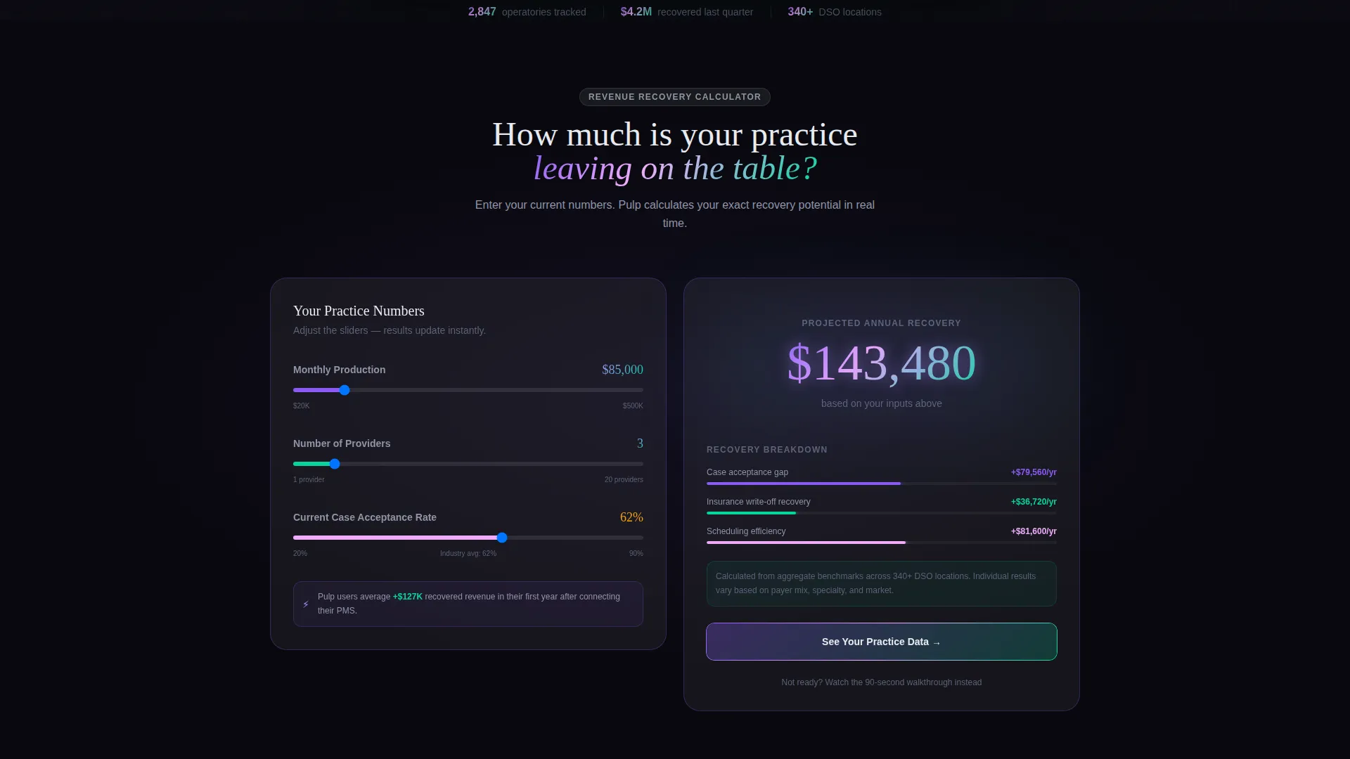
The left panel of the hero section presents an input form where visitors enter monthly production, number of providers, and average case acceptance rate. The right panel instantly renders a projected revenue recovery figure with an animated iridescent number climbing in real time. This interaction earns the primary click before any pitch copy appears.
Procedure Profitability Heatmap
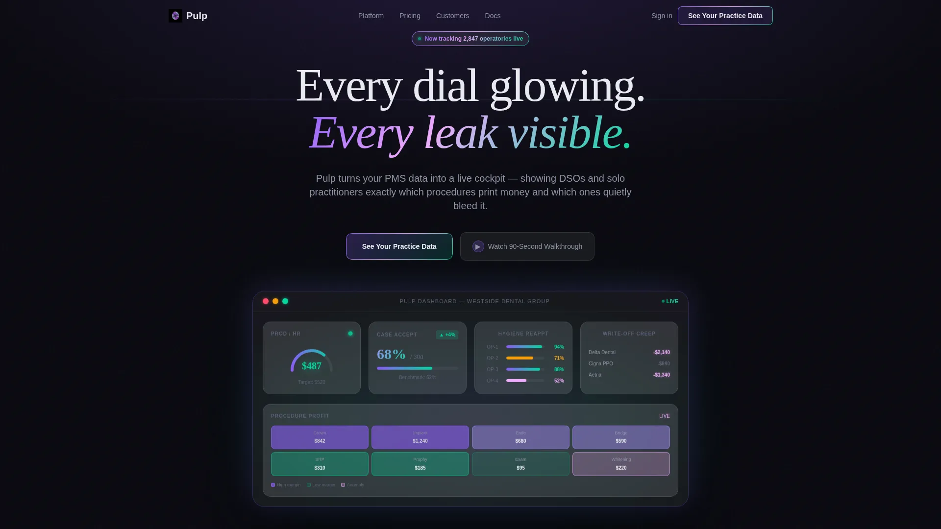
A visual heatmap inside the dashboard screenshot section shows which procedures generate the most revenue and which ones underperform. High-value procedures like crowns glow in iridescent violet. Lower-margin columns sit in cool teal. The contrast is immediate and readable at a glance.
Split-Screen Problem and Solution Scroll
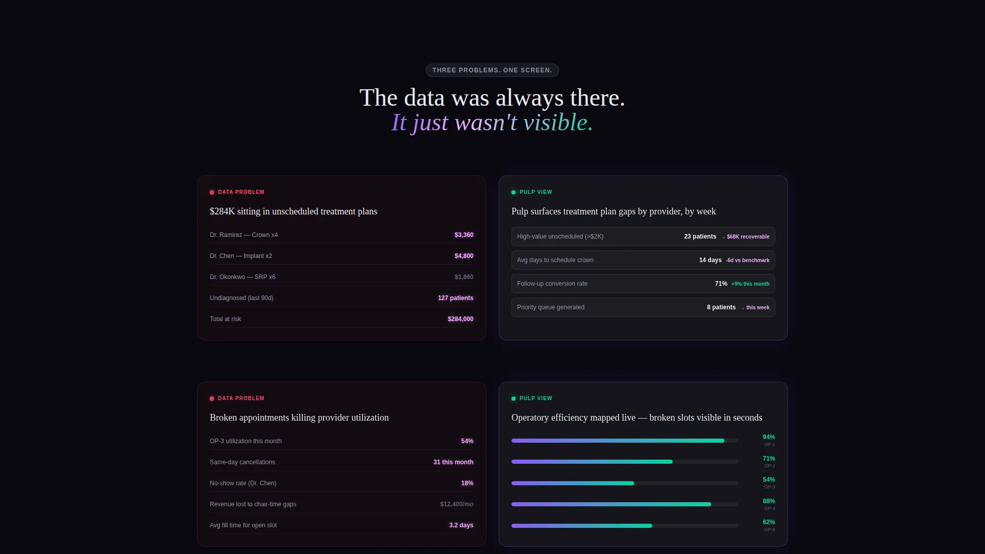
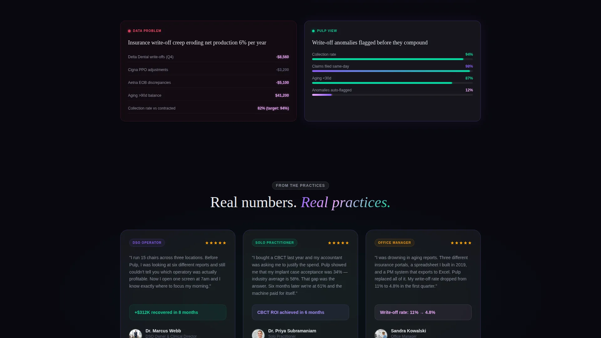
As the visitor scrolls past the calculator, each section divides into a left-side problem view and a right-side Pulp dashboard view. Raw issues like unscheduled treatment plans, broken appointments, and insurance write-off creep appear on the left. The corresponding dashboard panel appears on the right, showing exactly how the product addresses each one.
Dark Full-Bleed Hero Header
The header fills the entire viewport in near-black, then fades in a dental analytics dashboard from center-screen. The interface edges emit a soft iridescent halo, as if the data itself is producing the light. Visible metrics include a production-per-hour gauge, a case acceptance rate indicator, and a hygiene reappointment tracker.
Persistent Floating Call to Action
A floating button labeled "See Your Practice Data" stays visible as visitors scroll. It carries an iridescent border glow that matches the overall design system. A secondary option, "Watch a 90-Second Walkthrough," captures intent from visitors who are not yet ready to connect their practice management system.
Frosted Glass Card System
Dashboard screenshots and data panels use frosted glass card surfaces at 12% opacity over the void-black background. This gives every data element visual depth without obscuring the underlying information. The layered effect reinforces the sense of looking at a real instrument panel.
Page sections overview
| Section | Purpose |
|---|---|
| Dark hero header | Introduces the dashboard with glowing metrics and a full-bleed iridescent reveal |
| ROI calculator split | Lets visitors input their own data and see a projected revenue recovery number |
| Problem versus solution | Pairs each common practice pain point with its matching dashboard view |
| Persistent floating call to action | Keeps the primary action visible throughout the entire scroll journey |
| Secondary video path | Offers a low-commitment walkthrough option for visitors not ready to connect |
Design & branding system
The visual identity uses a Tech Glass theme with an AI Iridescent color system. The result feels like holding a prism over a dark surgical tray: sterile darkness interrupted by spectral color that shifts as you move through the page.
- Core palette: void black (#09090F) background, frosted glass panel white (#E8EAF020) at 12% opacity for card surfaces, iridescent violet (#8B5CF6) shifting to holographic teal (#06D6A0) on active data elements, and sharp clinical accent (#F0ABFC) for alerts and anomaly flags
- No photography: the product dashboard is the visual hero, floating in darkness like a live instrument panel
- Typography and layout reinforce clinical precision, with every element glowing from within rather than lit from outside
Mobile & speed optimization
The template layout is structured so that the split-screen sections and floating elements translate clearly to smaller viewports. The design prioritizes focus and legibility at every screen size.
- The 50/50 split-screen panels stack vertically on mobile so each side remains fully readable
- The floating call-to-action button remains accessible without covering critical content on smaller screens
- Dark backgrounds and glass-panel card surfaces reduce visual noise, keeping the interface clean on any device
How this template helps you convert
Every structural decision in Pulp points toward one outcome: getting a dental professional to click "See Your Practice Data." The page earns trust through demonstrated value before it asks for any commitment.
- The ROI calculator leads with the visitor's own numbers, making the revenue recovery figure feel personal and credible. Once a dentist sees a projected six-figure recovery built from their own inputs, the next step feels natural.
- The problem-and-solution scroll structure removes objections section by section. Each scroll reveals how the dashboard directly addresses a problem the visitor already recognizes in their own practice.
- The no-form click path removes friction entirely. The primary call to action connects directly to an onboarding flow. Visitors who need more time can watch the 90-second walkthrough instead, keeping intent warm without pressure.
Other information about this template
Pulp is built for dental software and SaaS teams who need a landing page that reflects the sophistication of their product. The template supports a dental analytics dashboard product context and can be adapted for related dental software and practice intelligence tools.
- The template style is a split-screen (50/50) layout, which works well for calculator-first and comparison-led conversion flows
- The header concept uses a Dark Full-Bleed with Glow approach, placing the product interface at the center of the visual experience from the first second
- The creative direction is Calculator and Tool First, meaning the interactive value demonstration precedes any marketing copy
- The landing page direction is optimized for click-through rather than form submission, reducing drop-off from visitors who resist long sign-up flows
Theme
Tech Glass
Creative direction
Calculator/Tool First
Color system
AI Iridescent
Style
Split Screen (50/50)
Direction
Click-Through
Page Sections
Live ROI Calculator with Animated Result
Procedure Profitability Heatmap
Split-screen Problem and Solution Scroll
Dark Full-bleed Glow Header
Persistent Floating Call to Action
Frosted Glass Card Surfaces
Related questions
What type of dental product is this template designed for?
Does this template include a working calculator?
Is there a form on this landing page?
Who is the intended audience for this template's messaging?
Can this template work for a single-location practice as well as a DSO?



