Dental Digital Presence Cost Estimator Website Template
Pulp is a split-screen dental knowledge base landing page template built for clinicians who need answers fast. It combines a dynamic Clinical Confidence Score calculator, stats-driven scroll sections, and a glassmorphic visual system to showcase the power of an organized dental reference app. The primary call to action drives app downloads in two clean steps.
by Rocket studio
Quick summary
Pulp is a single-page, split-screen landing page template designed for a dental knowledge base app. It opens with an interactive Clinical Confidence Score calculator and uses a stats-first scroll rhythm to build conviction fast. The glassmorphic color system, animated counters, and a sticky download bar work together to move dental professionals from first glance to app download.
Who this template is for
This template is built for dental app developers, dental software founders, and clinical education teams who need to convert skeptical, time-pressed professionals. The audience visiting the page already knows what a knowledge gap costs chair-side, so the template speaks their language from the first pixel.
- Second-year dental students cramming for board examinations
- Associate dentists and hygienists needing fast clinical protocol lookups
- Dental software teams launching or promoting a reference app to clinicians
What problem this template solves
Dental professionals do not have time to read marketing copy mid-procedure. A generic app landing page filled with stock photography and vague claims loses them in seconds. This template solves that trust gap by leading with numbers and interactive tools instead of words.
- Visitors see specific stats before any explanatory paragraph appears
- The calculator header gives immediate, personalized relevance to each clinical role
- The two-step download flow removes friction and personalizes the app on first launch
What you get with this template
You get a fully structured, single-page layout with every section scripted and visualized. The template includes distinct interaction patterns for the header, scroll-triggered stat reveals, and a sticky conversion bar, all built on a coherent glassmorphic design system.
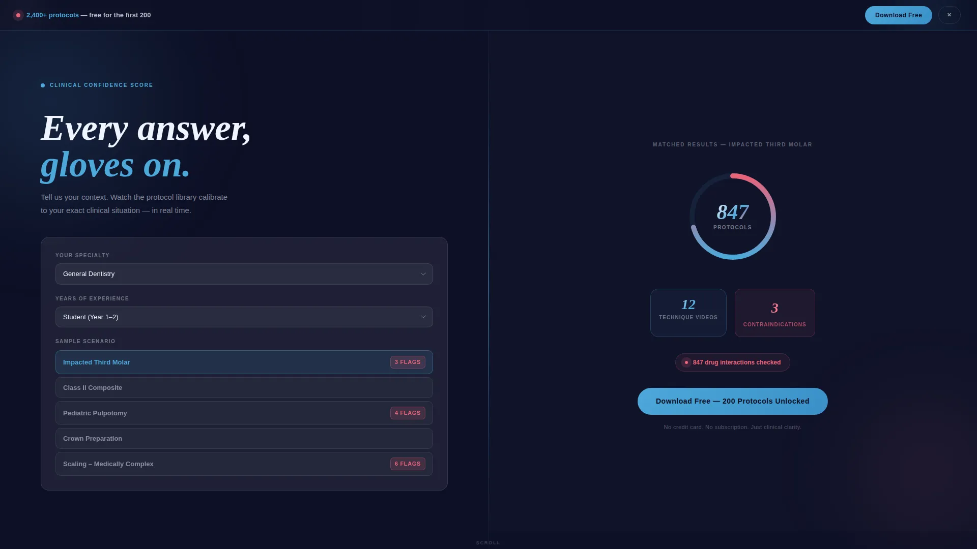
- A split-screen (50/50) header with an interactive Clinical Confidence Score calculator and animated radial gauge
- Scroll-triggered stat detonations paired with supporting feature demonstrations, including voice-search and one-thumb navigation showcases
- A sticky frosted-glass download bar with a two-step role-selection and platform-choice flow, plus a "Text Me the Link" secondary path for desktop visitors
Feature list
This template is built around a clear set of functional and visual components drawn directly from the brief. Each one serves the goal of turning a clinician's curiosity into a confident download tap.
Interactive Clinical Confidence Calculator
The header splits into two equal panels. The left panel lets visitors select their specialty, years of practice, and a sample clinical scenario. The right panel animates a radial gauge that fills in real time, revealing matched protocol counts in a cascading slot-machine number effect.
Stats-First Scroll Sections
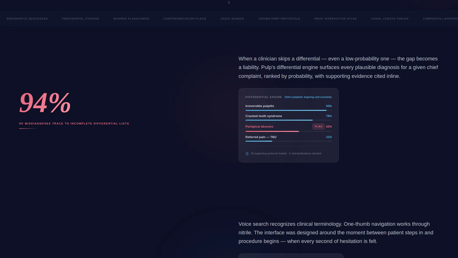
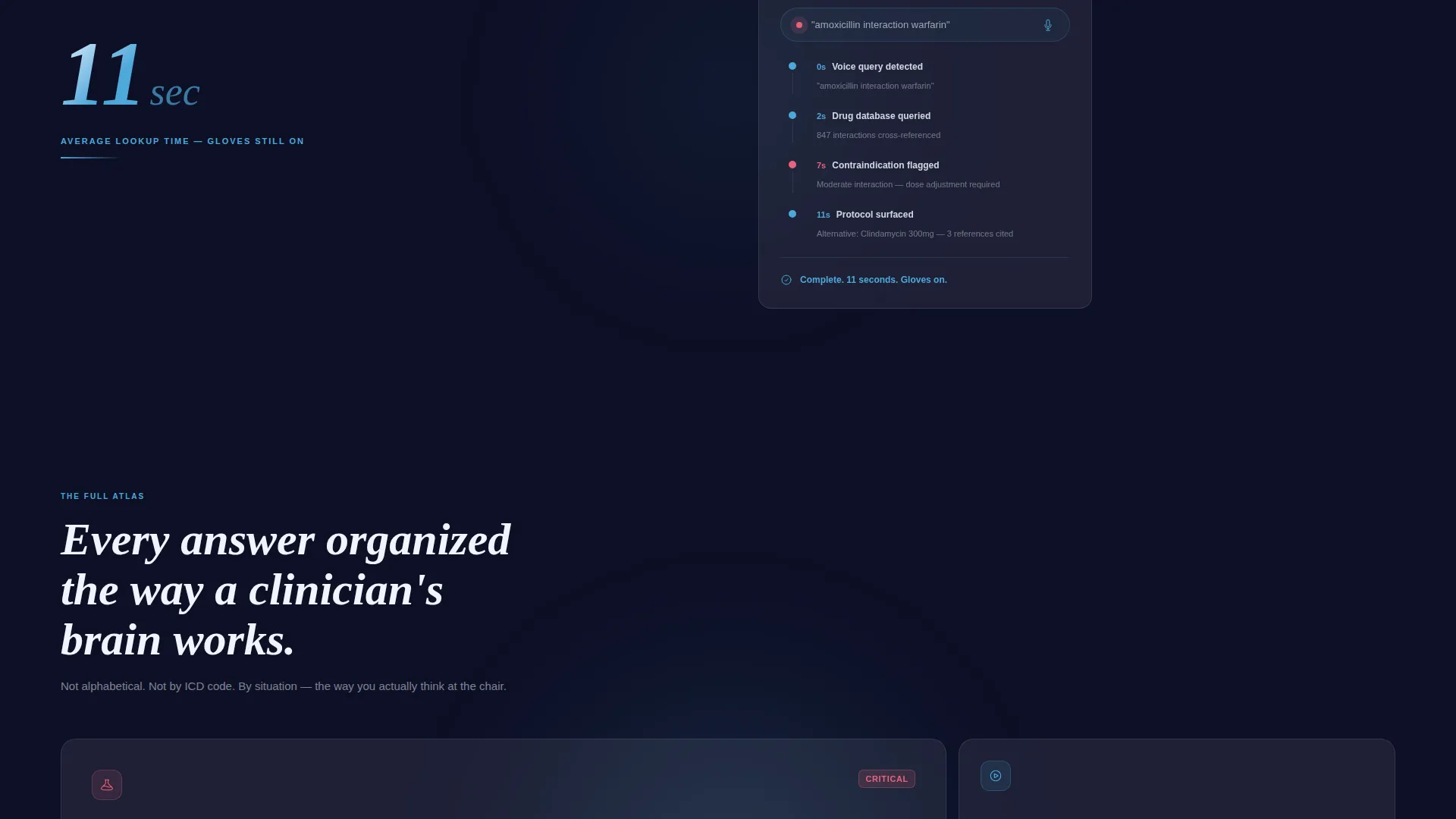
Every scroll event fires a bold statistic before any supporting copy appears. Stats like "94% of misdiagnoses trace to incomplete differential lists" and "11 seconds average lookup time, gloves still on" land first, then the section expands to show the feature behind the number.
Sticky Frosted-Glass Download Bar
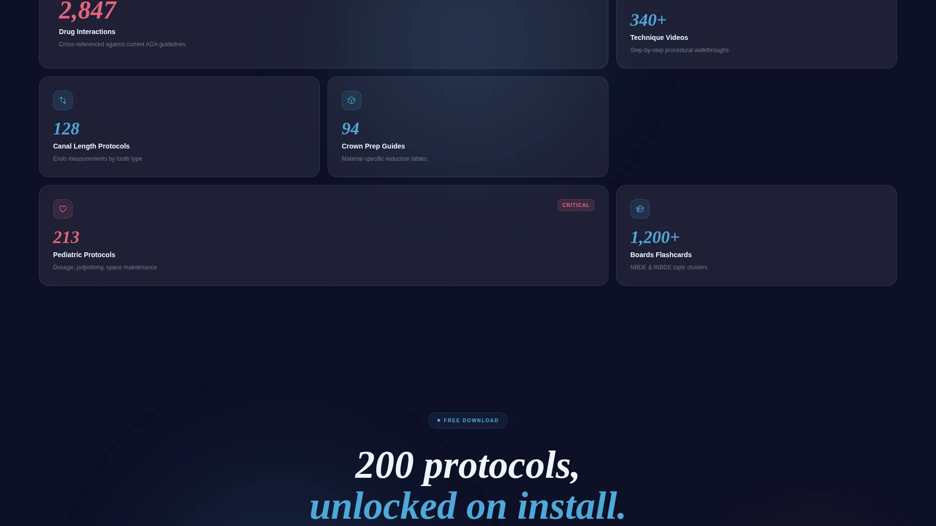
A persistent conversion bar materializes after the second stat section scrolls into view. It anchors the primary call to action "Download Free, 200 Protocols Unlocked" and stays visible as the visitor scrolls, keeping the download path one tap away at all times.
Two-Step Role-Personalization Download Flow
Tapping the download call to action opens a two-step micro-flow. Step one asks the visitor to select their role: student, dentist, hygienist, or specialist. Step two auto-detects the visitor's platform and presents the correct iOS or Android badge for a frictionless install.
Desktop "Text Me the Link" Conversion Path
Desktop visitors who are not ready to download immediately can enter a single phone number to receive the app link by text. This secondary path keeps desktop traffic in the conversion funnel without adding form complexity.
Dynamic Motion Visual System
Glass cards slide and stack as the visitor scrolls. Counters tick upward, depth-of-field shifts between panels, and the nerve-pink accent color pulses only on drug warnings and critical measurements. Motion is continuous, making the page feel as responsive as the app it promotes.
Page sections overview
| Section | Purpose |
|---|---|
| Split-Screen Header | Houses the Clinical Confidence Score calculator and animated radial gauge |
| First Stat Block | Delivers the misdiagnosis statistic and introduces the differential engine feature |
| Second Stat Block | Reveals the 11-second lookup time and demonstrates voice-search and one-thumb navigation |
| Sticky Download Bar | Anchors the primary call to action after the second stat section appears |
| Mid-Page call to action Repeat | Reinforces the download offer after stat sections have built sufficient conviction |
| Two-Step Download Flow | Collects role selection and presents auto-detected platform badges |
| Desktop Text-Link Path | Offers a phone-number field so desktop visitors can send the app link to their phone |
Design & branding system
The visual identity is built on a Glassmorphic color system that evokes precision and clinical focus. Every color choice has a functional purpose: the palette is not decorative, it is diagnostic.
- Frosted translucent white (#FFFFFFB3) for floating glass cards, clinical enamel blue (#4DA8DA) for borders and progress rings, and deep oral cavity charcoal (#1B1F3B) as the dark base layer
- Nerve-pink (#E8637A) used exclusively as an alert and interaction accent, appearing only when a drug warning, critical measurement, or attention-demanding stat needs to stand out
- Dynamic Motion theme drives all animation: counters tick, cards slide and stack, and depth-of-field shifts between panels to keep the page feeling alive and responsive
Mobile & speed optimization
The template is designed with one-thumb usability in mind, directly mirroring the app experience it promotes. A clinician with gloves on should be able to navigate the page and reach the download step without precision tapping.
- Large tap targets on the role-selection flow and platform badge buttons keep the download path accessible on small screens
- The sticky download bar remains fixed and visible during scroll on both mobile and desktop viewports
- Split-screen panels reflow gracefully for narrower screens so no content is hidden or truncated on a phone
How this template helps you convert
The conversion architecture is built around progressive trust. Each scroll step earns the next ask, so the download tap feels like a logical conclusion rather than a cold request.
- The calculator header creates immediate personal relevance by matching the visitor's specialty and scenario to a specific protocol count, making the app feel purpose-built for them before a single feature is described.
- The stats-first scroll sequence builds credibility through specific numbers, and the sticky download bar appears exactly when conviction is highest, right after the second stat lands.
Other information about this template
This template sits at the intersection of dental digital presence and clinical technology marketing. It is category-matched for teams promoting dental knowledge tools, clinical reference apps, and dental education platforms.
- The template style is Split Screen (50/50), with the header concept classified as a Calculator or Estimator interaction
- The creative direction follows a Stats-First Impact approach, and the landing page goal is App Download
- The theme is Dynamic Motion, the color system is Glassmorphic, and the niche is Dental Knowledge Base within the broader Dental Digital Presence subcategory
Theme
Dynamic Motion
Creative direction
Stats-First Impact
Color system
Glassmorphic
Style
Split Screen (50/50)
Direction
App Download
Page Sections
Clinical Confidence Score Calculator
Stats-first Scroll Architecture
Sticky App Download Bar
Two-step Role Personalization Flow
Desktop Text-link Secondary Path
Dynamic Motion Visual System
Related questions
Who is the target visitor for this landing page?
What does the Clinical Confidence Score calculator show?
Can desktop visitors also convert, or is this only for mobile?
When does the sticky download bar appear?
Can I customize the stats and protocol counts in this template?



