Precision Printing Analytics Landing Page Template
Pulp is a precision printing analytics landing page template built for Paper and Printing Vertical SaaS platforms. It uses a Tech Glass visual identity and a Spec Sheet creative direction to turn press data into persuasive proof. Comparison modules, a live dashboard header, and a frictionless conversion form make every scroll feel like a business case building itself.
by Rocket studio
Quick summary
Pulp is a single-page, dashboard-forward landing page template designed for print production analytics platforms. It pairs a Monochrome Steel visual identity with a Spec Sheet scroll cadence, so every section builds evidence rather than atmosphere. The result is a page that earns conversion by making a visitor's current workflow look expensive before the call-to-action ever appears.
Who this template is for
This template is built for vertical SaaS products serving the print production industry. If your platform turns press-floor data into decisions, this page speaks your buyer's language from the first scroll.
- Production managers overseeing multiple simultaneous press runs who need real-time data, not end-of-shift reports.
- Procurement directors negotiating paper contracts and substrate costs who rely on live cost-per-sheet visibility.
- Print brokers quoting jobs competitively while managing ink, substrate, and press uptime variables at once.
What problem this template solves
Print production teams still lose money to data latency. Manual tracking, disconnected spreadsheets, and delayed reports create blind spots that show up in wasted substrate, mispriced jobs, and press downtime that nobody caught in time.
- Teams lack a structured way to show prospects how much their current setup is costing them.
- Comparison-driven buyers need spec-by-spec proof before switching platforms, not just marketing language.
- Most analytics landing pages bury the value proposition instead of leading with live, believable data.
What you get with this template
You get a fully structured, single-page layout that moves a technically literate buyer from skepticism to sign-up through sequential evidence. Every section is designed with a clear function, not just visual flair.
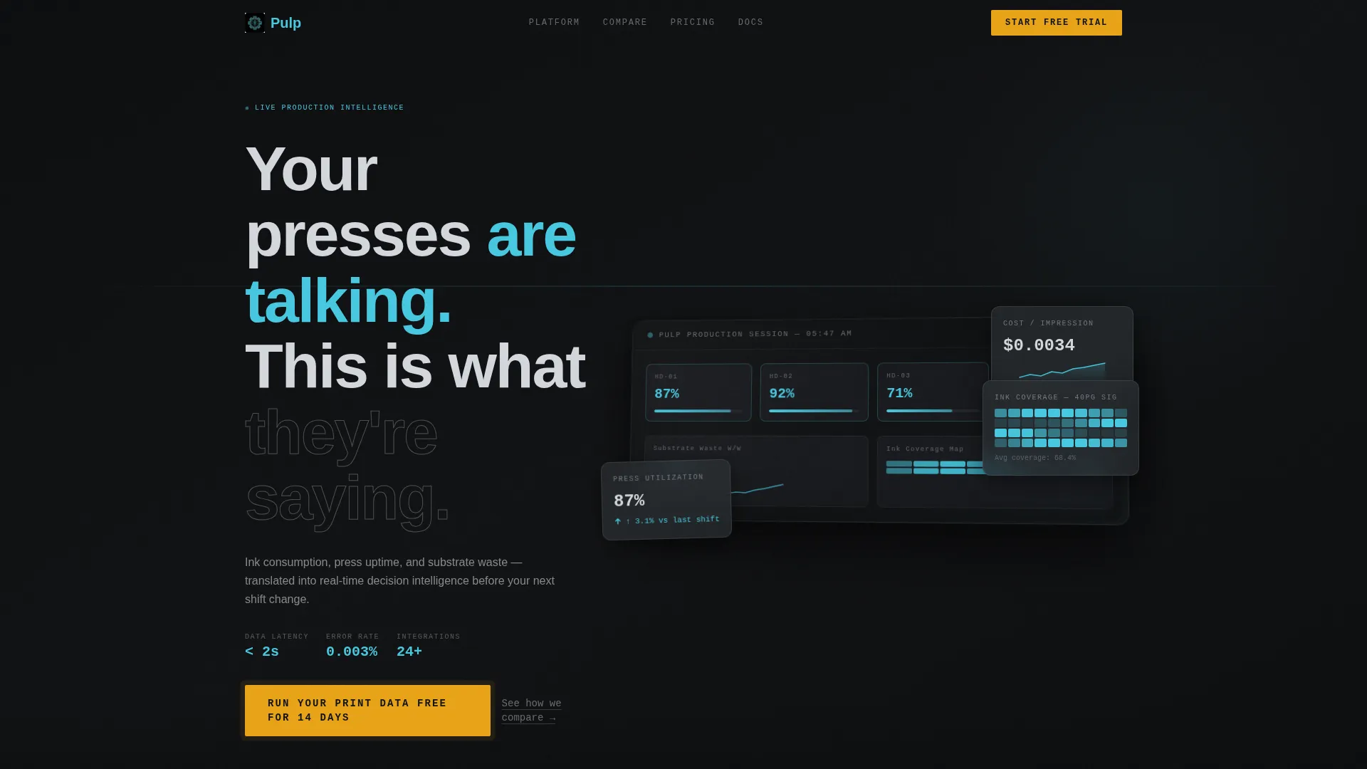
- A header section featuring a three-quarter angle dashboard preview showing a live production session with press utilization, substrate waste trend, cost-per-impression sparkline, and ink coverage heatmap.
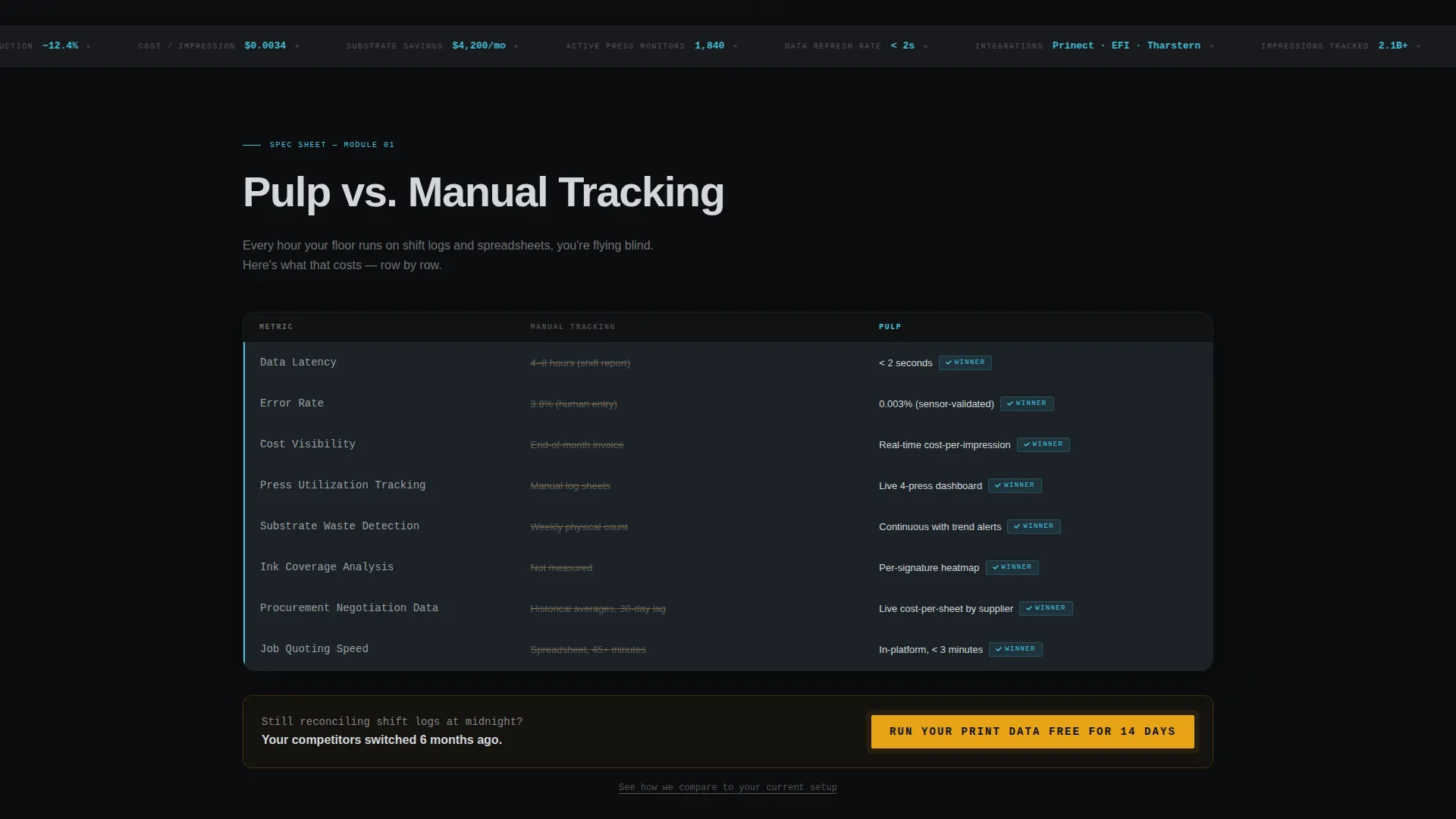
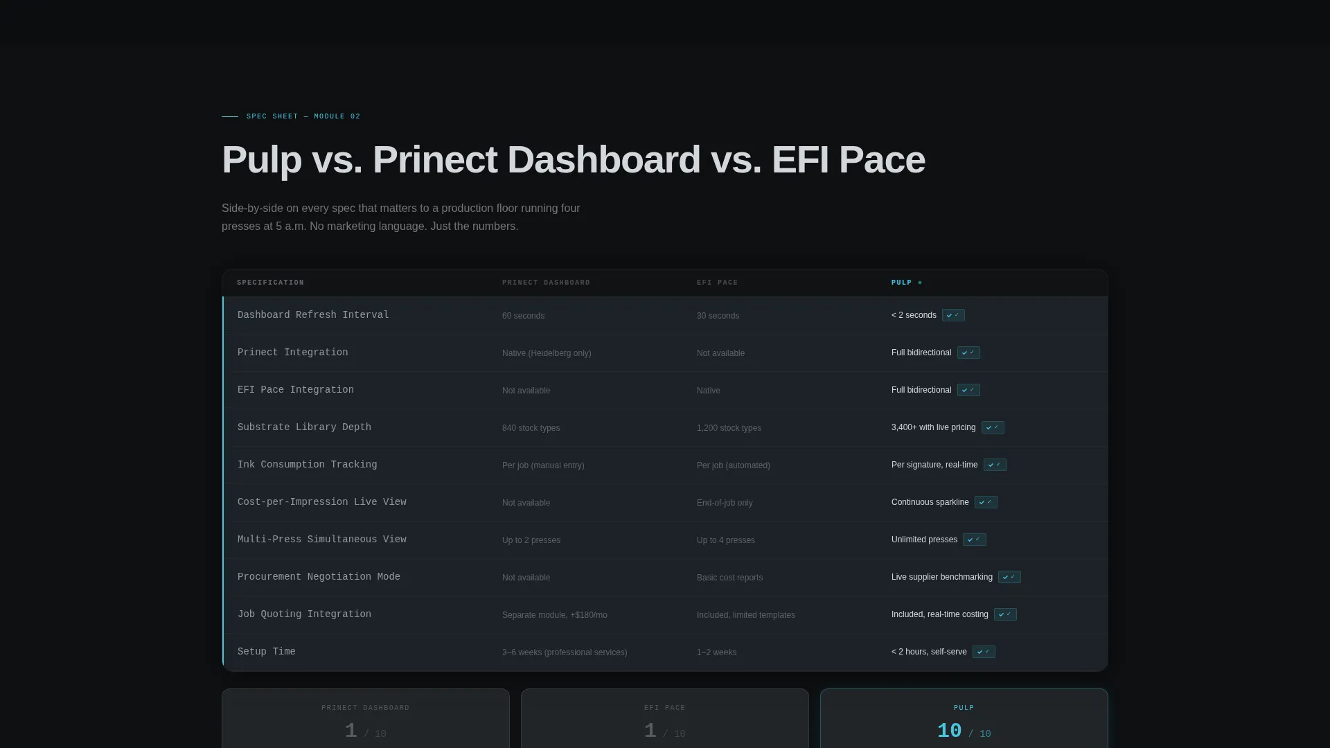
- Head-to-head comparison modules structured like technical data sheets, covering data latency, error rate, cost visibility, refresh intervals, and substrate library depth.
- A conversion form that asks only for company name, monthly impression volume, and current analytics tool, with no credit card required.
Feature list
This template includes the following built-in capabilities drawn directly from the brief.
Live Dashboard Header Preview
The header displays a three-quarter angle screenshot of an analytics interface showing a real production session. Press utilization, substrate waste trend, a cost-per-impression sparkline, and an ink coverage heatmap across a 40-page signature are all visible. The composition sits on a glass-reflective surface with soft depth-of-field blur at the edges, making the data feel tangible rather than illustrative.
Spec Sheet Comparison Modules
Each scroll section is structured as a head-to-head comparison module modeled on technical press documentation. The first module compares the platform against manual tracking across data latency, error rate, and cost visibility. The second benchmarks against competitor dashboards spec by spec, with every winning row marked by a status-indicator cyan highlight.
Locked Comparison call to action Strip
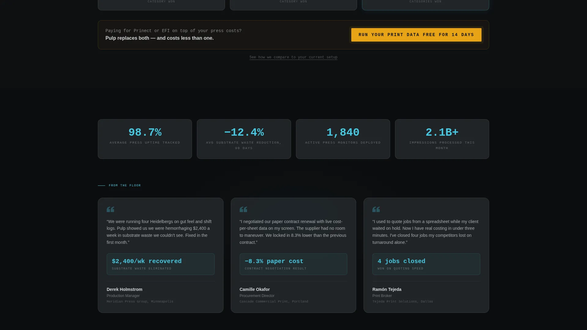
A primary call-to-action reading "Run Your Print Data Free for 14 Days" is locked to the bottom of every comparison module. It is reinforced by a secondary text link: "See how we compare to your current setup." The persistent placement means the action is always within reach, no matter where the visitor pauses.
Low-Friction Conversion Form
The conversion form collects three fields: company name, monthly impression volume via a tiered dropdown (under 1 million, 1 to 10 million, or 10 million and above), and current analytics tool including a "spreadsheets or none" option. No credit card is requested at any point.
Tech Glass Visual System
The layout uses a dark-first design language built on press-bed black backgrounds, charcoal data cards with hairline aluminum borders, and cyan active-state traces. Warning filament amber is reserved exclusively for comparison highlights and call-to-action pulses, keeping every color functional rather than decorative.
Page sections overview
| Section | Purpose |
|---|---|
| Dashboard Preview Header | Establishes credibility with a live-feel analytics interface view |
| Animated Headline Block | Delivers the opening message as the dashboard fades in below |
| Manual Tracking Comparison | Shows data latency, error rate, and cost visibility side by side |
| Competitor Benchmark Module | Compares refresh intervals, integrations, and substrate library depth |
| Locked call to action Strip | Keeps the primary action visible after every comparison module |
| Conversion Form Section | Captures company name, volume tier, and current tool with no card required |
Design & branding system
The visual identity follows a Tech Glass theme built around a Monochrome Steel color system. Every color in the palette earns its place through function, not decoration.
- Core palette: mill-finish aluminum (#D4D7DC), press-bed black (#111214), machine-guard charcoal (#2A2D32), status-indicator cyan (#47C8E0), and warning filament amber (#E8A317).
- Data cards float on charcoal surfaces with hairline aluminum borders, and cyan traces the edges of active states throughout the interface.
- Warning filament amber is used exclusively for comparison winner highlights and call-to-action pulse effects, keeping its visual weight meaningful.
Mobile & speed optimization
The template layout is structured to adapt naturally to smaller screens without losing the data-dense quality that makes the Spec Sheet cadence convincing.
- Comparison modules reflow into vertically stacked columns on narrower viewports, keeping spec rows readable without horizontal scrolling.
- The locked call to action strip maintains its position at the bottom of each comparison section across all screen sizes.
How this template helps you convert
The page is engineered around a Comparison and Versus conversion model. It does not ask for commitment until it has already made the visitor feel the cost of their current setup.
- The dashboard header opens with a credibility anchor, showing a production session already running, which sets the expectation that the platform works before any claim is made.
- The Spec Sheet comparison modules build a sequential evidence chain, each row tightening the case until switching feels like the rational conclusion rather than a sales decision.
- The locked call to action strip and low-friction form remove every remaining obstacle, presenting a no-credit-card, 14-day trial as the obvious next step.
Other information about this template
This template is designed specifically for the Paper and Printing Analytics Dashboard niche within the broader Paper and Printing Vertical SaaS category.
- The creative direction, Spec Sheet, is a deliberate choice for technically literate buyers who distrust marketing language and respond to documented proof.
- The template style is Dashboard and Data Grid, reflecting the expectation that buyers in this space evaluate tools by the quality and clarity of the data they surface.
- The header concept, Dashboard Preview, grounds the page in a believable production context rather than abstract product imagery.
- The landing page direction, Comparison and Versus, is appropriate for markets where incumbent tools such as manual spreadsheet workflows, Prinect, and EFI-connected dashboards represent the real competition named in the brief.
- The intersection match between Tech Glass theme, Monochrome Steel color system, and a print production context is intentional: the palette reads like a CNC control panel, which signals competence to buyers who work on production floors.
Theme
Tech Glass
Creative direction
Spec Sheet
Color system
Monochrome Steel
Style
Dashboard/Data Grid
Direction
Comparison/Versus
Page Sections
Live Dashboard Header Preview
Spec Sheet Comparison Modules
Locked Call to Action Strip Per Module
Low-friction Conversion Form
Tech Glass Visual Identity
Related questions
Who is this landing page template designed for?
Can I customize the comparison module rows?
Does the conversion form support custom dropdown options?
Is a credit card required for the 14-day trial call-to-action?
What makes the visual style appropriate for a print analytics audience?



