Nonprofit Survey Landing Page Template
Pulse is a split-screen landing page template built for nonprofit survey and feedback platforms. It opens with a live Response Rate Estimator that hooks visitors with their own data, then accelerates through animated stat cards, a workflow comparison, and a freemium sign-up flow. The design uses a deep Midnight Blue palette with civic teal call-to-action elements for a sharp, data-command feel.
by Rocket studio
Quick summary
Pulse is a single-page, split-screen landing page template for nonprofit survey and feedback platforms. It leads with an interactive Response Rate Estimator, builds momentum through animated proof sections, and drives visitors toward a no-credit-card free trial. Every section is purposeful, fast, and built to convert development directors, program managers, and board chairs.
Who this template is for
This template is built for teams launching or promoting a nonprofit survey and feedback platform. It speaks directly to the people inside nonprofits who handle data, funding, and reporting.
- Development directors managing donor feedback and grant reporting workflows
- Program managers who need beneficiary impact data for grant renewals
- Board chairs who want consolidated insights instead of scattered spreadsheet exports
What problem this template solves
Nonprofits collect enormous amounts of feedback but rarely have a clean way to act on it. Survey exports pile up, dashboards go unused, and funding decisions get made on gut feeling instead of structured data. This template gives a platform the right landing page to show those teams there is a better path.
- Visitors arrive with no immediate sense of how the platform improves their specific situation
- Generic landing pages fail to create personal stakes before asking for a sign-up
- Nonprofit buyers need proof of usefulness, not just a feature list, before committing
What you get with this template
You get a fully structured, single-page layout that moves visitors from curiosity to commitment through interactive tools, rapid-fire proof, and a low-friction sign-up path.
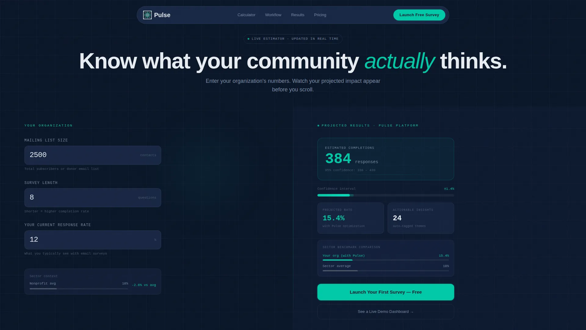
- A live Response Rate Estimator header that renders projected results as visitors type
- An animated stat card section and a side-by-side old-versus-new workflow comparison
- A sticky freemium call-to-action bar and a secondary demo sandbox path
Feature list
This template ships with purpose-built sections and interactive components designed specifically for a nonprofit data platform audience.
Live Response Rate Estimator Header
The header is a working calculator, not a banner. Visitors enter their mailing list size, typical survey length, and current response rate. The right panel updates in real time, showing estimated completions, confidence intervals, and a benchmark comparison against sector averages. The tool creates personal data ownership before the visitor has scrolled once.
Split-Screen Layout System
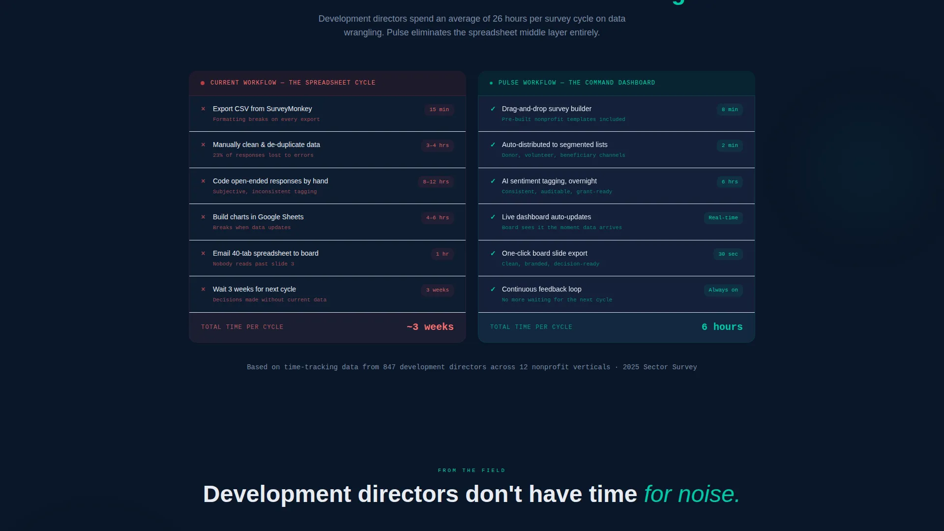
Every major section uses a clean 50/50 split-screen structure. This keeps content balanced and scannable, letting the template present two ideas side by side without crowding. The layout is especially effective in the workflow comparison section, where the old process and the Pulse process sit directly next to each other.
Animated Stat Card Section
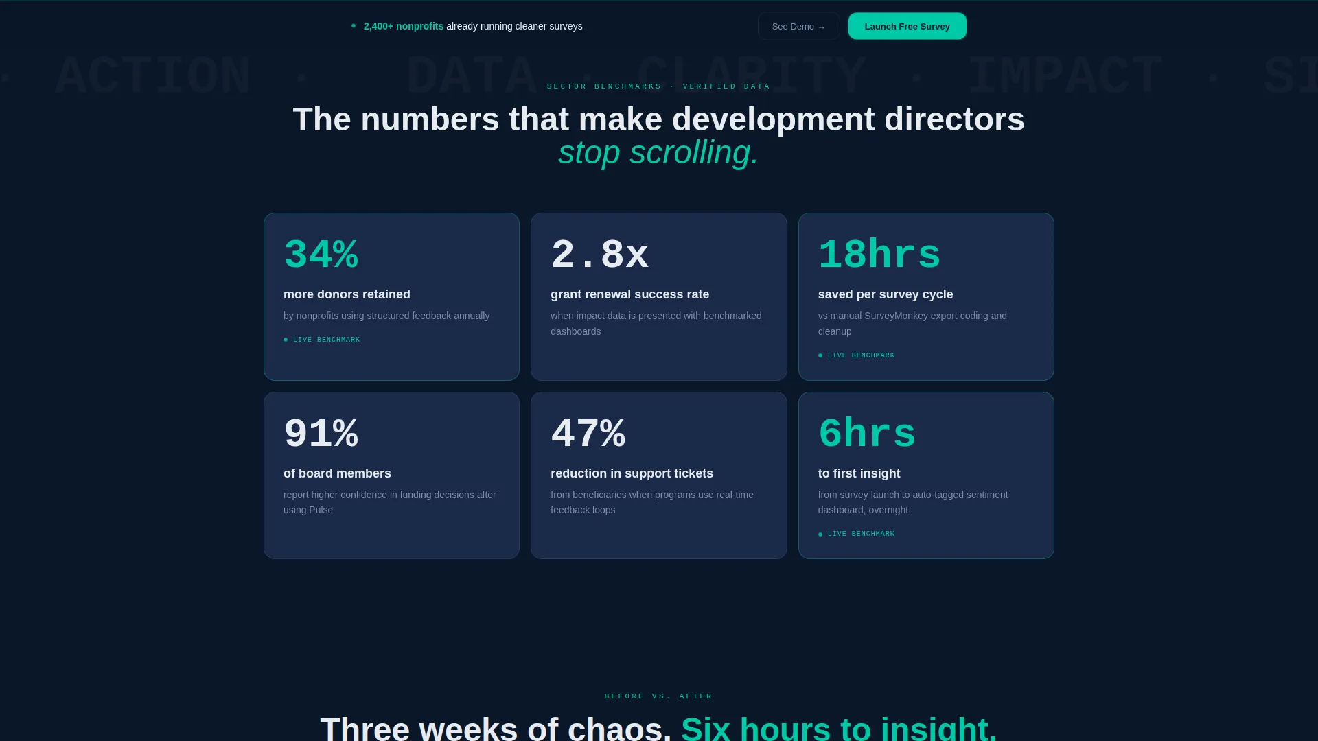
After the calculator, the page accelerates with a rapid-fire row of animated stat cards. Each card surfaces a single, sharp proof point tied to structured nonprofit feedback, such as donor retention improvements. The animation timing is tuned to maintain scroll momentum rather than interrupt it.
Old Workflow versus. New Workflow Comparison
A dedicated comparison section places the spreadsheet-heavy old process directly beside the streamlined new workflow. Visitors see the contrast instantly: manual coding and three-week turnarounds on one side, drag-and-drop survey building and overnight insights on the other. No explanatory copy needed; the layout does the work.
Freemium Call-to-Action System
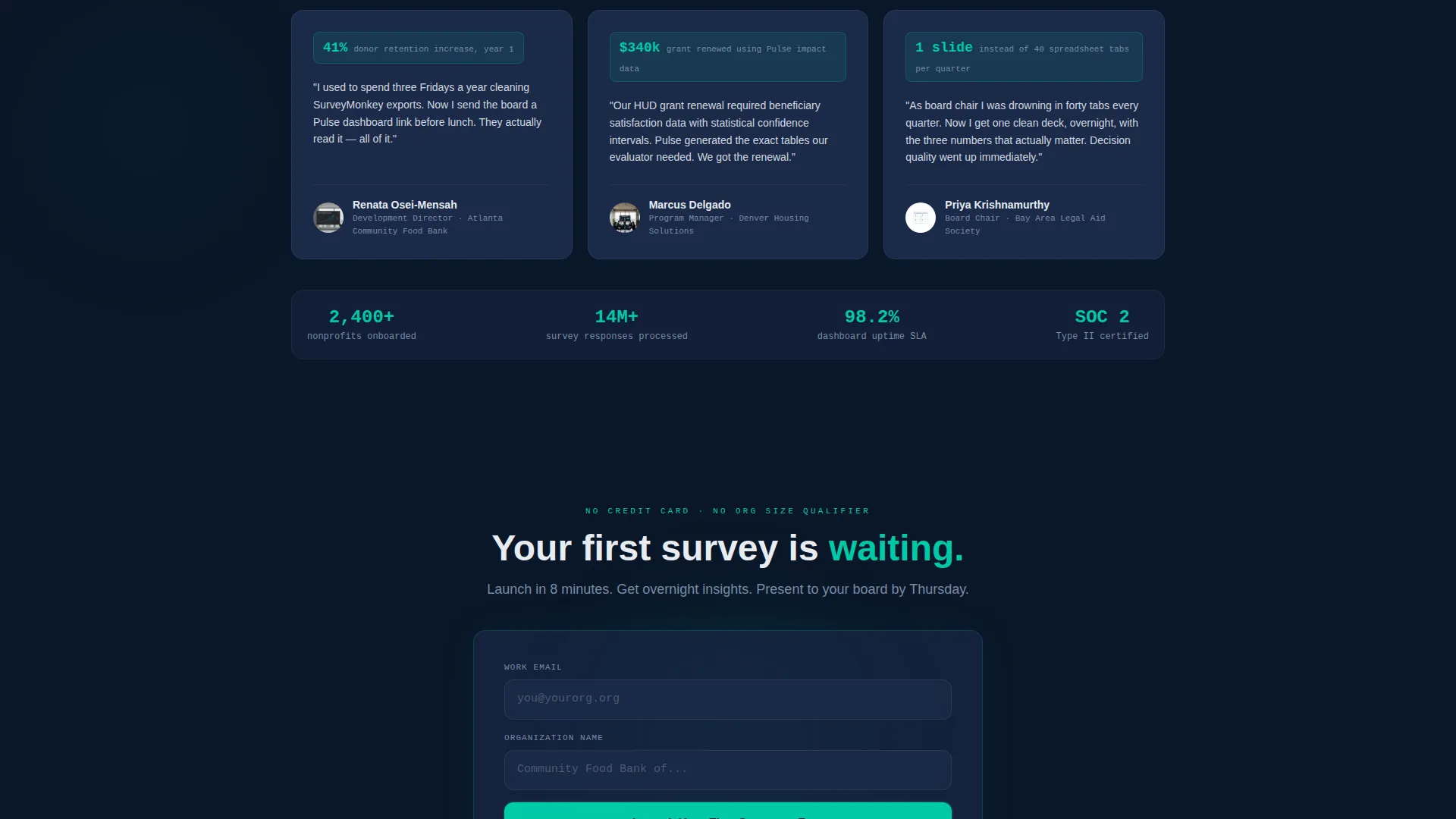
The primary call-to-action, "Launch Your First Survey Free," appears first inside the calculator results panel as a contextual next step. It reappears as a sticky bottom bar after the third scroll section. The sign-up form asks only for a work email and organization name, with no credit card required.
Secondary Demo Sandbox Path
A secondary call-to-action offers visitors a read-only live demo dashboard populated with anonymized shelter-network data. This gives skeptical buyers real proof before any commitment, reducing drop-off from visitors who need to see results before signing up.
Page sections overview
| Section | Purpose |
|---|---|
| Response Rate Estimator | Hook visitors with personalized projected data |
| Animated Stat Cards | Deliver rapid-fire social proof through movement |
| Workflow Comparison Split | Contrast old chaos with the new streamlined process |
| Freemium call to action Panel | Capture sign-ups with a no-barrier email form |
| Sticky call to action Bar | Reinforce the free trial offer after third scroll |
| Demo Sandbox Link | Offer a low-commitment proof path for cautious buyers |
Design & branding system
The visual identity follows a Data Command theme built on a Midnight Blue color system. Every color choice is functional, not decorative, creating the feel of a research vessel's control bridge at night.
- Deep command-center navy (#0A1628) forms the primary background, with tactical slate (#1B2A4A) used for card surfaces
- Cool signal white (#E8ECF1) handles all typography to maintain contrast and readability
- Pulsing civic teal (#00C9A7) is reserved exclusively for live data indicators, toggle states, and call-to-action buttons
Mobile & speed optimization
The template is structured for clean rendering across screen sizes, with layout decisions that support fast visual parsing on smaller devices.
- The split-screen sections reflow gracefully so mobile visitors see one focused column at a time
- Stat cards and the estimator inputs are sized for thumb-friendly interaction on touch screens
How this template helps you convert
Every layout and copy decision in this template is designed to reduce friction and increase the chance a visitor becomes a sign-up or a demo request.
- The Response Rate Estimator creates a sense of personal data ownership early, so visitors feel invested in the platform before reaching any call-to-action
- The freemium sign-up form asks only for a work email and organization name, removing the credit card barrier that typically causes nonprofit buyers to abandon
Other information about this template
This template is suited to any nonprofit software or nonprofit technology product that relies on survey feedback, feedback management, or data reporting as its core value. It works equally well for teams positioning around donor engagement tools, volunteer feedback systems, or beneficiary impact reporting.
- The template style is Split Screen (50/50) with a Launch Energy creative direction
- The header concept is a Calculator and Estimator interactive tool, not a static hero image
- The landing page direction is Freemium and Trial, optimized for low-barrier first conversions
- The theme is Data Command, making it a strong fit for any platform that wants to feel authoritative and precise rather than soft or illustrative
Theme
Data Command
Creative direction
Launch Energy
Color system
Midnight Blue
Style
Split Screen (50/50)
Direction
Freemium/Trial
Page Sections
Live Response Rate Estimator
Split-screen 50/50 Layout
Animated Stat Card Section
Workflow Comparison Section
Freemium Call to Action System with Sticky Bar
Secondary Demo Sandbox Path
Related questions
What kind of platform is this template designed for?
Does the Response Rate Estimator require custom coding to function?
Is a credit card required in the sign-up form built into this template?
Can visitors try a demo without signing up first?
When does the sticky call-to-action bar appear on the page?



